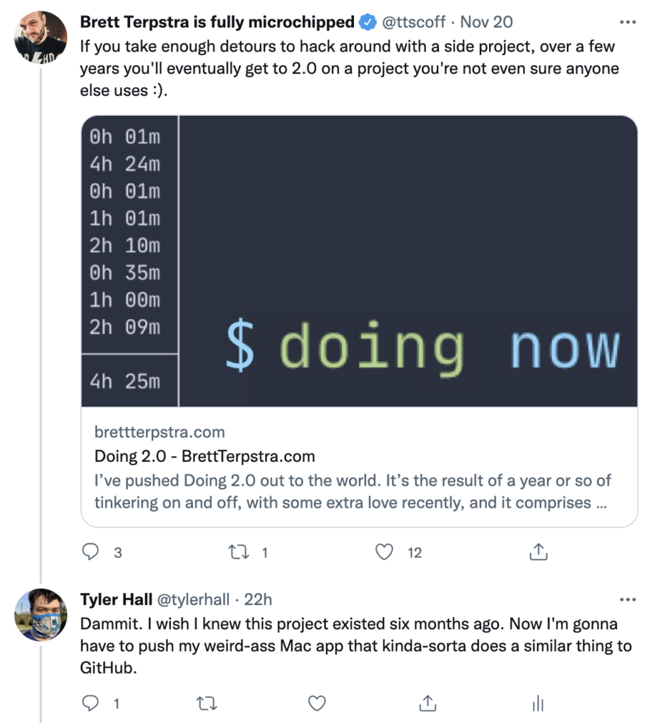
If you take enough detours to hack around with a side project, over a few years you’ll eventually get to 2.0 on a project you’re not even sure anyone else uses 🙂
To which I had an immediate face-palm reaction when I realized
How did I miss version 1?
My goodness, doing is so much more scriptable and robust than the weird-ass Mac app I built for myself to scratch a similar itch.
If I’m understanding the intent of doing correctly (and I’m writing this after only reading through the v2 announcement and skimming around the documentation), I think his project and mine (which I’ll get to in a bit) come from a shared need to record and track what you’re doing (or have done).
Where our two approaches diverge is Brett went full-on nerdcore building a reporting engine into doing that provides the ability to track time and generate statistics of what you’ve been…doing. The later, last, and recent subcommands look like a brilliant ad-hoc reminders list to get you back into your last work context.
I’ve been big into journaling for close to a decade now – at least in my personal life. But I’ve never been able to build up the same habit in my work / professional life – even though I know I would reap benefits there, too.
I’ve tried all sorts of workflows to make journaling my workday a regular and frictionless routine — everything from a Day One hotkey to some convoluted Keyboard Meastro macros and Drafts.app actions.
None of them stuck.
But what finally did work for me (at least for the last six months or so) is a tiny little Mac app called Capture Thing. (Sorry, I pick horrible names for projects I never intend to share with others.)
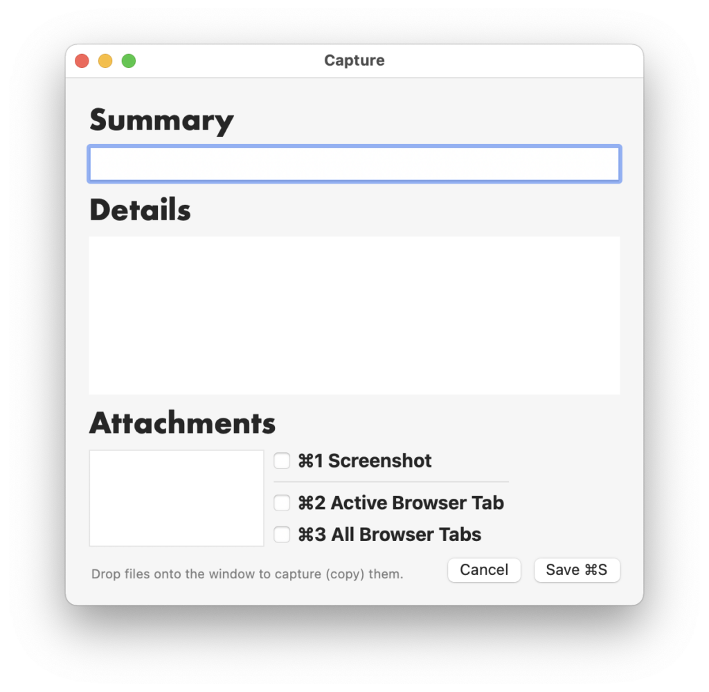
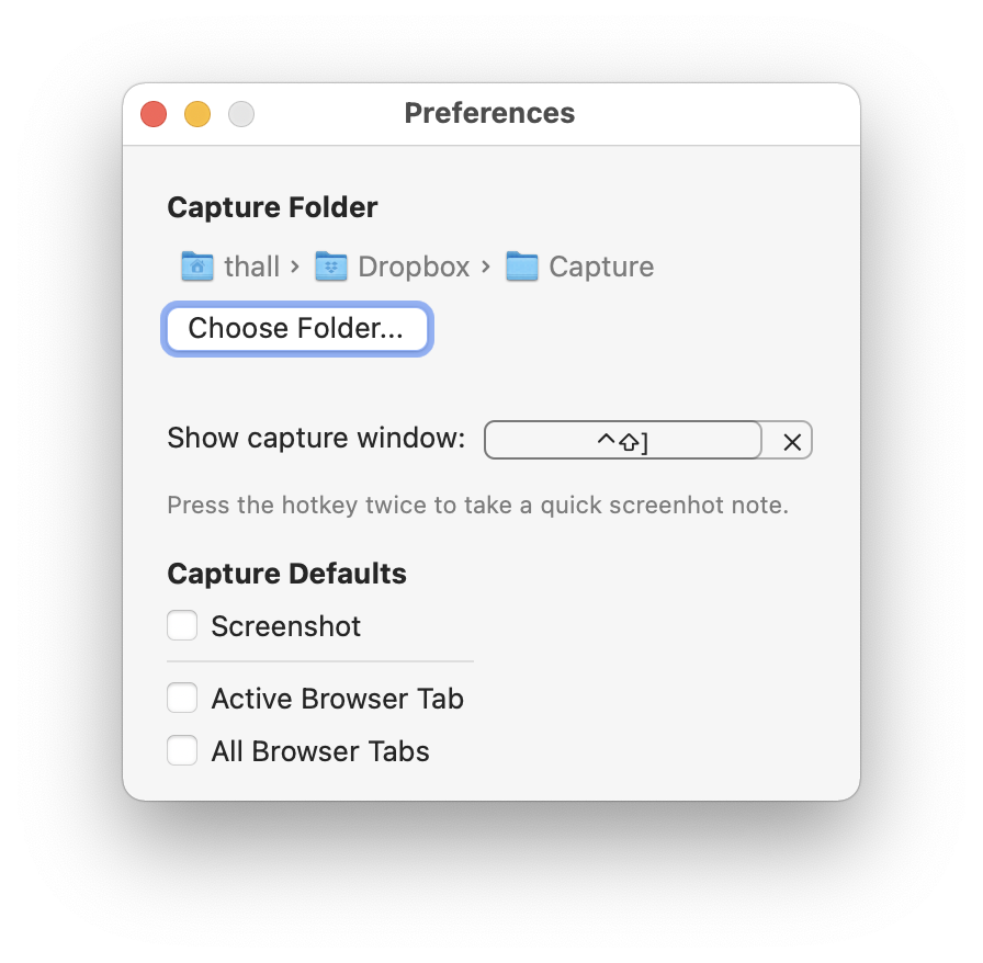
Here’s the app’s only window
While I’m working, whenever I want to record progress, take a note, or jot something down for future reference – I press a keyboard hotkey to summon the capture window. Fill in the details (as much or as little as I want – all fields are optional) and ⌘S to save the entry. The window disappears, and I’m right back where I was in some other app.
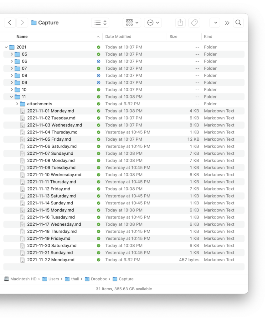
Where do these entries go? And what are all the options?
I have a folder in Dropbox called Capture. Inside that, the app automatically generates year/month folders as time goes on. And a new journal file for each day I capture info. Like this
Each journal file is (of course) a plain text Markdown document in a standard format that renders into a friendly, human-readable format for later viewing and searching.
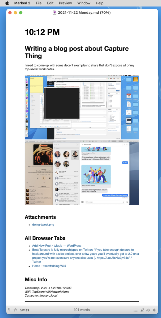
A complete entry (including every option) might look like this.
# 10:12 PM
Writing a blog post about Capture Thing
----------
I need to come up with some decent examples to share that don't expose all of my top-secret work notes.


### Attachments
* [doing-tweet.png](attachments/2021-11-22 1637640770doing-tweet.png)
### All Browser Tabs
* [Add New Post ‹ tyler.io — WordPress](https://tyler.io/wp-admin/post-new.php)
* [Brett Terpstra is fully microchipped on Twitter: "If you take enough detours to hack around with a side project, over a few years you'll eventually get to 2.0 on a project you're not even sure anyone else uses :). https://t.co/6sNw3jv34a" / Twitter](https://twitter.com/ttscoff/status/1462106481814298635)
* [Home · ttscoff/doing Wiki](https://github.com/ttscoff/doing/wiki)
### Misc Info
*Timestamp: 2021-11-23T04:12:53Z*
*WiFi: TopSecretWifiNetworkName*
*Computer: imacpro.local*
* * * * *
Top to bottom, here’s the entry format
An optional one-line summary.
An optional multi-line description with as much or as little content as you want.
If the Screenshot option is enabled, the app will take a screenshot of each monitor window, store those in the attachments directory, and link them inline in the Markdown.
You can drag and drop files into the capture window, and they’ll be copied into the attachments folder and linked, too. I’ll often take a small screenshot using CleanShot X, add some annotations, and then capture that image into my journal.
If you choose one of the browser tab options, the app will use AppleScript to grab the current tab (or all tabs) and dump those URLs into the entry along with their page titles as proper Markdown links.
Finally, to provide added context about when and where I made this entry, the app records the name of my computer as well as the current wifi network (which serves as a poor man’s location, so I know if I was at home, work, or a coffee shop).
As I go about my day, I capture what I’m currently working on or thinking. And at the end of the day, I have a full Markdown document of (hopefully) everything I worked on. I can review these journal entries fully rendered in an app like Marked.
For years I’ve hacked around on tools and projects that I nebulously classify as my “second brain” or “digital memory”. Those terms aren’t unique or invented by me, but I’m fascinated by the possibilities that arise when data storage is so cheap and it’s (trivially?) easy to capture so much of one’s life – privately, for your future reference.
But that’s a much longer blog post.
Let me end with a quick video or two of Capture Thing in action to highlight how keyboard-centric it is.
First, here’s a complete end-to-end capture.
And then, you can see that the three screenshot and web browser capture options are toggleable with ⌘1-3.
Those options are adjustable per entry but default to what you choose in Preferences.
Another nicety that I won’t bother screen recording is if you press the capture hotkey twice (without filling in any details), the app will instantly capture and save a screenshot. I’ve found this very helpful to capture chat windows and video presentations super quickly.
Despite its terrible name and even more awful app icon, Capture Thing is available on GitHub if you’d like to try it or take the source code and build your own bespoke capture journaling workflow.
It’s an open secret that Apple is working on an augmented reality headset (or something). All the recent advances in ARKit and adding LiDAR to the pro iPhones and iPads are certainly leading up to a larger goal.
I have no idea what that next leap is.
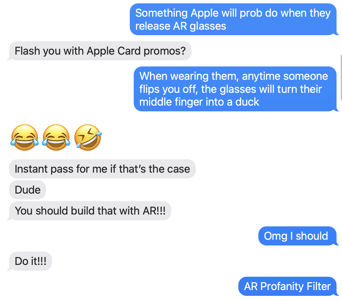
But, I do know that fourteen years into iOS, people still ducking hate autocorrect. Especially when you find your ducking text messages littered with ducks. There’s just no ducking way around it. Short of adding a fake contact to your address book named Dr. Duck Ducking McDucker, autocorrect seems ducking incapable of learning everyone’s favorite bit of profanity.
That got me thinking earlier today. What’s going to happen when Apple finally leads us into that next frontier of human / computer interaction? What happens when our day-to-day reality becomes augmented with live information and our physical and digital worlds merge even closer together?
What happens if Apple takes autocorrect’s prudish vocabulary into AR? If they dared to try and censor the real world, how would that look?
I decided to try and find out. And I have the Xcode project to prove it.
Watch.
So what did you just see in that video?
It’s an iOS app that analyzes video streaming from the camera and attempts to detect human hands. If it finds any, it then tries to distinguish the digits of each finger and, specifically, if the middle finger is raised. If it detects that, it takes the location of the offending finger and censors it with a 🦆.
This whole post, of course, really is a joke. But the silly idea originated from an actual conversation with my wife and then a friend egging me on to build it.
But, more importantly, it shows just how fantastic software is these days. How spoiled we are to carry supercomputers in our pockets. In less than 200 lines of code, I used these incredible frameworks developed by Apple to get this idiotic idea working in an evening.
I know I complain a lot, but I also want to credit the many talented people working hard to put software like this out into the world for other developers to build upon.
I’m not going to weigh in on Safari’s new design. Instead, I want to call out something Gruber wrote in his commentary:
You got URLs in address fields, but page titles weren’t exposed other than in the Window menu. That was, in my opinion, a fundamental flaw in the design. Web page titles are useful, and should be more human-readable than URLs.
That’s something I’ve long intuited based on my own web browsing habits but never really put into words. When I stop and think about it, modern web browsers drive me crazy by limiting tabs to a maximum width because that width is almost never enough to show the full page title.
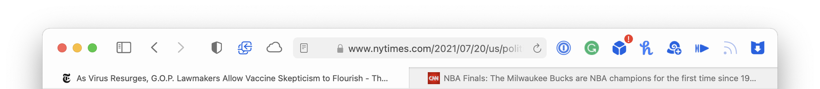
Well, except one web browser: Safari. Look.
Here’s Chrome, Firefox, and Safari showing the same two web pages using the same window widths.
Chrome
Firefox
Safari
Safari is the only one that lets each tab expand to fill as much room as is available – so you can see more of the web page’s title.
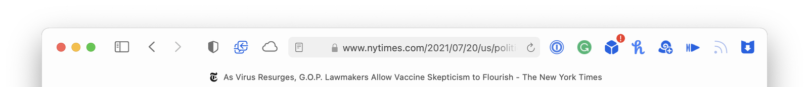
This difference is even more apparent if you only have one tab open. Here they are again:
Chrome
Firefox
Safari
If Safari on macOS Monterey is heading in a similar direction where web page titles are going to be even more truncated, that’s going to make me sad. I guess we should do something about it.
Here’s TheTitle.app
It’s a silly Mac app that is just a window title bar. It floats above all the other windows on your Mac and keeps an eye on your web browsers. As you move from browser to browser and web page to web page, TheTitle shows you the full page title – unobscured. Problem solved.
Super clever person, Mario Guzman, released Music Widget the other day. Here’s how he describes it:
A mini player remote for Apple Music. A take on the classic iTunes widget.
The app is exactly what it says on the tin. A pixel-perfect recreation of the old Mac OS X Dashboard widget that debuted with 10.4 Tiger in 2005. But it’s a bit more than that. Mario had to solve two problems.
First, a quick and dirty solution for making this app would be to boot up an old copy of Tiger and rip out the web assets (images, etc.) from the widget itself. But Tiger was 16 years ago. We have @2x retina displays on our Macs now. The original images would be too small or pixelly. Instead, he did things the hard way and took the time to rebuild everything from scratch in code.
Problem number two: Dark Mode wasn’t a thing sixteen years ago. Mario had to create that design himself. (It helped that he had a head start from previously bringing Dark Mode to his impressive rebuild of iTunes.)
And, holy crap, have you seen The OldOS Project from Zane K? He built a fully functional version of iOS 4 with SwiftUI.
Why are people putting so much time, effort, and obvious love into remaking old user interfaces using modern development tools? Why bother?
I’m sure there’s a whole host of reasons, and each developer is motivated differently. Ultimately, I don’t think it matters. My real question is this:
Fifteen or twenty years from now. In 2036. In 2041. What will those kids rebuild from our devices today?
Mario and I had a short conversation about this last week, and I’ve been thinking about it ever since. I’ve tried paying attention to the devices and apps I use all day. And, I just, don’t know?
Are future developers going to feel nostalgia for the hamburger menu? The Facebook newsfeed? Grayscale colors and identically shaped app icons? Flat UI?
I’m trying very hard not to fall into the trap of being yet another old man yelling at kids to get off my lawn, but I struggle to find delight on a grand scale in modern software. Every incremental step, year over year (from all companies, this isn’t just about Apple), seems to be focused on removing emotion and affection from our devices rather than finding ways to strengthen that bond.
Has the industry decided that our devices have reached a level of maturity that warrants making everything minimal, sterile, and utilitarian to help “do work” and “get stuff done”?
Where’s the fun? Where’s the experimentation? The joy and playfulness?
I see bursts of design like this coming from small companies and individual developers. But the major players have forgotten that how software makes you feel is just as important and necessary as what it lets you do.
What I mean is, it’s been a long time since I’ve been inside a restaurant with my kids.
467 days.
The last time we ate out as a family, they were, well, horrible little human beings. It was just that age.
But then we walked inside and closed the door behind us. And waited.
For over a year, we played it as safe as possible — minimized risks. Even when our jobs ordered us back into the office, we did what we could. Drive to work. Eat lunch in – not out with coworkers. A social pariah among young non-believers. Drive back home. Maybe the grocery or drug store.
A grandparent’s wave through a glass door.
And we made it through mostly unscathed.
Mostly.
It was, at the same time, the longest and shortest year of our lives.
Two weeks ago, my wife and I sat outside in the rain near a cave. And laughed. And sang. And danced a little.
Music echoed through the clearing.
We cried. And were thankful.
Tonight, my son asked for sushi from the Chinese place he likes best. His eyes lit up when I replied, “Would you like to eat inside?” My wife and I call it “Trump Chinese” because they sell counterfeit MAGA gear out of a golden display case in the lobby. Two hats for $35. The food is comforting – if overpriced. The owners are giant assholes. But it was a regular spot nonetheless.
When we drove up this evening, I cackled when I saw the interior stripped to the studs, and they had finally gone out of business. Good.
Sure, my kids sobbed because that age never likes disappointment. But that was solved easily enough by making a quick detour to a nearby deli instead. Another favorite of ours. Hello, old friend.
We opened the door and stepped out of our time machine — my children another year older. And, my goodness, actually not terrible dinner companions like they used to be.
Ten months ago, I drafted a post about how incredible the Apple ecosystem is when all the pieces fit together. It was a month into the pandemic, and I found myself walking through a real-life Apple commercial in the grocery store.
It was a perfect experience. Shopping in Publix with a mask on, viewing my grocery list on my watch (my phone in the car), streaming Apple Music to my AirPods, and occasionally saying, “Hey, Siri. Call my wife” (through a mask!) to hands-free ask her a question.
It even ended with (I’m not joking) a screenshot of my son audio-FaceTiming me from his iPad. It was the first time he ever called me on his own, and I was shocked to see his name appear as the caller ID on my watch when my headphones started ringing.
I answered, “What are you doing, Aaron?” and he straight-up said, “I just wanted to say I love you, Dad,” and hung up.
So, there I am. About to pay for a cart full of groceries, contact-less with my Apple Watch, masked up at the start of a global pandemic, listening to my son tell me he loves me over the phone for the first time, having this truly magical and emotional real-life moment – all thanks to a brilliant interplay of years and years of amazing work done by Apple engineers on both the hardware and software sides.
I was a bit stunned when I got back to my car, and it sort of hit me just how well the entire end-to-end experience worked. That, now, right when everyone was freaking out about this new virus, I was able to buy groceries and stay in contact with my family via Siri while wearing a mask in a noisy store and then pay hands-free. And my son took that moment to call me for the first time? As a lifelong adherent of the positive influence and power that well made software and hardware can have over our lives, I was taken aback.
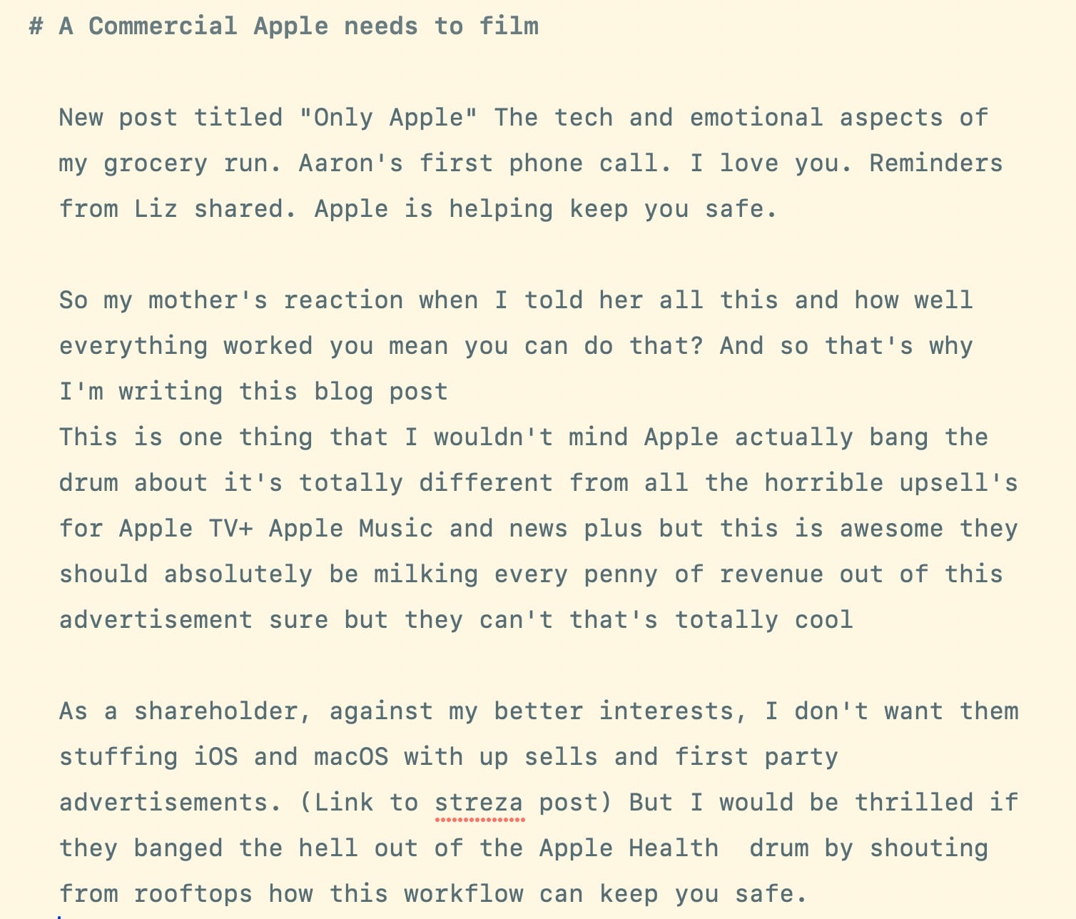
Here’s a screenshot of an early draft of that blog post and my raw notes last April. I titled it “A Commercial Apple Needs to Film.”
(Most of the screenshot below are my raw thoughts dictated into Drafts using Siri over CarPlay on the way back from the grocery store. Doing that alone could be its own commercial.)
I even had the ending of my post ready to go. It was going to be something like:
I never published that post because I wanted to get it right.
I was scared to get it wrong, and when things scare me, I procrastinate. I wanted it to capture how I felt as a father hearing my son say “I love you” while describing how amazing technology can be when done right – especially when a company like Apple owns the entire stack gets it right.
But now, as we approach twelve months since so much in our lives were upended, I wanted to get that post out there, partly because of the timing. But also as a sincere thank-you to the thousands of people behind-the-scenes who I’m sure work themselves to death to make an experience like mine possible. Because, let’s be honest, I bitch and moan a lot online about Apple – on Twitter and this blog.
Feel free to roll your eyes if say I complain “because I care,” – but it’s true. But it’s also because this is the industry I’ve spent my life involved in and know best. It’s my circle of friends and colleagues. It dictates my ability to earn a living. And technology is a driving force in all our lives now. And, for better or worse, Apple is one of the companies that decides how that part of our lives work.
I could rant and rave about US politics (which I do) to try and effect change, but my dumb blog and Twitter feed will never make a difference there. Instead, I throw money towards causes I support and trust the smart people running those organizations will spend it wisely. But when it comes to Apple, I’m shocked and grateful when I see people in this industry I look up to and admire share the things I write with their larger audiences, who I know include folks in Cupertino.
That’s why I complain. (Some stuff won’t fit into a Radar.)
And so, while I was planning on finishing my thank-you post to Apple this weekend, that’s not going to happen.
Instead, let’s talk about receipts.
I’ve been mostly disconnected from tech news this week for various reasons, but I was finally playing catch-up last night. And I was thrilled to see that Kosta’s war on App Store scams was finally starting to gain traction. I even quipped
It’s wild to see tech people finally clueing into how bad the App Store is run. It’s almost like the incentives have been misaligned for over a decade.
(That was towards the tech press and other influencers. Not Kosta).
But, whatever. I’ve been bitching about the insanity of the App Store and everything around it for years. Smart people like Michael Tsai, David Barnard, and Jeff Johnson have done much better jobs cataloging the App Store’s failings. So after posting my snarky tweet last night, I was ready to just go to bed, wake up, and work on writing something positive for a change.
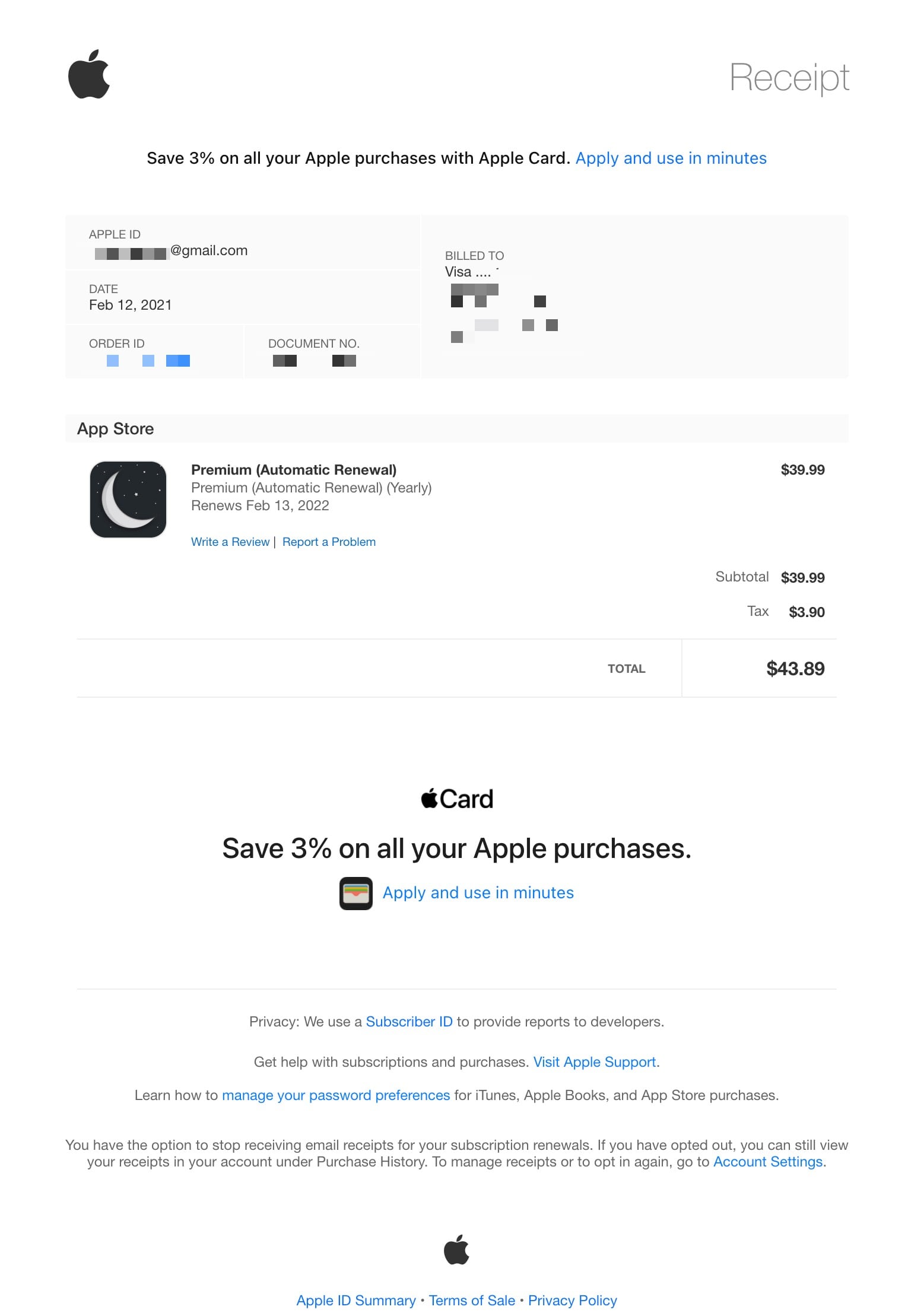
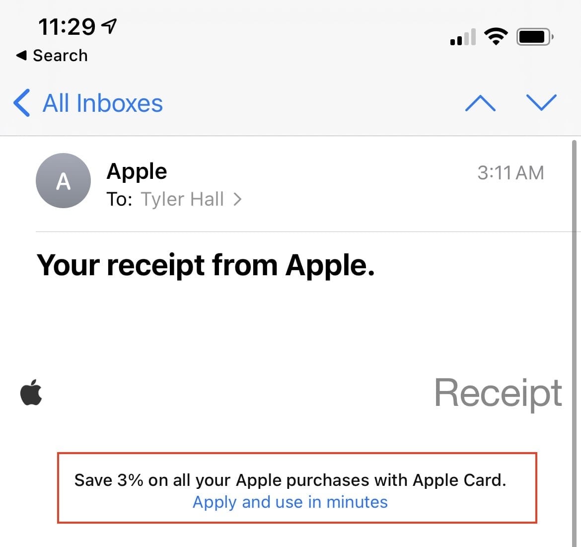
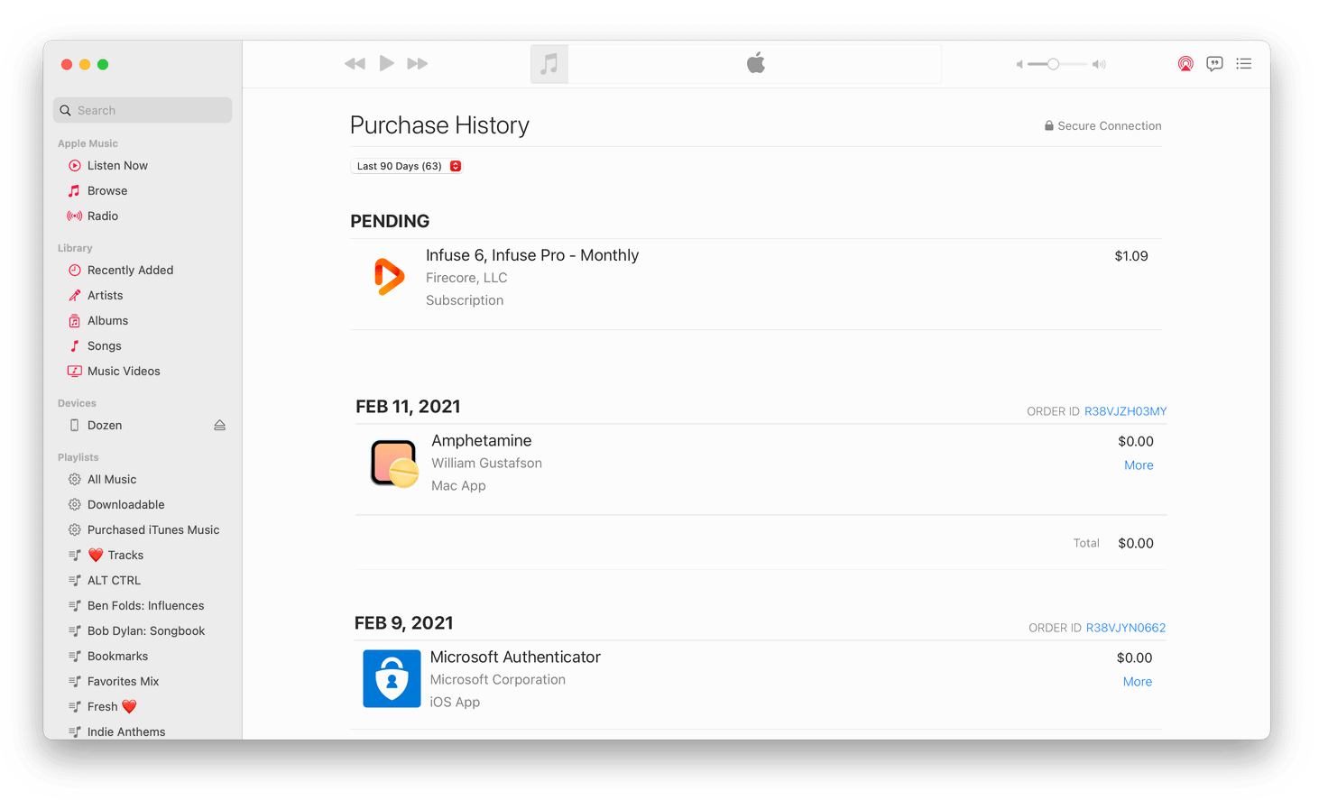
Then an unexpected charge hit my debit card.
Apple.com/Bill $43.89
I know that amount – it’s $39.99 plus tax. And while I spend money with Apple all the damn time, I wasn’t expecting to see a charge for that amount.
It’s always difficult to tell when Apple charges you for something and what it was for. Because unlike every other online retailer, they queue up email receipts for an indeterminate amount of time. When you buy something on Amazon (or almost anywhere else), there’s a receipt in your email immediately.
When you buy something from Apple – especially the App Store – you’ll get a receipt.
Sometime.
It may be a few hours later. A day later. Later that week?
From what I can tell, they group purchases into batches and then send a single combined receipt for those items. Maybe to save transaction fees on their end?
But to the unknown charge above, I had no idea. But I knew I would eventually see an email about it if I paid attention.
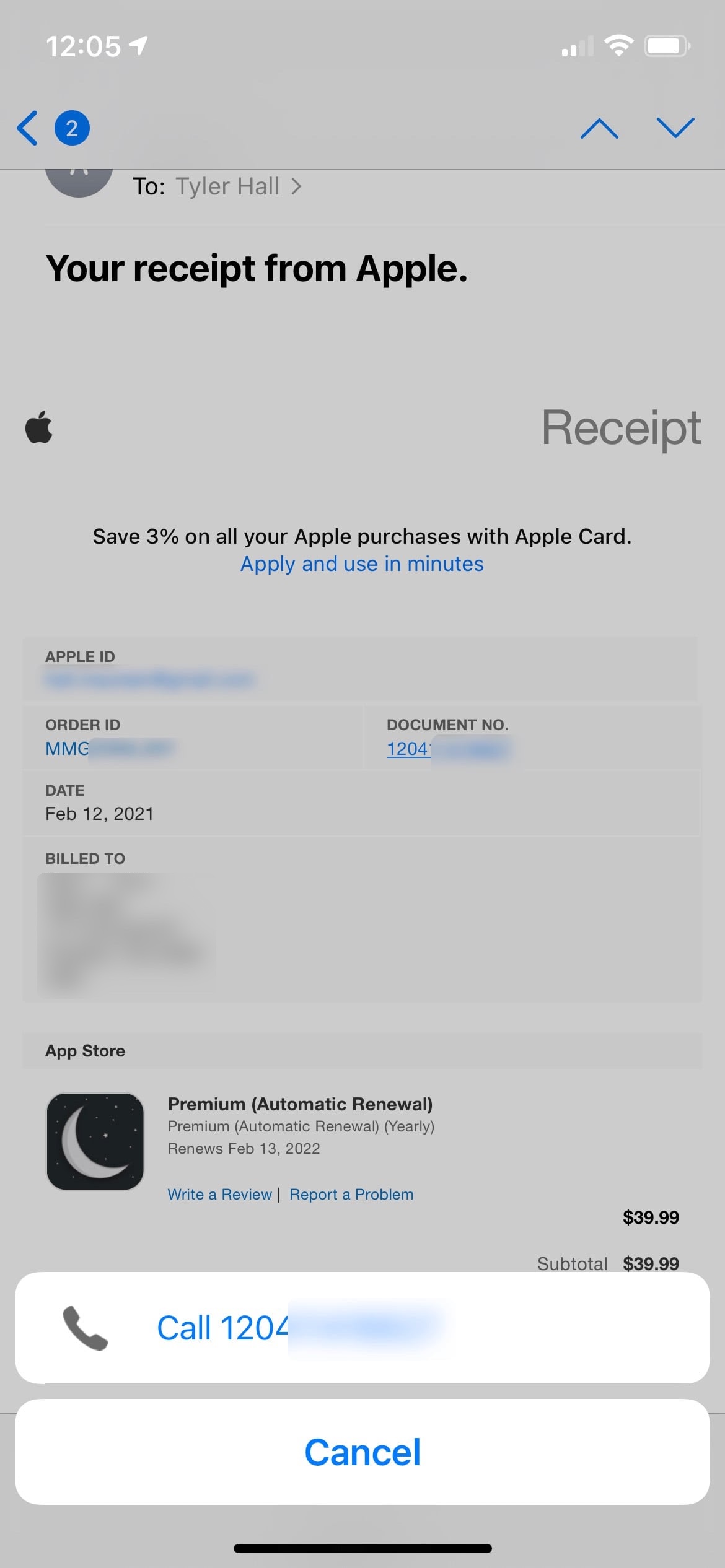
This morning:
Huh. I have no idea what that receipt is for.
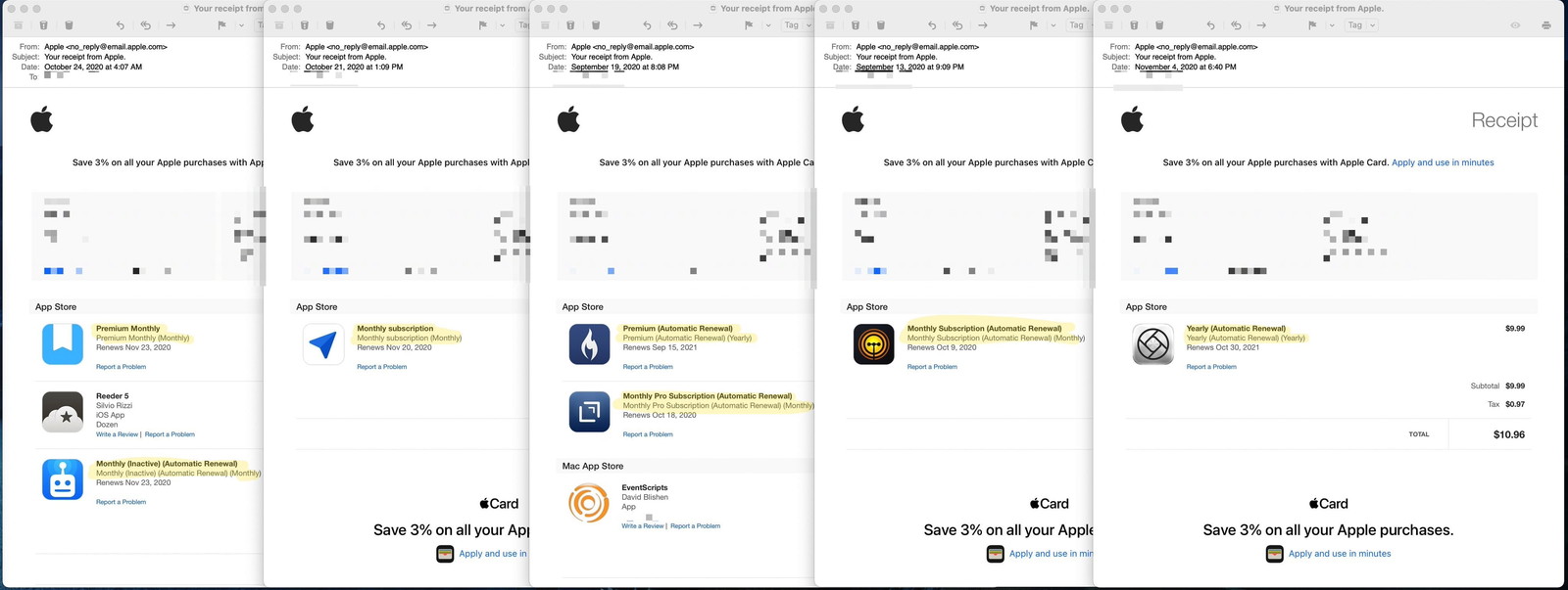
And that’s what baffles me the most about App Store receipts. On November 4, 2020 I tweeted
How can the App Store, after all this time, still not list the app’s name when a subscription renews? Every receipt I get is just a reminder that I purchased ten different apps all named “Yearly.” Does it help retention if we don’t know what we just paid for?
with this screenshot.
If you don’t know what each app icon is, can you tell what those automatic renewals are for? Here are the accompanying product names on the receipt:
Going back to my trip to the grocery store, imagine if I paid for $150 worth of groceries, and Publix gave me a receipt that read
Food (Food)
Beverage (Beverage)
Household Supplies (Household Supplies)
Frozen Stuff (Frozen Stuff)
And then, next to each item were the round-rect logos of Nabisco, Conagra, and Johnson & Johnson.
Helpful, right?
After you’ve handed over your money, that’s the experience Apple rewards its customers with at their “safe and trusted” storefront, which they describe as an “innovative destination focused on bringing you amazing experiences.”
App Store receipts are further complicated because of Family Sharing, which leads back to my mystery purchase.
I have no idea what that app icon is for. But I do know that since I’m the owner of our Apple family account, most purchases go to my debit card that the account shares. So it was probably someone else’s purchase.
Sure enough, the Apple ID in 12px font is for my 68-year-old mother. It was her purchase!
But I still have no idea what the app is. And I’m very suspicious because there’s basically zero chance she would ever willingly spend $39.99 on an app. Much less one that automatically renews.
Sidebar: Why do I share a family iCloud account with my mom? Because over a decade later, Apple is still full of miserly, penny-pinching tightwads that punitively cap the free storage tier at 5GB. Two years ago, Gruber wrote
5 GB seems ridiculous when the company is selling $999 iPhones with 64 GB of storage.
Think about it. Everyone should back up their phones. The best way to back up your iPhone — and the way Apple wants you to do it — is through iCloud. But 5 GB isn’t enough for most people, so they get these warning messages, which sound scary and which they don’t understand.
And he’s exactly right. Trying to convince my mother to pay $0.99 each month to back up the irreplaceable photos of her grandchildren on her phone is a non-starter. Not going to happen. This is exactly why I sure as hell know she didn’t mean to buy whatever that $39.99 app subscription was (that we’ll be getting back to in a minute). And it’s why I added her to our iCloud plan so her phone will get backed up even though I would very much prefer her account not be tied to my credit card.
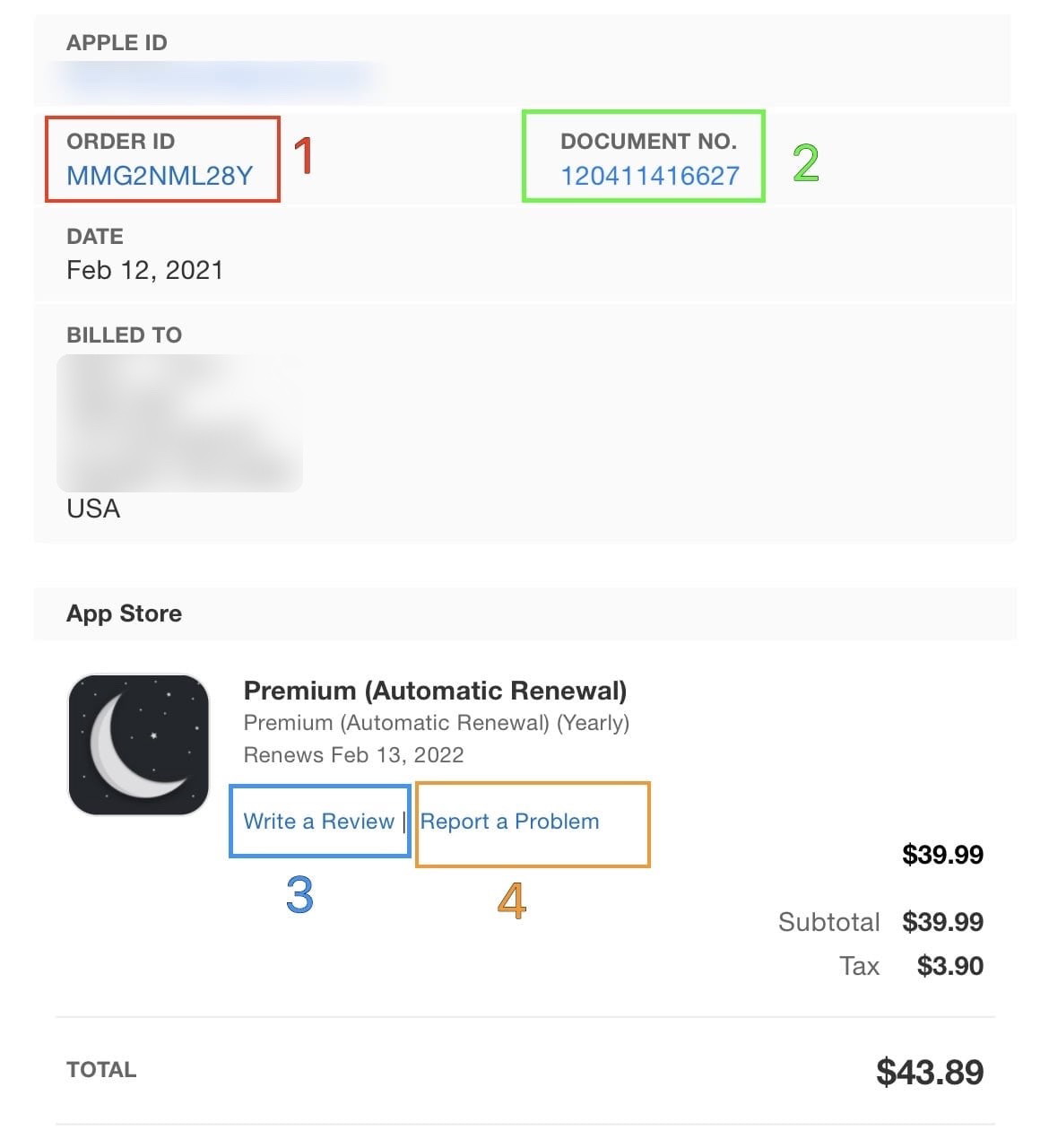
Let’s look closer at that app receipt. How can we figure out what the charge was for?
The first call to action is encouraging you to sign up for a credit card to pay for all of your unknown purchases.
Also, the last link in the email does the same thing.
But let’s focus on the middle part that isn’t trying to profit off of consumer debt.
I’ll annotate what each link does:
Let’s start by getting out of the way that tapping on the app icon or the item name(?) does nothing.
1. The Order ID link doesn’t open anything in Mail.app on iOS. Tapping does nothing. I can’t explain it. But if I click the link on my Mac, it takes me to an Apple FAQ that reads “See your purchase history for the App Store, iTunes Store, and more.”
Awesome! Here it is:
See a list of your purchases from the App Store, iTunes Store, Apple Books, and the Apple TV app.
Let’s approach this like my mother and click “Show Purchase History.”
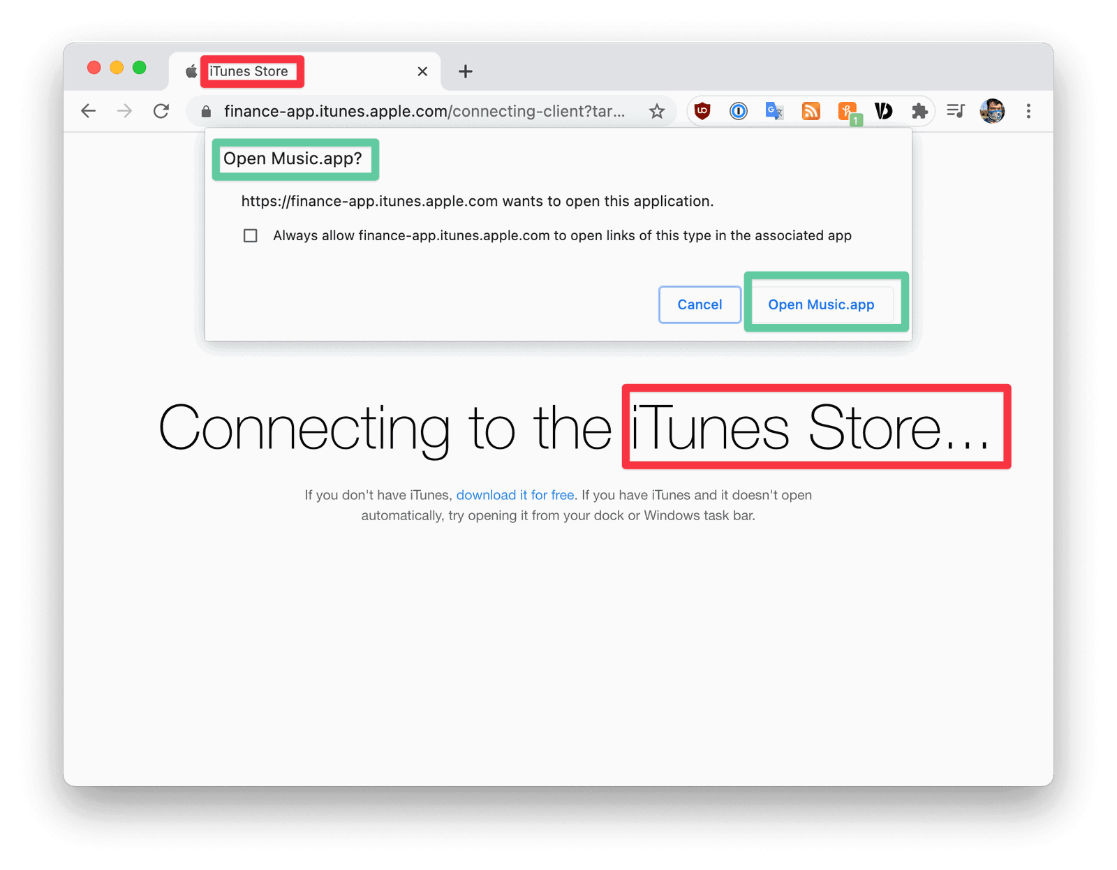
First off, I’m using Chrome (shame on me), and this is all very disorienting.
What does the “iTunes Store” have to do with the App Store? Why is my browser asking if I want to “Open Music.app?” to find out about an app purchase?
Sidebar: I tried this in Safari to see how the confusing permission prompt behaved with Apple’s first-party browser.
It never prompted me for any decision or opened another app. But that could very likely just be my Safari ad-blocker or something.
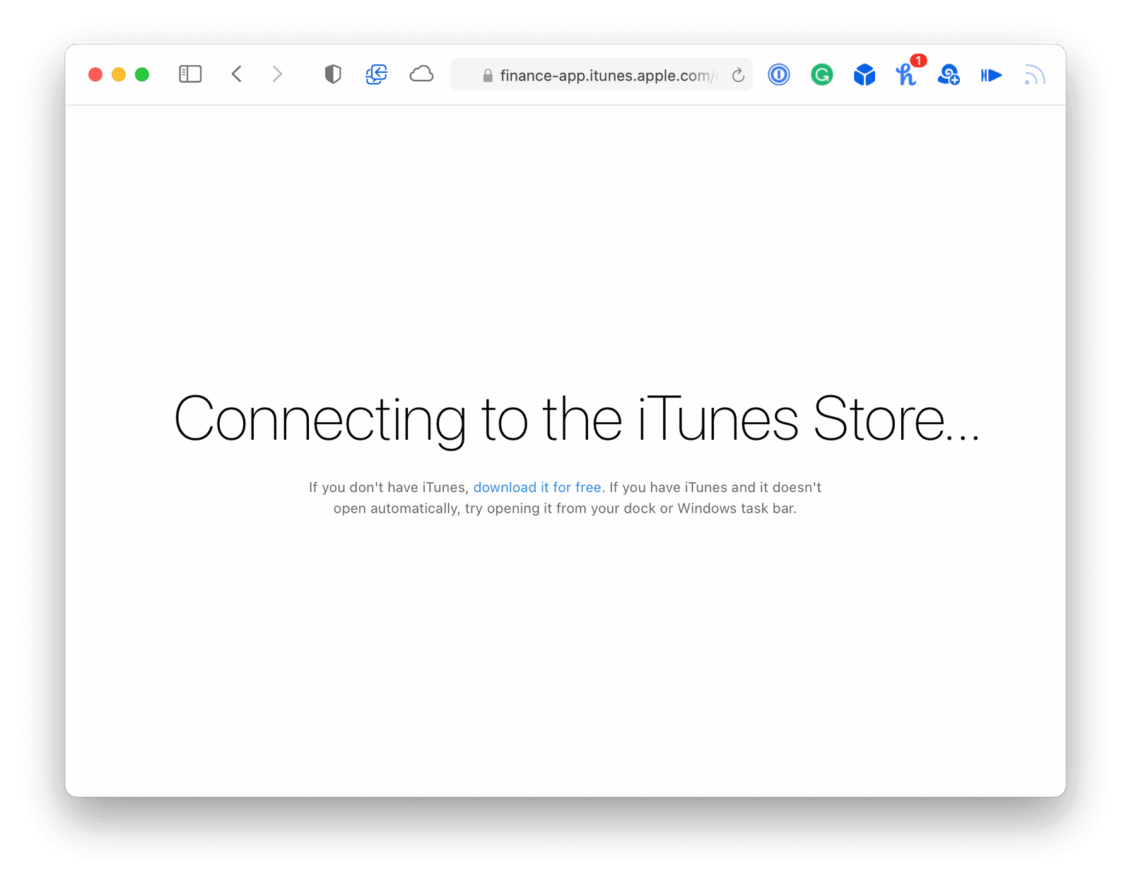
Let’s continue to Music.app for some reason.
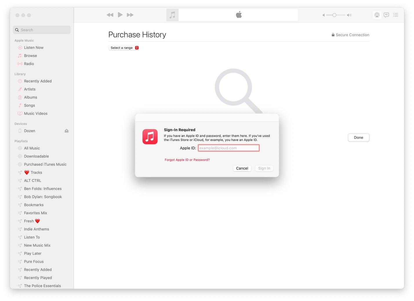
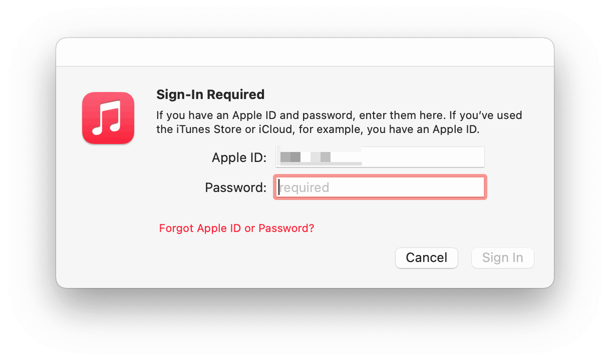
Ok. I know I’m already signed into Music.app because I was listening to Apple Music this morning. But Apple wants me to sign in to view a receipt. My Apple ID (which Apple obviously knows) is not pre-filled, which is a problem because let’s all acknowledge that no one over fifty knows what their Apple ID is.
(I will never understand the UX pattern of hiding the password field until you enter your username.)
At this point, can you imagine being an older adult and trying to figure out if you need to type in the password you use to sign in to your Mac, or your Apple ID, or the password for your email address?
After signing in, you do get to see your App Store purchase history inside Music.app.
But there’s no way to search for your purchases. And even if you could, what would you search for? Apple’s receipt didn’t give you any meaningful information. Your only option is to scroll the list and see if you recognize the receipt’s app icon.
In my case, that icon (and purchase) isn’t there because, as I said above, this purchase was made by a member of my family.
Back to the receipt.
2. Let’s tap the “DOCUMENT NO.” link. (Now, if you’re a developer like me, you know exactly what comes next and why.)
Mail.app thinks it’s a phone number. Pretending to be an aging parent, let’s assume that the phone number is for App Store customer support and call it. Sadly, it doesn’t work, and Verizon tells me that number cannot be completed as dialed. I guess the App Store is closed for the weekend?
3. Ok, this is clever. Maybe if we tap the third link to write a review for this unknown app, we can see the app!
Nope.
(I didn’t bother to investigate why a link to write an app review from an App Store receipt kicks you to Safari and then can’t open the App Store. Again, maybe an iOS adblocker?)
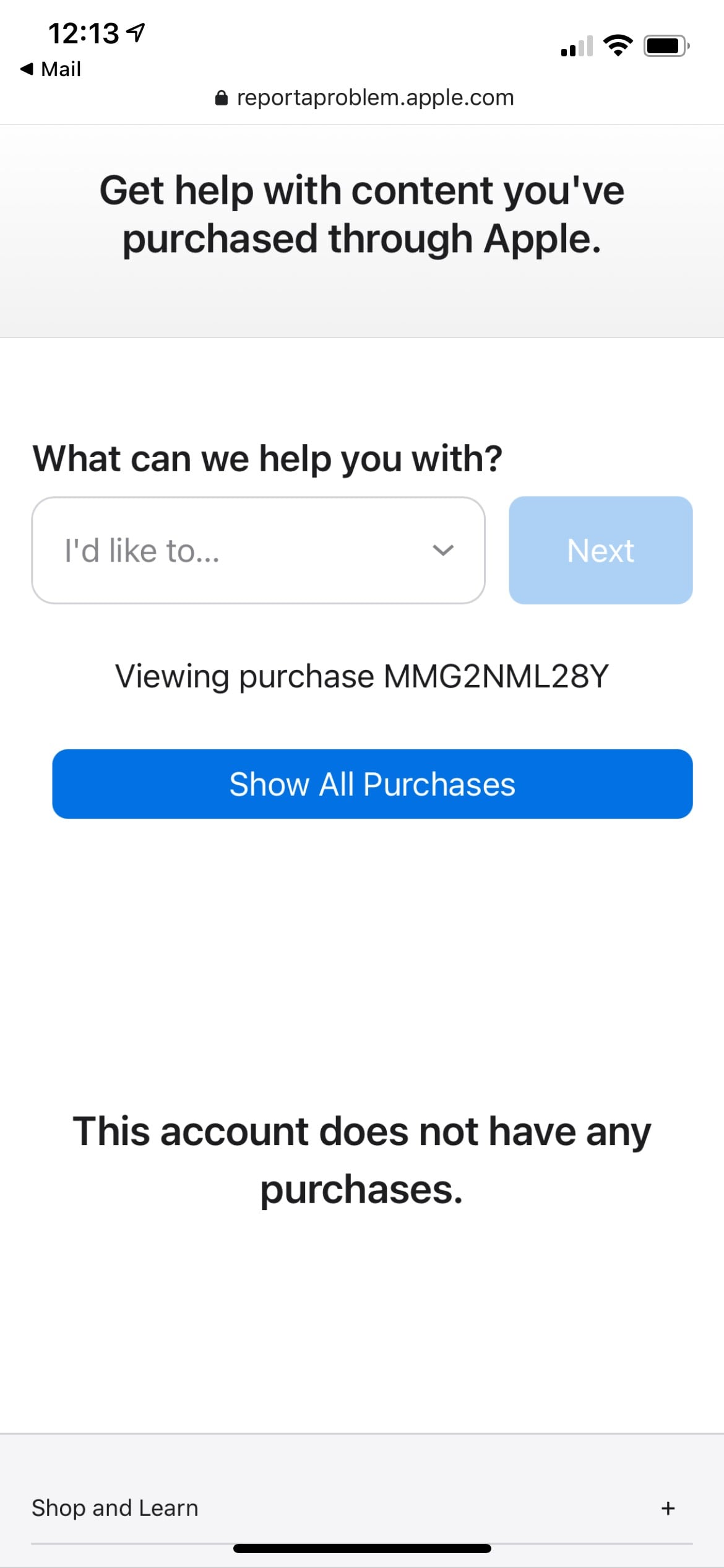
4. The “Report a Problem” link works! It takes me to Safari, prompts me to sign in with Face ID, and then…
tells me my “account does not have any purchases” ?♀️
Let’s go back to my Mac since nothing is clear on iOS.
In the email receipt on my desktop browser, clicking the “Write a Review” link opens Chrome and once again asks if I want to open Music.app. Sure.
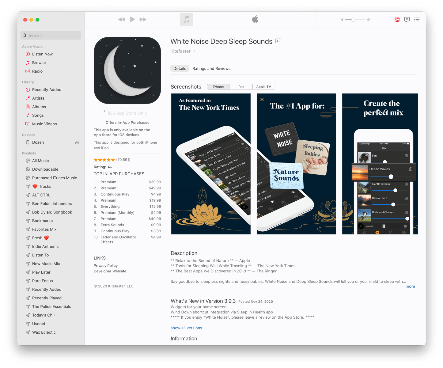
And there it is. Inside Music.app, right next to all my music playlists, the App Store page loads, and I can see my mom signed up for an automatically renewing $39.99 a year subscription for…
…a white noise app. Awesome.
I would really, really like to know more about this app. Because if it’s worth $40/year to my mom to listen to a perfect mix of nature sounds, I may be interested, too.
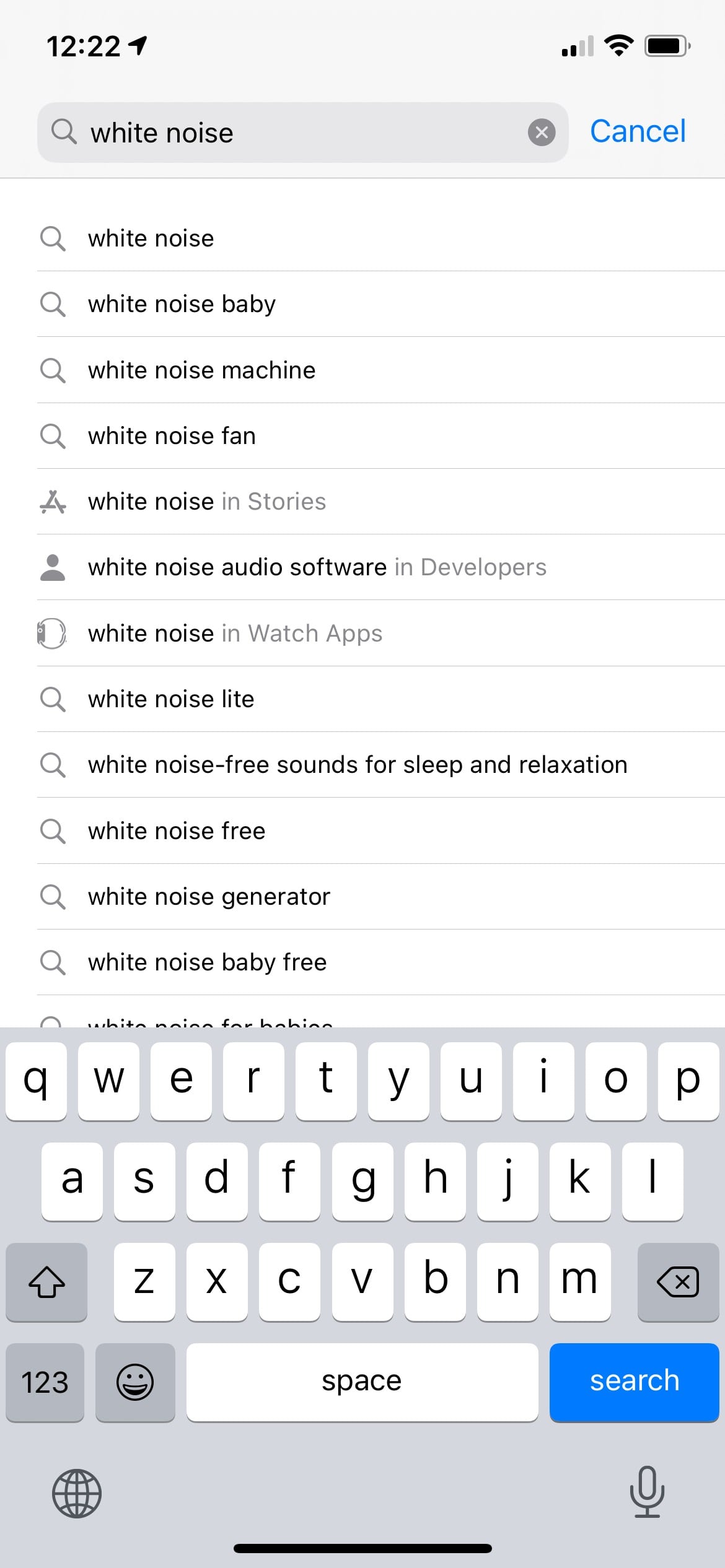
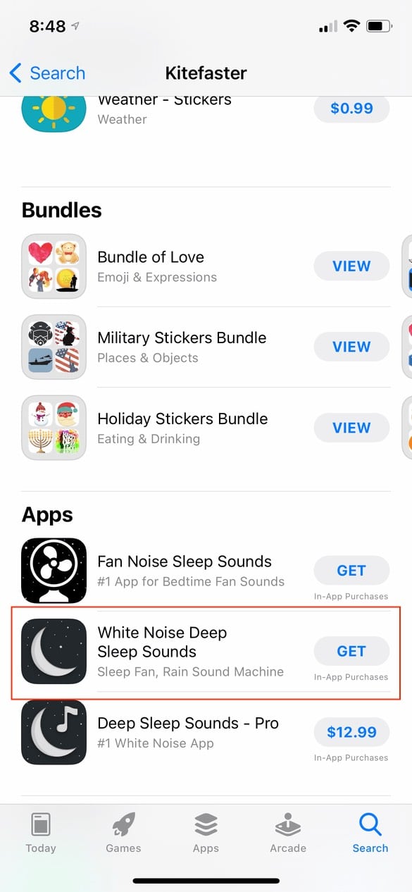
Unfortunately, because Music.app doesn’t (yet) support buying iOS apps (anymore). I’m not exactly sure how to find it on my phone. I guess I should search for “white noise” in the App Store.
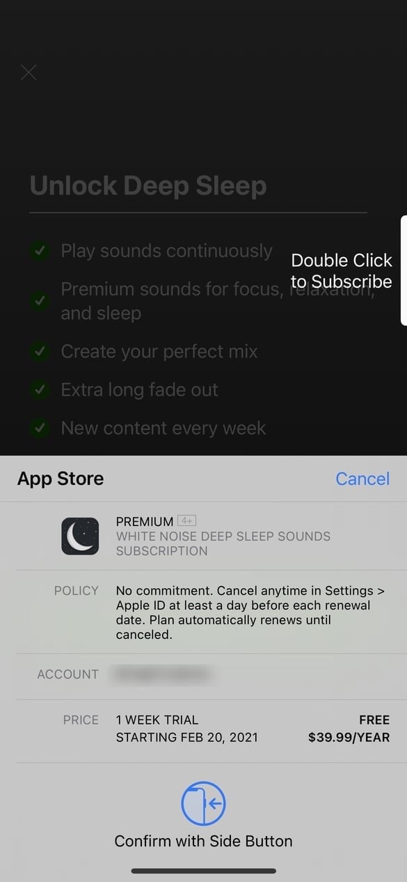
Ok, no. Anyone who has ever paid any attention to the App Store knows all too well the sheer bullshittery amount of scam apps pumped up with fake reviews I’m going to run into if I try and search for a high-value keyword like “white noise.” I’m not even going to go there. Let’s skip to the part where I find the app by searching for the developer’s name in the App Store and download it. What’s the worst that could happen? It is a free app, after all. (Ok, not “Free”. The app actually costs “GET”.)
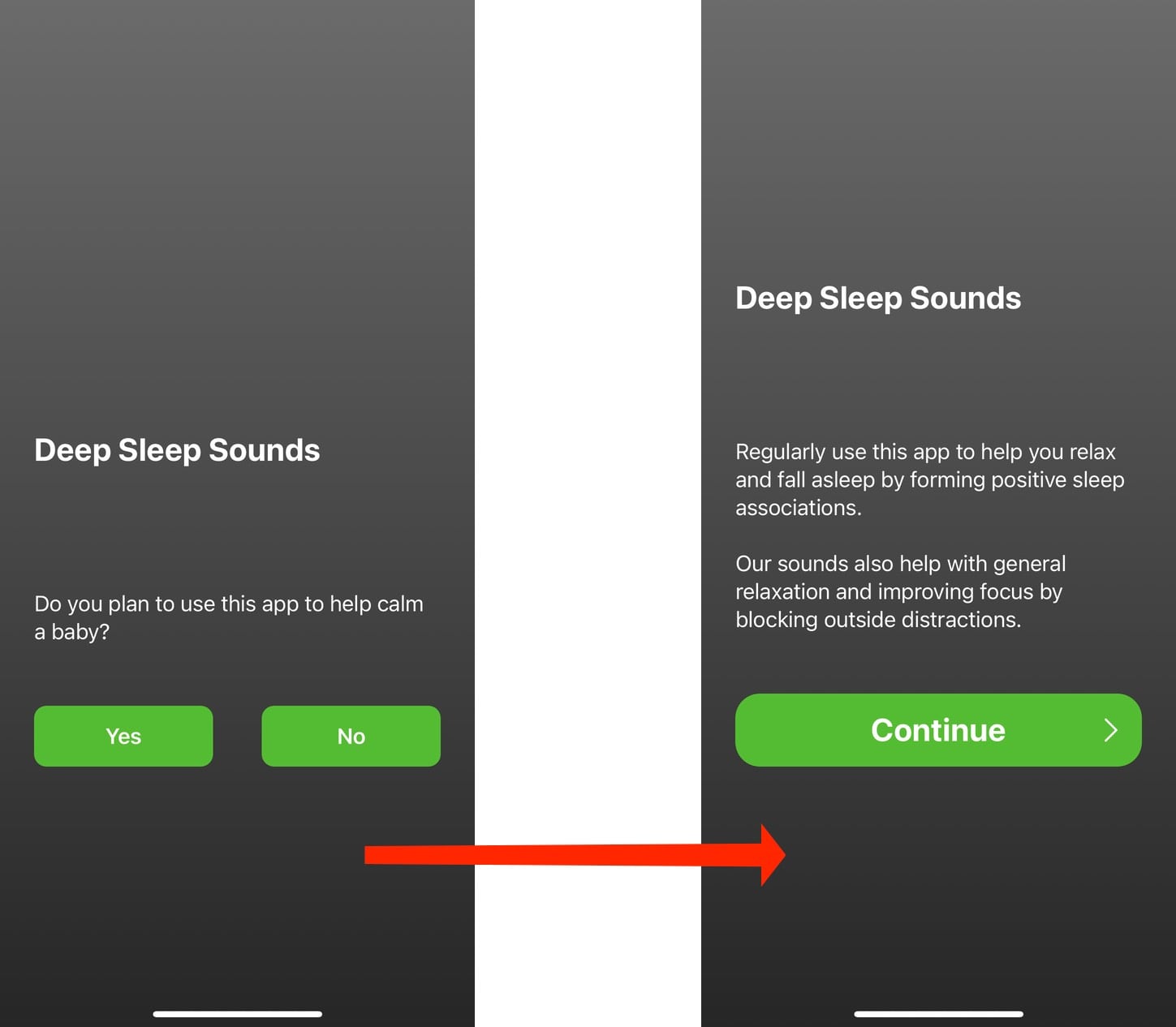
Here are the first two screens the user sees.
It may seem like innocuous onboarding steps, but I know for a fact – based on what comes next – that this developer is already using a dark pattern to trick customers into subscribing.
Those buttons are there to establish a behavior pattern for the user. It’s well established that customers don’t read words on screens. They just want to use the app and will tap whichever large, prominent buttons are in their way to get there. Tap, tap, tap. Done.
What do these screens lead to?
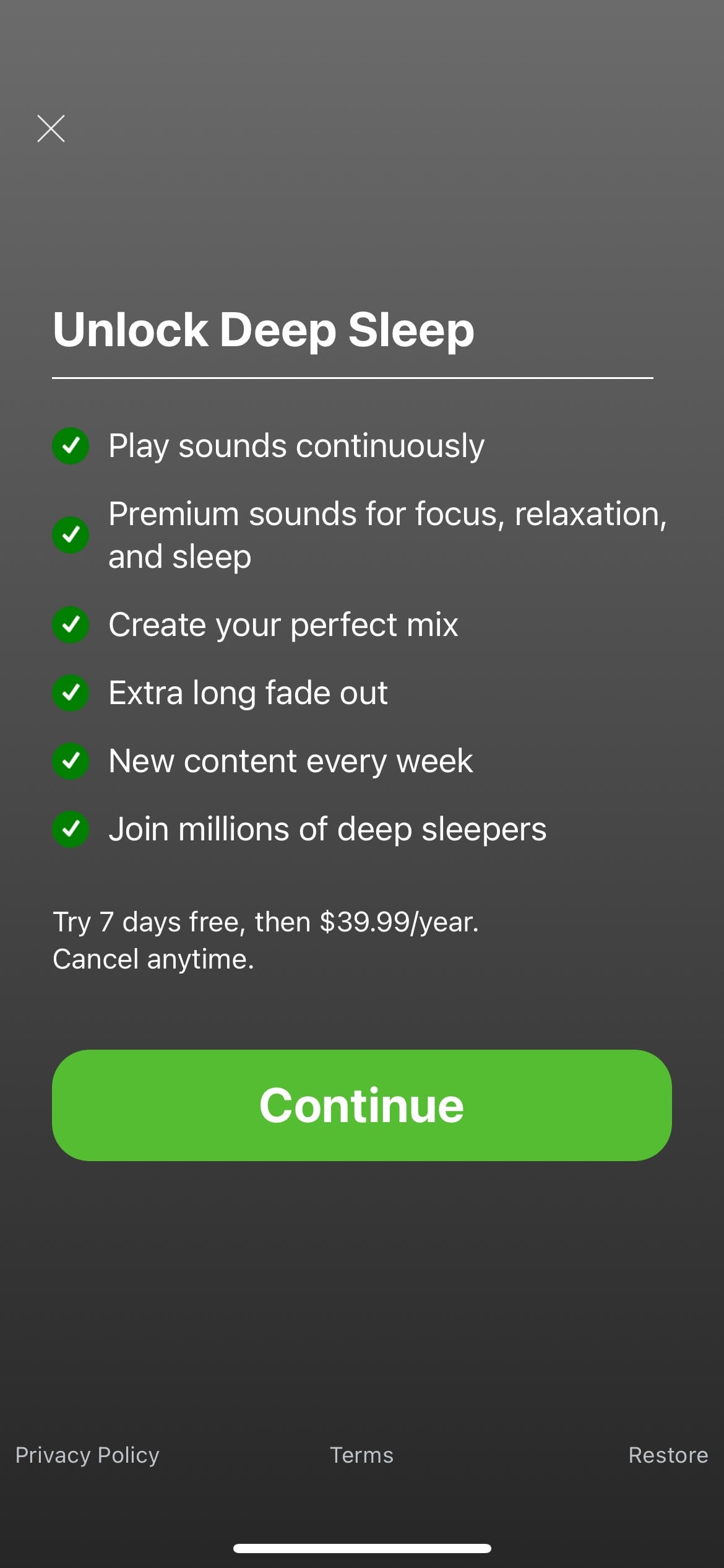
The app asks them to subscribe for $39.99.year (after a one-week free trial) without ever using the app. The only obvious way forward is the large “Continue” button, which brings up…
We can debate how usable this screen is. Is it optimized to inform (and warn) customers about what they agree to? Or is it designed for maximum conversions? Whatever the design intent is, it’s clearly a problem. Everyone under 40 has a story about a parent (or even themselves) accidentally making an App Store purchase they didn’t agree to.
(Remind me to tell you the story about the time my wife (who is 100% tech-savvy) accidentally paid $49 for a collection of PowerPoint templates in the Mac App Store that she thought was Microsoft Office because the app had “Microsoft Office” in the title and used the official Word/Excel/PowerPoint icons.)
We know it’s a problem. Apple clearly knows it’s a problem based on them finallyfixing the Touch ID purchase confirmation bug. And they have to know the true extent of the problem since they have purchase records, refund reports, and customer support data.
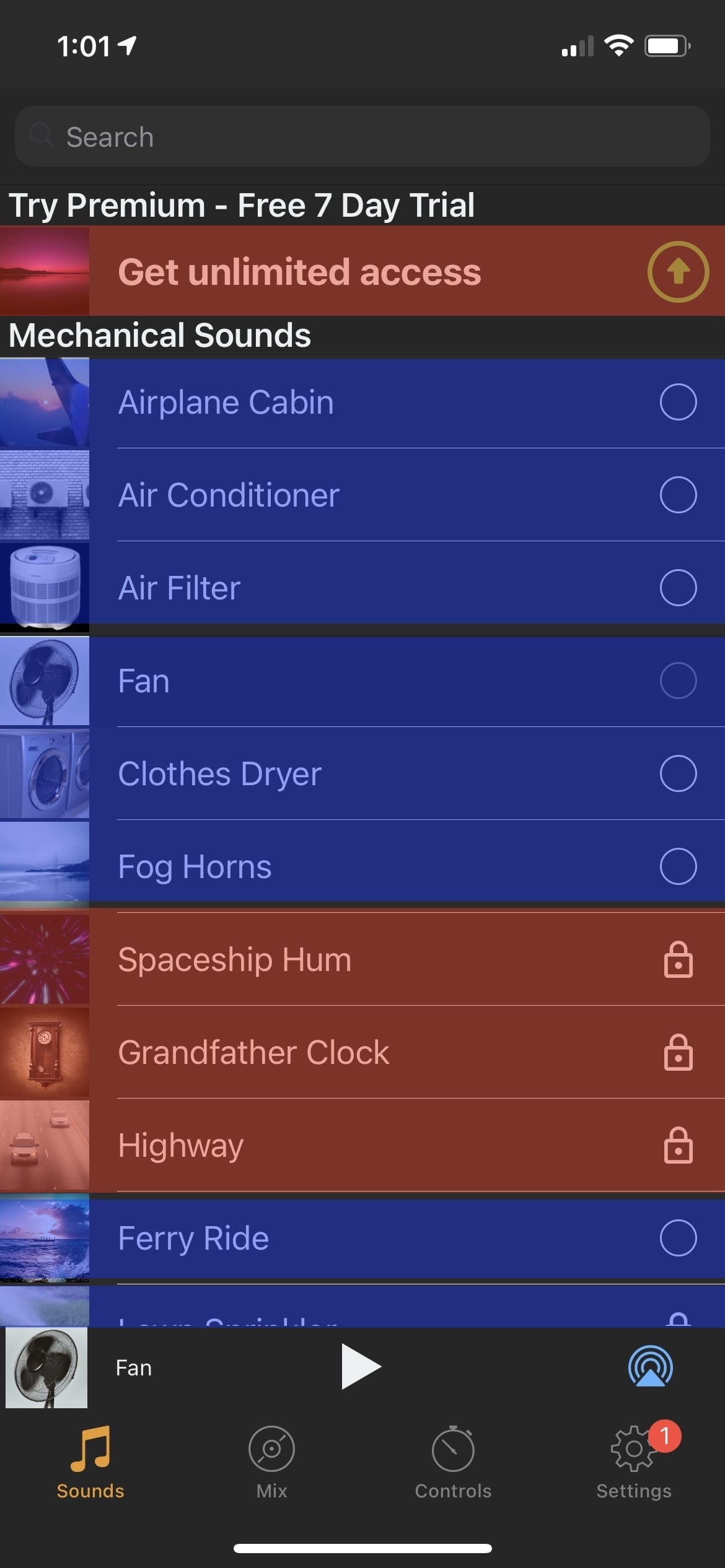
Can this app be used before you commit to $40 a year? Of course. Just tap somewhere in the area I outlined in red.
But once you get past that screen, here’s the actual app.
(Obviously, the red and blue boxes have been added by me.)
The red boxes are (I agree) clear prompts to subscribe to the app. The top row says as much. And the others have a padlock icon, which (I hope) means to most users that feature is locked behind a paywall.
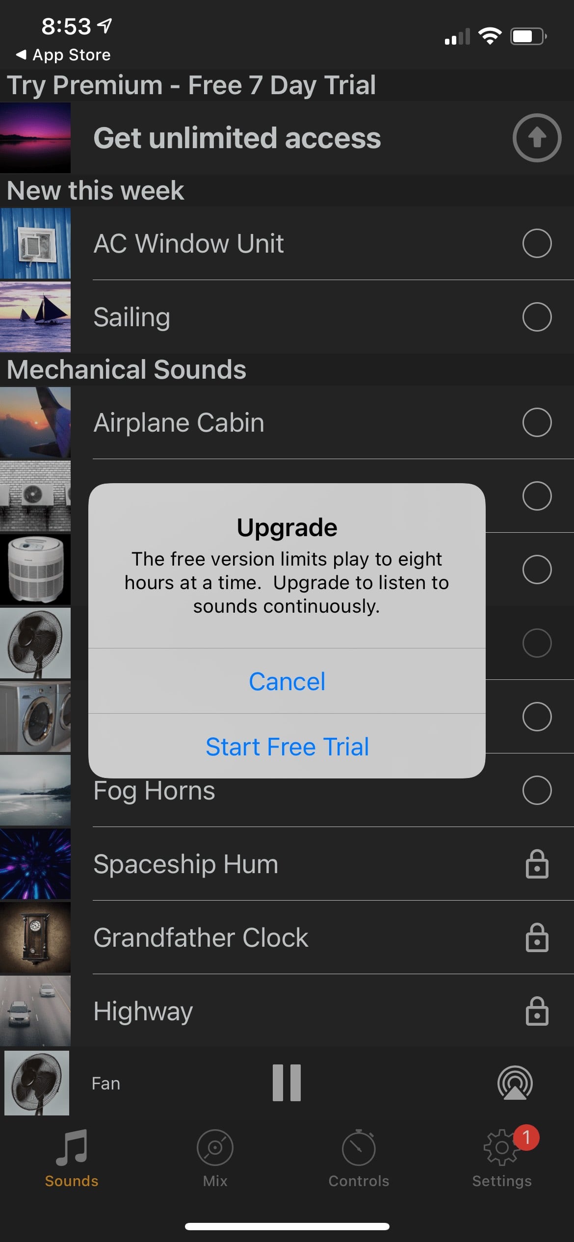
The blue boxes are the content you get for free. (This was a free app, after all.) But tap on one?
You’re prompted to start your free trial. This dialog is clearly written to trick users. Think about it.
You tap a sound to start playing. And your two choices are:
Start a Free Trial
Cancel
What “Cancel” actually means is “Listen anyway with the eight-hour time restriction.” But to a user, it reads more like, “If I tap that, it will cancel playing the white noise I want to hear. I guess I have to start a free trial.”
I don’t know for sure at what point my mother was tricked into paying $40. Was it the green onboarding buttons? Or the upgrade prompts that gate playing the free sounds? She doesn’t know either. When I called to ask her about it, she felt tricked.
And embarrassed.
And ashamed.
I mean, yes. It’s all right there. The subscription terms are clearly shown in 12px font on a confirmation screen with an animation inviting you to double-click the side button to purchase. And all of these apps are thoroughly vetted by App Review so customers can trust them. Just don’t think about the countless dark patterns based on years of research designed to trick users. And it’s all within an App Store that Apple markets with language like
a place you can trust
a safe and trusted place to discover and download apps
an innovative destination focused on bringing you amazing experiences
the apps we offer are held to the highest standards for privacy, security, and content
we offer nearly two million apps — and we want you to feel good about using every single one of them
Every week, over 500 dedicated experts around the world review over 100K apps
No surprise purchases
moderators review worldwide App Store charts for quality and accuracy
Download with confidence
Purchase safely and securely
I don’t know what the solution is. I guess Apple could hire even more reviewers? Or pay for better reviewers who understand the intricacies of software? But, App Review is already a kafkaesque gauntlet designed to punish small developers who play by the rules and look the other way at large corporations who flaunt them and scam apps that bring in the bulk of in-app purchases.
I don’t know if human curation can ever be a solution to this problem. Not at Apple’s scale.
My issue with this is that if Apple is not going to put in the effort to prevent the countless, systemic abuse running rampant on their storefronts, they need to stop marketing the App Store as something it’s not and using in-app purchases as a revenue stream.
Because, right now, the assumption of every developer I’ve spoken to – and friends and family members who have been scammed – is that Apple pays lip service to consumer safety on the App Store so they can reap the enormous financial rewards.
I don’t know how else to explain it because it’s been shown repeatedly that when Apple decides to focus on a problem, when they divert money and time and attention to fixing something, they usually succeed.
From purchase receipts that provide no actionable information to help you understand where your money is being spent, to a store filled with fake reviews and easily manipulated rankings and top charts promoting scam apps, follow where the money leads if you want to know why it’s still this way 13 years later.
If you’ll excuse me, I now need to help my mom remember her Apple ID password and use FaceTime to show her how to cancel a subscription.
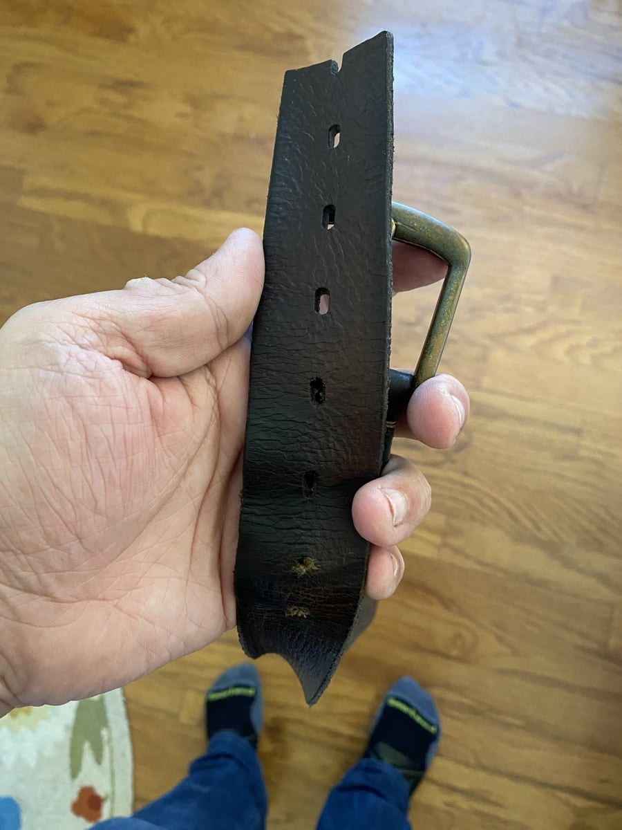
We officially went into quarantine on March 22. One hot afternoon in June, I found myself in the garage with a pair of shears, a screwdriver, and a hammer so I could cut an inch of leather off my belt and punch a new hole.
All in all, I had lost twenty pounds by doing nothing. At least not intentionally. It was merely due to skipping meals (no more lunch out at work every day), the food I did eat was almost always cooked at home, and I had cut out my twice-daily can of soda from the office fridge. (Not to mention a heaping daily dose of existential dread, anxiety, and fear.)
Small changes, but over three months, they added up. Fast-forward to October 1, when I tweeted this
Since the start of COVID, I’ve punched three holes in this belt and cut off an inch of leather two times. Today, it finally went in the trash, and I bought a smaller size. Not everything in 2020 has turned out awful.
I lost weight and was certainly medically healthier. But did I feel better? Not at all. By May, I was hurting. The next month I was in pain. That summer was nothing but agony from muscle and skeletal pain.
I knew what the problem was. I’ve sat in front of a computer some portion of almost every day of my life for the past thirty years. And I’ve always had terrible posture. Add that on top of Tourette’s syndrome, and I’m amazed I’ve even gotten this far in life without my body completely revolting at one more hour hunched over a keyboard.
(I’ve talked about this a little, but I was formally diagnosed with Tourette’s twelve years ago. It’s a motor tic disorder, which means I twitch all the time. And when I try to control and repress my tics or when I’m physically unable to let them happen, my body becomes incredibly sore from trying to twitch.)
And so, bingo. My excruciating back and neck pain. Not being able to sit on a couch without feeling like there was a lump in my throat (yes, I got that checked out) and a hot poker in the base of my neck. Or the tingling sensation from the heel of my foot up the side of my left leg as I made the short walk from my home office to the garage fridge for a Coke Zero.
Those were all the many ways my body decided to tell me, “Yo, none of this is healthy, and you’re gonna be real fucked up soon if you don’t find a better way of working (less).”
So, I listened. And five months later, I feel so many light-years better than I did that when I think back to mid-2020 that I can only gasp and wonder how I got any work done at all.
This post is all the fun, nerdy details that went into making my home and work offices more comfortable. It was a bit of self-preservation mixed with stress-shopping. But if you want the TL;DR, I can sum it up with two words:
Stop. Sitting.
There’s more nuance to that, but I’ll get there. First, I’m going to be upfront and say that (where possible) the product links below are affiliate URLs. However, next to each link, I also include a non-affiliate URL. Everything I list is what I purchased and (most importantly) ended up sticking with and whole-heartedly recommend. If you find the links useful and want to throw a few Amazon bucks my way, you’re awesome. If not, then I hope you find these links helpful regardless.
OK.
I’ve had a love affair with office chairs for years. I wrote about my favorite one back in 2014 that I liked so much I bought two. But even with my back wrapped in the warm, Silicon Valley-esque embrace of a Herman Miller chair, my body was having no more of it.
It was sturdy, sat mostly OK, and the back support was adequate. My only real complaint was I found the armrests too high even in their lowest position.
I bought that chair in June, but it was clear my back and neck problems weren’t going away by August. (Yes, I’m doing more throughout this whole period than just switching out chairs. Taking more breaks, daily walks, etc.)
I didn’t see any way forward other than just not sitting eight or more hours a day. I last used a standing desk briefly at a job in 2013. But it didn’t last. It was a fixed height (and incorrect for me), and I stood on hard commercial carpeting on top of cement. I wasn’t optimistic I’d be able to go full-time standing, but I wanted to try.
I was lucky enough to get a motorized desk at work; I did more online research and found this highly recommended standing mat (non-affiliate link) from Ergodriven. Instead of being flat, this one has “terrain,” as they call it – raised edges and a center “dome” that encourage you to keep your legs and feet moving more than you would if standing on a flat surface.
It’s quite wonderful. Comfortable in sock feet, sturdy when I wear shoes, and I’ve developed a habit of naturally angling my feet on the raised portion to stretch my legs as I work. I also bought a second one for my standing desk at home (more on that in a bit).
Speaking of standing desks, I think I was always hesitant to move to one because I’ve heard for years that the inexpensive ones are crap, and only the premium (trendy?) ones are worth the money.
So after standing full time for two months at work, I declared my standing desk experiment a success. My wife (amazingly) was all for me getting one at home, too. I liked the one I had in my office but assumed it was in the $700+ range. I asked my boss and was delighted to find out, nope. $280 ? (non-affiliate link).
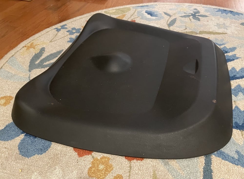
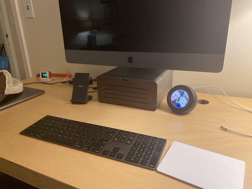
You’ll notice in that photo of my office desk my monitor is raised to a comfortable eye-level using a very classy MoonPie collectible tin. I wanted something just as nice for my iMac at home. I couldn’t find a Little Debbie collectible tin, so I settled on a HiRise stand (non-affiliate link) from the lovely folks at Twelve South.
It matches the iMac’s finish, and the front panel flips down to reveal storage. Also, the thing weighs a million pounds. Any computer or monitor you sit on top is not going anywhere – believe me.
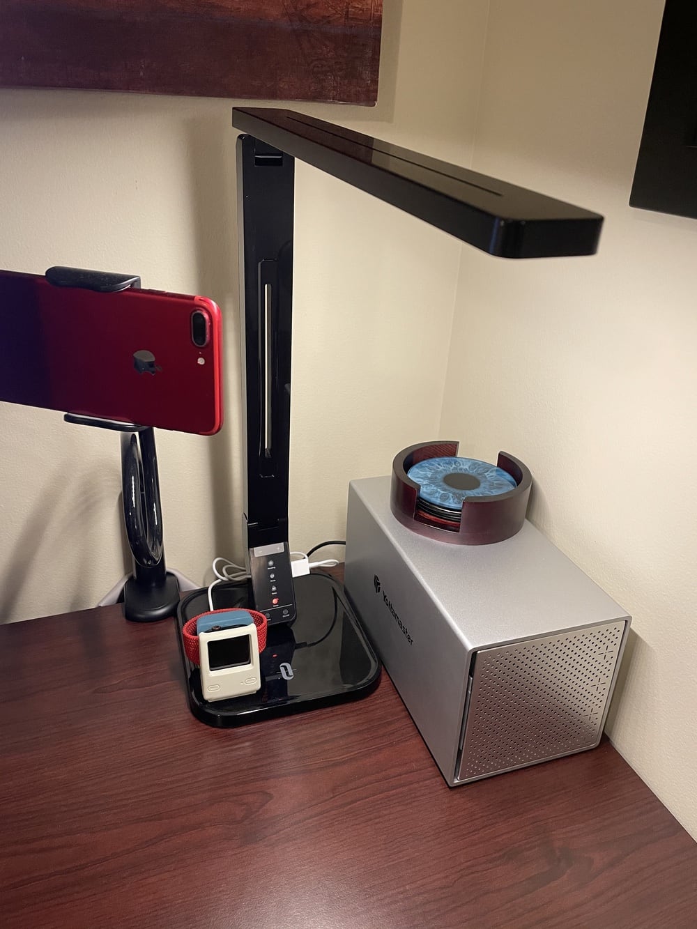
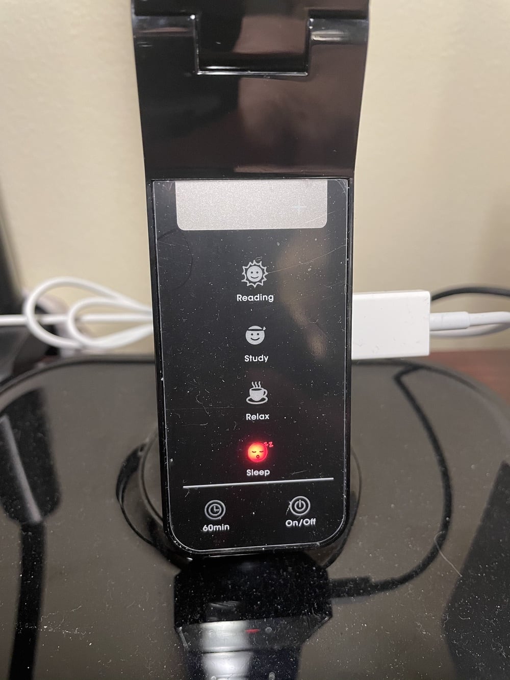
Next up, I work all hours of the day and night. I did have an old table lamp on the corner of my desk (overhead lighting is the devil), but it had a huge base and lampshade, which took up more desk space than I’d like. I wanted something smaller and ideally with an adjustable temperature bulb. (I’d prefer not to reach for an app just to control a “smart” bulb.)
It’s skinny and has three points of adjustment, so I can freely reposition it as needed. And if you look closely here
You can tap to switch the LED between four color temperatures – cool to warm. And it’s hard to see in that photo, but the white/gray rectangle in the middle has + and – buttons to adjust the brightness.
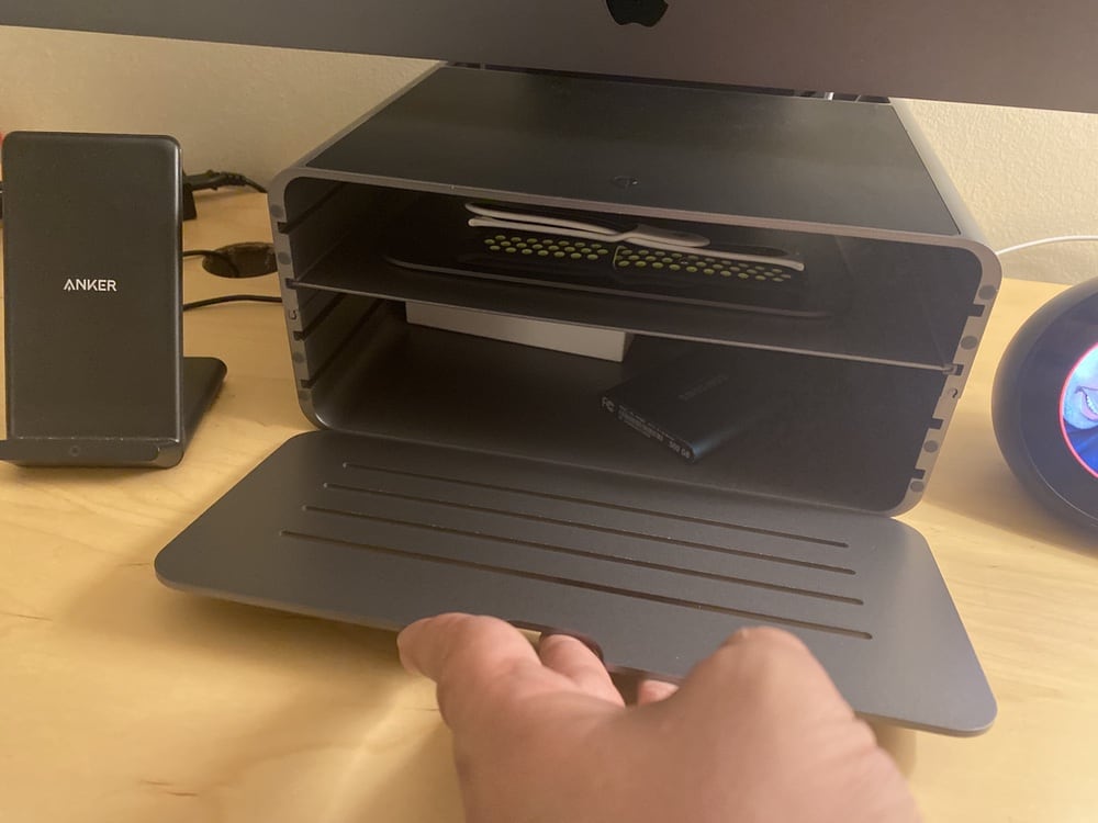
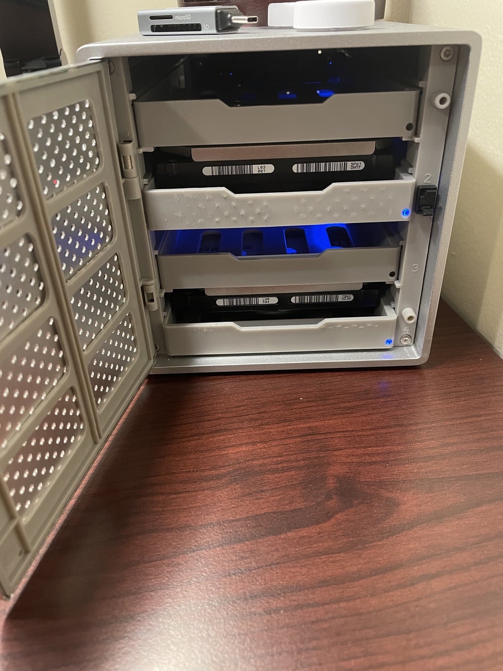
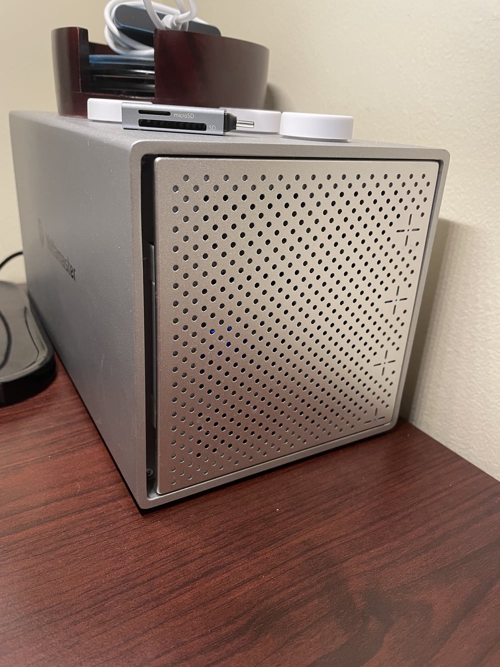
You may be wondering about that large, silver box in the first lamp photo. That is an amazing device from Yottamaster that I should have bought years ago.
For the first time in my adult life I am at peace with the cable organization behind my desk. Ending 2020 on a high note.
My iMac serves as the media and storage hub for my family. All of our movies and TV shows, music, photos, everything – stored on (currently) an 8TB and 12TB external drive.
I’ve never wanted to go all-in on a real NAS for various reasons. I’ve rolled my own over the network with a Raspberry Pi and openmediavault, which worked surprisingly well. But nothing beats the performance of having drives connected directly and the insanely affordable Backblaze pricing for tethered drives (non-affiliate link).
But it always drove me crazy giving up USB ports for multiple drives. And especially the awfulness of giant power bricks and their cables. I have no idea why I never thought to look for something like this before, but that silver box is perfect for my needs (non-affiliate link).
It’s just a hard drive enclosure with four bays. But it’s not RAID or anything fancy like that. It’s a single power cable and a single USB cable. But each drive mounts individually on my Mac as if they were all plugged in separately. I don’t want the overhead of dealing with a RAID array. I’m perfectly content spanning my data across multiple drives myself, so this is a terrific and inexpensive solution.
All right, we’re near to the end. One more thing for my desk. One more thing for my feet.
After standing full-time at work beginning in August and then doing the same at home in October, my legs hurt. Don’t get me wrong. It wasn’t the scary tingling sensation I had before or a painfully sore neck; this was just regular muscle soreness from being out of shape. I knew that my legs would adjust and get stronger with time, and they did.
But what I didn’t expect was around the time my legs stopped aching, the soles of my feet and especially my heel really began to hurt. At this point, I’m sure I was standing (and walking / moving) ten or more hours a day, thanks to an out of whack work/life balance. My back and neck had recovered by no longer sitting with poor posture all day, but now my feet were screaming. Fiery pins and needles type pain.
I could tell the standing mat helped, and so did taking breaks on the couch for conference calls. Ultimately, all the advice I read online agreed with an email response from my doctor, who I’m sure thinks I’m an idiot for not thinking of the fix myself.
Change your shoes, dummy.
At home, I was standing in my sock feet all day. And at work, I was in sneakers the whole time. Neither option was very supportive – and even if they were, standing the same way all day every day isn’t going to feel good.
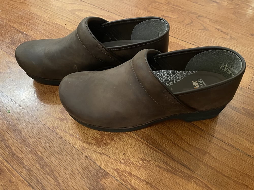
Again, I researched online and talked to two friends who are nurses (walking in hospitals for 12+ hour shifts). I went with their recommendation and bought a pair of Dansko clogs (non-affiliate link). They’re not particularly good looking (a co-worker laughed), but they’re hella supportive when standing.
My new routine is to switch between the clogs and sock feet every few hours throughout the day. Since making that adjustment in December, my feet are no longer in pain.
Finally, rounding out my home office, the only thing I don’t like about my desk is the desktop is so smooth it’s borderline slippery. It just doesn’t feel comfortable under my writs, and my keyboard will occasionally slide out of place.
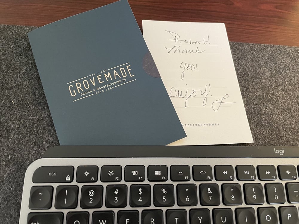
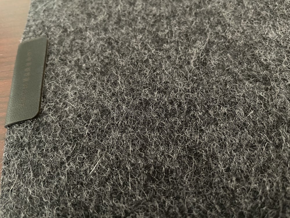
I totally get this is a huge Princess and the Pea situation, but so be it. I wanted something that looked and felt nice and found this desk pad from Grovemade. Made of wool, feels great, nothing slides around anymore, and they even included a handwritten thank-you note with the order. So, three cheers for well-made products from friendly companies.
That’s it. That’s my 2020 journey from sedentary pain, losing a little extra weight, upending my posture, and then falling down a rabbit hole of fussy home-office accessories. Like I said earlier, it was a bit of getting healthier along with some retail therapy to get through a genuinely shitty year for our world.
When an alert notification arrives in Big Sur (not a banner that slides away after a few seconds), it will remain on screen until you make a decision about it.
When those apps have something to tell me, I generally don’t want to miss it. So I appreciate that they remain on screen until I dismiss them or open the corresponding app.
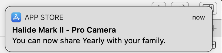
An example of unhelpful alerts that you didn’t opt-in to and can’t opt-out of are hot marketing garbage like this.
(That’s not Halide’s fault. Buy Halide. It’s excellent.)
But I digress. Helpful or spam-like, the UX problem is dismissing them.
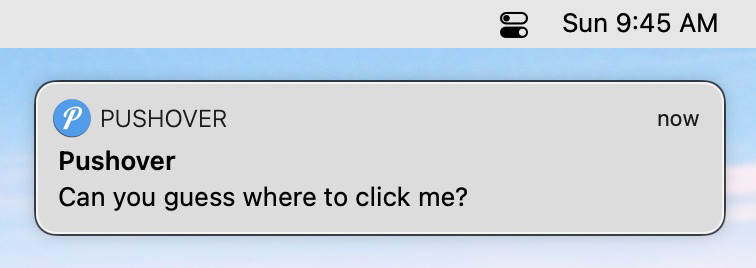
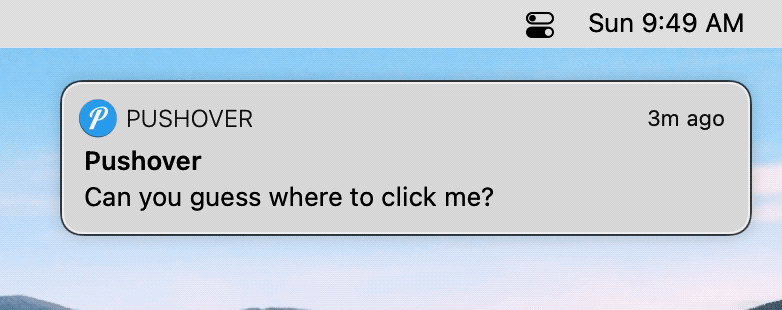
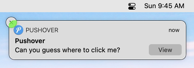
Here’s a fictitious notification:
Like the notification says, can you guess where you should click to dismiss it? The keyword being dismiss. Because, in almost all instances of an alert appearing, I want to know about it, but way less frequently do I want to open the entire app behind it.
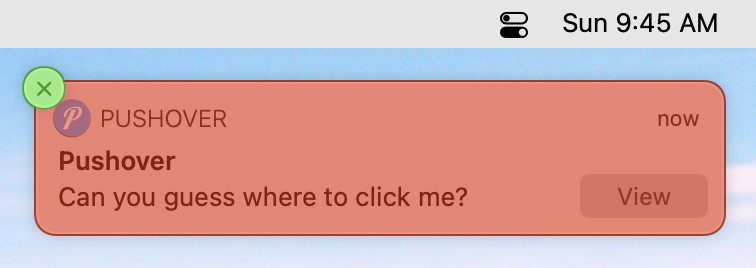
If the clickable areas are not clear from that gif, here’s a better view.
Clicking the green (X) will dismiss the notification. Clicking anywhere else in the red will launch another application on top of whatever you’re currently doing. (Remember the pain of accidentally launching an Adobe app in the late 90s or 2000s? Same vibe.)
For those of you keeping score at home, that’s a 22pt x 22pt target out of the banner’s total 346pt x 78pt. Or 1.8% of the total size.
Fitts’s law doesn’t even help since the (X) is just hanging out there in the ether – unlike the menu.
Worse, though, Big Sur hides the (X) until you mouse over the literal bounds of the banner – not even the area where the hidden (X) will appear is initially valid.
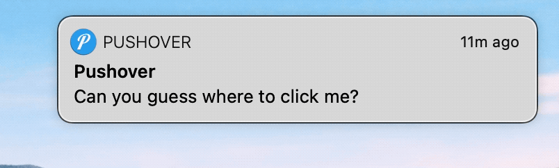
If you move your mouse towards the notification intending to dismiss it, the clickable area (without backtracking your mouse) is this even smaller green part.
A whopping 16pt x 15pt that aren’t even visible at first to help you aim.
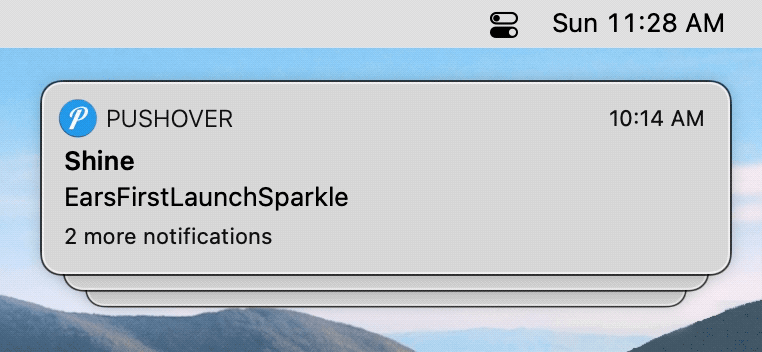
Compounding the problem, when you wake your Mac from sleep, you’ll often have a stack of multiple notifications to dismiss. Some of them requiring multiple clicks to get through the (X) and a second (Clear All).
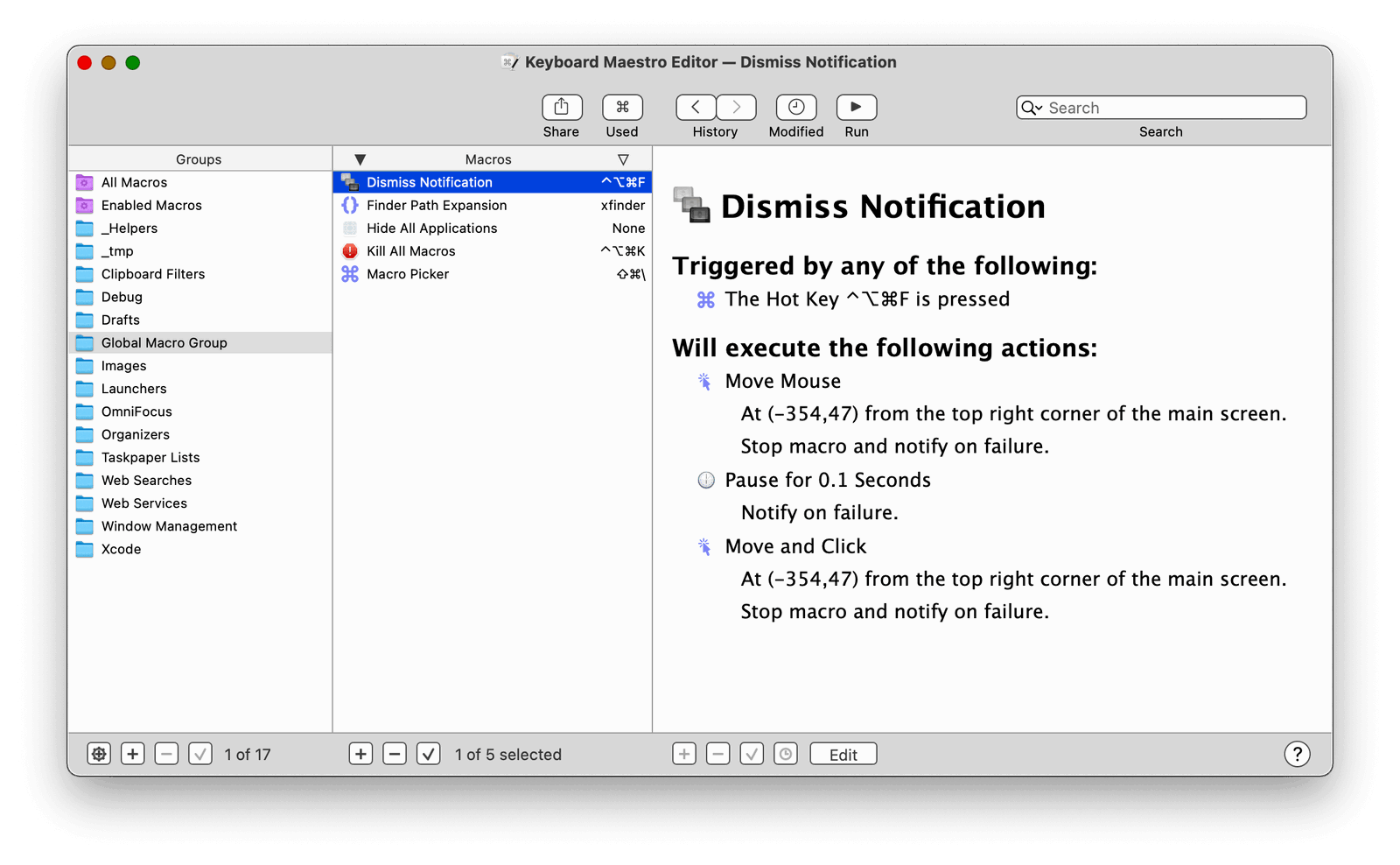
As usual, Keyboard Maestro to the rescue. Clicking those 240 invisible pixels is now a hotkey away.
It also works when they’re stacked or in Notification Center.
It’s the simplest of macros. Move the mouse to a fixed position from the top-right corner of the screen. Pause to give the (X) time to appear, and then simulate a click.
The first is about something I built for my son that brought me, well, joy. And the second half is the realization I later came to that made me very sad.
I’m Not a Carpenter
I recently found out that my father-in-law doesn’t (and hasn’t ever) respected me as a “real man” because I don’t work with my hands for a living. I don’t spend my weekends in the garage fixing cars or in the backyard building a deck.
Given the right YouTube video, I’m capable of doing basic repairs and solving problems myself, but that type of work isn’t a skill I grew up learning.
But to think I don’t “build things” is disingenuous and highlights a real generation gap in understanding what “work” used to be (and still is) and what it can be (and is) for more and more people.
I say all of that first to vent and get it off my chest. But second, to illustrate that the iPad app I built last night and this morning is a real thing that (hopefully) solves a real problem just as much as repairing the guest toilet or changing my own oil would.
My son is in first grade and loves stories, but he’s having trouble reading. It’s not that he doesn’t know his sight words or can’t sound out letters. It’s that he’s just like me and inherited one of my worst traits. We both hate doing things we’re not immediately good at.
For him, that means that as soon as he comes to a new word, he gets frustrated and shuts down if he has any trouble figuring it out.
So I’ve been looking for a way to encourage him to keep trying and stay engaged.
Luckily, he’s six. And six-year-old boys are pretty easy to figure out. For him, that means anything involving Super Mario or Black Panther is bound to pique his interest.
I had the idea for this app right after the kids fell asleep last night, and I stayed up late to make it.
My idea was to gamify his reading sessions. I know there are tons of apps out there to help kids read, but building software is what I do for a living. I wanted to use those skills that my father-in-law looks down on and make something special and unique just for my son. Maybe one day I’ll build him a treehouse. But last night, I built him this app.
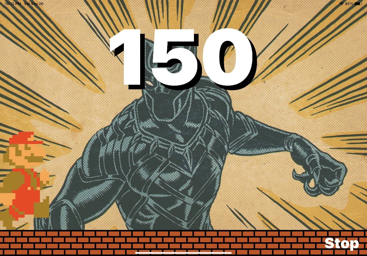
It’s a simple, one-screen iPad app. The goal is to move Mario across the iPad.
How do you do that? By reading a book.
When a new game starts, the app listens for my son to read a book out loud, and iOS does on-device speech-to-text. With every word he reads, Mario runs further and further across the screen. A live counter ticks down from his word count goal. And when the counter reaches zero and Mario reaches the other side of the iPad, my son gets rewarded with confetti, Mario jumping up and down, and the official Super Mario end-of-world theme music.
What does my son think of his new app? Judge for yourself…
Besides sprinting across the screen, Mario does have another trick up his sleeve. To keep things interesting, at any point when he’s reading, if my son shouts, “Jump!,” Mario will dutifully jump on screen.
Will this app solve my kid’s reading problems? Probably not. Even though my wife is already talking to me about adding additional in-app rewards and bonuses to keep him motivated, I’m sure he’ll be bored with it within a week.
And that’s ok. My larger reason for building the app brings me to the second half of this post.
Modern Software is Designed Not to Last
If you’ve followed this blog for any length of time, you’ll find that I take preserving our (my family’s) digital memories and history seriously. I think it comes from watching my mom put together countless family photo albums and my dad doing decades of genealogy research.
And I’ve applied my digital hoarding habits to our photos, videos, old videotapes from the 80s, scanned physical documents, and even interviewed and recorded grandparents before they passed.
At the start of the pandemic, I began recording myself reading poems by Shel Silverstein every night. He’s my kids’ favorite author / poet. My goal is to read aloud every poem he published and put those audio recordings in some sort of digital archive for my kids. And while I certainly hope I’m not dead anytime soon, I wanted to create a keepsake from me to them that they can look back on when they’re older.
The realization I had last night while building my son’s app, is that as long as I put those poetry recordings somewhere safe and practical, they should last a generation or more. I’m not overly worried about mp3 files (or wav or whatever) bit-rotting and becoming unplayable. Our family photo archives are probably safe as jpg files. (I’m talking file formats, not necessarily the storage medium, which is an entirely different rabbit hole.)
As a society, we spend so much time preserving and protecting artifacts and artistic works from hundreds and even thousands of years ago. It’s just how we’re wired.
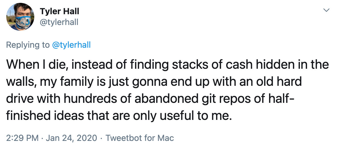
I made a joke on Twitter that my legacy and contribution to this world will be the hundreds of abandoned git repos my family finds on my computer when I die. (Or maybe even farther in the future than that.)
And there’s real truth to that.
I’m not a musician or an artist or a novelist. If I recorded music, made paintings, or penned a seven-volume teen vampire young-adult book series, those things would outlast me.
But this app I made for my son? I built it because I thought it might help, sure, and because software is what I do. It’s my life’s output, my legacy, and I wanted him to have his own piece that belongs only to him.
Unfortunately, I write software for Apple’s platforms. And on iOS (and increasingly on macOS), that requires code signing and Apple’s blessing to do anything.
And so if I were to die tomorrow, the app I made just for him and installed on his iPad this morning will stop working in one-hundred and ninety-two days. Not for any technical reason. Not because of future software incompatibilities. If his iPad remained in working order for another hundred years, it wouldn’t even matter. This digital heirloom will self-destruct as soon as my developer certificate expires.
And it’s all due to an arbitrary decision on Apple’s part to lock down their platform(s) to maintain control and protect profits.
And so with all the recent anti-trust rumblings, this is the part that worries me the most.
Sure, it’d be great if Apple’s App Store commission (tax) aligned with the value they provide developers. And I bitch all the time online about the capriciousness and borderline hostility of App Review.
But those are relatively minor concerns in the grand scheme of things. My ask is that Apple’s customers (and this applies to all platforms across the industry) regain the right to run the software of their choosing.
Cupertino could allay anti-trust concerns, and I’m serious when I say this, provide an amazing gift to the world and future generations if they’d stop being the worst version of themselves and allow side-loading. And they could do this while continuing to do swan dives into literally infinite Scrooge McDuck sized vaults of cash.
Our world is digital now. And that means our heritage is, too.
I don’t think I’m being hyperbolic when I say that future historians and even archaeologists are going to revisit our time and be furious at the direction our industry turned towards using consolidation, monopoly power, and artificial restrictions to protect profits at all costs.
Imagine if Howard Carter discovered King Tut’s tomb but couldn’t open the door because the Pharaoh’s signing certificate had expired.