Surtainly Not
I’m behind on testing my apps for Big Sur because I haven’t wanted to update my iMac Pro yet if any third-party apps I depend on stop working. This machine is the hub that controls many devices around the house and serves up music, movies, and TV shows for everyone. My kids would not be happy if that broke.
I don’t want to tempt fate with my MacBook Pro because I have to have at least one stable development environment.
That leaves my precious 2015 MacBook (One). Unfortunately, its logic board died six months ago, so I really am without a Mac I feel comfortable using to test.
At least that’s what I’ve been telling myself since WWDC. But now we’re into September, and I have to start testing. So, I crossed my fingers and upgraded my iMac last night.
Eighteen hours later, I’m here to write about the dumb, little toy of an app I made this morning just for Big Sur. I honestly don’t expect other people to use it. I’m not even sure if I’ll keep using it. It was more of a “I hate this. I wonder if I can fix it?” type of thing.
Surtainly Not.app
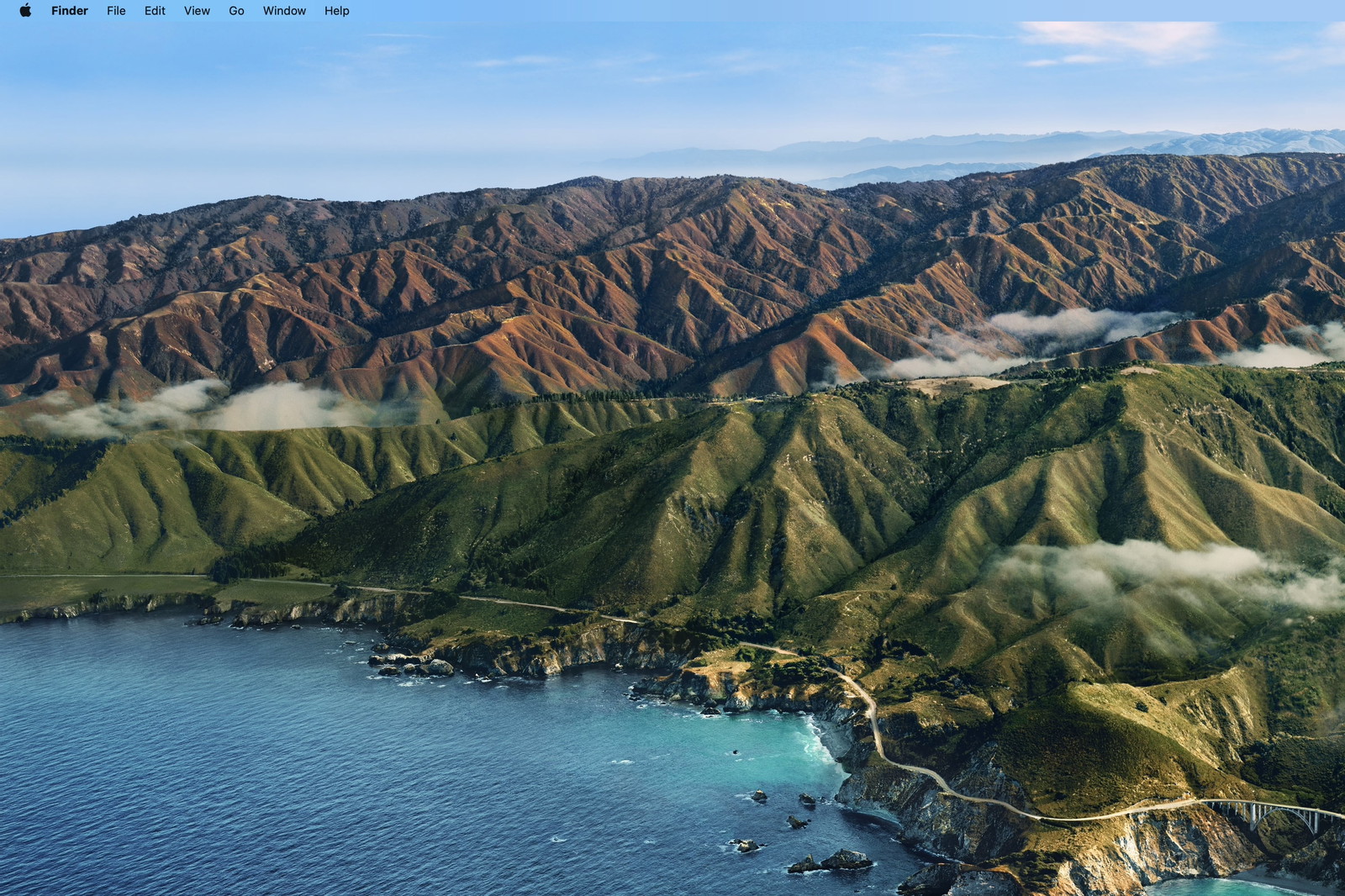
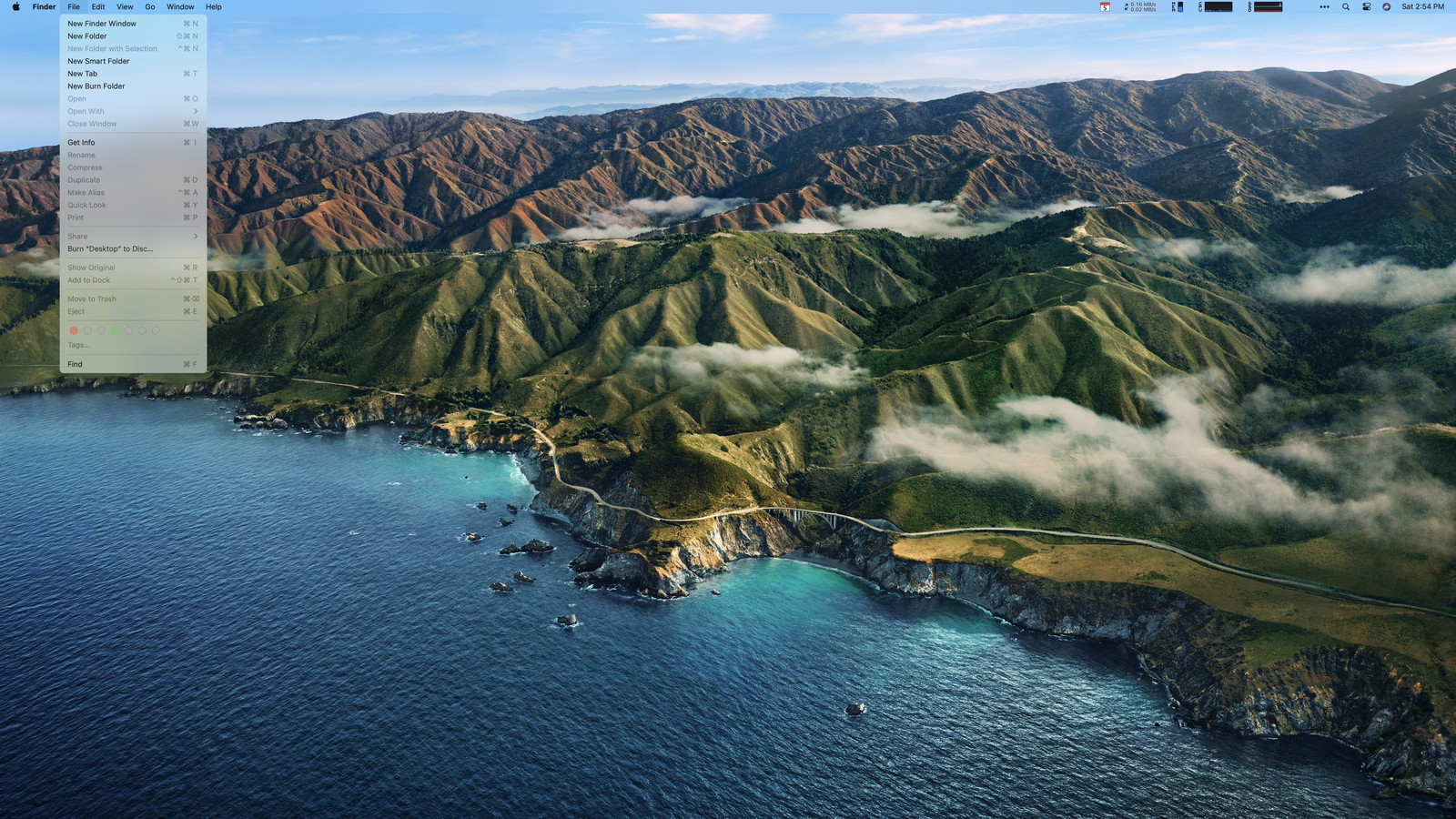
Here is my Desktop on Big Sur.
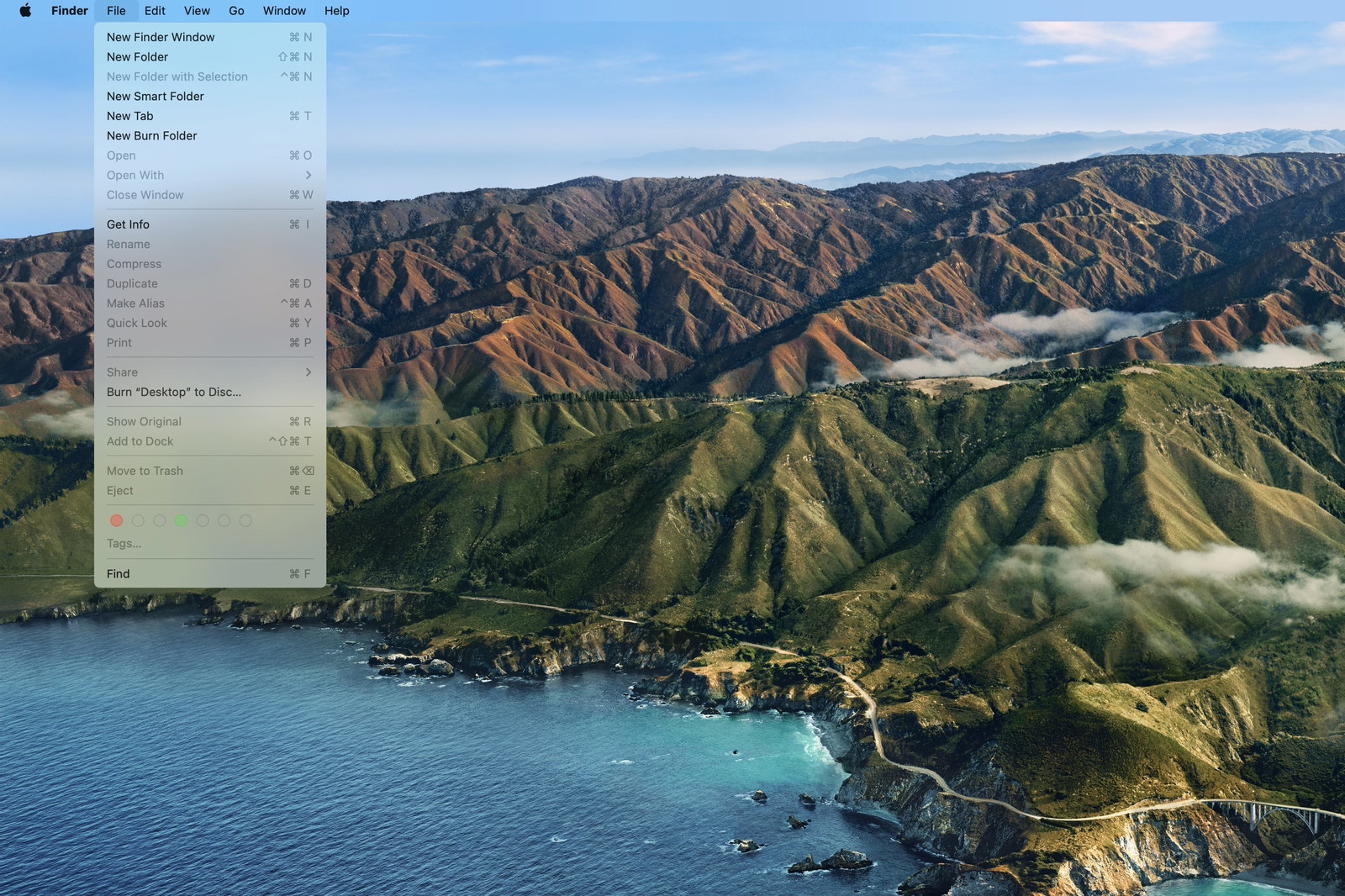
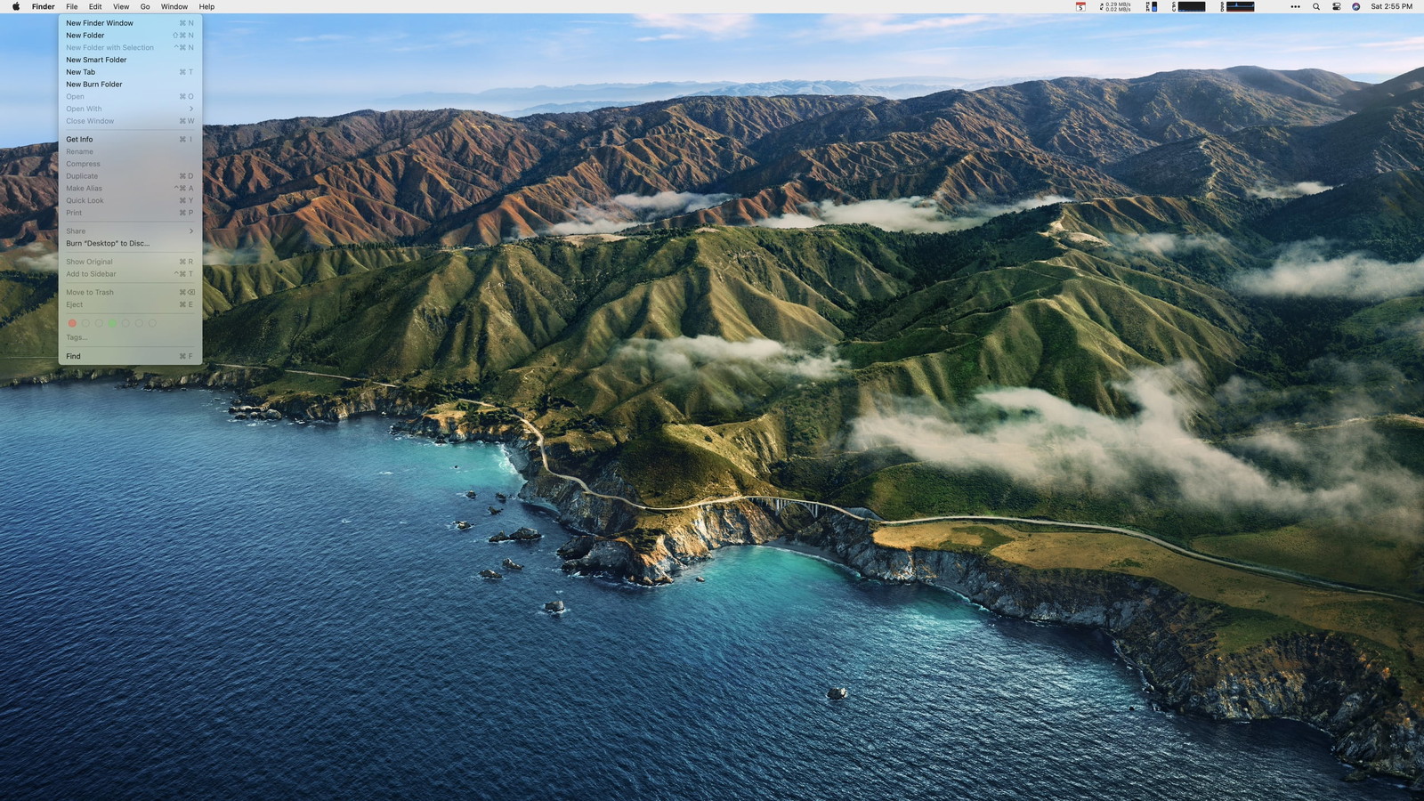
And with a menu open.
I’m still on the fence about Big Sur’s new design language overall. But, whatever. It’s iOS 7 come to the Mac. It’ll get dialed back in a few years, and we’ll all get used to it.
But that menu bar.
There’s the old, now-cliché quote from Jobs:
Most people make the mistake of thinking design is what it looks like. People think it’s this veneer — that the designers are handed this box and told, ‘Make it look good!’ That’s not what we think design is. It’s not just what it looks like and feels like. Design is how it works.
I can’t reconcile that approach to building software (you can’t just design it; you have to build it) with the choice to make the menu bar transparent. And I know it’s such a minor little detail, but the macOS menu bar never goes away. It’s in your face every moment you use a Mac. It can’t just be good. It needs to be great.
The updated look harkens back to Leopard in 2007. Siracusa, in his (formerly) annual Mac OS X review, wrote:
The rationale proffered by Apple for the use of translucency in the original Aqua design was that it denoted a transient element—pull-down menus and sheets, for example. Now it’s being applied to the least transient element in the entire interface.
further calling the new menu bar a
gratuitous, inappropriate use of translucency to the detriment of usability.
Here, let’s go back to Jobs on stage at WWDC 2007. (I had third row seats that year.)
He justifies the translucent menu bar by saying that most users choose their own digital photo instead of the default wallpaper. The updated design adapts to that photo and, I assume, makes your desktop feel more immersive.
Regardless of the reasons for the change, Apple did eventually add a system preference to turn off the translucency. And at some point, even that preference went away in favor of an opaque bar again.
Let’s pause here.
As I was preparing the above video for this post, I completely forgot there was a final feature about the new Leopard Desktop that was highlighted in that keynote.
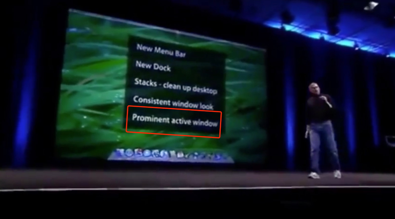
Jobs took time out of a keynote to callout that it was now easier to tell which window is focused. At 1:29 in that clip, you’ll hear an outsized “Wooo!” from some of the audience just for this one improvement.
I’m too lazy to boot up a VM with 10.5 to take a screen recording, so here’s a video of me cycling through windows on Catalina:
Compare that with the latest build of Big Sur:
You can tell the difference, but it’s nowhere near as prominent (to use Jobs’ word). Does it matter? To some users, I think it absolutely will matter very much. Then again, I don’t have access to the same UX research as the world’s largest tech company. Maybe they know something the rest of us don’t?
It’s not just what it looks like and feels like. Design is how it works.
But I worry the industry is moving too far away from that doctrine.
Anyway, back to Big Sur…
I’ve been following along with screenshots and design critiques of the new OS since it was revealed. I really was (still am) excited to explore all of the UI nooks and crannies. But in less than a day of using it, I’ve lost track of how many times my eyes have had trouble settling on menu items because, well, I can’t see them.
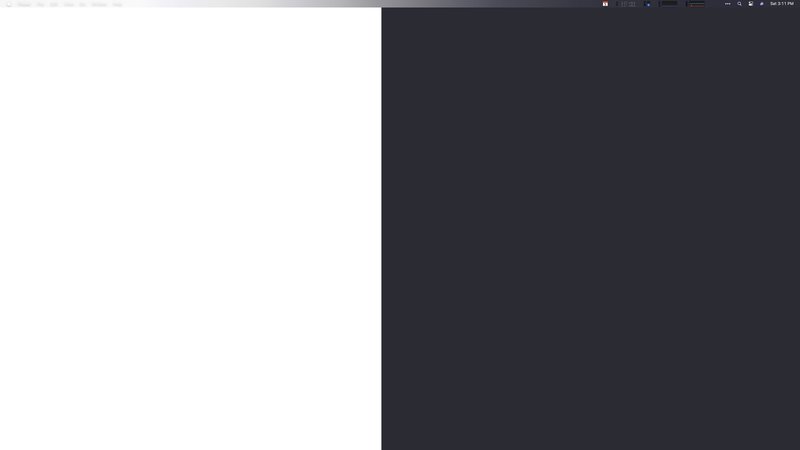
Don’t believe me? Here’s the Big Sur Desktop again using an admittedly contrived custom wallpaper image I made.
I’m guessing macOS 11 calculates the average brightness of your Desktop image (or something like that) to decide between a dark or light font color for the menu bar.
And try as an algorithm might, it’s going to guess wrong sometimes. (Often? Frequently?) And if you can’t guarantee the legibility of such a critical UI element in every case, why go down that route at all unless your goal is a shinier veneer? I’m not trying to be dismissive or even mean about the new look just because it’s new. I would genuinely love to know the reasons behind it.
Anyway, back to the dumb app I made.
This morning I wanted to fix the contrast of the menu bar’s text against my wallpaper. My first thought was to just put a dark or light border (depending on the wallpaper) on the image itself. But I like to change my wallpaper frequently, so that could get tedious.
Next idea. The menu bar is transparent. I’ll build a quick app that floats a window with a solid background color behind it.
Sadly, after an hour of screwing around with NSWindow.Level, I was never able to find the correct incantation of black magic to position a window behind the menu bar. However, I did figure out that I can place one on top with the right window settings, which gave me a path forward.
Two hours of tinkering later, I came up with a working solution. Here’s the ridiculous Rube Goldberg machine that keeps my menu bar legible.
First, position a borderless NSWindow without a title using the same frame as the menu bar like this:
backgroundColor = .windowBackgroundColor
ignoresMouseEvents = true
styleMask = [.borderless]
styleMask.remove(.titled)
level = NSWindow.Level.init(Int(CGWindowLevelForKey(CGWindowLevelKey.mainMenuWindow)))
let aRect = NSRect(x: 0, y: screen.frame.size.height - 24, width: screen.frame.size.width, height: 24)
setFrame(aRect, display: true)
orderBack(nil)
That puts the correct (for me), solid color over the menu bar, but you can’t see the menu items behind it since it’s not transparent (kinda the point).
How do I get the menu items on top of my custom window?
Easy. You just, uh…
- Observe
NSWorkspace.didActivateApplicationNotification - When a new app becomes active, use AppleScript to fetch its top-level menu items.
- Then, and I’m so sorry for this, draw your own duplicate menu bar items on top.
Believe it or not, it works.
And here’s a video as I switch apps…
Is it perfect? Certainly not.
First, because I’m waiting for a notification from the system about a new active application, the menu bar will repaint the new app’s items a split-second slower than the native menu bar.
I’ve done zero testing on multiple monitor setups.
The app has no UI other than the menubar overlay. That means, if you want to quit it, you’ll have to kill it with Activity Monitor.app or the command line.
I’m also not drawing the selection highlights when you click on a top-level item. I wrote some preliminary code that draws the highlight and mostly reacts accordingly, but it wasn’t good enough for my liking, so I turned it off. But maybe that doesn’t matter since Big Sur doesn’t draw much of a highlight between items anyway.

Like I said at the top of this post, Surtainly Not.app isn’t something I expect people to use. It was more just a thought experiment on a lazy Saturday afternoon with a cup of coffee in hand.
The source code is available on GitHub, and you can download a pre-built, notarized build of the app here.
Update 2020-09-11
While my fix for the Big Sur menu bar works (albeit with bugs), it’s really just a joke intended to make a point. If you really want to get rid of the transparency, you should use a proper app made for the job. Frank Reiff over at publicspace.net did just that. It’s called Boring Old Menu Bar, and you should go buy it. I just did.