There aren’t enough adjectives in the world to describe her giant-sized personality. So I’ll just say happy number six to the strongest girl I know.

mostly nonsense
There aren’t enough adjectives in the world to describe her giant-sized personality. So I’ll just say happy number six to the strongest girl I know.
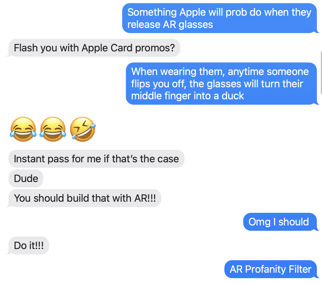
It’s an open secret that Apple is working on an augmented reality headset (or something). All the recent advances in ARKit and adding LiDAR to the pro iPhones and iPads are certainly leading up to a larger goal.
I have no idea what that next leap is.
But, I do know that fourteen years into iOS, people still ducking hate autocorrect. Especially when you find your ducking text messages littered with ducks. There’s just no ducking way around it. Short of adding a fake contact to your address book named Dr. Duck Ducking McDucker, autocorrect seems ducking incapable of learning everyone’s favorite bit of profanity.
That got me thinking earlier today. What’s going to happen when Apple finally leads us into that next frontier of human / computer interaction? What happens when our day-to-day reality becomes augmented with live information and our physical and digital worlds merge even closer together?
What happens if Apple takes autocorrect’s prudish vocabulary into AR? If they dared to try and censor the real world, how would that look?
I decided to try and find out. And I have the Xcode project to prove it.
Watch.
So what did you just see in that video?
It’s an iOS app that analyzes video streaming from the camera and attempts to detect human hands. If it finds any, it then tries to distinguish the digits of each finger and, specifically, if the middle finger is raised. If it detects that, it takes the location of the offending finger and censors it with a 🦆.
This whole post, of course, really is a joke. But the silly idea originated from an actual conversation with my wife and then a friend egging me on to build it.
But, more importantly, it shows just how fantastic software is these days. How spoiled we are to carry supercomputers in our pockets. In less than 200 lines of code, I used these incredible frameworks developed by Apple to get this idiotic idea working in an evening.
I know I complain a lot, but I also want to credit the many talented people working hard to put software like this out into the world for other developers to build upon.
I love our new world of always-on technology because it can provide empirical, digital evidence that validates the squishy, fuzzy experience of being human. It can prove you’re not crazy. That there is a reason for feeling the way you’re feeling.
I don’t have a good segue into this next paragraph, but one of the things I hate most about myself is I don’t think fast enough on my feet. It’s why I prepare so meticulously when I know in advance that I need to make an important point or defend my position. When an argument becomes heated, when I’m unexpectedly challenged without supporting evidence ready and within reach, I go full Costanza.
Given an hour to craft my argument, I can eviscerate the other side in a scathing email that makes my case. But on the fly, I fumble and back down in the face of a more aggressive opponent.
That doesn’t happen often, but it did today. And I could feel my body reacting, fumbling, and shutting down in real-time as it always does. Fight or flight? I noped right out of there. I packed up my bag and went home for the day.
The difference this time, since the last occurrence, is I was wearing my watch.
Were the stress and my body’s reaction real? Or imagined? (Does it matter?)
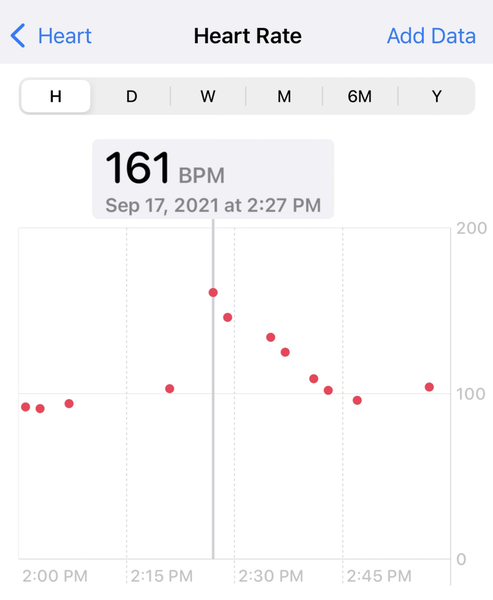
A 161 bpm heart rate during a contentious conference call sure seems to validate how I felt.
To me, that’s fascinating. The direct connection between a piece of aluminum strapped to your wrist and the emotions overwhelming your brain. A tenuous but verifiable link between digital and analog. An opportunity to recognize something tangible and make a change.
So when I arrived home today, I silenced and shut down every device and scheduled some vacation time for next week. In my out-of-office auto-reply, I even lied and said that I would be away without access to the internet or a cell phone.
Later, after sunset, I held my daughter’s hand and walked around our backyard in the pitch black for an hour. Me in my house shoes. Her with bare feet. We talked about the usual things that are top-of-mind to a six-year-old.
Why is it cold at nighttime but not really when it’s Summer?
Can wolves hear me with their long ears if I howl quiet?
What was that noise?
Where do bees go when it’s dark?
Where do ants live?
If I get a flashlight, will that scare away the lightning bugs or make them come closer?
The problem with all of the above, is that there aren’t any computer companies left.
This is a joke. But not really. But also, yes. But also sorta serious.
Yesterday, Gruber linked to Jeff Kirvin’s essay “Safari 15 Isn’t Bad, Just Misunderstood”.
I’m not going to weigh in on Safari’s new design. Instead, I want to call out something Gruber wrote in his commentary:
You got URLs in address fields, but page titles weren’t exposed other than in the Window menu. That was, in my opinion, a fundamental flaw in the design. Web page titles are useful, and should be more human-readable than URLs.
That’s something I’ve long intuited based on my own web browsing habits but never really put into words. When I stop and think about it, modern web browsers drive me crazy by limiting tabs to a maximum width because that width is almost never enough to show the full page title.
Well, except one web browser: Safari. Look.
Here’s Chrome, Firefox, and Safari showing the same two web pages using the same window widths.
Chrome

Firefox

Safari
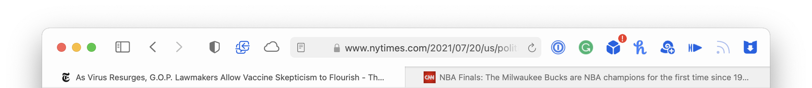
Safari is the only one that lets each tab expand to fill as much room as is available – so you can see more of the web page’s title.
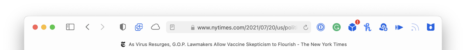
This difference is even more apparent if you only have one tab open. Here they are again:
Chrome

Firefox

Safari
If Safari on macOS Monterey is heading in a similar direction where web page titles are going to be even more truncated, that’s going to make me sad. I guess we should do something about it.
Here’s TheTitle.app
It’s a silly Mac app that is just a window title bar. It floats above all the other windows on your Mac and keeps an eye on your web browsers. As you move from browser to browser and web page to web page, TheTitle shows you the full page title – unobscured. Problem solved.
Here’s a demo video.
And the source is available on GitHub, or you can download a notarized build here.
A few weeks ago I built a niche little app idea dubbed MeetingBuddy. You choose a target app from a pre-defined list (or pick any app on your Mac) and a time interval and MeetingBuddy starts screenshotting that app’s windows.
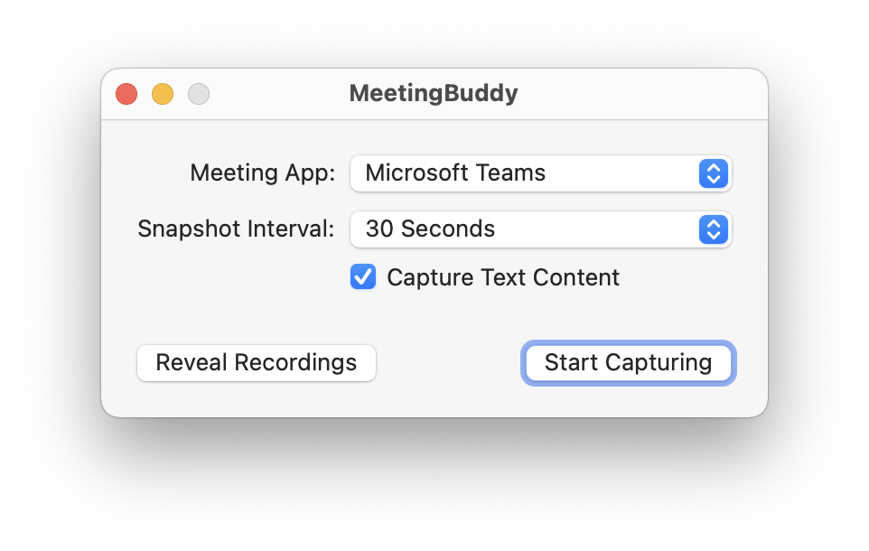
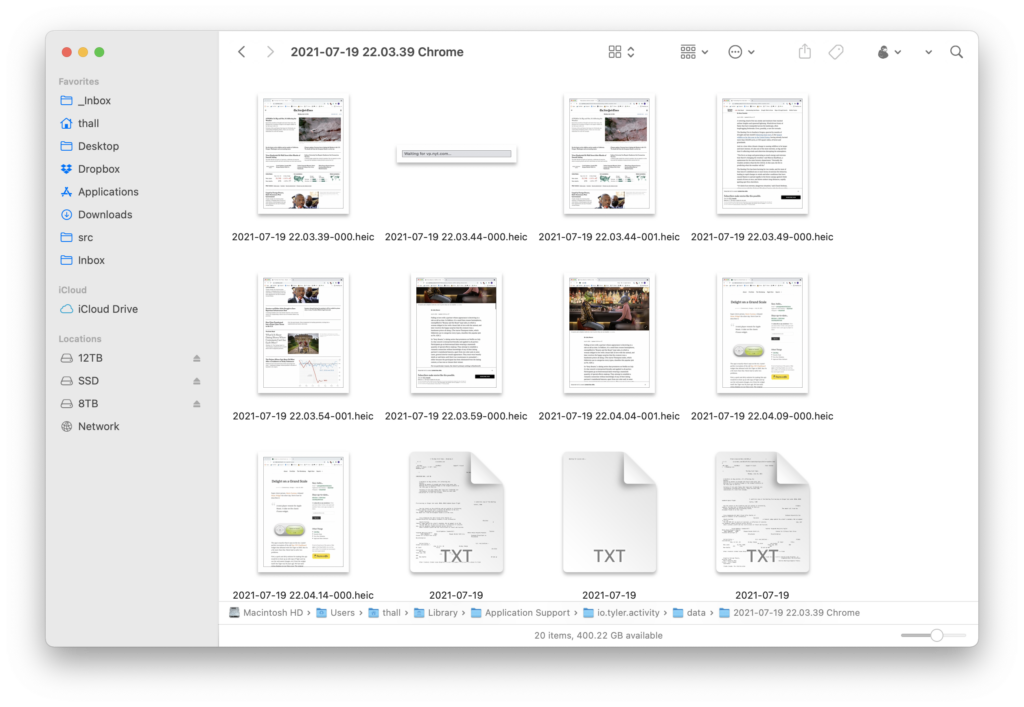
Each recording session goes into its own folder
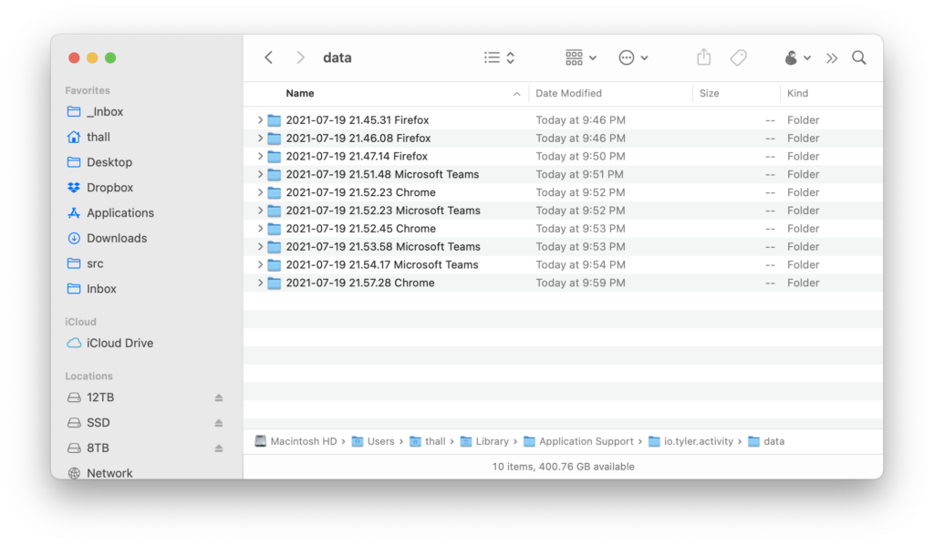
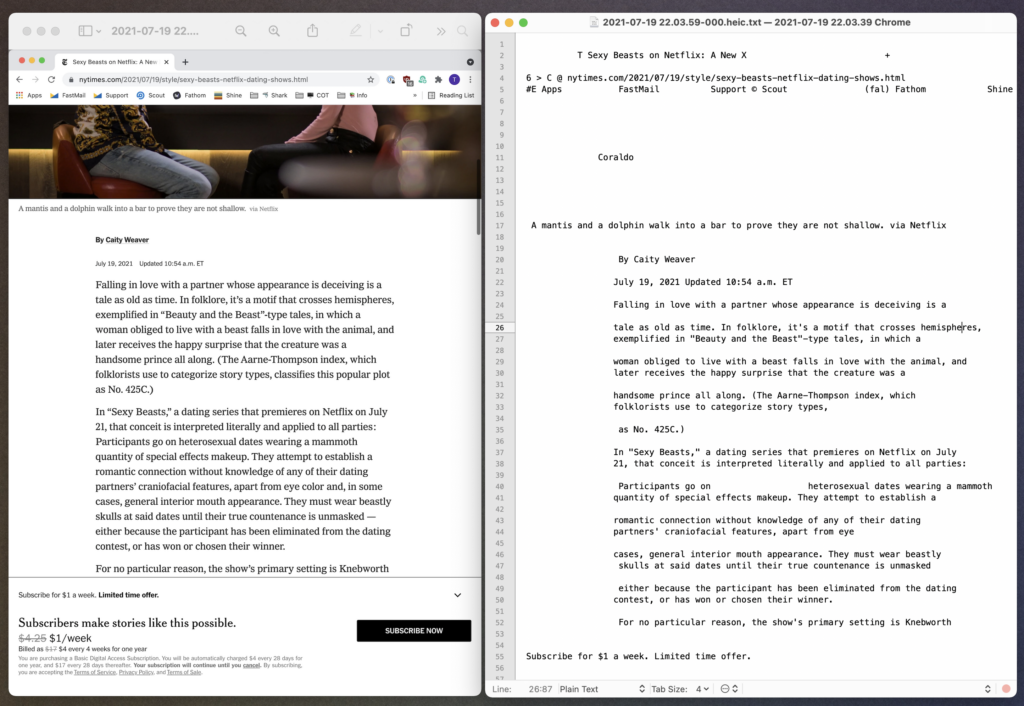
where all of the screenshots are organized by date. But! while this is all going on, MeetingBuddy is also OCR-ing any text found in the screenshots and storing that alongside each image in a sidecar file.
You end up with a folder of recordings for each session. Images and their corresponding text contents.
Why is this useful? Honestly, I’m not exactly sure that it is just yet. But here’s what I’ve been using it for.
(This all ties back to my Amnesia app idea, which COVID sorta derailed. Maybe I’ll get around to finishing that, too, one day. You can hear me talk about Amnesia on this podcast.)
And whether you keep the screenshots and text files in folders on your Mac, or if you dump them into a digital brain like DEVONthink, it’s super easy to search and cross-reference the text of what was on screen with the full image.
I don’t yet know if MeetingBuddy will go anywhere, but if nothing else, it’s given me an excuse to learn some new macOS APIs I hadn’t dealt with before.
Here’s a demo:
And if you’d like to try MeetingBuddy, you can download it here. I can’t even begin to describe how completely unpolished it is. I haven’t run it on any Mac other than my own, but it should work. Probably. (And, suffice to say, MeetingBuddy collects zero information about what you record. All text processing and image capture is done locally on your Mac.)
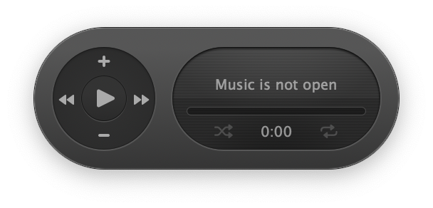
Super clever person, Mario Guzman, released Music Widget the other day. Here’s how he describes it:
A mini player remote for Apple Music. A take on the classic iTunes widget.
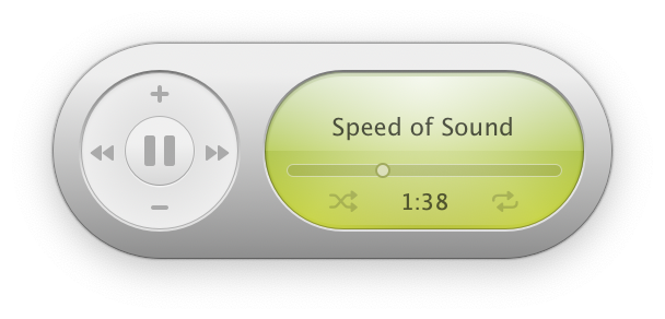
The app is exactly what it says on the tin. A pixel-perfect recreation of the old Mac OS X Dashboard widget that debuted with 10.4 Tiger in 2005. But it’s a bit more than that. Mario had to solve two problems.
First, a quick and dirty solution for making this app would be to boot up an old copy of Tiger and rip out the web assets (images, etc.) from the widget itself. But Tiger was 16 years ago. We have @2x retina displays on our Macs now. The original images would be too small or pixelly. Instead, he did things the hard way and took the time to rebuild everything from scratch in code.
Problem number two: Dark Mode wasn’t a thing sixteen years ago. Mario had to create that design himself. (It helped that he had a head start from previously bringing Dark Mode to his impressive rebuild of iTunes.)
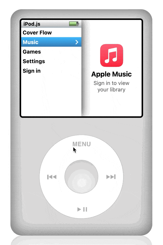
Another bit of nostalgia that made the internet squeal last month was Tanner Villarete‘s recreation of the classic iPod interface on the web.
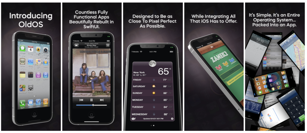
And, holy crap, have you seen The OldOS Project from Zane K? He built a fully functional version of iOS 4 with SwiftUI.
Why are people putting so much time, effort, and obvious love into remaking old user interfaces using modern development tools? Why bother?
I’m sure there’s a whole host of reasons, and each developer is motivated differently. Ultimately, I don’t think it matters. My real question is this:
Fifteen or twenty years from now. In 2036. In 2041. What will those kids rebuild from our devices today?
Mario and I had a short conversation about this last week, and I’ve been thinking about it ever since. I’ve tried paying attention to the devices and apps I use all day. And, I just, don’t know?
Are future developers going to feel nostalgia for the hamburger menu? The Facebook newsfeed? Grayscale colors and identically shaped app icons? Flat UI?
I’m trying very hard not to fall into the trap of being yet another old man yelling at kids to get off my lawn, but I struggle to find delight on a grand scale in modern software. Every incremental step, year over year (from all companies, this isn’t just about Apple), seems to be focused on removing emotion and affection from our devices rather than finding ways to strengthen that bond.
Has the industry decided that our devices have reached a level of maturity that warrants making everything minimal, sterile, and utilitarian to help “do work” and “get stuff done”?
Where’s the fun? Where’s the experimentation? The joy and playfulness?
I see bursts of design like this coming from small companies and individual developers. But the major players have forgotten that how software makes you feel is just as important and necessary as what it lets you do.
Last March, I released Three Things Today. It’s a one-trick-pony Mac app that lets you schedule out your three main goals for each day on a calendar. It’s built around my two basic assumptions for getting work done:
Anyway, you can read more about the app and how it operates under those two assumptions.
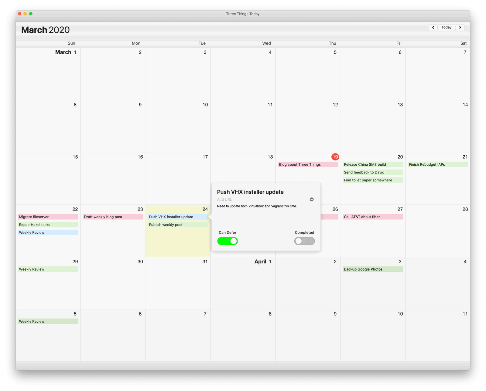
The point of today’s post is that while I’ve been using Three Things myself for a year now, a very nice person was kind enough to email me last week and let me know that the version posted online had expired. My bad.
Also, this new version comes with an experimental new feature: iCalendar syncing!
You can add a public iCalendar (.ics) feed to Three Things, and it will display all day events / tasks within the app.
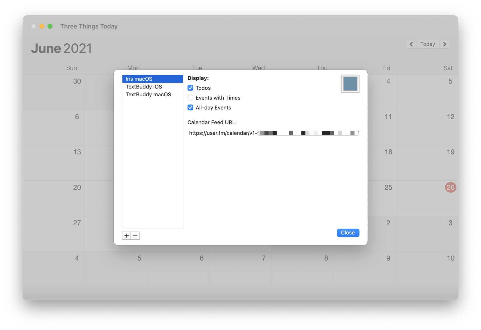
Why is this useful? For me, I’ve subscribed Three Things to the calendar feeds for my Trello boards that I track my software projects with. Most of my Trello cards (tasks) are undated, but in the rare case one has a due date, it will automatically appear in Three Things. More importantly, Three Things will enforce rule #1 and make sure I don’t overcommit myself on that day accidentally.
My five year old, driving home from daycare today, unprompted:
I know what lockdown is.
Like when we had to stay home for a long time last year?
It’s when we turn the lights off and lock the door and hide in the fire room because a bad guy is coming.
Pause.
But, daddy. Why do bad guys have swords and kill all the people?
And suddenly, my kids are grown up.
What I mean is, it’s been a long time since I’ve been inside a restaurant with my kids.
467 days.
The last time we ate out as a family, they were, well, horrible little human beings. It was just that age.
But then we walked inside and closed the door behind us. And waited.
For over a year, we played it as safe as possible — minimized risks. Even when our jobs ordered us back into the office, we did what we could. Drive to work. Eat lunch in – not out with coworkers. A social pariah among young non-believers. Drive back home. Maybe the grocery or drug store.
A grandparent’s wave through a glass door.
And we made it through mostly unscathed.
Mostly.
It was, at the same time, the longest and shortest year of our lives.
Two weeks ago, my wife and I sat outside in the rain near a cave. And laughed. And sang. And danced a little.
Music echoed through the clearing.
We cried. And were thankful.
Tonight, my son asked for sushi from the Chinese place he likes best. His eyes lit up when I replied, “Would you like to eat inside?” My wife and I call it “Trump Chinese” because they sell counterfeit MAGA gear out of a golden display case in the lobby. Two hats for $35. The food is comforting – if overpriced. The owners are giant assholes. But it was a regular spot nonetheless.
When we drove up this evening, I cackled when I saw the interior stripped to the studs, and they had finally gone out of business. Good.
Sure, my kids sobbed because that age never likes disappointment. But that was solved easily enough by making a quick detour to a nearby deli instead. Another favorite of ours. Hello, old friend.
We opened the door and stepped out of our time machine — my children another year older. And, my goodness, actually not terrible dinner companions like they used to be.