I’m behind on testing my apps for Big Sur because I haven’t wanted to update my iMac Pro yet if any third-party apps I depend on stop working. This machine is the hub that controls many devices around the house and serves up music, movies, and TV shows for everyone. My kids would not be happy if that broke.
I don’t want to tempt fate with my MacBook Pro because I have to have at least one stable development environment.
That leaves my precious 2015 MacBook (One). Unfortunately, its logic board died six months ago, so I really am without a Mac I feel comfortable using to test.
At least that’s what I’ve been telling myself since WWDC. But now we’re into September, and I have to start testing. So, I crossed my fingers and upgraded my iMac last night.
Eighteen hours later, I’m here to write about the dumb, little toy of an app I made this morning just for Big Sur. I honestly don’t expect other people to use it. I’m not even sure if I’ll keep using it. It was more of a “I hate this. I wonder if I can fix it?” type of thing.
Surtainly Not.app
Here is my Desktop on Big Sur.
And with a menu open.
I’m still on the fence about Big Sur’s new design language overall. But, whatever. It’s iOS 7 come to the Mac. It’ll get dialed back in a few years, and we’ll all get used to it.
Most people make the mistake of thinking design is what it looks like. People think it’s this veneer — that the designers are handed this box and told, ‘Make it look good!’ That’s not what we think design is. It’s not just what it looks like and feels like. Design is how it works.
I can’t reconcile that approach to building software (you can’t just design it; you have to build it) with the choice to make the menu bar transparent. And I know it’s such a minor little detail, but the macOS menu bar never goes away. It’s in your face every moment you use a Mac. It can’t just be good. It needs to be great.
The updated look harkens back to Leopard in 2007. Siracusa, in his (formerly) annual Mac OS X review, wrote:
The rationale proffered by Apple for the use of translucency in the original Aqua design was that it denoted a transient element—pull-down menus and sheets, for example. Now it’s being applied to the least transient element in the entire interface.
further calling the new menu bar a
gratuitous, inappropriate use of translucency to the detriment of usability.
He justifies the translucent menu bar by saying that most users choose their own digital photo instead of the default wallpaper. The updated design adapts to that photo and, I assume, makes your desktop feel more immersive.
Regardless of the reasons for the change, Apple did eventually add a system preference to turn off the translucency. And at some point, even that preference went away in favor of an opaque bar again.
Let’s pause here.
As I was preparing the above video for this post, I completely forgot there was a final feature about the new Leopard Desktop that was highlighted in that keynote.
Jobs took time out of a keynote to callout that it was now easier to tell which window is focused. At 1:29 in that clip, you’ll hear an outsized “Wooo!” from some of the audience just for this one improvement.
I’m too lazy to boot up a VM with 10.5 to take a screen recording, so here’s a video of me cycling through windows on Catalina:
Compare that with the latest build of Big Sur:
You can tell the difference, but it’s nowhere near as prominent (to use Jobs’ word). Does it matter? To some users, I think it absolutely will matter very much. Then again, I don’t have access to the same UX research as the world’s largest tech company. Maybe they know something the rest of us don’t?
It’s not just what it looks like and feels like. Design is how it works.
But I worry the industry is moving too far away from that doctrine.
Anyway, back to Big Sur…
I’ve been following along with screenshots and design critiques of the new OS since it was revealed. I really was (still am) excited to explore all of the UI nooks and crannies. But in less than a day of using it, I’ve lost track of how many times my eyes have had trouble settling on menu items because, well, I can’t see them.
I’m guessing macOS 11 calculates the average brightness of your Desktop image (or something like that) to decide between a dark or light font color for the menu bar.
And try as an algorithm might, it’s going to guess wrong sometimes. (Often? Frequently?) And if you can’t guarantee the legibility of such a critical UI element in every case, why go down that route at all unless your goal is a shinier veneer? I’m not trying to be dismissive or even mean about the new look just because it’s new. I would genuinely love to know the reasons behind it.
This morning I wanted to fix the contrast of the menu bar’s text against my wallpaper. My first thought was to just put a dark or light border (depending on the wallpaper) on the image itself. But I like to change my wallpaper frequently, so that could get tedious.
Next idea. The menu bar is transparent. I’ll build a quick app that floats a window with a solid background color behind it.
Sadly, after an hour of screwing around with NSWindow.Level, I was never able to find the correct incantation of black magic to position a window behind the menu bar. However, I did figure out that I can place one on top with the right window settings, which gave me a path forward.
Two hours of tinkering later, I came up with a working solution. Here’s the ridiculous Rube Goldberg machine that keeps my menu bar legible.
First, position a borderless NSWindow without a title using the same frame as the menu bar like this:
That puts the correct (for me), solid color over the menu bar, but you can’t see the menu items behind it since it’s not transparent (kinda the point).
How do I get the menu items on top of my custom window?
First, because I’m waiting for a notification from the system about a new active application, the menu bar will repaint the new app’s items a split-second slower than the native menu bar.
I’ve done zero testing on multiple monitor setups.
The app has no UI other than the menubar overlay. That means, if you want to quit it, you’ll have to kill it with Activity Monitor.app or the command line.
I’m also not drawing the selection highlights when you click on a top-level item. I wrote some preliminary code that draws the highlight and mostly reacts accordingly, but it wasn’t good enough for my liking, so I turned it off. But maybe that doesn’t matter since Big Sur doesn’t draw much of a highlight between items anyway.
Like I said at the top of this post, Surtainly Not.app isn’t something I expect people to use. It was more just a thought experiment on a lazy Saturday afternoon with a cup of coffee in hand.
While my fix for the Big Sur menu bar works (albeit with bugs), it’s really just a joke intended to make a point. If you really want to get rid of the transparency, you should use a proper app made for the job. Frank Reiff over at publicspace.net did just that. It’s called Boring Old Menu Bar, and you should go buy it. I just did.
I can’t explain how or why my brain jumps around the way it does, but it immediately connected that idea with Brett Terpstra’s fantastic Bunch.app. I’ve been using his app for months now to automate opening, well, a bunch of apps at once. Like when I arrive at work or do other context switches.
Right now, I trigger those bunches with a keyboard shortcut, but for no other reason than “it might be cool if…”, I wondered if I could do the same thing with an NFC tap.
More broadly speaking: I wondered if I could automate actions on my Mac from my phone?
I won’t leave you in suspense. Here’s the result, which I’ll explain below.
You’ll see I tap my phone on an NFC sticker on my desk at work, and all of my work applications launch on my Mac.
To make this work, I needed to find a way to trigger my Mac from an iOS Shortcut.
I got that solution working in this situation, but iCloud Drive is often nowhere near real-time enough like Dropbox. (And the Shortcuts.app requirement means I need to use iCloud Drive.) So, while it technically worked, it was slow and unpredictable. The latency between NFC tap and my Mac reacting would vary from 3 seconds to 10 seconds to never until I opened Files.app on my phone.
So, I needed a faster solution. A way to send a command directly from my phone (or maybe any other device?) to my Mac.
What I came up with is a tiny, macOS menu bar app I call Shelley – because as a friend told me, it’s a Frankenstein of a hack.
Point Shelley at a folder on your Mac containing executable shell scripts. Then, it sits in your menu bar listening for incoming HTTP requests. When an appropriate request arrives along with a secret key, only you know, Shelley looks for a matching shell script and runs it.
The results are instant, and you have the flexibility to script essentially any action on your Mac. Launch apps, open URLs, or even run AppleScripts.
Honestly, I’m not sure what to do with Shelley quite yet. But I remember feeling the same about Hazel, KeyboardMaestro, and even Quicksilver back in the day.
With macOS, the underlying Unix tools combined with a scriptable UI layer means you can automate almost anything.
And like the automation apps above, given enough time and a little imagination, I’m sure I’ll come up with actually useful things to do with Shelley. And I can’t wait to hear what other folks come up with, too.
Here’s how it works…
Shelley Instructions
Shelley runs on port 9876 and listens for a specific HTTP GET request formatted like:
http://some.ip.address/run/<command-name>
or
http://some.ip.address/wait/<command-name>
To execute one of your scripts, open one of those links in a web browser on another computer, phone, or another device. Or use your favorite scripting tool to send an HTTP request. Or use the iOS Shortcuts.app. Whatever you want.
The example with run will immediately execute your script and return (close the HTTP connection).
If you ping the wait variant instead, the connection will wait and remain open until the script finishes executing.
How does Shelley know which script to run?
First, open the app’s Preferences and choose a folder to keep your scripts.
Place your shell scripts in this folder. They must be marked executable (chmod +x script.sh) and end with a .sh file extension.
Then, if you wanted to run the work-morning.sh script above, you’d ping your Mac at:
http://some.ip.address/run/work-morning
To keep things somewhat secure, you’ll also need to provide a secret key that only you and Shelley know.
Shelley stores your secret key in the key.txt file automatically added to your scripts folder. (Feel free to modify the random value it picks.)
You can pass that key to Shelley in your HTTP request in one of two ways:
Through the URL by tacking it on to the end of your GET request:
Or as the value of an HTTP header simply named key.
That’s all great, but IP addresses change – especially if the Mac you’re targeting is wireless. Luckily, if you’re doing this over a LAN connection, you don’t need your IP address – just your Mac’s Bonjour name.
The fifteen days since my last post are the longest I’ve gone all year between writing. My resolution at the start of this calendar year was to write 50 posts in 2020. So, I’m not quite behind yet, but I am glad that my reasons for missing two weeks eventually led to the topic of tonight’s post.
The first, and most practical reason I’ve fallen behind my writing schedule is that June and July are the busiest months for my 9 to 5 job. (Well, lately, more like my 8 to midnight job.)
To keep myself sane while dealing with my work deadlines, I’ve found myself tinkering around with an idea I’ve wanted to try building for years now. Oddly enough, it’s not yet-another-app, but a website (web service, maybe?). And it’s actually something that’s designed to be self-hosted. I haven’t yet decided if it will (eventually) be open source, or if I might solicit feedback from friends (real and online) just in case it’s more useful than I think.
But I digress.
This topic of this post is about a pattern in how I work – my process – that I only recently noticed the other day. In hindsight, it’s how I’ve always built things – how I’ve approached new projects. But for some reason, I never clued into the fact that, yes, this is how I work. These are the same steps I take with each new “thing”. And this is the step I’m currently on.
It was that realization that prompted this tweet last week.
Step 1. Build it as fast as possible.
Step 2. Wait 48 hours.
Step 3. Try again.
That’s not exactly it, but close. The longer version is…
Sometimes the idea for something new comes in a flash of inspiration. And other times (as in the current case) it meanders around in the back of my head for years – just waiting for the right moment or combination of external factors.
For this project, it’s the result of the rebirth of the indie web movement, my long time interest in self-hosting and owning the tools and data I run my business with, and Apple’s WWDC announcements about Safari and their OS’s upcoming privacy improvements.
But whatever the idea or genesis, there’s always a tipping point where that initial spark really catches fire and I have to build it now. I don’t know how to describe the feeling I get in my head (my whole body really) other than electricity-at-the-thought-of-new-possibilities. It also feels incredibly similar to when the dumb part of my brain is trying to convince the smart part of my brain that the ridiculous impulse purchase I’m considering is actually a good and rational thing to buy.
And so, full steam ahead, I try and build a proof-of-concept as fast as I can. I give no regard to code quality, architecture, performance, look and feel, anything. My only goal is to see if I can make it work in some functional way in the simplest form possible.
Writing code in this state is an ultimate high for me. It’s a pure act of creativity. Sure, I enjoy alcohol and other substances, but no feeling I’ve ever gotten from those things can compare to the literal buzz I get when my hands on the keyboard are perfectly in-sync with the instructions pouring out of my head.
And while the word may be in my job title, I hate calling myself an “engineer”. Beyond the math, there’s almost no engineering involved in how I approach the code I write. That doesn’t mean I’m not careful, thoughtful, or that I don’t make well-reasoned decisions, but I’ve always viewed my development style more like art – sculpture, specifically.
I start with a raw block of material and massage and shape it towards a final form. Sometimes, especially at the start, I may have no idea what the end goal is. But over time as I add new pieces, move and rearrange others, it takes on more definition, structure, and patterns emerge. If you look closely, you’ll see influences from prior art and other developers, too.
That’s all to say that the things I build are rarely assembled from a blueprint. They’re organic, and I’ve often found myself at odds with other peers in the industry because of that. But that’s a topic for another post.
Once the prototype is done, once I’ve proven to myself that my idea is possible, I let it sit.
For a day. For a week. In one unique instance, seven years.
During this time I focus on other things. My real work, my family, baseball (2020 season?), whatever. Anything other than the new project. And as I go about my day, my brain will naturally start to surface ideas, features, goals, must-haves, and nice-to-haves. All the little details and tentpoles that would eventually define the full scope if I choose to move forward.
If I’m on my phone or in the car, I’ll jot down (or dictate) the idea into Drafts. If I’m on my Mac, the note will go straight into Trello, which is where all of my personal projects are tracked.
It’s also the naming phase. I almost never have an idea for what to call the project when I start building it. But during this ideation downtime, coming up with a good name for the new thing seems to be a natural byproduct of listing every possible feature.
And so, once I’ve given myself enough time to sit. To think. To let all that initial, throwaway code settle and be still in my mind, I’ll revisit it with fresh eyes and attempt to place it into one of four buckets.
This is crap / dumb / stupid / a nice distraction but not worth pursuing.
This is great – but only for me.
Other people might like this.
Other people might pay for this.
In the first case, I save everything to git if I haven’t already, and move on. (I never throw away code, though.)
Number two is often very likely. I have lots of one-off projects and tools that are only useful for me.
If I think it’s useful and worth sharing, and if I’m also willing to stomach the shit-storm of asshole internet trolls who find joy in complaining about the quality of code other people publish for free, I’ll post it to GitHub. I love doing this.
But if I decide it might really be useful, typically based on feedback from friends, I’ll begin thinking about how long it might take to reach an MVP if not even a 1.0. Is there a valid business model? Is it something I feel comfortable asking strangers to pay money for in exchange for the responsibility that places on me as the developer and support person?
And if all those stars align, I’ll officially add it to my Trello development calendar, and it’ll be done just as soon as I finish the other 437 projects ahead of it.
But once the project reaches this stage, I know enough about myself to understand that I do my best planning and thinking visually. And given that the prototype was built with almost no thought to UI / UX, and that I now (hopefully) have a long backlog of features in Trello, I’ll spend whatever amount of time it takes to settle on a “final” look and/or flow that I can move forward with. (I put “final” in quotes because, ha, this stuff is never really done and will be changing forever.)
It’s just my personality and a near like writer’s block in my head, but until I’m convinced I’ve nailed down the main window (if it’s a Mac app), the first few screens (iOS app), or HTML/CSS structure (web app), I can’t write any more code. It’s impossible for me to move beyond the working prototype stage until I have a basic shell or the chrome to put my ideas into.
It doesn’t matter if the UI I settle on will eventually be completely thrown out and replaced, but it has to reach some initial threshold where my inner critic says “Ok, that’ll do for now.” Only then can I continue.
And it’s that first, final design stage I find myself in with this current project. I’ve got a working prototype churning away on a DigitalOcean VPS this very moment that I’ve been using every day this past week. And I’ve got 200+ cards in my Trello backlog. And I’m aching with excitement to stretch some development muscles I haven’t exercised in years.
It all started with a nightlight that looked like a snowman and ended up taking 89 lines of JavaScript to make my kids go to sleep.
Like most young children, mine have always slept with a small nightlight that plugs-in directly to the wall outlet. It’s a warm, comforting, not-too-bright glow.
But this past Christmas, my wife’s parents gave them a large, ten inch tall, battery powered, super-bright nightlight that looked like a snowman. My son and daughter were enthralled, and it quickly became irreplaceable and a required part of their bedtime routine.
The problem, like most parents can tell you, is that – I assume for safety and/or liability reasons – most large nightlights are battery powered. There’s no cord plugging into an outlet. And, boy oh boy, was this snowman battery powered. It took three C batteries to light him up. And as parents will also tell you, it’s not good enough to only turn it on at bedtime and then sneak back in the middle of the night to turn the light off to save power. The slim chance that a kid who is now used to sleeping with a bright nightlight will wake up before morning, find themselves in a dark room, and freak out is way worse than having to replace batteries.
But this particular snowman? Two C batteries. Every. Three. Days.
So that lasted until February before we had enough and began looking for a rare, plug-in variety. I quickly learned that non-battery powered nightlights on Amazon fall into three categories:
Sketchy under $10 ones that might as well say “fire hazard” in the product listing.
Lights in the $25 – $40 range that might be OK, but look suspiciously like cheap, dollar store plastic.
Boutique, child-themed, bedroom illumination appliances in the $70 – $200 range.
After narrowing down three options in the second group, I let my son make the final decision and he chose a $29 model that promised to project a multi-colored array of rotating constellations on the ceiling. And I should have known better. All of the parent and consumer product review websites that I normally turn to for buying advice all said the same thing: if you want a bright nightlight that plugs in and won’t burn your house down, you might as well pony up for something quality made.
In writing this blog post, I looked up my order so I could show some details about the light. But if it’s any indication of how well it turned out, I’ll just show this screenshot from my order history. That’s all I could get because both the product listing and company are gone from Amazon.
But this isn’t a post about a fly-by-night Amazon seller. This post is about a Saturday afternoon’s JavaScript diversion. Which I’m getting to soon, I swear.
But, quickly: the globe around the light didn’t fit or attach, the inner lid sitting on top of the bulb kept falling off, and it didn’t project a star pattern. But! It did change colors and my kids loved it.
Until it broke. And I fixed it.
And then it broke again. For good.
So for the past three weeks my kids have been back to their old, dim, drugstore-bought nightlight. And if they weren’t falling asleep because of that it would actually be OK. But it’s worse than that. Now, every night when I say goodnight, they whimper and tell me how much they missed their old snowman light. And how much they want a “fun” light to sleep with. Sleepless nights I can deal with. But when the last image of your kids every single night is them genuinely sad – and not even in a whiny, complaining, spoiled type of way – just matter-of-factly sad that a toy they loved is now gone, you as a parent start looking on Amazon all over again.
And I don’t know how I missed it during my first search, but this time my wife sent me a link to Echo Glow.
Our family isn’t really in the Google ecosystem, so we’ve never had a Google Assistant smart speaker. And my wife outright loathes Siri. So, when I got to beta test the first Echo, we found a helpful, useful middle ground that we’ve never switched away from. And as a decade-long fan of Sonos, even HomePod couldn’t sway us away from Alexa.
So, for $30 I can get a first-party, plug-in, made-for-kids, Amazon nightlight that looks nice, changes colors, and does all the things you’d expect of a smart bulb? Sold.
Buuuut, obviously, I’ll need an Echo of some sort to control it. We’ve got a few around the house, but there have never been any electronics in the kids’ bedroom. So after running it by my wife, I added a new Echo Dot to our order. Our kids love asking Alexa questions on our existing Echoes. And my son loves exploring new music with his Spotify kids account. (Seriously, Spotify, thank-you so much for making a dedicated kids app.) My plan was they’d love the new nightlight, could have fun controlling it with the Echo Dot, which could also serve double-duty as a replacement for their bedroom sound machine.
Wait? Did I not tell you about their sound machine already? Because that’s where the JavaScript comes in.
My son had colic. As a baby, his crying was so ceaselessly unending that we still refer to those first twelve months as “the dark times”. We eventually found a combination of Baby Merlin’s Magic Sleepsuit (seriously) and white noise that would finally, finally help him fall asleep by 3am. Around the house in his rocker during nap time, he cuddled up to an iPod touch running Swish. (Thanks, Daniel!) And in his room we had a white noise machine made for babies.
And we still have it.
Try as we might, we could never transition him (and now his younger sister) away from it. So, now, six years later, they both fall asleep to the sound of a light forest rain that still gives me anxiety almost as bad as the Slack knock knock brush sound.
So when I swapped out their ancient white noise machine for the new Echo, I naively thought it would be easy to add an Alexa skill to play some rain sounds at night.
Narrator: It wasn’t.
As the parent of a formerly fussy baby, I have exacting requirements. Which means the white noise app:
Must play a gentle rain noise. No thunder. No babbling brook or chirping birds. No rain forest frogs. Just rain.
The sound has to be continuous. If it loops, it can’t have a break while the audio starts over. If that’s not possible, then each loop needs to be long enough that my kids aren’t going to notice.
I don’t want to play twenty questions with Alexa just to get it playing.
Turns out, that’s not how any of the 283 available white noise Alexa skills work.
Once I narrowed down the options to those that didn’t come from obviously shady developers, I started giving them a try. The best was White Noise by TMSOFT, who also happens to make the iOS white noise app I’ve used for years to help me sleep when I’m away from home.
But each Alexa skill had the same problem: the sound would end after an hour or two before they asked you to subscribe for unlimited play time. At first I just assumed this was part of the new wave of everything-is-a-subscription software. Which, as a developer, I totally get – and I’m not opposed at all to paying for an app that helps my kids sleep. But still, a subscription? Not just a one time purchase?
So, I started investigating and finally realized something that makes total sense when you think about it. These Alexa skills are all cloud based. As far as I’m aware, they’re not actually stored on your Echo. And, so, the audio isn’t on the device either. It’s streamed. Every time. And an app that streams eight hours of nighttime audio every night for every customer is quickly going to burn through some bandwidth. And bandwidth isn’t free. And thus the justification for the subscription.
Again, not opposed to paying, but let’s see if I can find another solution that works with what I already have. Could I just…play?…my own rain noise?
I have some old, multi-hour long, rain sound mp3s in my iTunes library dating back to when I used a click-wheel iPod plugged into a bedroom speaker to fall asleep in college. And because they’re in my iTunes library, that means they’re available in iTunes Match. And Alexa can play Apple Music, so…
Nope. Apple Music and only Apple Music – as in the streaming service. Not your real music library in Apple’s cloud.
But, at one point years ago I paid for Amazon’s cloud music storage service and uploaded all of my music to their service for playback. Unfortunately, not only has that service been discontinued, but Alexa won’t play music from the libraries of those of use grandfathered in.
Next up. Spotify. Two problems.
Yes, their catalog does contain lots of rain sounds and other relaxing and white noise “albums”. But, like an album, they’re all just songs. As in mostly 5 – 10 minutes long each – if even that long. I tested a few on repeat just to see how they sounded when looped, but you could clearly hear the gap as playback restarted.
Assuming, I did find a long enough track, Spotify only allows your account to play music on one device at a time. Admittedly, Amazon has done the best at supporting multiple users and families of any of the tech ecosystems, but I still haven’t figured out how to connect multiple Spotify accounts to a device. So every time my kids’ rain starts, that would stop the music I’d otherwise be listening to and vice versa.
Ok, let’s get clever. I pay for YouTube Premium, and YouTube has some absolutely insane users who uploaded hours of lengthy video content. So it took all of thirty seconds to find a suitable eight hour (!!!) YouTube “video” of rain noise.
Sadly, there’s no official YouTube skill for Alexa. I assume because something something tech giants can’t play nice together. And even if the few 3rd party YouTube Alexa apps I found weren’t totally sketchy, I wasn’t ready to hand over access – even if the OAuth permissions were limited.
Finally, I turned to my best friend, Plex. Last year I gave up iTunes Match as well as all the other TV / movie services and just started keeping our content hosted locally. That includes our family music library. And, sure enough, Plex has a nice, officially supported skill for Alexa.
I downloaded the eight hour rain video from YouTube I mentioned above – all 13.87 GB of it. And converted it into a 461 MB mp3. Dropped it into my Plex library, and, boom! Playback success.
Sadly, the Plex skill violates requirement #3. It’s way too verbose to start playing when dealing with sleepy children. Back to the drawing board.
If I may skip ahead to the end quickly, now that I’m writing this and looking back at all the trouble I went through to find a working solution I was happy with, I probably should have saved myself a lot of time and just paid for one of the subscription white noise Alexa apps. But that’s not what a nerd does when they’re faced with an annoying challenge and the opportunity to learn something new.
Instead, I decided it was time to write my own Alexa skill. And so now, 1,985 words deep into this blog post, I get to the point and the part about JavaScript.
All of the existing Alexa skills I tried do too much. Not surprisingly in a competitive market, they try and stand out by competing on features. But as a parent, I just need something that works. And kids are creatures of habit. They want the exact same routine every night. They don’t need a library of 200 white noise options with durations, times, cross fades, or anything else. That’s exactly why, as the parent of a new born six years ago, Swish was on my wife’s home screen. Open the app. Done. No fuss. Nothing to press.
So the goal for my Alexa app was to say an invocation phrase. And. That’s it. No dialog. No choices. Nothing else.
I’m happy to say that after cobbling together a few StackOverflow answers and the Alexa Hello World template, my solution does that. After I finish reading my kids their nightly book, I’ll say
Alexa, start bedtime routine
and she’ll reply
Night, night. Sleep tight. Night, night. I love you.
The new nightlight will start flickering like a campfire at 30% brightness, and that eight hour mp3 of rain noise, hosted on my own web server, will gently stream into my kids’ bedroom
My first pass at making it work just started the audio playing. But I say the above goodnight phrase to my daughter every night when I tuck her in. Actually, she first said it to me about a year ago. And I’ve repeated back it ever since. It only seemed natural to have their new, all knowing, disembodied companion say it as well.
To all the engineers who work on making ecosystems for developers available, open, and hackable, so that I can put together something like this in a couple hours even when I know better and should have just kept their old sound machine plugged in, thank you. And sleep tight.
Technical Notes
The Alexa skill web debugging environment is, how should I put it? Awesome. When you create your project, Amazon spins up a Node lambda environment for you, gives you a mostly comprehensible GUI to set basic parameters, and then a really nice code editor with error checking to write your JavaScript.
Click a few buttons, and everything is built and deployed for testing in under 30 seconds. If the computer you’re working on is near an Echo device that is signed in to the same Amazon developer account, your new dev skill is just available for you to use. No setup needed. If not, you can use their web debugger, which lets you type to Alexa or you can use your browser’s microphone functionality to speak to her like a real device. And if your skill is designed to run on an Echo with a screen, Amazon even displays a preview of the visual output as well.
That’s just the debugger for interacting with Alexa. Before you can do that you first have to speak an invocation phrase to launch your skill. How do you know if what you say will properly trigger Alexa? They have a debugger for that, too. Type an invocation phrase, and Amazon will parse it and tell you which, if any, of your intents match.
And speaking of invocation phrases and intents, a funny thing happened on the way to an AI powered bedtime routine.
I initially tried to launch my skill (and stop playback in the morning) with phrases like “goodnight”, “go to sleep”, “time for bed”, “wake up”, etc.
Much like how Siri (unhelpfully) works with third party apps, Alexa assumed common phrases like those were meant for her and her only. (At least in my testing. Maybe I was doing something wrong?) When I’d try to stop the rain noise by saying “wake up”, Alexa would respond with a cutesy phrase like
Hello. I’m right here.
Similar things would happen with every other phrase I could think of around how you might verbally say goodnight or good morning. Alexa always intercepted the invocation phrase before it got to my app. (Just like if you have ever asked Siri to play music or set a reminder with a non-system app.)
So, sitting at my desk, frustrated because I just want to test the damn thing and at this point I could care less what I say as long as I can find out if my code even works or not, I pick the first random phrase I can think of that can’t possibly be interpreted in any other way.
So, earlier when I said that I told Alexa to run my custom skill by saying
Alexa, start bedtime routine
I lied.
Now that I realize the phrases I was first trying were getting intercepted, I could probably make that one work. But in the heat of the moment when I needed one that would just work, I came up with something else. So, now, when it’s time to say goodnight to my kids, I tell her
Alexa, open a good bottle of Scotch
Anyway, this was my first time ever dipping my toes into the development side of Amazon’s voice ecosystem. And I’m incredibly impressed. Folks can argue about which tech giant has the smartest or most useful voice assistant, but after the deep dive I’ve done on a new product using Siri on iOS the past few months, the difference between Amazon and Apple’s documentation, development and debugging environments are night and day.
This afternoon was a nice break from my normal tech stack and a lot of fun. I’m excited to try a real idea one day, or see how Amazon’s voice model influences the Siri app I’ve been working on.
For the curious, here’s my cobbled together Alexa skill index.js. Apologies to all the Amazon engineers whose API I’ve made a mess of by not reading the documentation carefully enough.
To my future self ten years from now: this post is for you.
Late last year I shipped the biggest update to my flagship app in its thirteen year history. If you’re not familiar with the app or my tiny software company, don’t worry about it. Those details aren’t important.
In my announcement to my customer mailing list, I promised that more important than the immediately available updates, was that this release laid the groundwork for many more significant future improvements and new features. I even went so far as to make the biggest mistake a developer can make: I promised a ship date for the next round of improvements.
The reason I put that date out there was because I felt guilty. Despite this release being the culmination of nearly a year’s worth of work – and an insane seventy-one hours spent coding during the final four days leading up to the Black Friday launch, I still felt like it wasn’t enough.
So I basically said “Upgrade today, and I’ll deliver even more in forty-five days”.
That deadline came and went in mid-January. Sure, I’ve shipped eight app updates since then, but they’ve all been minor releases. Bug fixes and some nice improvements, plus a bit of polish. But certainly not what I was aiming for.
I’m happy to say, though, that now I’m finally in the home stretch of delivering that first big round of improvements that all of 2019’s foundational changes made possible. It’s not complete yet, but I can see the end goal.
But that’s not the point.
Getting to the Point
The above 250 words were just to provide context for the rest of this post.
Since August 27, 2007, my little app has seen
142 releases
2,200 commits (that I’m aware of)
and the currently shipping version has 54,501 lines of code (according to SLOCCount).
And despite all that work, all of those updates, and all of the bug fixes and new features they contained across thirteen years, there is a single, twelve year-old ticket that I’ve never closed.
Call it a bug. Call it a new feature or an improvement. Whatever. But it relates to a critical piece of my app’s infrastructure that literally allows the app to do its job. (I’m purposely being vague about the technical details because I don’t want them to be the focus of this post.)
My current way of making things work is an incredible hack that relies on a system framework deprecated in OS X 10.8. Over the years, I’ve migrated to slightly different (but not really better) approaches, but they’ve all been stopgaps, half-measures, and so very clearly the wrong way of doing things.
And it’s remained that way because I’ve been afraid.
Obviously the focus of my career has been building for Apple’s platforms, but I’ve worked with so many different tech stacks, languages and frameworks over that time. And for the most part, I’ve been fortunate enough to get up to speed quickly and find success with each.
But always, always in the pit of my stomach, deep down in the back of my lizard brain, there’s this nagging voice when it comes to the low-level work, the real work, the type of code that real developers write
You’re not good enough. You can’t make it work. You’re not smart enough to figure it out.
So I keep punting on the work. I keep pushing that bug fix further and further out and just hope that my code keeps working and that a random macOS point release doesn’t bring it all crashing down.
I’ve made a few false starts at writing the code the correct way. I first learned Objective-C and the Cocoa frameworks from the Hillegass book seventeen years ago.
And then shortly after moving to Cupertino in 2007, I vividly remember browsing the computer books section in the Barnes & Noble on Stevens Creek Blvd and finding this:
I bought it, and took it back to the economy, extended-stay hotel I was living in and spent the evening browsing through every topic.
I don’t know why I was so in awe of the book. It may have simply been that it was titled Advanced Mac OS X Programming. Or maybe just that so much of what it covered was so far above my head at the time.
But then, right there in the middle of that book, was a section on the right way to approach the problem I’m still struggling with in my app today. (Well, what was the right way back then. Things have changed, but the new APIs are in a similar ballpark.)
So it hasn’t been that I’ve been unaware of what to do for the past decade and a half. I’ve mostly known how to go about solving the issue. And as I’ve dug into the sample code I’ve been able to find online over the years, I’ve built a mental model of how all the pieces fit together, but the technical underpinnings still elude me.
And I guess that’s OK. That’s the point of system frameworks and APIs, right? To an extent, they’re made available to paper over the low level details and give developers an easier interface to work with.
But there’s just something about this particular stack and area of the system that has become a permanent roadblock in my head. It’s so far outside of my expertise that my normal willingness to dive in and learn something new takes a back seat and is blocked by fear, worry, guilt, shame, and so many other awful unnamed emotions that whenever I even think about attempting to work on this feature my self-confidence vanishes, I shut down, and turn to adjusting font sizes and margins to distract myself into feeling better.
For me at least, it’s my ultimate expression of imposter syndrome.
And goddamn it sucks.
Light
But.
I have a deadline.
Not just a self-imposed release date, but an actual contractual obligation to get all the work I’ve been focused on since the last big release in November done, tested, and shipped next month.
The third week of May is going to be a huge opportunity to reach a new market and acquire new customers. And I want to put my best foot forward. The app is feature complete as far as the new stuff I want to ship. My focus now and over the next seven to ten days is smoothing out the workflow of the app and just making it better and easier – especially for new customers. It needs to Just Work.
And so two nights ago I sat down in my office. And just fucking did it. I told myself “no” was not an acceptable answer and dove into every arcane, unmaintained bit of Apple documentation I could find. Searched old Cocoa mailing lists for sample code, and finally, finally have a working solution.
For forty-eight hours, I was knee-deep in UNIX sockets and C code, exercising programming muscles that I haven’t flexed since I was an undergrad almost twenty years ago.
What I’ve built is nothing novel. It’s exactly the same solution that every other system-level Mac app or utility is using.
The difference though, is that after thirteen years I finally got past my own shit and mental demons and made it happen. I guess I was just fed up with myself constantly ducking out of doing the hard work. That, plus a looming deadline I have to meet, finally held my feet to the fire on this particular feature in a way that has never been done before.
I reached the light at the end of this particular tunnel. So many features. So many bug fixes. Thousands of customer emails and replies. Brainstorming sessions. UI mockups on the back of napkins at bars or doodling on a notepad while at my real job. But this one damn bug was always out of reach. And now it’s done.
So, to my future self ten years from now and anyone else reading this post, I’ll leave you with this picture.
I don’t know where that picture came from or who originally made it. My former therapist gave it to me six years ago. I printed it out, and it’s been hanging on the wall above my desk ever since. I need to remember to look at it more often.
I try to keep this blog on topic. That being the business side of software development, or productivity, or the various ways I try to bend macOS to fit my odd workflows, or just griping about technology in general. My assumption is I’ve been writing about those topics here for thirteen years, and those of you kind enough to spend a few minutes with me every week keep coming back because they overlap your interests, too.
So, I do my best to keep other topics at bay – especially ones concerning the world outside our tech bubble. But at the same time, writing has always been therapeutic for me. It helps me organize my thoughts and stay centered. For the three or four hours I spend writing each week, the familiar pattern of brainstorm → write → edit → post → react lets me escape.
And we could all use an escape right now.
I’ve been working on a much larger piece recently. My working title for it is American Virus. It’s my take on the events shaping our new world in 2020, and why my country is attempting to out-America itself like never before. How my family is coping. How I see my friends (from a distance) dealing with life. And how technology blends into everything.
I don’t know if I’ll ever finish writing it or ever even post it. It just seems to get longer and longer each day as I think of more and more to add and document about this time period.
I think the most important thing is that I am writing. Number one, it’s good for me. And, number two, I think we should all be documenting our shared experiences. At some point in the future, it will be over – in one way or another.
And when the other side is reached, I hope we can look back on the things we did and how we were feeling in this moment and learn from that.
And so with no real conclusion in mind for a post that doesn’t really fit with the things I normally write about, I’ll just leave you with a link to the place where I do go to to write about stuff not made of ones and zeroes.
Today I lost about four hours debugging what I thought was a bizarre bug due to my own ignorance. Now, I don’t want to be too hard on myself – no one can be an expert in every nook and cranny of a tech stack as large as AppKit. But, still, this one really knocked me on my butt when I realized my mistake.
In today’s exciting episode of Tyler is a Professional Software Developer…
The bug I was running into happened when I dragged an NSTextField out of an NSStackView and dropped it elsewhere in the window. In the gif below you’ll see that after the drop completes, the NSTextField lingers behind – continuing to duplicate each time I drag and drop it.
Note: Only the originalNSTextField is draggable. The copies left behind don’t accept mouse events.
So, I start debugging this. My first thought is there’s some sort of race condition happening because when I drop the NSTextField, the change persists to my Core Data stack – which does the usual NSManagedObjectContext merge dance and then posts a notification letting the other views in the window know there’s new data and they should refresh. (I don’t know if that’s the proper way to do it, but it’s how I approached it in this situation.)
That notification ? refresh isn’t necessarily anything crazy or complex, but once the change finishes persisting to Core Data, my CloudKit code picks up the new data and pushes it up to the customer’s iCloud account. I don’t just do a push to CloudKit, though. The data model for this app is very, very tiny. So, I’m saving myself some added complexity and just doing an actual two-way sync each time. And, of course, when the sync completes – ? – my views are told to reload any additional changes from the sync session.
I’ve messed up code like this plenty of times before and I’m hoping my first instinct is correct and I’m somehow maybe adding an extra copy of the NSTextField twice to the NSStackView?
Here’s the pertinent code. It removes any existing tasks from the NStackView and then loops through the new data adding a view for each item back into the stack view.
        monthDayView.clearTasks()
        for t in tasks {
            let taskView = t.taskView()
            monthDayView.stackView.addArrangedSubview(taskView)
        }
Heres’ the implementation for clearTasks() above:
    func clearTasks() {
        for view in stackView.arrangedSubviews {
            stackView.removeArrangedSubview(view)
        }
    }
(For the seasoned NSStackView readers out there who can already see the bug in my code, please hold your laughter while I explain the next frustrating hour of my evening in excruciating detail…)
Seems safe enough, right? But still, my eyes don’t lie. There’s clearly a duplicate NSTextField hanging around. Let’s dig deeper.
I start with the app in this state:
I add this debugging code to confirm if the stack views really do or do not have the number of arranged views I’m expecting:
In the screenshot above, March 18 is the “real” item, and the other three are the weird zombie copies. For each of those views, the above debugging code gives me these results:
March, 18: 1 viewsOK!
March, 10: 0 viewswtf?
March, 16: 0 views ?
March, 24: 0 views ?
Um? That seems…wrong? Those extra views are clearly still there.
Firing up Xcode’s wonderful view debugger, however, completely blew my mind and shattered any remaining self-confidence I had as an app developer…
There’s not just one extra NSTextField hanging about. There. Are. Thirty. Of them.
Clearly at this point I am missing something incredibly obvious and foundational about the situation and frameworks in order for my (I think) relatively simple code to be breaking this badly. Let’s start from first principles and re-read the documentation.
Relatively speaking, NSStackView is a newish part of AppKit. It’s only been around since Mac OS X (not macOS) 10.9 Mavericks. Regardless, in the seven years since then, I haven’t ever really used it that often. I know it’s there and a nice tool to have available, but I’m just not super familiar with it. And as you’ll soon see, even less so than I thought.
I’m reading through Apple’s documentation in Xcode and I finally stumble upon removeArrangedSubview(_:)…
I think that’s strange for a seven year old API, but ok and keep browsing.
Nearly an hour later I’m really questioning everything I thought I knew about ones and zeroes until a google search leads me to this page. And, sure enough, my bug is spelled out right there:
However, using removeArrangedSubview()doesn’t remove the view altogether it keeps the view in memory, which is helpful if you plan to re-add it later on because you can avoid recreating it. Here, though, we actually want to remove the web view and destroy it entirely, and that can be done with a call to removeFromSuperview() instead.
Holleeee crap. I never knew stack views worked that way. (Thanks, Paul!) I mean, wow. That is a very basic misunderstanding on my part. So, I add one additional line of code:
    func clearTasks() {
        for view in stackView.arrangedSubviews {
            stackView.removeArrangedSubview(view)
            view.removeFromSuperview()
        }
    }
and ? it works. Not only does it work, but it also fixes a number of other peripheral bugs that I had logged but not investigated yet.
Anyway, I hope this excessively long post has enough keywords stuffed into it so that anyone else facing the same problem can find it.
But, last point. Why didn’t Apple’s documentation mention this very important detail? More so, why isn’t that method documented at all?
Ha, well. Turns out, they did document it. My empty screenshot above is from Xcode’s documentation browser. However, if you go to the same documentation on the developer website you’ll see…
Two of the topics I’ve written about the most on this blog are backing up your data and also photography – not professional, artsy photography, but more in the sense of your family’s photo and home video library. I’m a huge nerd for these topics. Part of the reason for that is my own obsessive personality traits, but also because of my affinity for nostalgia and history. My life, to a certain degree, is documented through the literal data I’ve created over the years. And the lives of the people I love are likewise documented through the digital archives I keep. So when those two topics intersect, holy cow do I ever proudly fly my geek flag.
There’s no need to rehash how much things have changed since then. I could go on and on about how the backup options available to consumers have evolved as well as how we’re simply generating exponentially more data. In fact, I do go into all of that here and here. Instead, I want to specifically talk about how I’m managing my family’s photo and video archives from two perspectives:
Purely from a data safety perspective. That means ensuring nothing ever gets lost.
And also from a usability point of view. Unlike other types of long-term data storage, the whole point of keeping your photos and home videos safe is to be able enjoy them. If they’re only stored on Blu-rays or magnetic tape drives kept in a bank vault, that kinda defeats the purpose.
The last time I wrote about this topic I thought I had everything figured out. And for a while I did. But it (surprise!) turned out that the Rube Goldberg machine I had created using rclone, rsync, and the Google Drive API as a workaround way to access my Google Photos, was a little too fragile. My aim back then was to make as much of the process as automatic as possible. In hindsight, I think that was too lofty a goal. Over the last nine months I’ve settled on a more manual, monthly backup strategy that I’ve found to be a good compromise. It Works For Me?
99% of my family’s photos and videos come from mine or my wife’s phone. We’ve had two DSLRs over the years. And even bought a nice camera specifically for when my son was born at the recommendation of Shawn Blanc. But they’ve all fallen by the wayside as camera phones have gotten so damn good. (Also, something something about the best camera is the one you have with you.) So, nearly every photo we take comes from one of our iPhones.
The other remaining one percent? That comes from photos other people take of our kids and post to a shared iCloud photo stream. I did have a decent system in place for backing those up, but then, well, shit. So I’m still not sure what to do about them anymore 🤷♀️.
Anyway, my family’s photo and video collection is currently weighing in right at one terabyte. For a long time I managed to keep it all stored and organized in Dropbox. I even wrote an app specifically to help with that. (As well as a book I never finished writing.) Eventually, though, that became untenable and I bit the bullet and switched to Google Photos. And Google pretty much solves the usability aspect of this puzzle for me. You can read that linked post for the reasons why I think it’s an incredible product.
Both my phone and my wife’s phone backup automatically to Google. A year or so after we made the switch, Google debuted partner accounts that let you automatically share your library with one other person. That’s awesome – and something I think Apple is sorely missing. But given that my wife and I had already settled on a solution that worked for us and also that having a second Google account involved would complicate the backup process I outline below, we still use the old trick of having the Google Photos iOS app signed into my account on both our phones.
So, that’s what needs to be backed up in a safe and sensible manner: 1TB of data stored in Google’s cloud. How do I go about it? I’ll tell you. But first…
Let’s talk about Amazon Photos and the cost of the cloud
Amazon debuted their Google Photos competitor in 2014 (I think). I gave it a brief try around 2015 or 2016, but I was very much underwhelmed. I remember it being decidedly not good and wrote it off. But late last year, for reasons I don’t really remember, I thought I’d take another look. And you know what?
It’s really good. Like, really, really good. Light years ahead of what I remember first trying.
For the last two years I’ve been looking towards the future and the ever increasing size of my photo library and hoping for a way out of Google. I certainly worry about the privacy implications of willingly paying Google to slurp up even more of my private data, but, meh. I don’t know of another alternative, and (for now) I’m willing to make the tradeoff given the benefits Google Photos offers. My biggest concern is the expensive brick wall I’m going to run into in the next year or two when I estimate I’ll cross into the next storage tier.
As I said, I’m currently using 1TB of data. My current Google One storage plan is $9.99/month for 2TB. That’s the same pricing as what Apple offers with iCloud. But what happens when I reach 2TB and 1 byte? The next option is 10TB of storage for $99.99/month.
Uh, that’s quite a jump. And I’m not even saying the price is unreasonable. If I had 10TB of data to store, I’d be fine paying that much. (Even B2 would cost $50/month.) And, to be fair to Google, at least they offer the option. Apple doesn’t even offer a higher iCloud storage tier than 2TB. When my family maxes that out? I guess our phones will just stop working?
But even as quickly as my data needs are growing, it’ll be a long time before I can justify $100/month. And so that’s why I decided to give Amazon Photos a full-on, complete, all-in try. Take a look at their pricing:
(Oh, and I should point out a bonus about using Amazon. If you’re a Prime member, you can store an unlimited number of full-res, original quality photos and they don’t count against your quota. So, the extra storage space you’re paying for only needs to cover your videos. That can be a potentially huge cost saver.)
I’m assuming Amazon is more concerned with purely making a profit on their storage costs because they have plenty of intermediate tiers that reasonably increase in cost as your storage needs grow. In my case, going one byte over 2TB with Google would be $1,200 a year for 10TB. Amazon would only be $180 for 3TB. And so with $1,020 on the line, I wanted to give Amazon Photos a fair shake and see if they were a viable alternative.
Spoiler: they’re not. At least not yet. But it was so damn close.
Let’s start with the good parts.
Amazon’s app, while maybe not as pretty as Google Photos, is far more functional and snappier to use. What I mean is, when I look at Amazon Photos from an iOS developer’s point of view, it appears to be built with, you know, UIKit.
Google Photos? I get the horrible feeling they’re attempting some shared codebase, cross-platform, UI framework shenanigans that only the engineers at a multi-billion dollar corporation intent on solving “hard problems” think they can pull off. Like pretty much all of their iOS apps, it feels completely foreign on the platform. But UX issues aside, it just doesn’t perform as smoothly. When I scroll through a long stream of photos, I can just feel all the layers of indirection and architecture they’ve built working furiously just to be able to display an image loaded over the network.
Amazon on the other hand – their shit is fast. It feels fluid and responsive in a way that only truly native apps do. Even on a mediocre LTE connection, images scroll on screen just as fast as I can scroll to them. The same is true about both of their web apps. It feels like Amazon is using a bunch of <img> tags inside a <table> (not really, of course). Meanwhile, Google is playing fast and loose with the DOM to reimplement scrolling from scratch for reasons only god knows why. I hardly ever see any blank / placeholder images with Amazon while I wait for the network to catch up. Google on the other hand…
After a bit of looking, Marissa explained that they found an uncontrolled variable. The page with 10 results took .4 seconds to generate. The page with 30 results took .9 seconds. Half a second delay caused a 20% drop in traffic. Half a second delay killed user satisfaction.
This conclusion may be surprising — people notice a half second delay? — but we had a similar experience at Amazon.com. In A/B tests, we tried delaying the page in increments of 100 milliseconds and found that even very small delays would result in substantial and costly drops in revenue.
the Google Photos app just feels slow in comparison.
Next up. Amazon’s sidebar filter. Oh. My. Goodness. It ticks my nerd checkboxes so hard.
With Google Photos you just have a search box. That’s it. And I get it. Google is built around search. The idea is to just type what you’re looking for and Google will give you that. And it works.
Until it doesn’t. Because it’s a black box, you have no idea if Google is interpreting your query correctly. There’s no documentation. No real search syntax to reference. You just have to sort of blindly experiment and hope Google understands what you’re asking for.
And, sure, Amazon has a search box, too. But being able to literally see the number of photos across all of the data points and categories Amazon has grouped your library into, and then being able to mix and match, sort and filter them live – until you’ve narrowed down to exactly what you need – is so incredibly refreshing and a delight to use.
The last super awesome feature I’ll highlight is a trend in consumer software that drives me absolutely up the wall. And that’s lack feedback when something goes wrong.
In my day to day life, Apple is by far the biggest offender. Almost daily, something iCloud or otherwise network related will fuck up on Mac or iOS, and the UI will just sit there with a dumb grin on its face like nothing is wrong. There will be no error message or any sort of actionable feedback about what went wrong. They’ve stripped the UI of so many progress indicators that often times you have no idea if anything is actually happening or if your task has just silently failed. Or, worse, there will be a progress indicator – but in the case of Photos.app on macOS – when you export a video it will remain at 0% for minutes upon minutes with no progress shown. Until finally, and suddenly, the job will finish despite never showing more than 0% complete. (NSProgress exists. Use it!)
/rant over
The Google Photos app is guilty of this as well. Many, many times the app will report that an image or video cannot be uploaded. Occasionally there might be a vague message saying the item was “unsupported” – despite the fact that it’s just a regular image taken with my iPhone. Same as the 80,000 the app has previously uploaded for me. And that’s it. No details. No way to try again or learn more about what went wrong or what might be done about it. Just a mostly silent failure.
Last Fall, my wife’s phone stopped backing up completely. The Google Photos app would not attempt to backup any new photos she took beyond a certain date. Logout / login. Delete the app and reinstall. Nothing worked. And, of course, there were zero error messages or even any indication anything was wrong or failing. Finally, we wiped her phone clean, let iCloud sync her photos back to the device, and tried again. Only then did Google start backing up once more. The cause? The solution? I have no real idea.
Now, compare that to Amazon’s app.
Bless those engineers. Look at all those glorious progress bars and detailed status labels. And when something does go wrong?
An actual error message with what went wrong! The product team that designed that screen would obviously never make it at a real Silicon Valley tech company.
Dealbreakers
With all the great things I said above about Amazon’s offering, why didn’t I stick with them? For a thousand paper cut reasons and one really big reason. First, here’s an email I sent to their feedback address.
Hi, Amazon folks.
I’m looking to move entirely away from Google Photos to Amazon. I’m really, really liking your product so far – especially being able to use the options on the left sidebar to explicitly filter combinations of people/places/dates. That’s a huge improvement over Google’s “only a search field” approach where I have to search and just hope Google figures out what I want.
I’ve successfully imported my 80,000 photos/videos from Google and recreated my 400+ albums. But there are a few key features that are preventing me from fully switching…
All of my albums follow the naming convention of “YYYY-MM Some Title”. For example “2019-06 Aaron’s 5th Birthday Party” or “2008-07 Beach Vacation”. This lets me sort by name and have them ordered chronologically. Unfortunately, in Amazon Photos I can’t search by album name. And with 400+ albums, that’s a huge problem.
Using the search field at the top of the page, I can enter a query and pause, and the search field will autocomplete and show a list of matching album names, but it’s extremely limited and not quite accurate enough. Here’s what I mean…
Say I have the following albums in my account:
* 2019-06 Aaron’s 5th Birthday Party * 2019-06 Summer Camp * 2019-01 New Year’s Party * 2008-07 Beach Vacation * etc
If I type “2019-06” into the search field and wait, it will correctly list the two matching albums. However, it will only display at most five results. If I have more matching album names than that, I can’t see them. If I actually perform the search (“2019-06”), the full search results page doesn’t list any matching albums – only individual photos ordered by date – no albums.
Also, going back to the search field, if I were to type “Party”, it doesn’t list any results despite there being (at least) two albums with the word “Party” in their names. It appears that the autocomplete results are only matching by the beginning of the album name – not by words within the full album name. And, again, even if the autocomplete results were more helpful, the full results page still isn’t returning results for albums.
Thanks for reading all the above. Your AI/ML based search results are a nice bonus feature for finding what I’m looking for, but for myself and the way I organize my family’s photo library, I really need to be able to do just a basic keyword search by album name.
Oh, and if it helps provide some weight behind my feedback: I’m a Prime member and also recently upgraded to an additional 1TB paid storage plan just for Amazon Photos. I’m sure my storage needs will continue to increase over time.
Happy to provide more detailed feedback if you have questions.
Cheers. Tyler Hall
Even given that feedback, I was very much still on the fence. Until I hit a showstopper.
I have quite a few large videos in my library. They’re nothing insane. I’m not trying to upload blu-ray rips. But iOS now shoots video at 4k / 60fps. And I’ll occasionally take a 10+ minute home video. That’s easily multiple gigabytes in size. The Amazon iOS app handles files that size with no problems, but their server backend chokes.
I noticed this behavior with two videos – each 10 to 15 minutes long. Multiple days after uploading to their cloud, the website will show a thumbnail preview of the video, but it won’t play. Instead, it gives an error message saying the video cannot be played in a browser and I should use a mobile app instead. Ok, fine. But even on a stable wifi connection, those two videos would simply never play on any device. And I don’t mean they buffered or stuttered. Playback would just never start. Even if I dragged the scrubber to another point in the video, nothing. I tried again days later hoping that videos that big just needed extra time to process. But, the same result. I will say that I did try and download the raw video file and that worked fine. So my data was safe and backed up. It simply wasn’t viewable.
So, for me, that was a bug, breach of trust, a bridge too far, whatever you want to call it that made me realize I couldn’t fully switch to their product. At least not yet. But I’ll check back maybe in another year.
With Amazon out of the running, I still don’t know what I’m going to do when I hit Apple and Google’s next storage limit. But I estimate I have a least another 18 months before that becomes a problem.
Back to backing up my data – the whole point of this post. Here’s my solution.
My (Current) Google Photos Backup Strategy
I don’t trust Apple’s cloud. I don’t trust Google’s cloud. I don’t really trust anyone’s cloud for a number of reasons.
When Apple does their best work, it’s often the best in the industry. But that’s becoming increasingly rare as the services we depend on become more and more complex, and, quite frankly, I’ve experienced enoughbugs (worse – intermittentbugs) and poor product decisions that I’ve lost faith. They have my business, certainly, but they don’t have my trust.
Even though I’m paying Google for extra storage space, I’m not their customer. I’m a product to be sold to their advertisers. And that puts me in a position where I have no leverage if something goes wrong. At any point one of their automated systems could flag me for a TOS violation and my account would simply be gone along with my data. It happened to my original Yahoo! account. It happened to my Twitter Developer account. It’s one of the main reasons why I quit Gmail years ago. And so I refuse to put all of my eggs in the basket of a company I can’t hold accountable.
I don’t actually fear any cloud losing my data due to a hardware failure. My worries all revolve around an application error or process failure. I’m in love with the benefits our new services culture offers, but I don’t trust the system for a moment. If I don’t have a backup of my data under my control, then it may as well not exist.
I also don’t trust that my house won’t burn down. And my photos and videos are too precious to me to take a chance with. So, I want them in three places at all times:
In Google Photos where they’re useable.
Locally on an external backup drive at my house where they’re accessible.
Google Photos should be the source of truth. It’s where my photos go first and how I organize them. B2 and my local copy should be a mirror of that and of each other.
If performing these backups becomes too time consuming or tedious, it won’t get done. And if you don’t have regular backups, why have any at all? And because each backup set might involve tens of gigabytes of new data, the whole process needs to be manageable from a 200 Mb/s Comcast Business connection. That’s the fastest internet I reasonably have access to.
So, every month on the 5th, I backup the previous month’s worth of photos and videos. Why the 5th day of the month? To stay organized, I literally only operate on and worry about days 1 – 30 of the previous month. By waiting to the 5th I can be reasonably sure of and notice if any stragglers from mine or my wife’s phones didn’t get uploaded.
The first step is to use Google Takeout to request a backup of my data. Doing a full Google Photos dump each month would be insane. Instead, Google helpfully allows you to choose specific albums and/or dates to archive.
Request the backup, and then a few hours or maybe a day or two later, Google will email you when your data is ready. For reference, here’s the February 2020 backup I requested a few days ago:
You’re seeing that correctly. My February archive was too big for a single 50GB .tgz file. So, Google helpfully split it into two. Ooof.
As I said above, I’m on a Comcast Business connection, so my download speeds are perfectly adequate. But it’s not fiber. And once I download 100GB and store it locally, I still then have to re-upload to B2. And my upload speeds are abysmal. So that’s out. Instead, I work around the bandwidth constraints like this.
I spin up a Linode (or DigitalOcean depending on my mood) VPS with just enough storage. For last month’s 100GB export, I went with an $80/month Linode that includes 320GB of storage. (Think: 100GB across two .tgz files and then double that once they’re extracted.) Don’t lose your mind yet. This whole process only takes an hour or two. So that $80/month price actually works out to less than $0.30 for the short amount of time I need it.
With plenty of storage and a fast cloud connection (I make sure to spin up the VPS in a California location since that’s where B2’s datacenter is), I download the Google Takeout archives remotely, extract, and sync to B2.
But wait! If you go this route you’ll find that the download URLs Google provides are protected behind your Google Account (as they should be). And since I’m doing all of this over an SSH connection to my VPS, I can’t exactly just give them to curl to do its thing. I’ll be unauthenticated and get rejected.
I toyed with various idea for how to login or spoof cookies or something, but I finally landed on a much simpler and more pragmatic solution. Using Charles Proxy as an SSL man-in-the-middle, I use Safari on my Mac to begin the download. Then, I kill it. Go to Charles and find that failed connection, right-click, and Copy cURL Request.
That literally puts the correct curl command on my clipboard including all of Google’s insane HTTP headers and authentication cookies. I can then just paste that into my shell and watch a 50GB file download in a matter of minutes.
Next, I extract the file, and use B2’s official command line tool to sync the new photos and videos into my bucket. Going datacenter to datacenter, it never takes longer than twenty minutes. Once the transfer is complete, I run the sync command a couple more times just to verify and let it report back that all files were copied successfully. Only then do I delete my data and destroy the VPS. And like I said earlier, the machine is only alive for at most an hour or two. So the costs never exceed $0.50 – even including bandwidth charges.
Your milage will vary, of course, but here’s the basic commands I use on the VPS (recent Ubuntu flavor) to install the B2 command line tool, download from Google, and sync to Backblaze.
The final step is to get the new data back down locally to my external drive. I also use B2’s command line tool for that. I’m lucky that downloading a hundred gigs of data only takes an hour or so. Even still, and even if it took multiple days, my iMac is always online so I just start the job and let it run however long it takes.
Ok, the final, final step is only sorta related to all this. Because storage is insanely cheap now, I also keep complete backups of my iCloud photo library as well as my wife’s in B2. Doing this is easier than backing up Google Photos. We each have accounts on my iMac with Photos.app set to download the original files of all our media. Then, I just setup Arq to backup to B2 every day and forget about it. It’s purely done as an ultimate last-ditch recovery solution in the event of a real disaster or if I manage to corrupt my other backups.
Next Steps
So that’s basically it. Nearly 4,000 words just to explain the convoluted process and reasons for how I backup my photo library. If the past has taught me anything, it’s that this strategy is likely to change in the future as well. As the amount of data we generate increases, bandwidth speeds up, and cloud and local storage prices fall, I feel like we’re at or nearing an inflection point where I can’t even imagine what my needs will be in the near future – much less years from now when I hand over the family archives to my kids for safe keeping as my aging father recently did to me with his own decades’ worth of genealogy research.
In the near term, my open questions are what will happen when my family hits the 2TB iCloud max? Apple doesn’t even offer a higher tier to pay for. I know that eventually they’ll recalibrate and increase their storage as the average Mac and iOS customer consumes more data. But if (when) I hit that limit before they do? I don’t know what to do other than just erase my iCloud photo library and depend entirely on Google Photos.
And speaking of, we’re going to hit our current 2TB plan’s ceiling within two years. And it’s a helluva jump from paying $10 a month to $100. I guess I’ll just have to move to Amazon at that point regardless of any remaining showstoppers in their product. And when I do, I’ll be sure to write about and publish the command line tools I wrote in Swift to migrate my library from Google to Amazon.
A Final Anecdote
In the first half of this post, and indeed in many, many of my posts on this blog and on Twitter during the last year or so, I’ve bitched about Apple and how I (and many others) perceive their recent software quality. Bugs, lazy decision making, too many balls in the air, etc. Certainly I could have been kinder in many of my assessments, but I stand behind everything I’ve written.
That said, a quick anecdote that I haven’t ever mentioned publicly.
After my Catalina rant gained attention last October, an Apple executive personally reached out to me via email. While it wasn’t exactly like one of those fabled responses out of the blue from Steve Jobs, it was along those lines in spirit. Over the course of a weekend we had a good discussion about the state of the Mac, how customers, developers, and shareholders like myself perceive Apple’s attention to the platform, as well as how this executive viewed the company’s commitment to the Mac – both software and hardware.
We certainly didn’t see eye to eye on every topic, and I’m not entirely sure how much of what they said were their honest feelings versus what their obvious PR training allowed them to say. But, it was a productive conversation. And whether or not they thought I was full of shit (I usually am) they did genuinely listen and demonstrate that they cared. I know this because
As our exchange was winding down, they setup a phone call between myself and an Apple engineering manager to do a deep dive into some of the technical points I brought up in my Catalina post and over email. That manager turned out to be incredibly smart, thoughtful, and willing to consider and debate every suggestion I had. Every interaction I’ve had with Apple engineers in the WWDC labs has been excellent. This was no different.
During our emails, I mentioned my pet peeve from earlier in this post about the lack of visual feedback, progress indicators, and silent failures that have crept into macOS. I offered to make a quick screen recording and also put together some examples to illustrate my points. They said that would be great, and when I sent them a link to a nearly 1GB zip file of videos and annotated PDFs on a Saturday morning, they replied a few hours later that “I’ve forwarded it to the team and they’re already looking into”. Okay. That’s nice to say but obviously lip service. At least I thought it was until I thought to check my server logs on Monday and saw that the file had been downloaded by nearly twenty internal Apple IPs Saturday afternoon and Sunday morning.
My point with all of that is that I’m going to keep bitching on Twitter and on this blog whenever I see shortcomings in Apple’s software and when I don’t agree with the direction they’re moving. But I am going to try and be kinder to the people behind the products. Because I know they are listening (to all of us, not just dumb me). And because this person took the time to demonstrate they obviously care.
The more men are freed from privation; the more telegraphs, telephones, books, papers, and journals there are; the more means there will be of diffusing inconsistent lies and hypocrisies, and the more disunited and consequently miserable will men become, which indeed is what we see actually taking place.
I read The Kingdom of God Is Within You in college. I think I was too young at the time to fully digest it – for it to have the impact on me that it has had on others. Nonetheless, Tolstoy’s ideas have stayed with me in the seventeen years since then. Particularly the bit I quoted above. It seemed prescient at the time during the post-9/11 run-up to the war in Iraq when every news organization collectively lost their minds and got drunk on the power they found by turning up the volume, channeling fear, and scrolling sensationalized chyrons 24/7.
And now in 2020? There’s no need for me to spell it out. It’s all become exponentially worse in just a few short years.
Other than my unhealthy addiction to Twitter (which is clearly a huge part of our problem), I reached the point two or three years ago where I would only log in to Facebook once every few months. But I would never post anything. My Instagram account was made private long ago after a bunch of creepers started adding comments to photos of my kids they came across because I had (stupidly) tagged the images with the state park we were visiting.
Once all the old-guard tech companies realized there was no money to be made from instant messaging, they shut those networks down. Everyone I cared about migrated to text messages. I poured one out for Adium and haven’t even launched that app since 2016.
All of my close friends and family share exclusively through iCloud photo albums. (Oops.)
By the time 2020 arrived, I had sort of made peace with the idea that all those hundreds of friends I had on Facebook weren’t really very good friends after all. And I was honestly sad at the thought of no longer seeing my high school classmates’ kids grow up in photographs – even though I hadn’t seen or spoken to them since the day before graduation twenty years earlier. Except for that one click to confirm a friend request, of course.
As far as I was concerned, I was done with Facebook. And mostly Instagram, too. A quick look at my 1Password shows 842 website accounts. How many of those have I logged into in the last five years? How many of those services even still exist? I just assumed Zuck’s empire would become one more abandoned piece of my personal online history. And I was content to let my accounts lay dormant forever.
I’ve thought a lot about that story over the past twenty days. And in the course of writing this blog post I’ve taken the time to re-read it, gather my thoughts, and try to pin down exactly what it is that I find so objectionable. So anathema.
And I can’t do it.
It’s not just one thing. Or even a final straw. It’s all of it. Everything at once. An entire decade’s worth of shit, greed, hubris, and billions of people (myself included) who are both the perpetrators and victims.
What I think affects me the most is that I know how these things are built. And it infuriates me. I’m a developer. I’ve also worked in Product. And I’ve worked in Marketing. To a degree, all of these social networks are founded and grown organically. And perhaps they even become unicorns organically, too. But at some point we all have to admit that they do not continue to grow unbounded, continue to make disastrously poor, costly, and harmful decision after decision without morally bankrupt leaders and equally indefensible low-level workers purposefully and consciously choosing to do the wrong thing all in the hopes of upping engagement a sliver of a percent so they might earn one extra dollar.
Real people – every day – are going to work and continuing to build these systems. They plan the sprints. Write the code. Review the copy. And push to production. They speak at conferences and post on Medium about the hard problems they are solving.
Fuck all of my old Silicon Valley friends who remain at these companies and participate in this fraud just to get one more stock grant.
But I’m done. As of last week my accounts are closed. (Well, except for Twitter. I am a professional hypocrite after all.)
This is just a decision I’m making for myself. For my mental health. And to continue being morally OK with existing online. I’m not advocating for anyone reading this to close their accounts, too. If you find a particular social network beneficial, go for it. The world is on fire, and we can all use happiness wherever we can find it.
This is just my choice. And I’m not even anywhere near the first person to come to it. But already in the last week I feel like a weight has been lifted.
Next
So, what comes next?
For me, that means continuing to interact with the same people I already care about by sharing and posting even more with them now that I’m not feeding the machine. And I’ll do that by owning my own platform.
For me, that means blogging with WordPress because that’s the publishing tool I’m most comfortable with.
I’ve already setup a new website to replace Instagram and to a lesser extent Facebook. It’s public facing, but I’m not going to share the URL here. It’s just for friends and family. If you happen to find it, then I hope you enjoy the many photos of my lunch as well as my kids being annoyingly cute.
Of the accounts I closed, Facebook and Instagram are the only two I care about preserving my history. Fortunately, both services offer comprehensive data export options to let you get a copy of all of your data in both human readable and machine readable formats.
I’ll leave the exact instructions as a google exercise for you, but in a nutshell the process is this…
Export your data. You’ll be emailed a link to a zip file.
Create a new WordPress blog somewhere.
Run the PHP scripts in this GitHub repo.
Profit.
The two scripts (one for Facebook, another for Instagram) will crawl through your exported data and make some (I think) clever decisions about what data to import and how to import it in a blog-friendly way. The result will be a blog with all of your old photos and videos, along with captions, and (optionally) location data inserted chronologically with the same date/time that you posted the original content.
One extra-special thing about this script I want to point out is that I also approached it from the point of view of a parent. I want to be able to share this new website with friends and family – many of them not the least bit tech savvy who frequently call me for help because they’ve forgotten their Facebook password…again.
So the last thing I want to do is lock all of this content behind yet another account they have to remember.
But at the same time I don’t necessarily want detailed personal info about my kids just floating around online before they’re of age to consent to that themselves.
So, like I said above, importing the location data attached to your old content is optional. But also, the script allows you to define a list of replacement words. The idea being, I added my kids’ names to the blacklist in settings along with a replacement. Then, when the script imports everything, any post caption containing names (words) like “Trevor” or “Jacqueline”, will be replaced with “T” and “J”.
This allows me to maintain the context of what I originally posted and/or captioned my photos with without being too revealing. If a stalker is determined to find out the names of my kids, there’s nothing I can do to stop them. But that doesn’t mean I have to make their identities easily googlable.
Here’s what the finished product looks like…
It’s every Facebook and Instagram post I ever made that included a photo or video, on my own domain, set to the date and time they originally appeared. It’s almost like Facebook was just a bad dream.
Furious Conclusion
So that’s my small contribution to make things better. It likely won’t matter. But it does give me some relief to have done something. Anything.
I’m filled with rage and despair and also just sad thinking about what we in the tech industry unintentionally unleashed upon the world – and then willfully made worse through greed and arrogance.
The other day a coworker was making fun of me (in a good natured way) after we spent some time coding together and they realized just how many keyboard shortcuts I use. And it wasn’t about me having all the standard macOS shortcuts wired-in as muscle memory or even obscure hotkeys specific to a given app. It was all of the custom, global keyboard shortcuts I use to automate repetitive tasks on my Mac in the hope that what I’m telling my Mac to do with my hands might just barely be fast enough to keep up with what my brain wants it to do.
In my head I think of apps, websites, and folders on my Mac as “places”. I don’t just open an app or visit a website. I go there. For me, much like traveling in real life, getting to my destination as fast as possible is usually the goal. And so the majority of the keyboard shortcuts I use are about launching things on my Mac that would otherwise take too many mouse clicks or key presses.
I live and die by my keyboard. And here are the shortcuts I couldn’t do without.
Controlling windows
Let’s start at the highest level. Everything you do on a Mac takes place inside a window. And constantly having to reposition new widows by delicately dragging their edges and titlebars into place drives me mad. It’s the GUI equivalent of busywork.
I’ve played around with automatic window layout managers on Linux – and even a few that have been ported in spirit to macOS. But they were all a little too fiddly and unforgiving for my taste. (Which is great for some people!) As you’ll see below, while I generally want my windows arranged in an orderly fashion, sometimes I do need to break away from my grid-based system and arrange them freeform like a sane, normal person.
Years and years ago I used and was a huge fan of MercuryMover. But at some point I switched to another app that I no longer remember before finally settling on Magnet in 2012. It’s simple and works great. Here are the keyboard shortcuts I’ve setup in it…
Magnet allows for a fair amount of positioning options without going deep into the weeds. The system I use divides my screen into three arrangements: halves, thirds, and quadrants. (Along with a few miscellaneous commands that I’ll describe.)
At first glance many of my window position shortcuts might seem arbitrary, but they make sense to me. Each one is prefixed with the ^⌥ modifier keys and then a trigger key that sort of mnemonically maps in my head to what the window position should be.
Two Halves
In my head I divide my screen into top / bottom and left / right halves, which I position windows with using…
Left half of screen ^⌥←
Right half of screen ^⌥→
Top half of screen ^⌥↑
Bottom half of screen ^⌥↓
Three Thirds
Here’s how I see my screen in the thirds layout:
And I use these shortcuts to position my windows…
Left third of screen ^⌥1
Center third of screen ^⌥2
Right third of screen ^⌥3
Four Quadrants
And similarly, I also visualize my screen like this:
Top left of screen ^⌥7
Top right of screen ^⌥8
Bottom left of screen ^⌥9
Bottom right of screen ^⌥0
Second screen support
Magnet works great in that the window position commands apply to the screen that the window is currently on. But if you want to quickly send a window to the next or previous screen, you can do that, too.
Send to screen on the left ^⌥⌘←
Send to screen on the right ^⌥⌘→
Miscellaneous window positioning commands
And here are the remaining miscellaneous commands I use for a few special window positions.
Full screen ^⌥⏎: This does exactly what you’d expect. It makes the window fill the entire screen, but, crucially, does not activate macOS’ fullscreen mode for that app. It just makes the window as large as it can be.
Center on screen ^⌥C: This takes the active window and centers it horizontally and vertically on the screen without adjusting its size.
Undo ^⌥⌫: If you use Magnet to position a window using one of the above commands, this hotkey will restore the window to its previous size and position.
And, finally…
Default position ^⌥5: This is a hotkey controlled by KeyboardMaestro – not Magnet. It sizes the window to be as tall as possible and 50% of the screen width, and then centers it on screen. I call this my “default window position”. I often use it when I want to bring my focus to a specific task. (For the curious: I chose “5” as the trigger key because the “5” key is phsyically in the middle of the keyboard between the 1-3 and 7-0 keys I use with my other window shortcuts.)
Next up are what I call my “launchers”. They quickly bring up the apps I use most often. Nearly all of them are built, again, using KeyboardMaestro.
Web browser ⇧⌘⏎: Like most people, I’m constantly opening my web browser. This hotkey will launch Brave if it’s not already open. If it is running, it will bring its windows to the front. And if no windows are open, it will make a new one.
Open iTerm⇧⌘: This one is slightly interesting as I needed a way to either bring iTerm to the front or open a new window if one didn’t exist. For some reason the app didn’t follow the standard new window behavior, so I had to script around it.
1Password
I trigger 1Password with ^⇧⏎ and am very happy with how this macro turned out.
I take security seriously and so when I’m out and about with my laptop, I want 1Password to automatically lock itself after being idle, etc. I’m more than happy to have to enter my long, master password to unlock it. But when I’m at home working on my iMac that never leaves my house, I hate having to type in that password over and over again.
So, the macro I use to launch 1Password is actually two macros with the same hotkey. However, one is only activated when I’m at home and the other when I’m using a laptop. They both launch 1Password, but the iMac specific one then fetches my master password out of the system keychain and types it into the 1Password window for me. This lets me open and unlock the app with a single hotkey. Some might call this incredibly insecure, but I call it a small security trade-off for extra convenience 🙂
Here’s the iMac macro…
And I make use of KeyboardMaestro‘s ability to disable certain groups of macros based on what computer you’re using. In this case, you can see that I’m writing this post on my laptop right now, and the iMac group is disabled.
(I wanted to include a video of this macro in action, but in the end I decided it was too much trouble because I would have had to blur out all of my data in 1Password once that window opened.)
My final two launcher commands deal with navigating the Finder.
The other is probably my most used of any shortcut. Pressing ⇧⌘8 will prompt me to type the name of an application on my Mac. I can then arrow down the list of matching names and press return to select it. Then, KeyboardMeastro will open the selected Finder items (can be one file or multiple files) with that app.
Example: Often I’ll have a bunch of images selected in Finder. By default, ⌘↓ will open them with Preview. But I can just as easily hit ⇧⌘8 to open them in Acorn. Or, I might want to make a quick edit to a source code file but don’t want to wait for Xcode to spin up. Again, with ⇧⌘8 I can immediately open it in TextMate instead.
I know there are probably a million other ways to accomplish this – I think Alfred probably does it somehow – but it was faster for me to quickly write this script a couple years ago then dig around a for a specific app to do the job. Here’s what it looks like in action…
And the macro…
In / Out
These next commands are all about data. Getting data into some apps and out of others.
First, there is, of course, my beloved OmniFocus‘ quick entry window shortcut key ^⌥␣ which immediately brings up a floating window to jot down whatever task just came to mind, and then just as quickly disappears so I can get on with my work.
I use F12 for creating a new note in Drafts. I could use Drafts‘ native hotkey support, but by going through KeyboardMaestro I get the option of launching Drafts if it’s not currently running. That’s just one less point of friction to worry about. (If there’s already a way to do this with Drafts itself, I missed it. Sorry, Greg!)
I use Pastebot to manage and sync my clipboard and so should you. The system paste hotkey is ⌘V, so naturally my shortcut for opening Pastebot’s history window is ⇧⌘V.
And, finally, I have tons and tons of other macros that I don’t use everyday or that simply don’t warrant a dedicated hotkey. However, pressing ⌘⇧ will open KeyboardMaestro‘s macro search window. I can then just start typing the name of the one I’m searching for and then press ⏎ to run it.
Lastly in the launcher category is my Jira ticket opener hotkey. If you’re lucky enough to use Jira everyday, then you know it’s considered a dumpster fire by everyone who doesn’t just use it to generate reports. And navigating to a specific ticket – especially if you don’t already have a browser window open and loaded up on the appropriate page – is often a 10 to 15 second journey done tens if not sometimes a hundred times a day.
Using the macro search shortcut above (⇧⌘), I can then type jira⏎ to open a textfield that prompts me to enter the numeric portion of the ticket number. Press ⏎ again and KeyboardMaestro opens a new browser window (or tab) directly onto that ticket’s detail page.
Sure, it still takes forever for atlassian.net to load, but it’s way faster than going to an intermediate page first, then needing to click into a search field, and then wait for an awful AJAX request to hydrate the data I’m actually interested in.
(Oh. And the first time my coworker saw me execute that macro, they said “Of course. You of all people would have a hotkey for Jira.” ?)
Miscellaneous Shortcuts
I’ll call out just a few others. The first are a few hotkeys I use for performing various tasks in Xcode. And the last is an amazingly useful macro that I just wish I were smart enough to have come up with on my own.
Xcode
If you use Xcode, there’s no need for me to explain how useful it is to have a lightning fast way to blow away your DerivedData folder.
Along those same lines, I also have a similar macro that wipes out all of the ~/Library/Application Support and ~/Library/Preferences files and folders for the apps I’m working on. This is super useful for resetting data when you’re testing sync logic or when you’re iterating on database schemas.
Next, long-time readers of this blog will probably realize I’m quite insane and particular about my computing habits. (So will those of you who have made it this far in this blog post.) I especially like Xcode arranged in a certain way when I’m writing code vs debugging / running an app.
When I launch an app, I let Xcode do it’s normal behaviors to show the console, swap the sidebar to a different view, etc. But when I’m done testing, I want a quick way to get back to my coding mode. I’ve assigned ⇧⌘8 to be my Xcode “cleanup” macro.
In case you don’t have every Xcode shortcut memorized like I do, that does the following:
⇧⌘Y Close the bottom console pane
⌘1 Swap the sidebar to show my project’s file structure
⌘J Open the window pane selector (what is this thing actually called?)
⏎ Select the main editing pane so I can start typing
Basically, the macro maximizes the visible space for the text editor, shows me my most used sidebar view, and makes the editor the first responder so I don’t have to manually give it focus to start typing. Here it is in action…
Last on the list of my Xcode shortcuts is one I simply refer to as “FML”, which I launch with ⇧⌘R. (The meaning of that abbreviation is an exercise for the reader.)
So, so, so many times I’ll try to build and run my latest code changes and Swift and/or Xcode (I’m not sure where to draw the line or what is actually responsible) will vomit into my error logs and refuse to build. I can even do a ⇧⌘K to clean the build folder or, if all else fails, use my earlier macro to wipe out DerivedData. And, yet, still no luck building code that I ? know is fine.
But if I simply quit and relaunch Xcode – and make no code changes – my project will build and run.
This macro automates that process of quitting Xcode, pausing, opening it again, then opening the most recent project, and building. Voilà!
And, finally…
(And I do really mean finally this time.)
This macro takes advantage of KeyboardMaestro‘s text snippet expansion capabilities. If I type the phrase xfinder, KM will replace it with the full path of the selected item in the Finder.
I really wish I could remember where I came across this brilliant trick. It seemed like black magic the first time I read about it.
⌘Q
So, yeah. After writing all of the above, I’m now thinking maybe this post should have been titled A Love Letter to KeybaordMaestro.
That app, along with Magnet, are indispensable to my daily workflow. Many of the shortcuts I highlighted are extremely niche and built to suit my own, weird way of doing things. But hopefully, even if you don’t find any of them specifically useful, they do give you inspiration for ways you can remove all the little papercuts and friction you run into everyday.


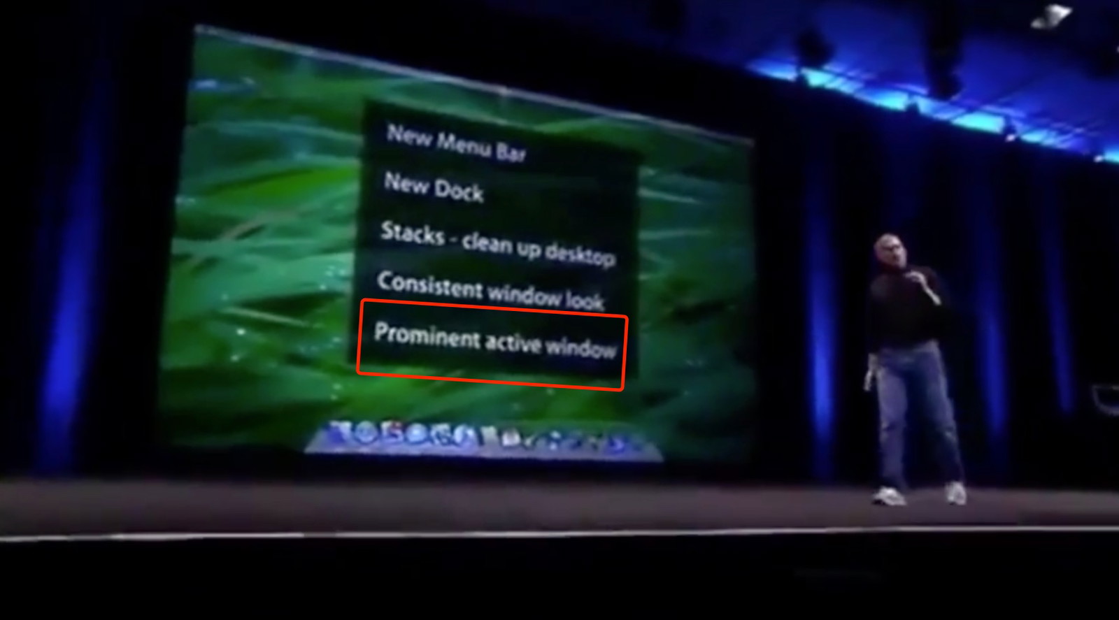


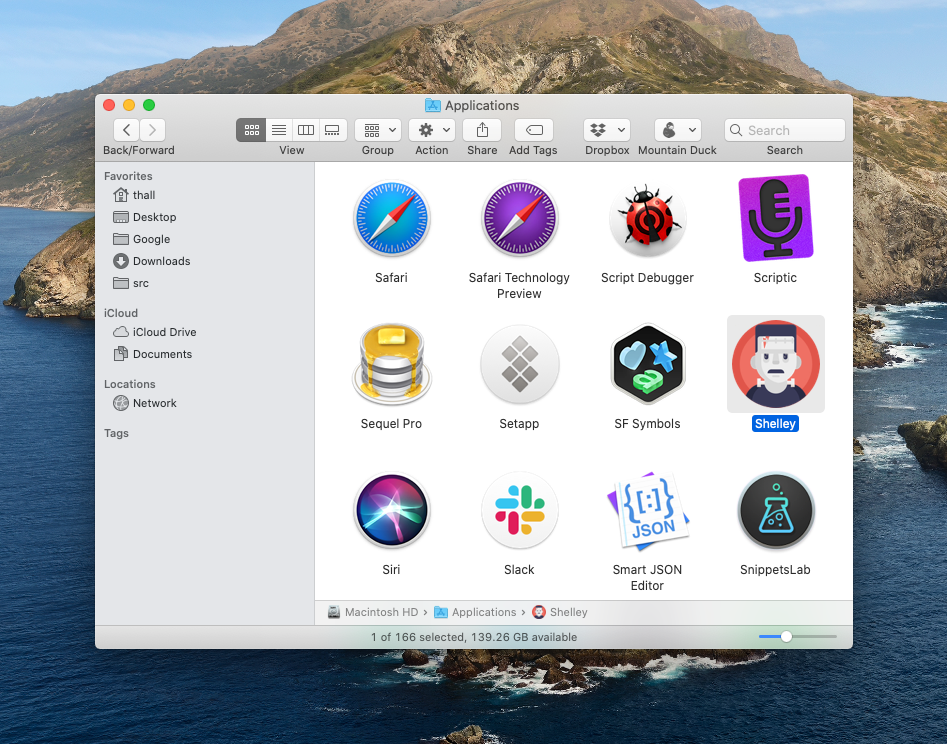
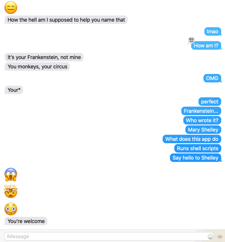
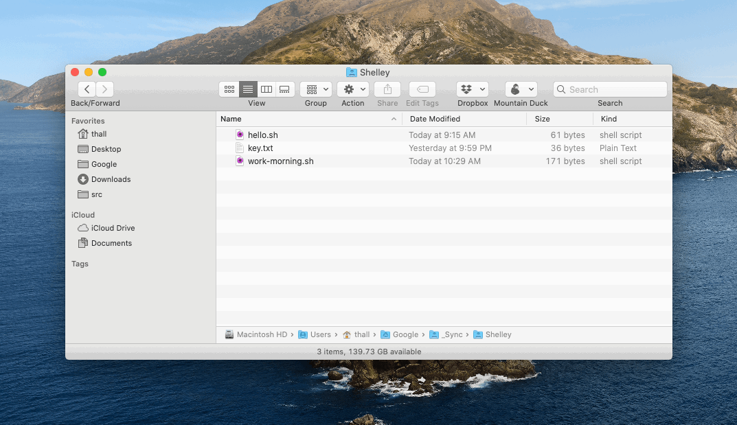
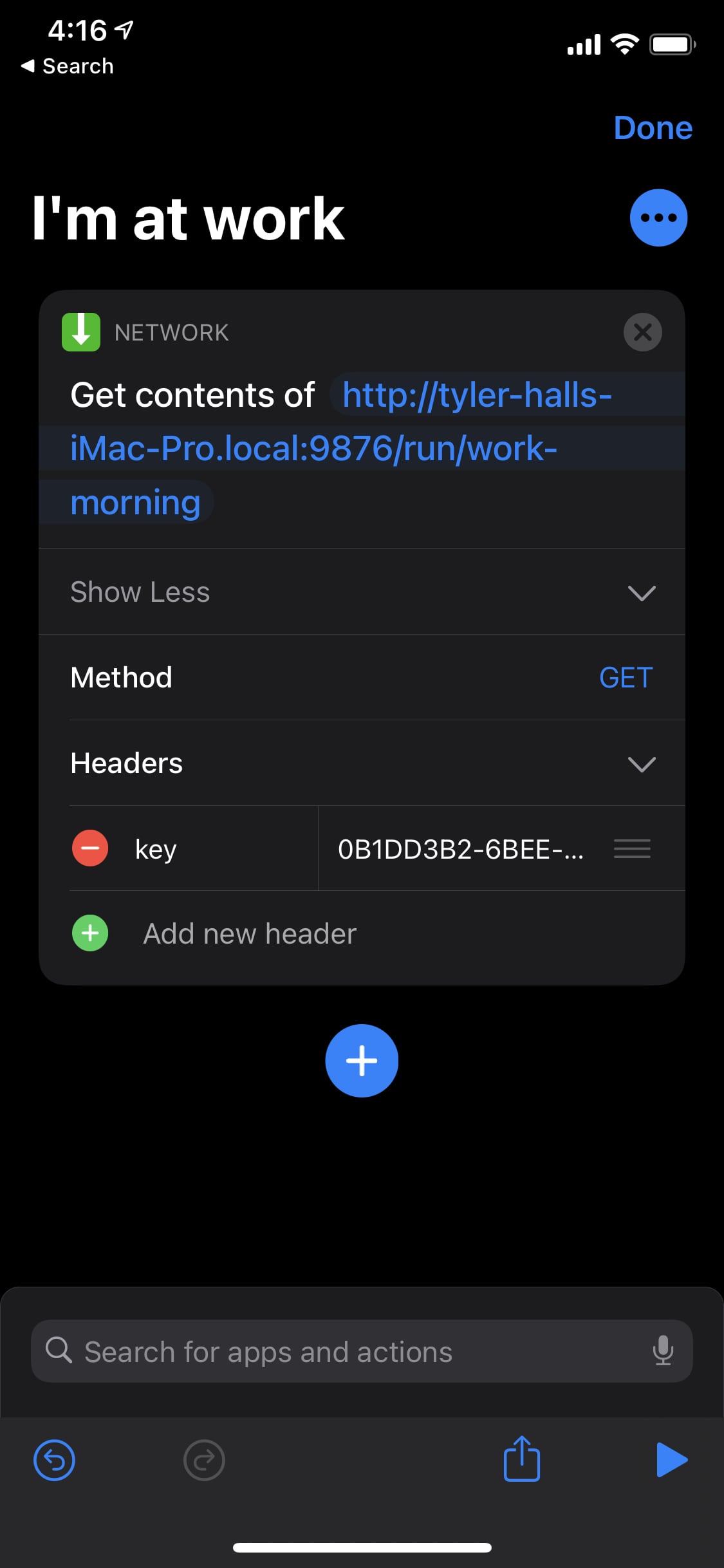
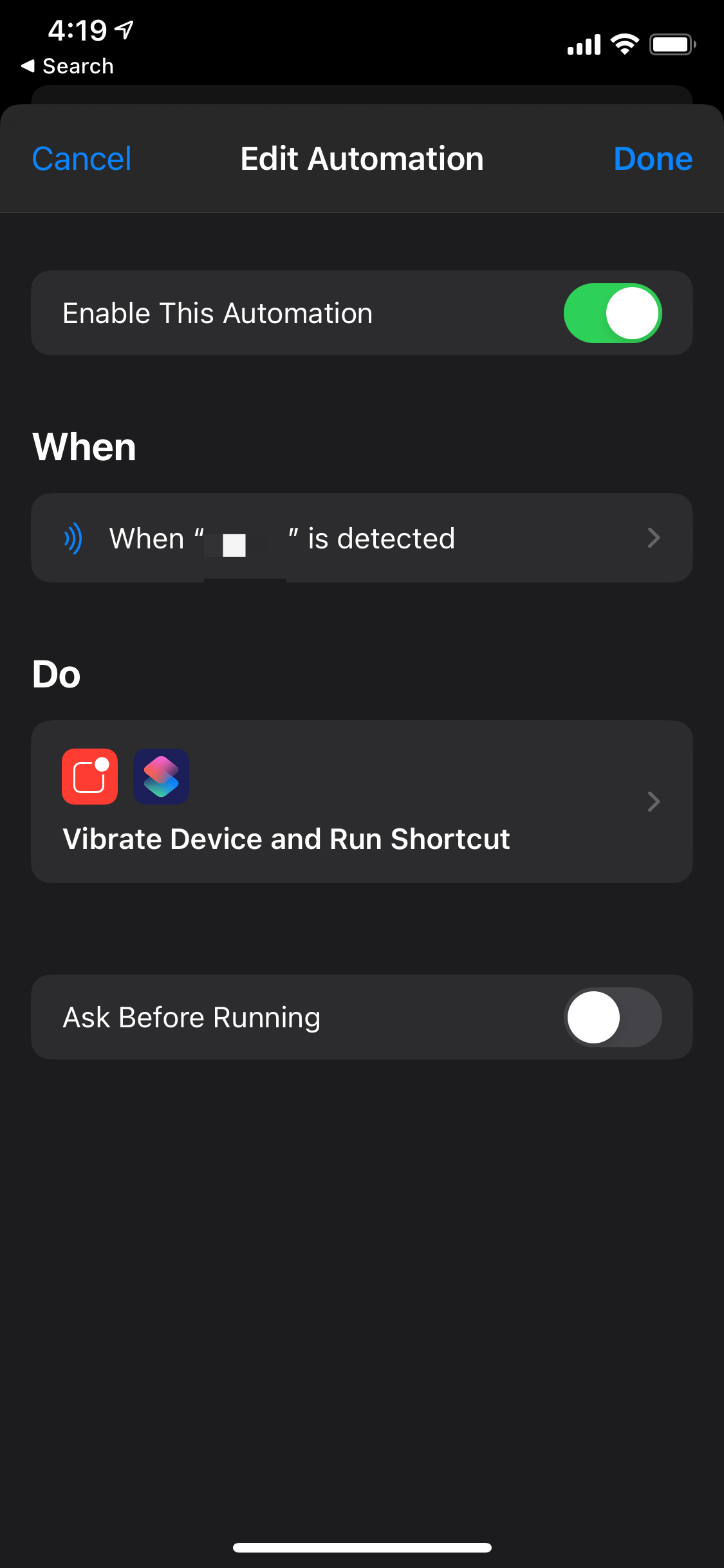


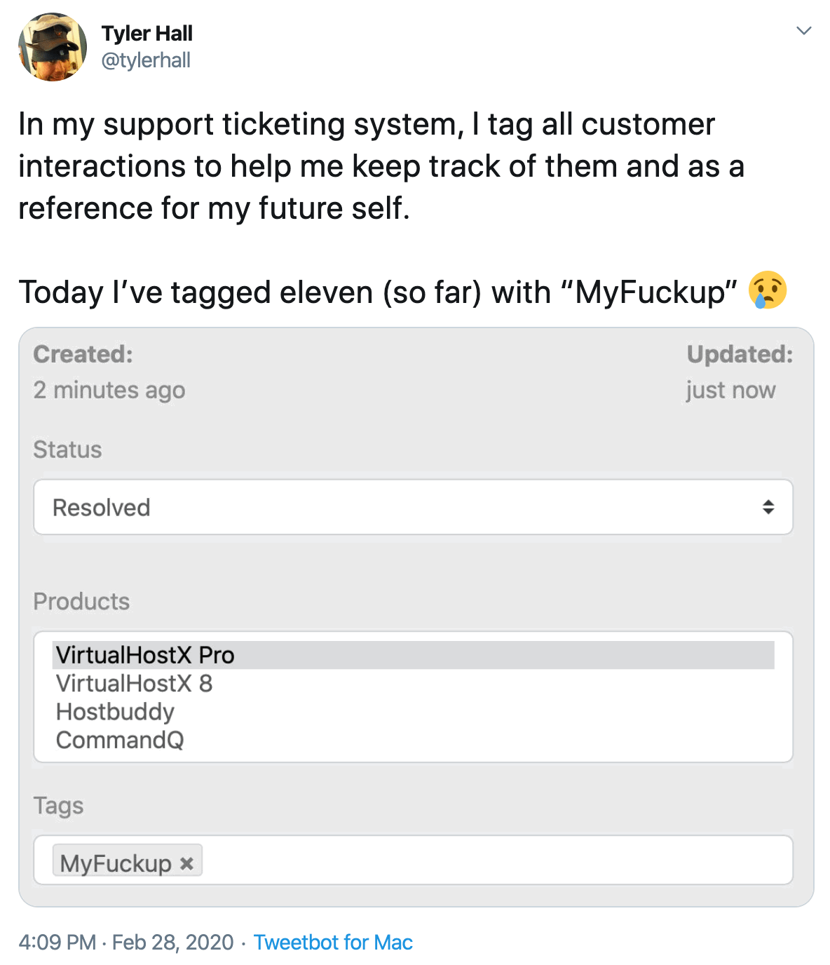


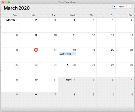
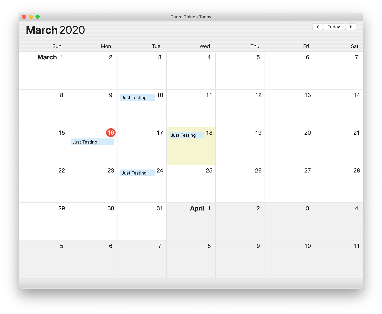
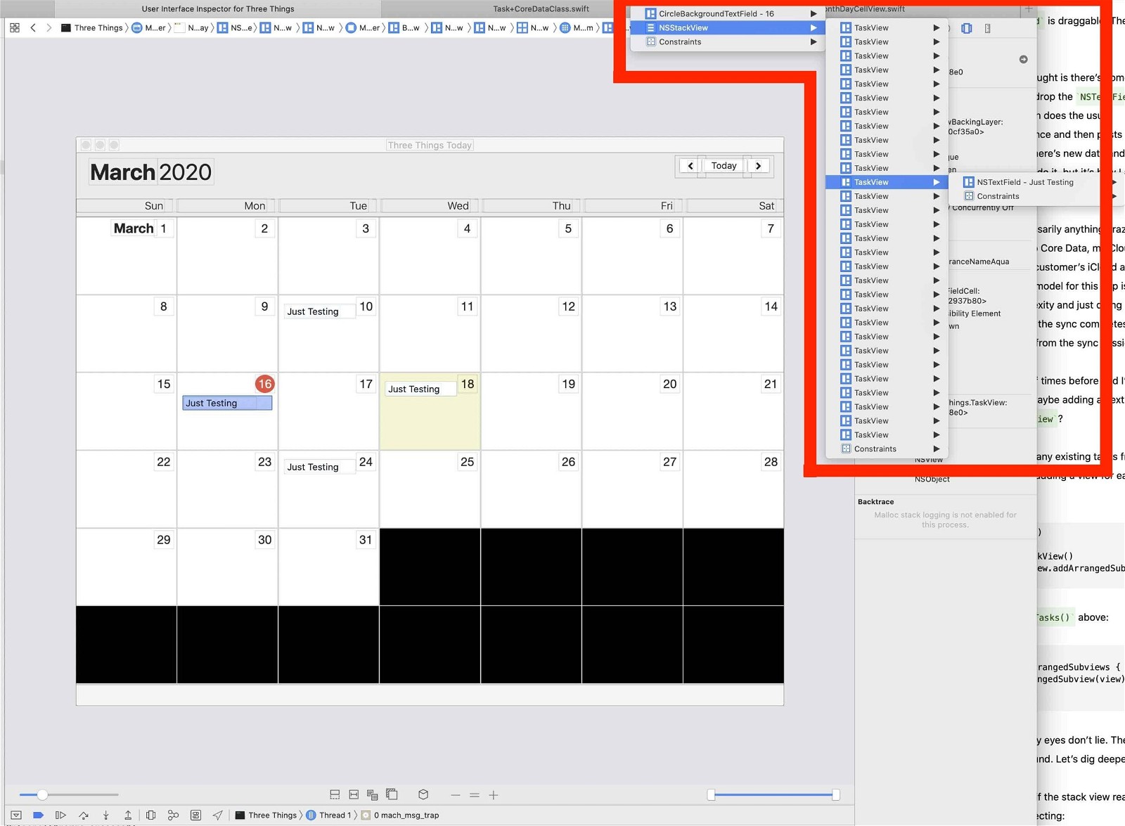
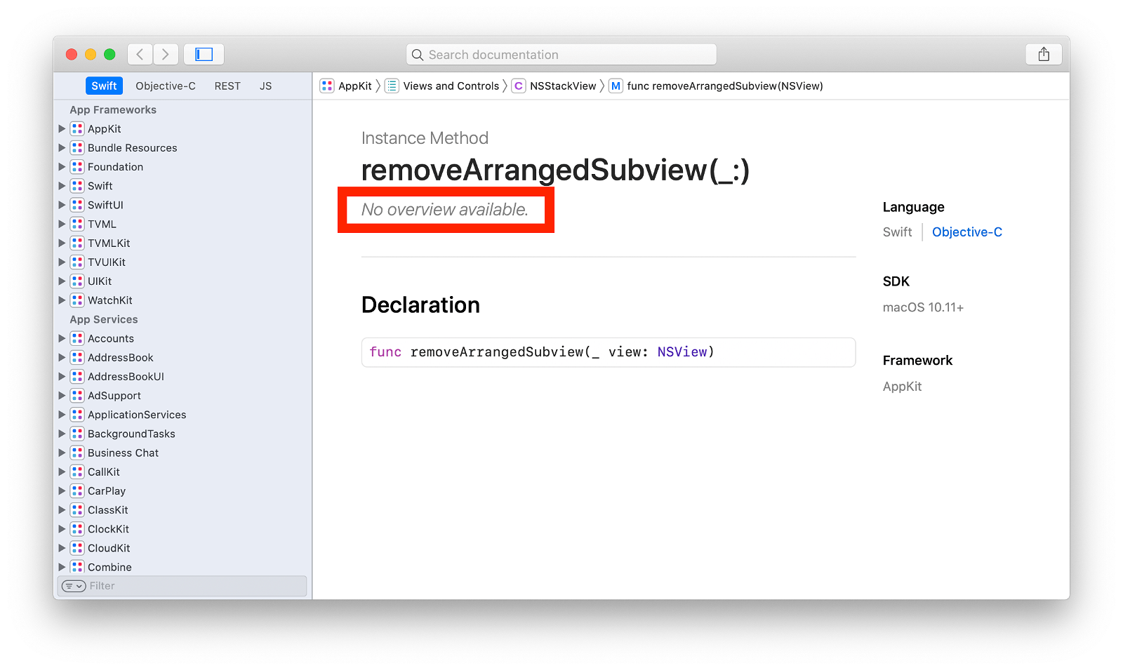
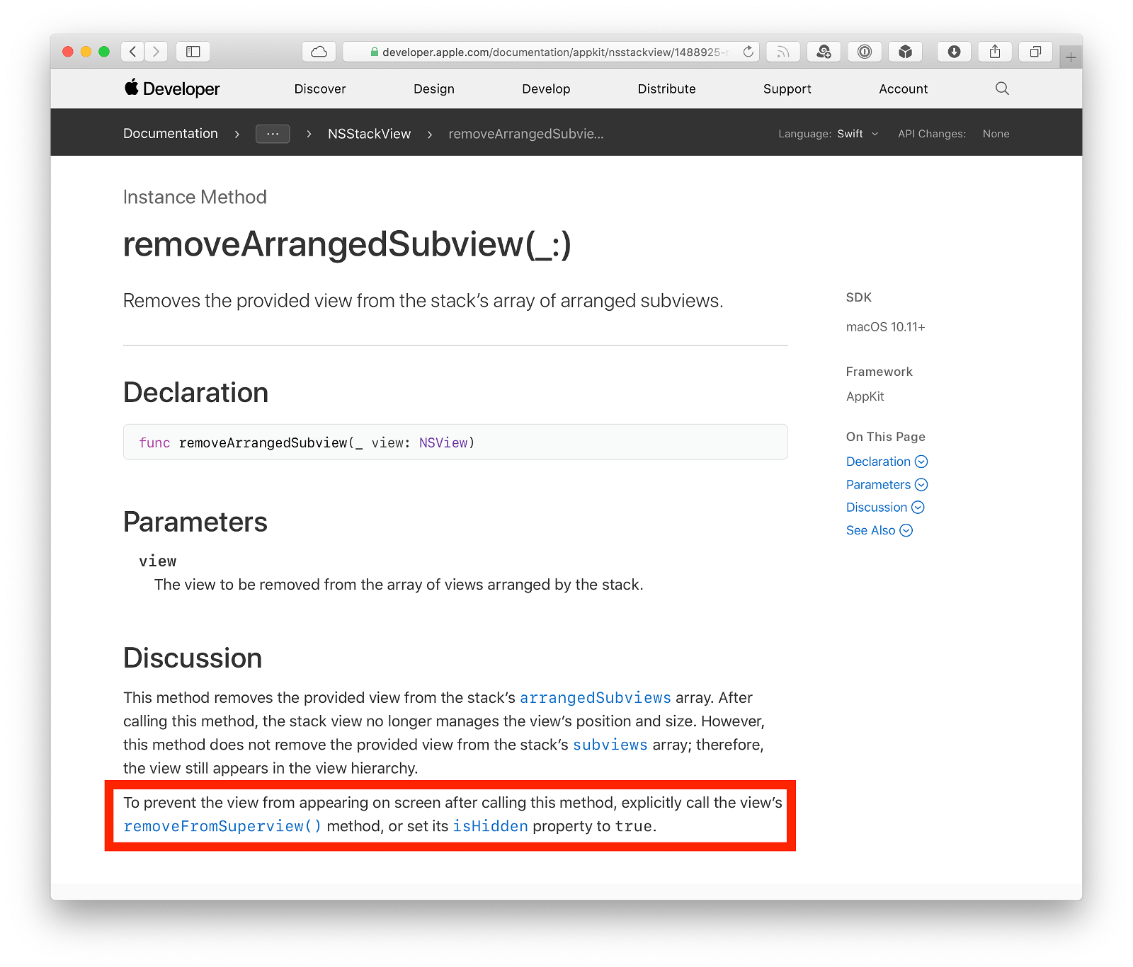
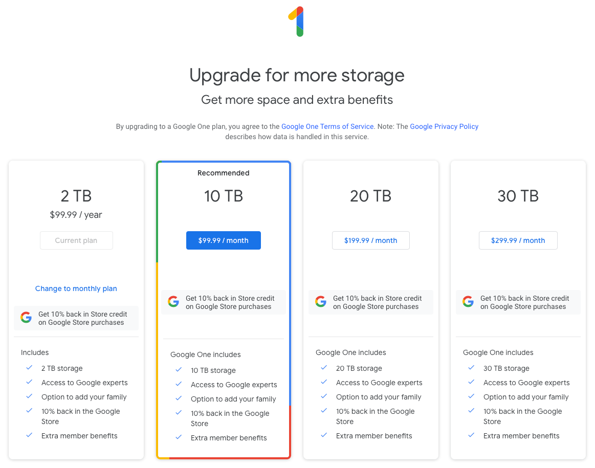

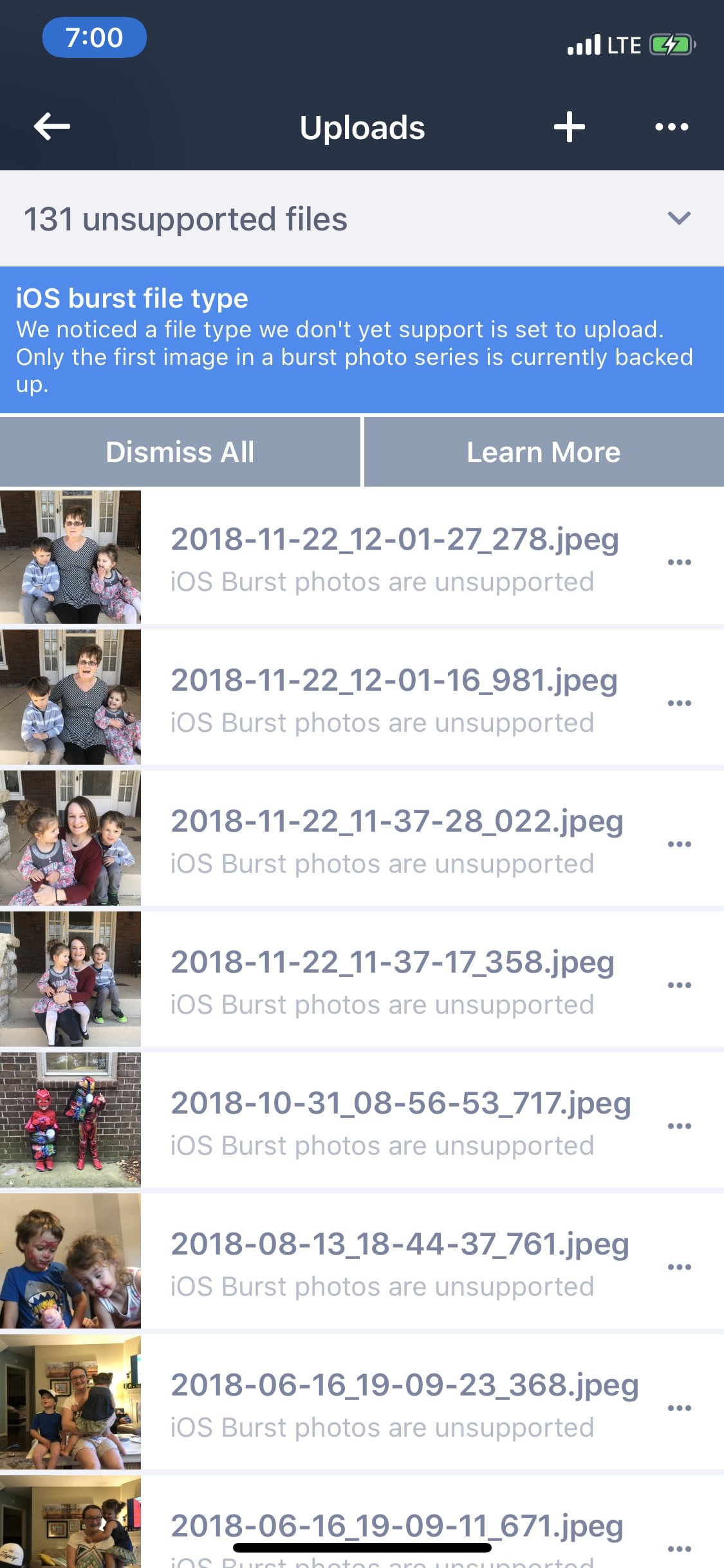
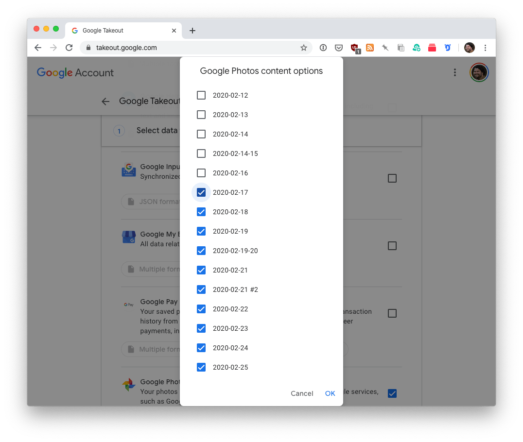
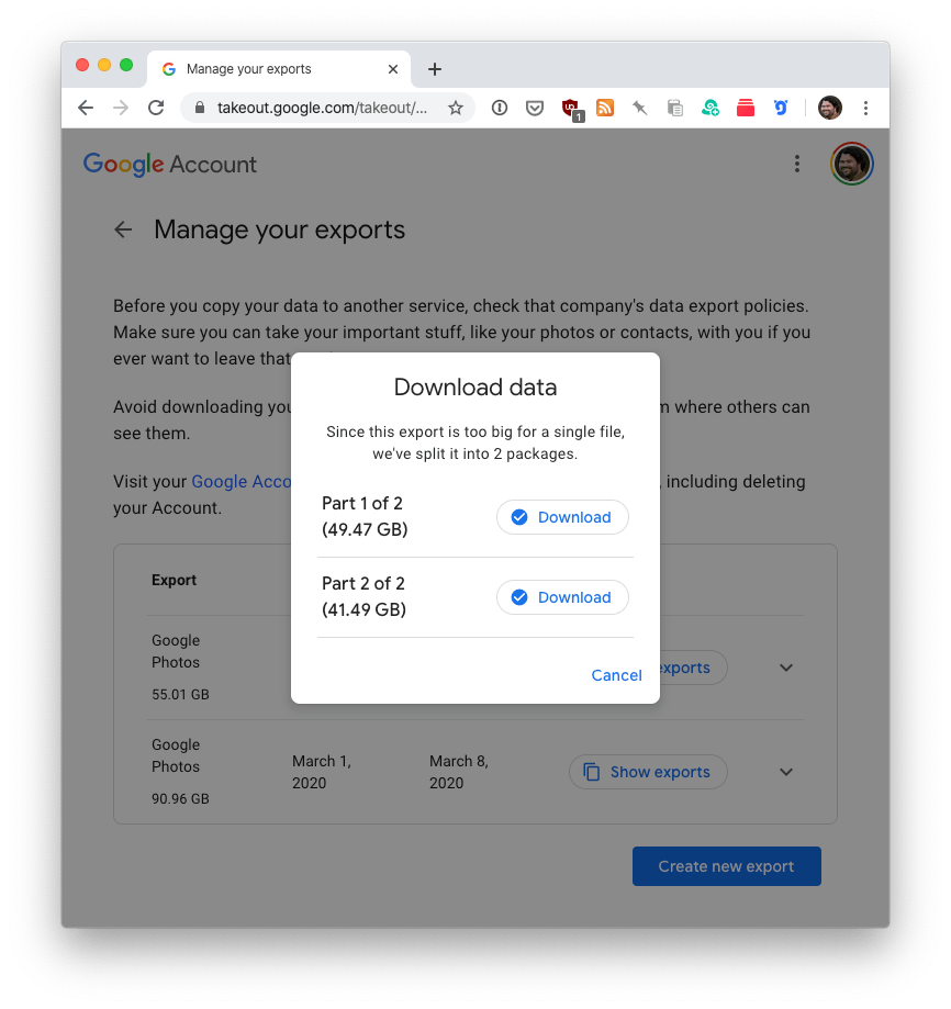
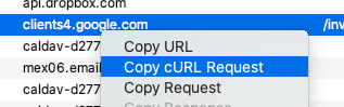
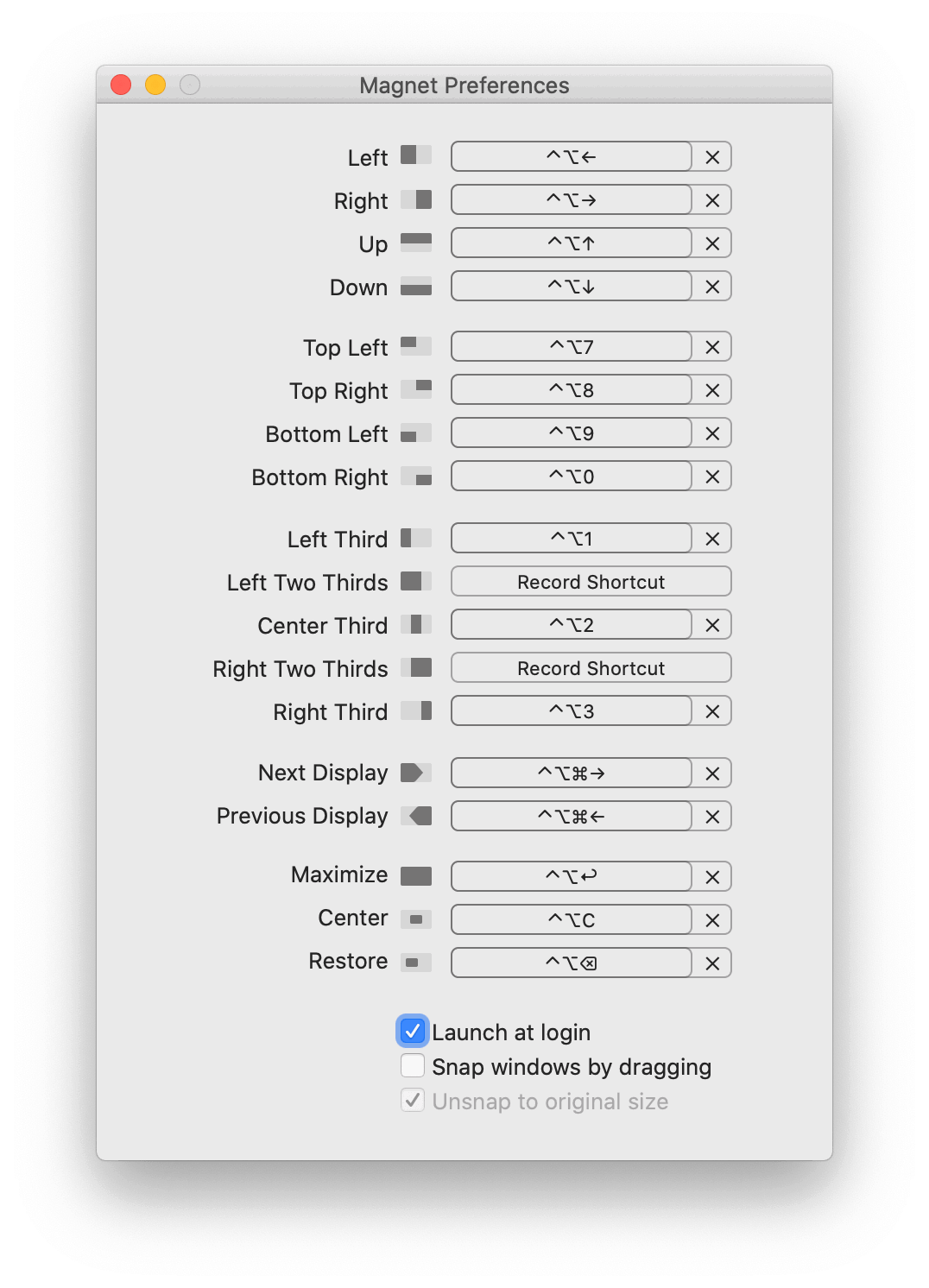


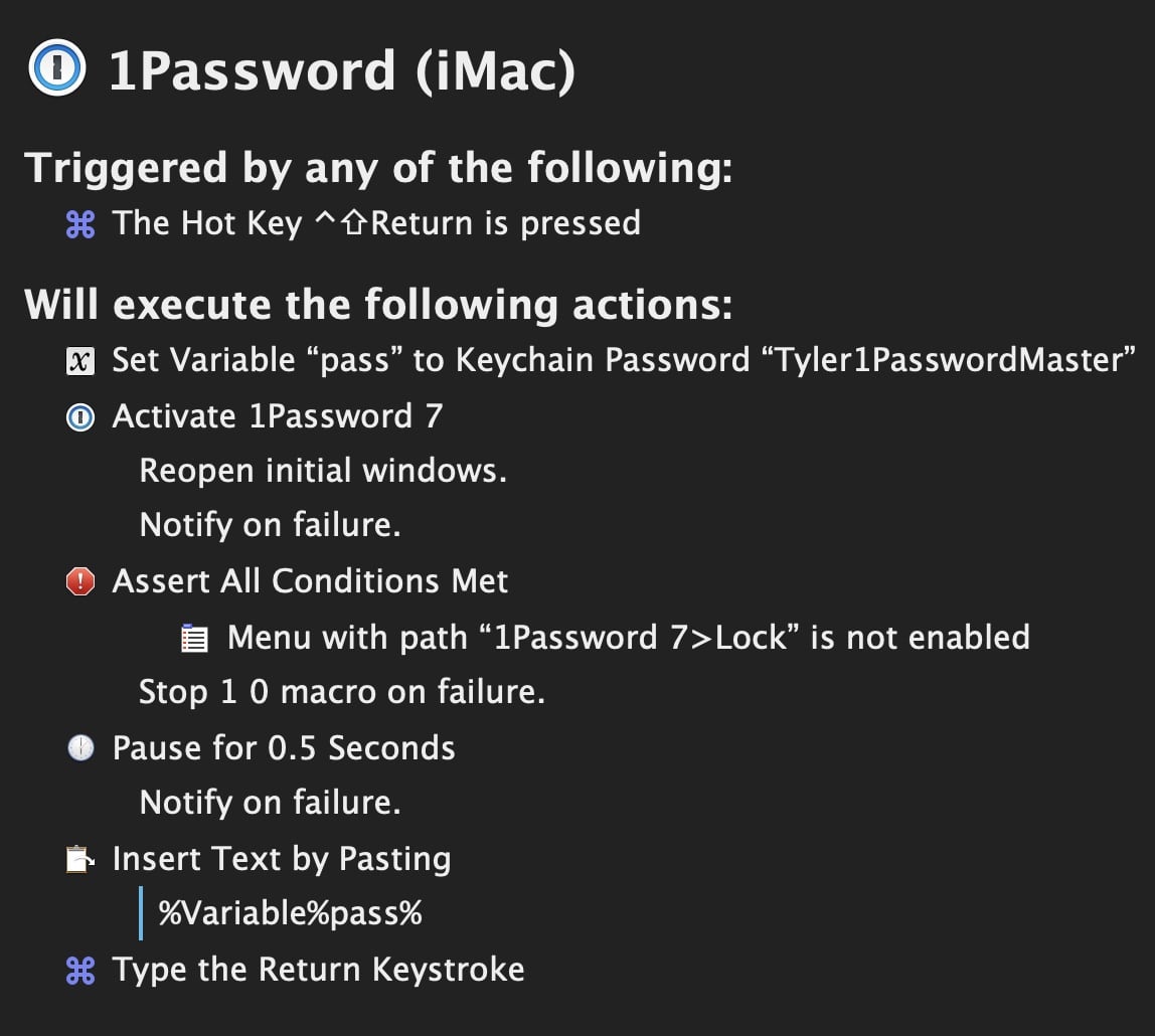
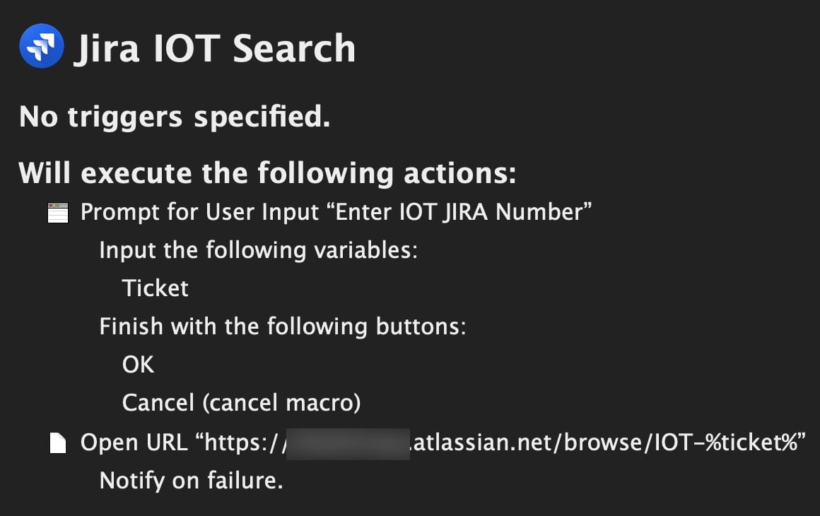