Roar Notifications
As much as it is a job and source of income, for me, building software is also a way to relax, a form of self-expression, play, and in the best moments – joy.
Today, I want to show off a project so far along the joy side of that spectrum that it blows past being silly and borders on pure ridiculousness.
Let’s reskin Notification Center on macOS.
And make it look like Winamp.
Last year, I wrote two posts titled 240 Invisible Pixels and Surtainly Not. On the surface, I complained about how difficult it is to interact with the Big Sur redesign of the menu bar and Notification Center alerts. I believe Apple has fallen victim to a design fad where they unintentionally make software harder to use in their quest to simplify the design visually.
As Michael Tsai recently put it
Making things look simple by hiding things doesn’t actually make them simple.
Affordances, color, contrast, delineation – hell, even discernible buttons – have fallen out of favor in Apple’s modern design language to a point where function often takes a backseat to form – especially on macOS.
But ignoring recent usability regressions in favor of clean-looking design, what kills me the most is how joy, personality, whimsy, fun, and goddam delight are lost in service to aesthetics.
Modern software, with Apple leading the charge, feels…sterile.
How much design and engineering effort has shifted from delighting users to finding new ways to interrupt their workflows with dark patterns leading to greater services revenue? It all feels gross.
Speaking of which, did you know you can save 3% on all your Apple purchases with Apple Card.1 Apply and use in minutes2
And so every time I have to tell Apple “Not Now” when “No” should be a choice, or when I have to guess where to hover the mouse to reveal what should be a call to action, I get frustrated.
I could let those things keep bothering me. Or I can tell the latest design trends to go fuck themselves and build something stupid and silly and fun and delightful.
Does everyone remember Growl? It was a fantastic 3rd-party app notification framework for OS X that Apple aped Notification Center from. (It’s OK. Some apps are meant to be Sherlocked.)
The best part about Growl was the plethora of built-in and community-contributed skins. It was so geeky and personal, and you could make app notifications look like anything.
Last month, a reader came up with a better way to grab two-factor authentication codes from Messages.app, I started thinking about what other information might be hanging around in the bowels of macOS – just waiting to be explored.
I eventually stumbled upon the SQLite database that holds app notifications. To my surprise, all the contents of your notifications are open and readable. And that’s when Growl came to mind. Could I build my own poor-mans Notification Center with different skins and themes?
It turns out, yes.
Could I layer on some extra features, too? Yep.
Say hello to Roar.
Roar is a little Mac app that watches your Notification Center database. When new ones arrive, it takes over and displays them with one of five ridiculous skins.
Bezel
The first is a straight-up reimplementation of Growl’s old in-your-face Bezel style.
Music Video
Growl’s Music Video display style was my absolute favorite for the longest time.
Macintosh
This style displays a classic Macintosh window – complete with the best freeware version of Chicago I was able to find with a quick Google search.
iTunes Widget
When I showed Mario Guzman what I was up to with this project, his immediate reaction was to offer a skin based on his pixel-perfect Music Widget.
Winamp
Finally, if you grew up in the 90s, how can you say “no” to an animated Winamp skin?
But wait, there’s more
My original complaint in 240 Invisible Pixels was how difficult it is to interact with notifications on recent versions of macOS, given their hidden buttons and tiny click targets. What if we take the mouse pointer out of the equation and make common notification actions keyboard-driven?
When I need to interact with a notification, I typically do one of four things:
- Open the associated app
- Copy a two-factor auth code
- Open a URL in the notification
- Copy the notification’s contents
Roar lets you do all of these things with a global keyboard shortcut. You can press the hotkey to reveal a menu with four choices when a notification arrives.
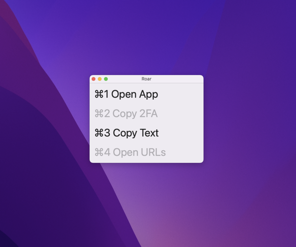
Press ⌘1 – 4 to select an action (or Escape to dismiss) and run it against the most recent notification.
⌘1 will activate the app associated with the notification. Basically, the same behavior as clicking a notification.
⌘2 will copy the first two-factor auth code it can find. In the screenshot above, that action is gray to indicate that no code was found in advance.
⌘3 copies the contents of the notification to your clipboard.
⌘4 Will open any URLs in the notification in your default browser.
Don’t take this seriously
Everything shown above works. The code is on GitHub, and I’ve made a notarized build available if you’d like to try Roar.
That said, because the app relies on scraping your notifications from Apple’s database, Roar is at the mercy of how often the system saves notifications to disk. In my testing, that delay varies. Sometimes Roar will appear immediately after the original notification. Other times it may be ten seconds.
Is Roar meant to be an actual Notification Center replacement? No. Of course not. This all just started as a thought experiment and turned into a fun diversion over a holiday break from work.