Receipts
Ten months ago, I drafted a post about how incredible the Apple ecosystem is when all the pieces fit together. It was a month into the pandemic, and I found myself walking through a real-life Apple commercial in the grocery store.
It was a perfect experience. Shopping in Publix with a mask on, viewing my grocery list on my watch (my phone in the car), streaming Apple Music to my AirPods, and occasionally saying, “Hey, Siri. Call my wife” (through a mask!) to hands-free ask her a question.
It even ended with (I’m not joking) a screenshot of my son audio-FaceTiming me from his iPad. It was the first time he ever called me on his own, and I was shocked to see his name appear as the caller ID on my watch when my headphones started ringing.
I answered, “What are you doing, Aaron?” and he straight-up said, “I just wanted to say I love you, Dad,” and hung up.
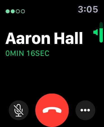
So, there I am. About to pay for a cart full of groceries, contact-less with my Apple Watch, masked up at the start of a global pandemic, listening to my son tell me he loves me over the phone for the first time, having this truly magical and emotional real-life moment – all thanks to a brilliant interplay of years and years of amazing work done by Apple engineers on both the hardware and software sides.
I was a bit stunned when I got back to my car, and it sort of hit me just how well the entire end-to-end experience worked. That, now, right when everyone was freaking out about this new virus, I was able to buy groceries and stay in contact with my family via Siri while wearing a mask in a noisy store and then pay hands-free. And my son took that moment to call me for the first time? As a lifelong adherent of the positive influence and power that well made software and hardware can have over our lives, I was taken aback.
Here’s a screenshot of an early draft of that blog post and my raw notes last April. I titled it “A Commercial Apple Needs to Film.”
(Most of the screenshot below are my raw thoughts dictated into Drafts using Siri over CarPlay on the way back from the grocery store. Doing that alone could be its own commercial.)
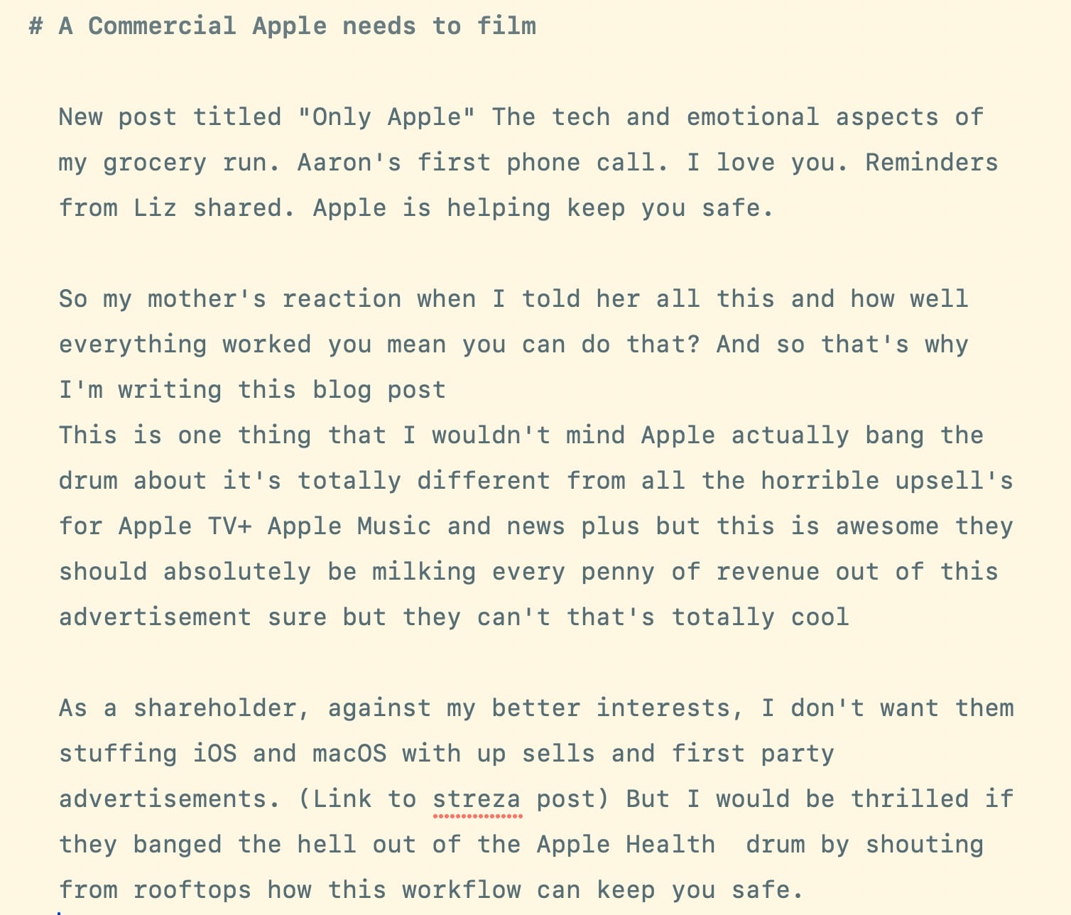
I even had the ending of my post ready to go. It was going to be something like:
When the whole system works, it’s not indistinguishable from magic. But it is magical.
I never published that post because I wanted to get it right.
I was scared to get it wrong, and when things scare me, I procrastinate. I wanted it to capture how I felt as a father hearing my son say “I love you” while describing how amazing technology can be when done right – especially when a company like Apple owns the entire stack gets it right.
But now, as we approach twelve months since so much in our lives were upended, I wanted to get that post out there, partly because of the timing. But also as a sincere thank-you to the thousands of people behind-the-scenes who I’m sure work themselves to death to make an experience like mine possible. Because, let’s be honest, I bitch and moan a lot online about Apple – on Twitter and this blog.
Feel free to roll your eyes if say I complain “because I care,” – but it’s true. But it’s also because this is the industry I’ve spent my life involved in and know best. It’s my circle of friends and colleagues. It dictates my ability to earn a living. And technology is a driving force in all our lives now. And, for better or worse, Apple is one of the companies that decides how that part of our lives work.
I could rant and rave about US politics (which I do) to try and effect change, but my dumb blog and Twitter feed will never make a difference there. Instead, I throw money towards causes I support and trust the smart people running those organizations will spend it wisely. But when it comes to Apple, I’m shocked and grateful when I see people in this industry I look up to and admire share the things I write with their larger audiences, who I know include folks in Cupertino.
That’s why I complain. (Some stuff won’t fit into a Radar.)
And so, while I was planning on finishing my thank-you post to Apple this weekend, that’s not going to happen.
Instead, let’s talk about receipts.
I’ve been mostly disconnected from tech news this week for various reasons, but I was finally playing catch-up last night. And I was thrilled to see that Kosta’s war on App Store scams was finally starting to gain traction. I even quipped
It’s wild to see tech people finally clueing into how bad the App Store is run. It’s almost like the incentives have been misaligned for over a decade.
(That was towards the tech press and other influencers. Not Kosta).
But, whatever. I’ve been bitching about the insanity of the App Store and everything around it for years. Smart people like Michael Tsai, David Barnard, and Jeff Johnson have done much better jobs cataloging the App Store’s failings. So after posting my snarky tweet last night, I was ready to just go to bed, wake up, and work on writing something positive for a change.
Then an unexpected charge hit my debit card.

Apple.com/Bill $43.89
I know that amount – it’s $39.99 plus tax. And while I spend money with Apple all the damn time, I wasn’t expecting to see a charge for that amount.
It’s always difficult to tell when Apple charges you for something and what it was for. Because unlike every other online retailer, they queue up email receipts for an indeterminate amount of time. When you buy something on Amazon (or almost anywhere else), there’s a receipt in your email immediately.
When you buy something from Apple – especially the App Store – you’ll get a receipt.
Sometime.
It may be a few hours later. A day later. Later that week?
From what I can tell, they group purchases into batches and then send a single combined receipt for those items. Maybe to save transaction fees on their end?
But to the unknown charge above, I had no idea. But I knew I would eventually see an email about it if I paid attention.
This morning:
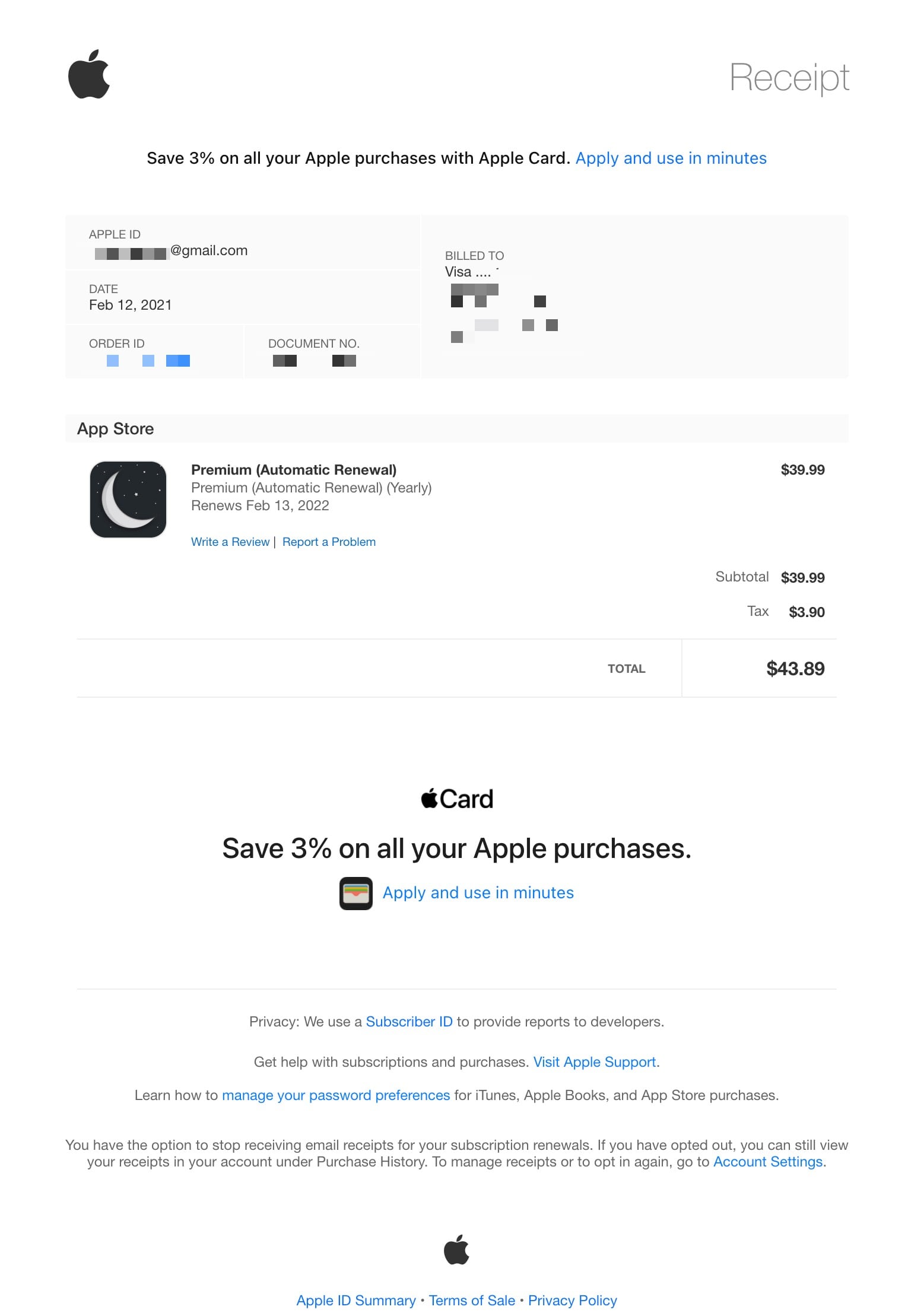
Huh. I have no idea what that receipt is for.
And that’s what baffles me the most about App Store receipts. On November 4, 2020 I tweeted
How can the App Store, after all this time, still not list the app’s name when a subscription renews? Every receipt I get is just a reminder that I purchased ten different apps all named “Yearly.” Does it help retention if we don’t know what we just paid for?
with this screenshot.
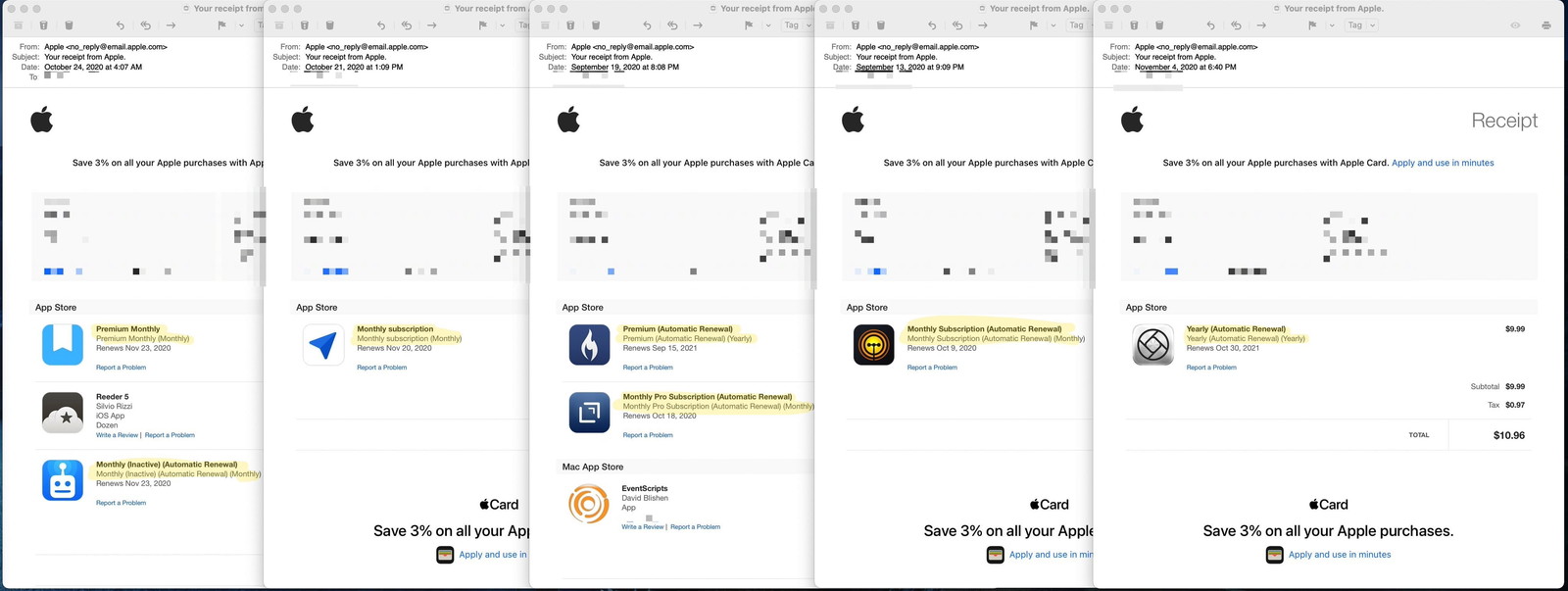
If you don’t know what each app icon is, can you tell what those automatic renewals are for? Here are the accompanying product names on the receipt:
- Premium Monthly / Premium Monthly (Monthly)
- Monthly (Inactive) (Automatic Renewal) / Monthly (Inactive) (Automatic Renewal) (Monthly)
- Monthly Subscription / Monthly Subscription (Monthly)
- Premium (Automatic Renewal) / Premium (Automatic Renewal) (Yearly)
- Monthly Pro Subscription (Automatic Renewal) / Monthly Pro Subscription (Automatic Renewal) (Monthly)
- Monthly Subscription (Automatic Renewal) / Monthly Subscription (Automatic Renewal) (Monthly)
- Yearly (Automatic Renewal) / Yearly (Automatic Renewal) (Yearly)
Going back to my trip to the grocery store, imagine if I paid for $150 worth of groceries, and Publix gave me a receipt that read
- Food (Food)
- Beverage (Beverage)
- Household Supplies (Household Supplies)
- Frozen Stuff (Frozen Stuff)
And then, next to each item were the round-rect logos of Nabisco, Conagra, and Johnson & Johnson.
Helpful, right?
After you’ve handed over your money, that’s the experience Apple rewards its customers with at their “safe and trusted” storefront, which they describe as an “innovative destination focused on bringing you amazing experiences.”
App Store receipts are further complicated because of Family Sharing, which leads back to my mystery purchase.
I have no idea what that app icon is for. But I do know that since I’m the owner of our Apple family account, most purchases go to my debit card that the account shares. So it was probably someone else’s purchase.
Sure enough, the Apple ID in 12px font is for my 68-year-old mother. It was her purchase!
But I still have no idea what the app is. And I’m very suspicious because there’s basically zero chance she would ever willingly spend $39.99 on an app. Much less one that automatically renews.
Sidebar: Why do I share a family iCloud account with my mom? Because over a decade later, Apple is still full of miserly, penny-pinching tightwads that punitively cap the free storage tier at 5GB. Two years ago, Gruber wrote
5 GB seems ridiculous when the company is selling $999 iPhones with 64 GB of storage.
Think about it. Everyone should back up their phones. The best way to back up your iPhone — and the way Apple wants you to do it — is through iCloud. But 5 GB isn’t enough for most people, so they get these warning messages, which sound scary and which they don’t understand.
And he’s exactly right. Trying to convince my mother to pay $0.99 each month to back up the irreplaceable photos of her grandchildren on her phone is a non-starter. Not going to happen. This is exactly why I sure as hell know she didn’t mean to buy whatever that $39.99 app subscription was (that we’ll be getting back to in a minute). And it’s why I added her to our iCloud plan so her phone will get backed up even though I would very much prefer her account not be tied to my credit card.
Let’s look closer at that app receipt. How can we figure out what the charge was for?
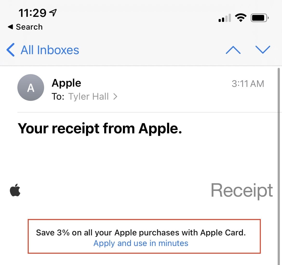
The first call to action is encouraging you to sign up for a credit card to pay for all of your unknown purchases.
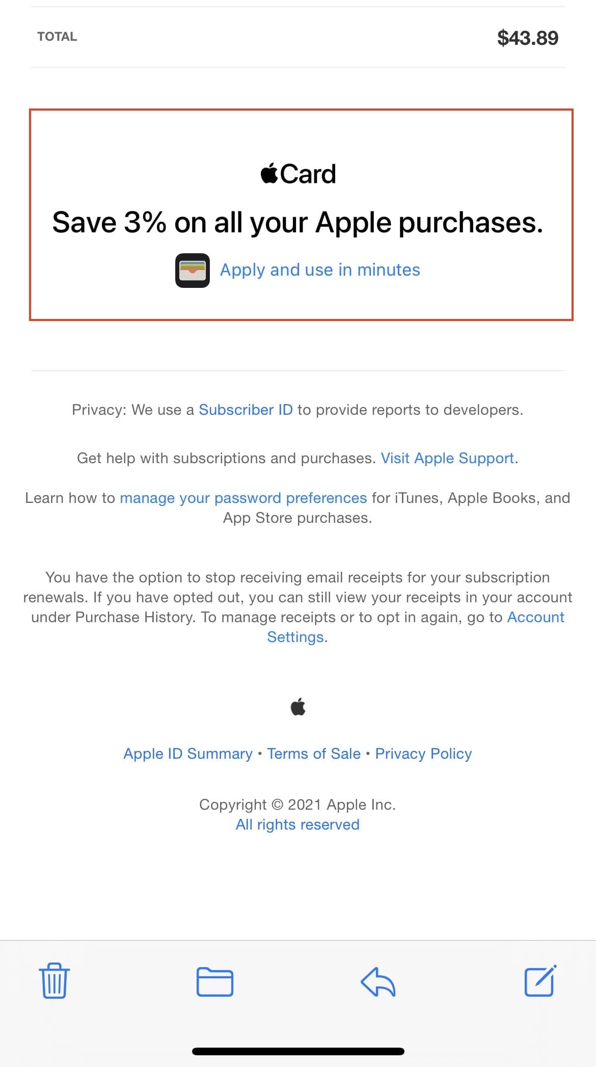
Also, the last link in the email does the same thing.
But let’s focus on the middle part that isn’t trying to profit off of consumer debt.
I’ll annotate what each link does:
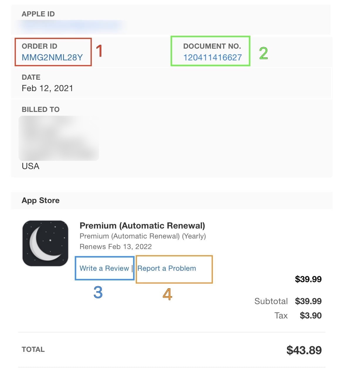
Let’s start by getting out of the way that tapping on the app icon or the item name(?) does nothing.
1. The Order ID link doesn’t open anything in Mail.app on iOS. Tapping does nothing. I can’t explain it. But if I click the link on my Mac, it takes me to an Apple FAQ that reads “See your purchase history for the App Store, iTunes Store, and more.”
Awesome! Here it is:
See a list of your purchases from the App Store, iTunes Store, Apple Books, and the Apple TV app.

Let’s approach this like my mother and click “Show Purchase History.”
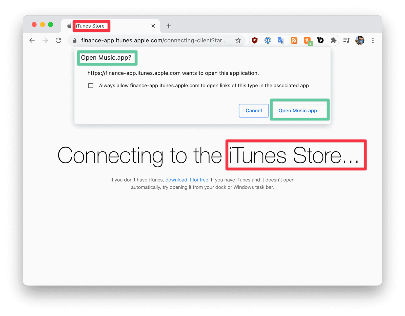
First off, I’m using Chrome (shame on me), and this is all very disorienting.
What does the “iTunes Store” have to do with the App Store? Why is my browser asking if I want to “Open Music.app?” to find out about an app purchase?
Sidebar: I tried this in Safari to see how the confusing permission prompt behaved with Apple’s first-party browser.
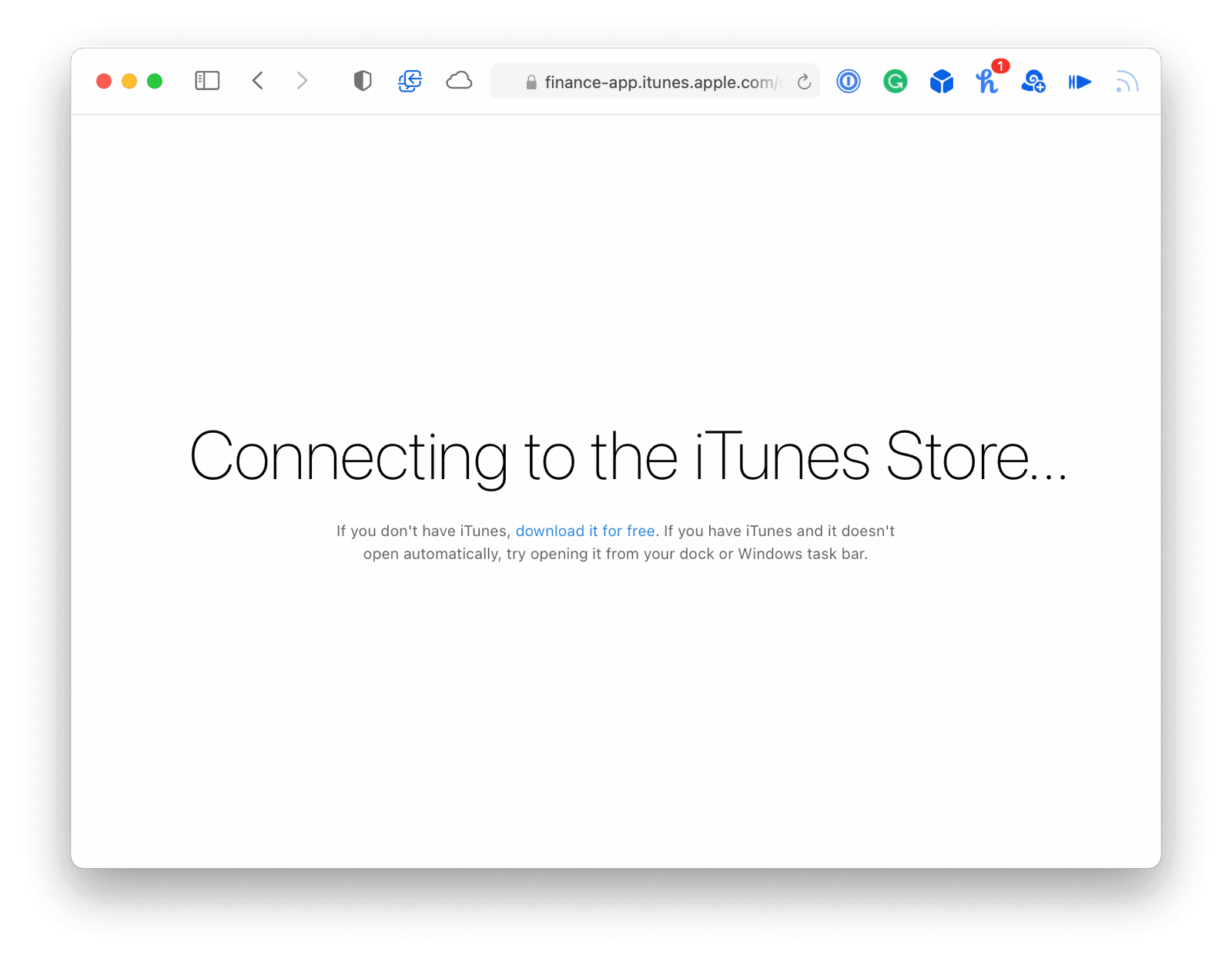
It never prompted me for any decision or opened another app. But that could very likely just be my Safari ad-blocker or something.
Let’s continue to Music.app for some reason.
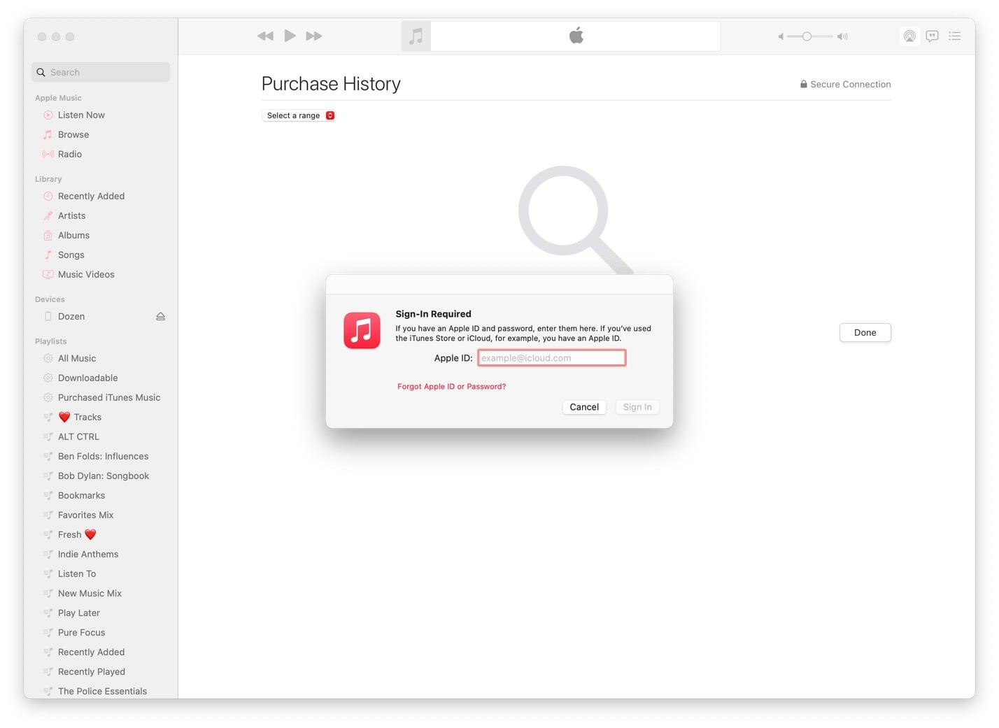
Ok. I know I’m already signed into Music.app because I was listening to Apple Music this morning. But Apple wants me to sign in to view a receipt. My Apple ID (which Apple obviously knows) is not pre-filled, which is a problem because let’s all acknowledge that no one over fifty knows what their Apple ID is.
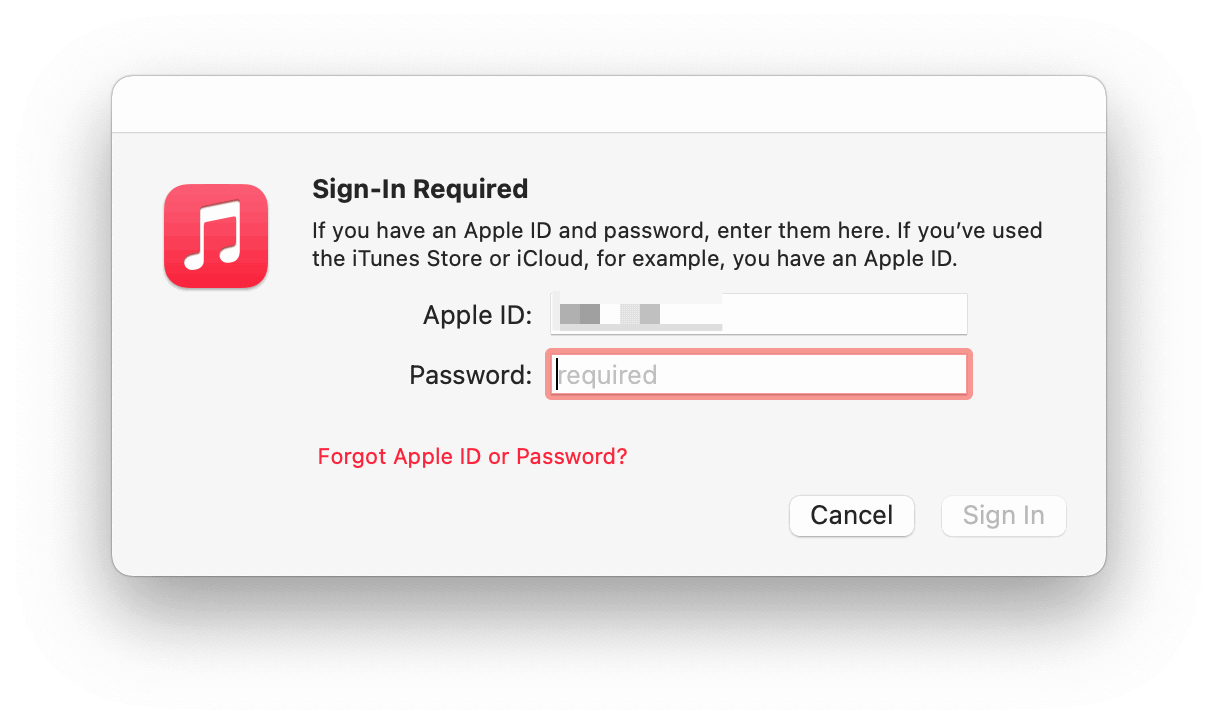
(I will never understand the UX pattern of hiding the password field until you enter your username.)
At this point, can you imagine being an older adult and trying to figure out if you need to type in the password you use to sign in to your Mac, or your Apple ID, or the password for your email address?
After signing in, you do get to see your App Store purchase history inside Music.app.
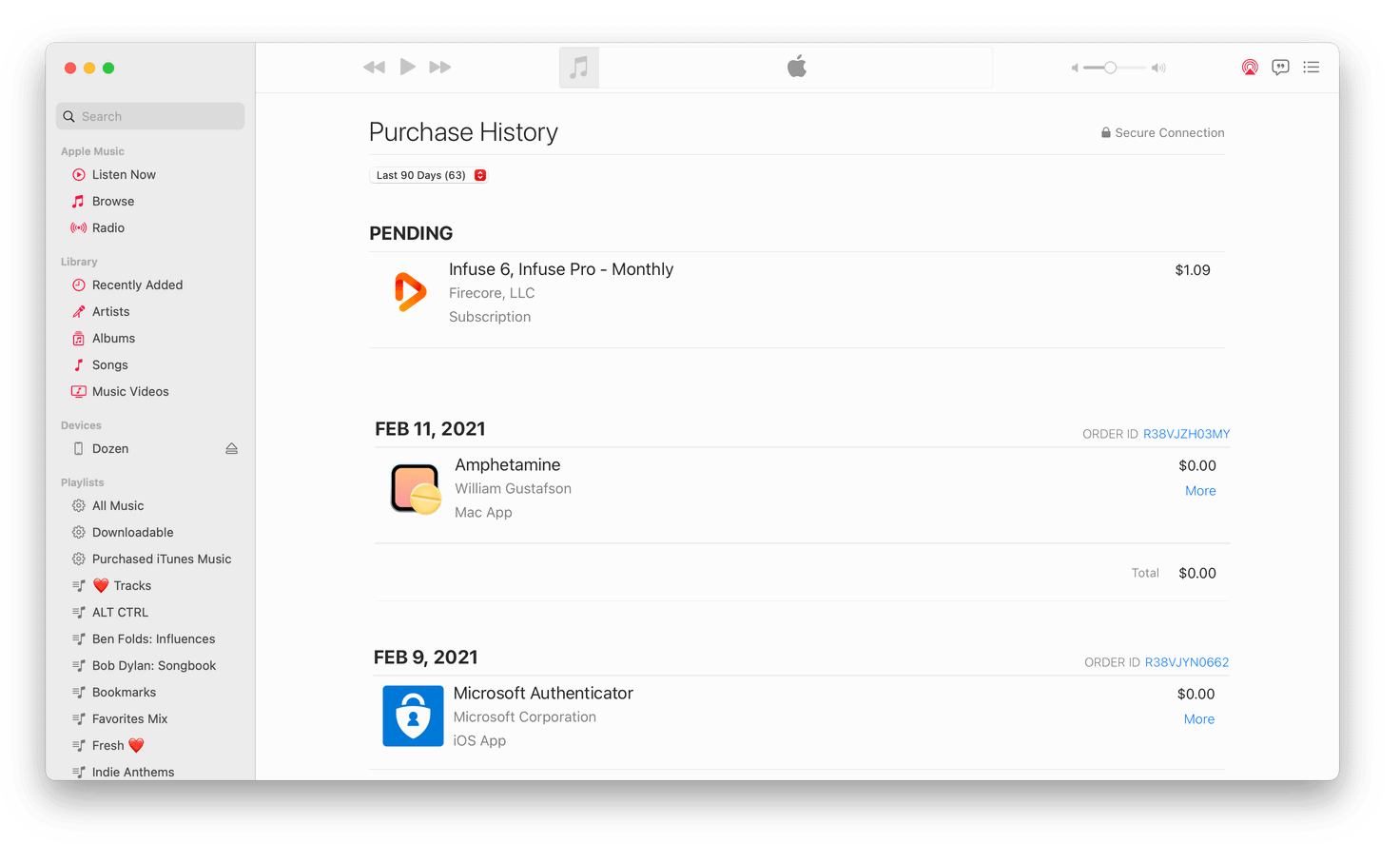
But there’s no way to search for your purchases. And even if you could, what would you search for? Apple’s receipt didn’t give you any meaningful information. Your only option is to scroll the list and see if you recognize the receipt’s app icon.
In my case, that icon (and purchase) isn’t there because, as I said above, this purchase was made by a member of my family.
Back to the receipt.

2. Let’s tap the “DOCUMENT NO.” link. (Now, if you’re a developer like me, you know exactly what comes next and why.)
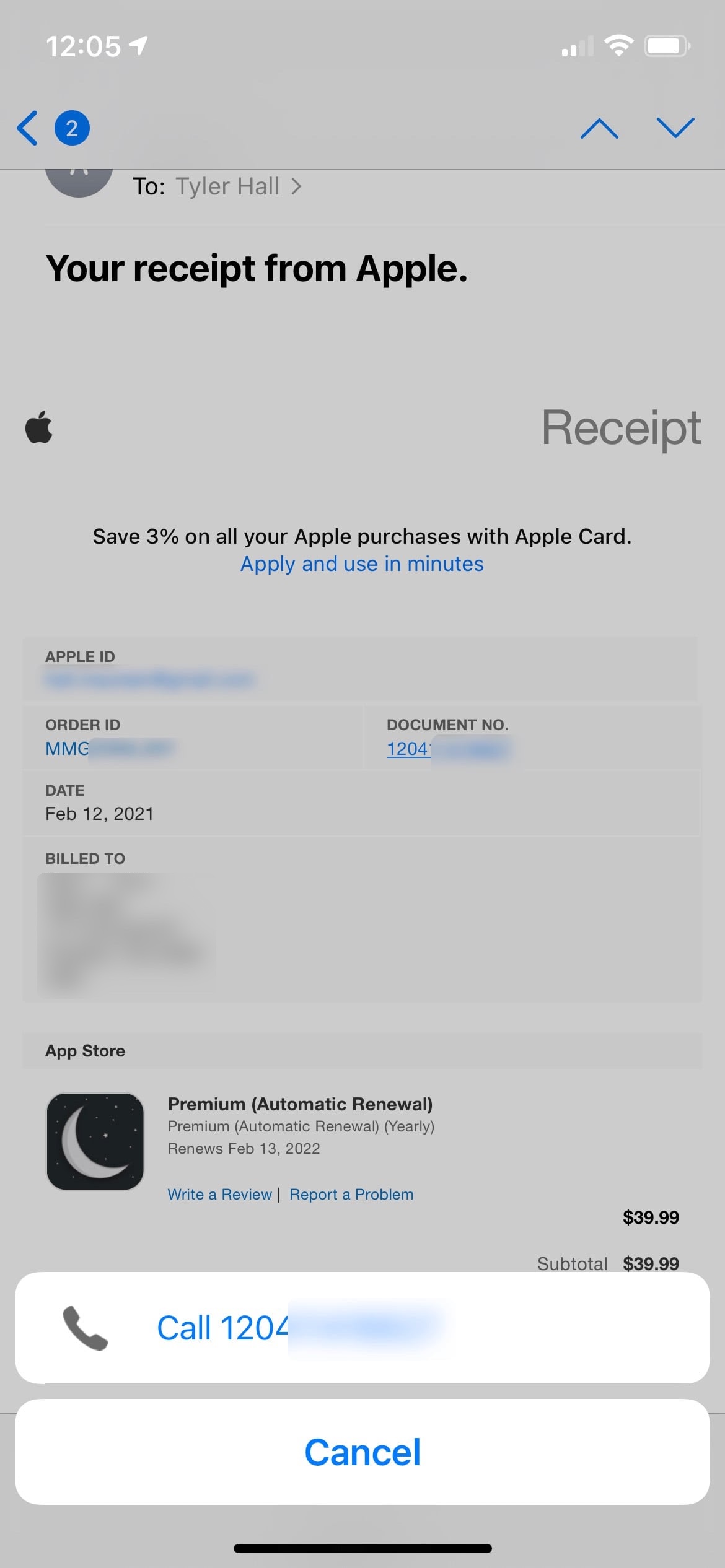
Mail.app thinks it’s a phone number. Pretending to be an aging parent, let’s assume that the phone number is for App Store customer support and call it. Sadly, it doesn’t work, and Verizon tells me that number cannot be completed as dialed. I guess the App Store is closed for the weekend?
3. Ok, this is clever. Maybe if we tap the third link to write a review for this unknown app, we can see the app!
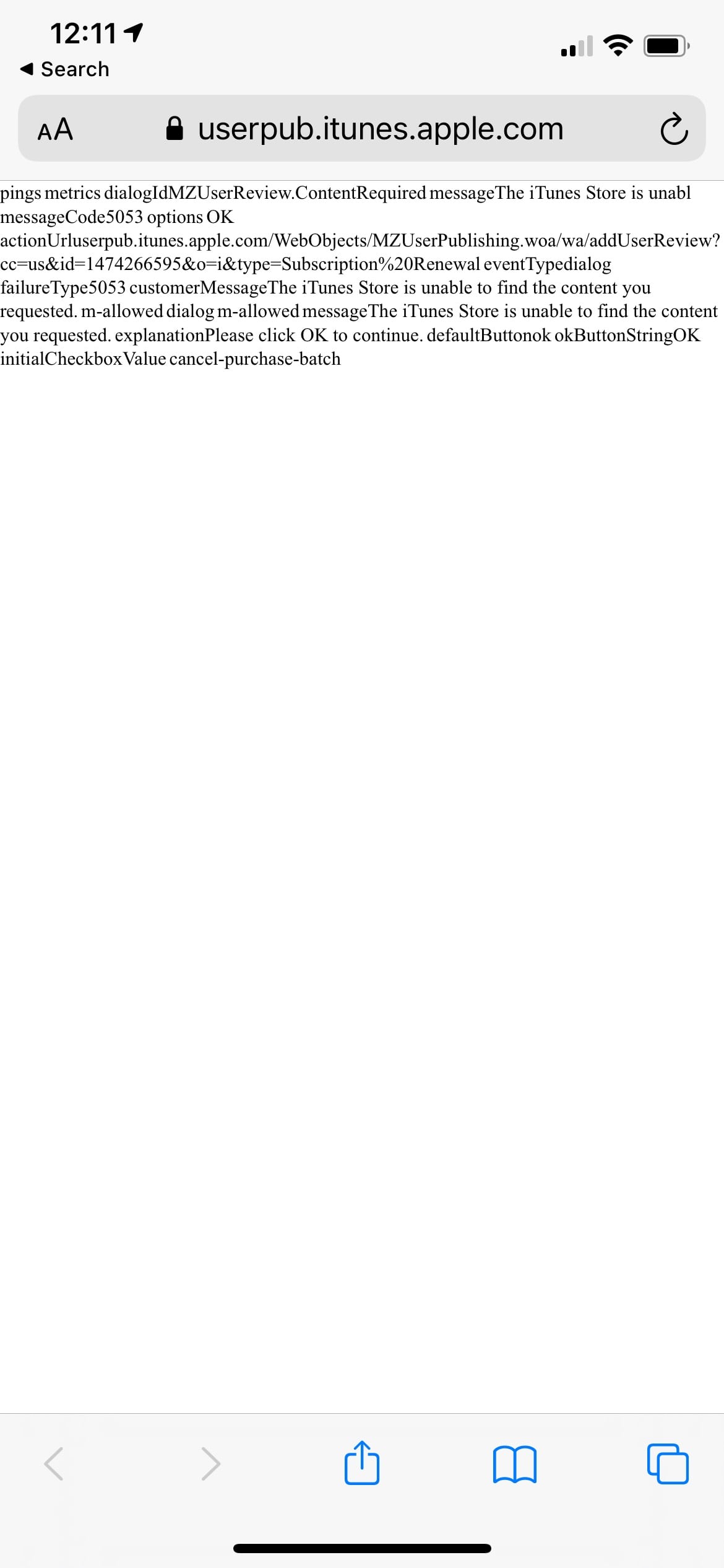
Nope.
(I didn’t bother to investigate why a link to write an app review from an App Store receipt kicks you to Safari and then can’t open the App Store. Again, maybe an iOS adblocker?)
4. The “Report a Problem” link works! It takes me to Safari, prompts me to sign in with Face ID, and then…
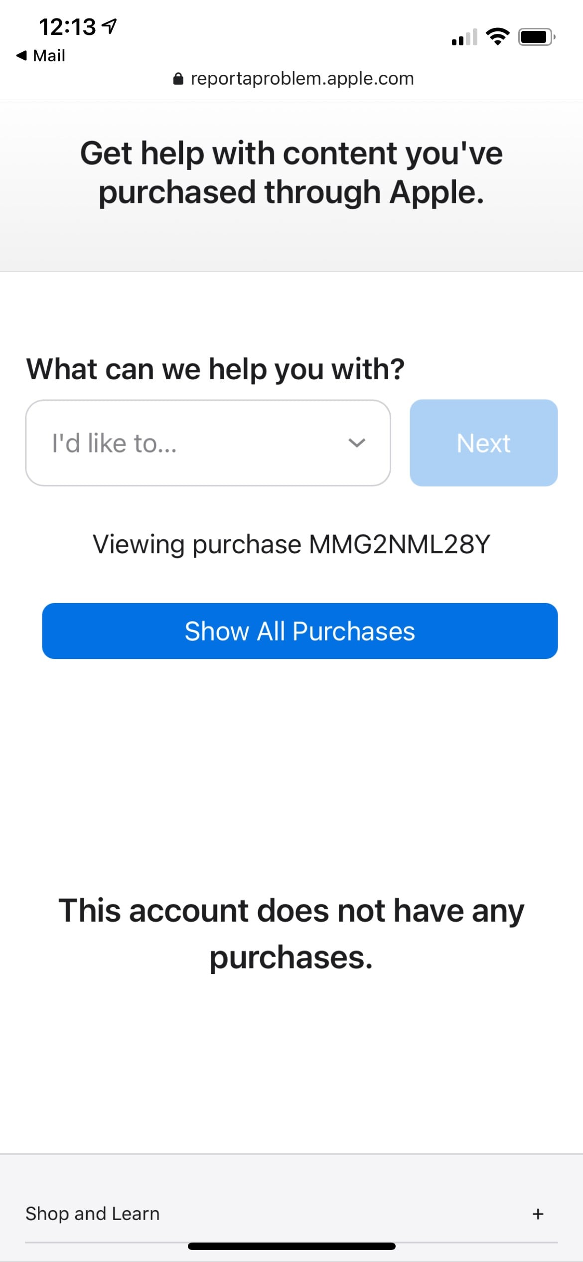
tells me my “account does not have any purchases” ?♀️
Let’s go back to my Mac since nothing is clear on iOS.
In the email receipt on my desktop browser, clicking the “Write a Review” link opens Chrome and once again asks if I want to open Music.app. Sure.
And there it is. Inside Music.app, right next to all my music playlists, the App Store page loads, and I can see my mom signed up for an automatically renewing $39.99 a year subscription for…
…a white noise app. Awesome.
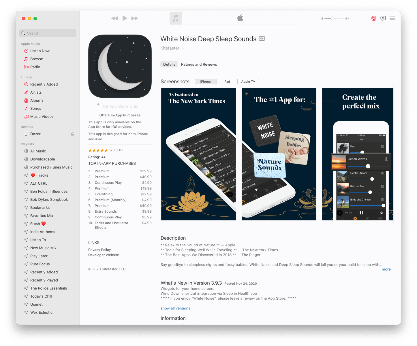
I would really, really like to know more about this app. Because if it’s worth $40/year to my mom to listen to a perfect mix of nature sounds, I may be interested, too.
Unfortunately, because Music.app doesn’t (yet) support buying iOS apps (anymore). I’m not exactly sure how to find it on my phone. I guess I should search for “white noise” in the App Store.
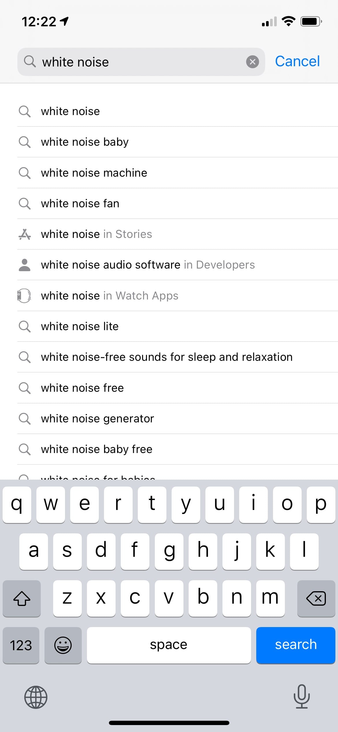
Ok, no. Anyone who has ever paid any attention to the App Store knows all too well the sheer bullshittery amount of scam apps pumped up with fake reviews I’m going to run into if I try and search for a high-value keyword like “white noise.” I’m not even going to go there. Let’s skip to the part where I find the app by searching for the developer’s name in the App Store and download it. What’s the worst that could happen? It is a free app, after all. (Ok, not “Free”. The app actually costs “GET”.)
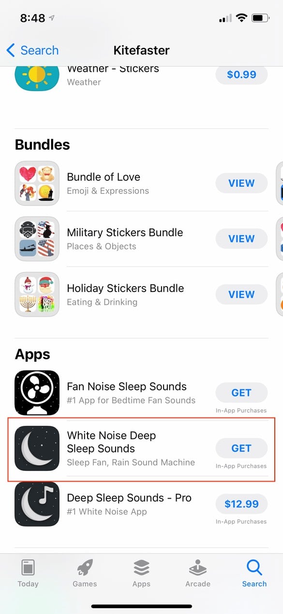
Here are the first two screens the user sees.
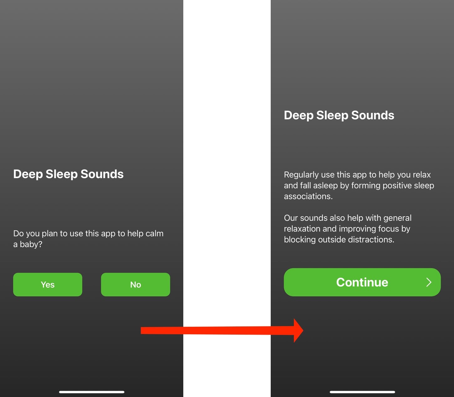
It may seem like innocuous onboarding steps, but I know for a fact – based on what comes next – that this developer is already using a dark pattern to trick customers into subscribing.
Those buttons are there to establish a behavior pattern for the user. It’s well established that customers don’t read words on screens. They just want to use the app and will tap whichever large, prominent buttons are in their way to get there. Tap, tap, tap. Done.
What do these screens lead to?
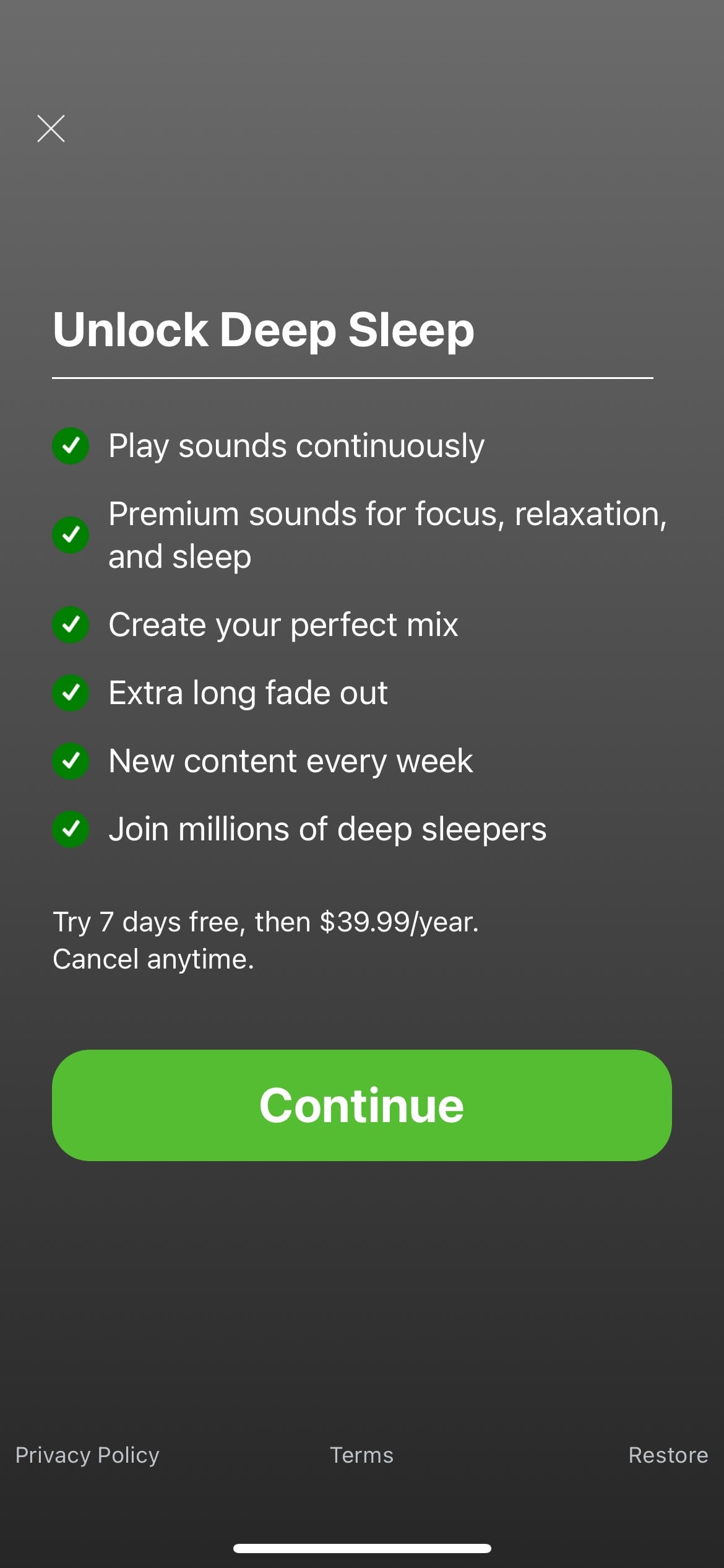
The app asks them to subscribe for $39.99.year (after a one-week free trial) without ever using the app. The only obvious way forward is the large “Continue” button, which brings up…
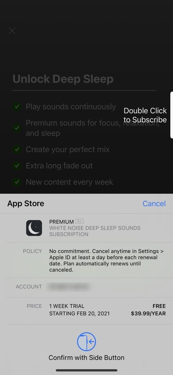
We can debate how usable this screen is. Is it optimized to inform (and warn) customers about what they agree to? Or is it designed for maximum conversions? Whatever the design intent is, it’s clearly a problem. Everyone under 40 has a story about a parent (or even themselves) accidentally making an App Store purchase they didn’t agree to.
(Remind me to tell you the story about the time my wife (who is 100% tech-savvy) accidentally paid $49 for a collection of PowerPoint templates in the Mac App Store that she thought was Microsoft Office because the app had “Microsoft Office” in the title and used the official Word/Excel/PowerPoint icons.)
We know it’s a problem. Apple clearly knows it’s a problem based on them finally fixing the Touch ID purchase confirmation bug. And they have to know the true extent of the problem since they have purchase records, refund reports, and customer support data.
Can this app be used before you commit to $40 a year? Of course. Just tap somewhere in the area I outlined in red.

But once you get past that screen, here’s the actual app.
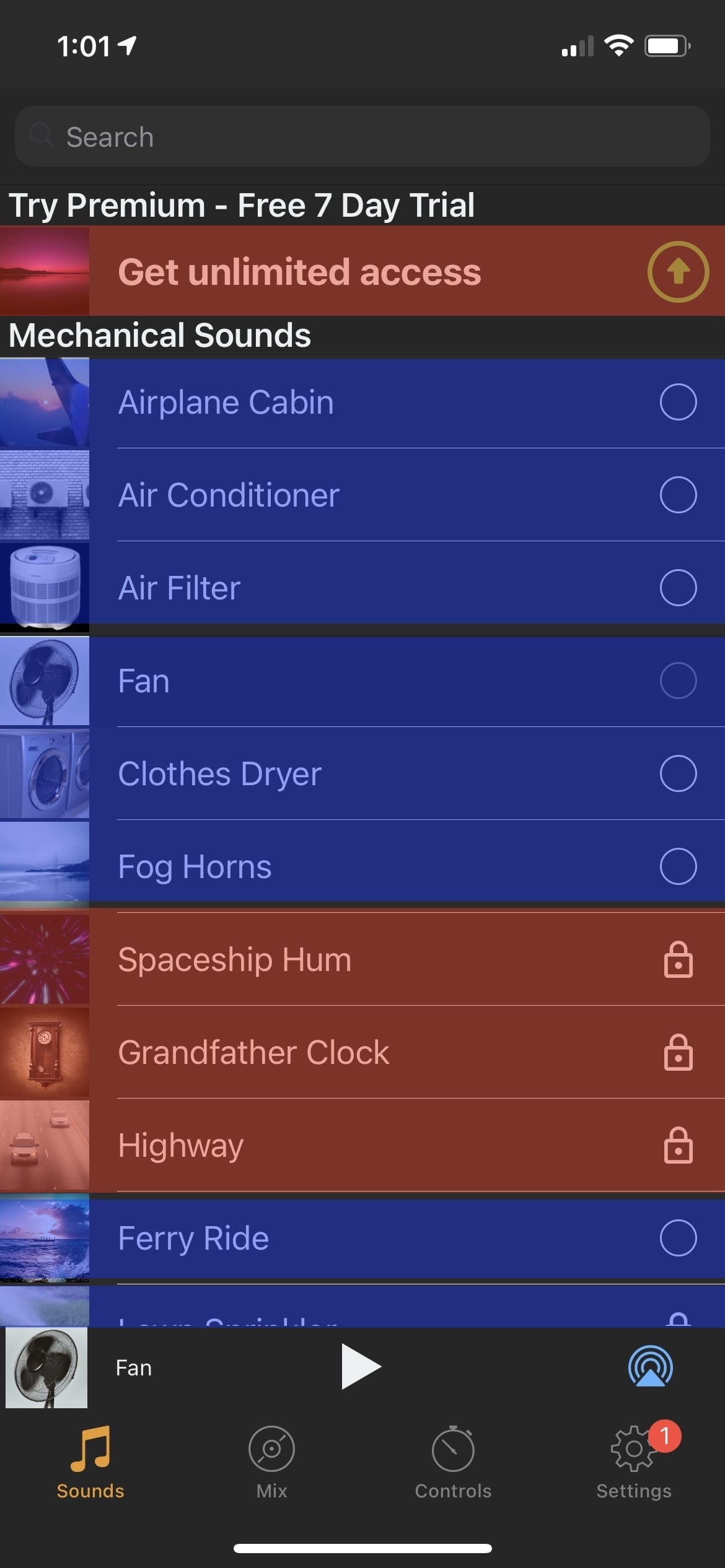
(Obviously, the red and blue boxes have been added by me.)
The red boxes are (I agree) clear prompts to subscribe to the app. The top row says as much. And the others have a padlock icon, which (I hope) means to most users that feature is locked behind a paywall.
The blue boxes are the content you get for free. (This was a free app, after all.) But tap on one?
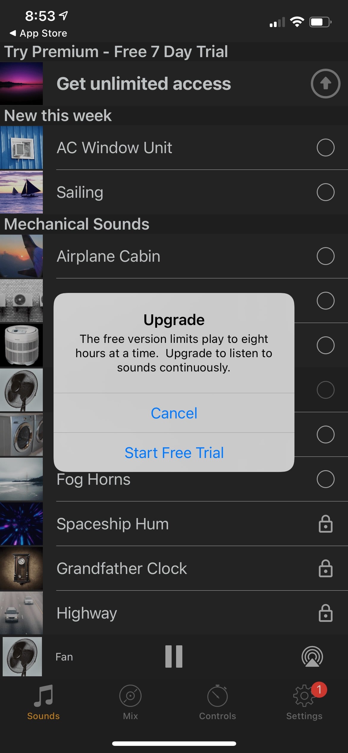
You’re prompted to start your free trial. This dialog is clearly written to trick users. Think about it.
You tap a sound to start playing. And your two choices are:
- Start a Free Trial
- Cancel
What “Cancel” actually means is “Listen anyway with the eight-hour time restriction.” But to a user, it reads more like, “If I tap that, it will cancel playing the white noise I want to hear. I guess I have to start a free trial.”
I don’t know for sure at what point my mother was tricked into paying $40. Was it the green onboarding buttons? Or the upgrade prompts that gate playing the free sounds? She doesn’t know either. When I called to ask her about it, she felt tricked.
And embarrassed.
And ashamed.
I mean, yes. It’s all right there. The subscription terms are clearly shown in 12px font on a confirmation screen with an animation inviting you to double-click the side button to purchase. And all of these apps are thoroughly vetted by App Review so customers can trust them. Just don’t think about the countless dark patterns based on years of research designed to trick users. And it’s all within an App Store that Apple markets with language like
a place you can trust
a safe and trusted place to discover and download apps
an innovative destination focused on bringing you amazing experiences
the apps we offer are held to the highest standards for privacy, security, and content
we offer nearly two million apps — and we want you to feel good about using every single one of them
Every week, over 500 dedicated experts around the world review over 100K apps
No surprise purchases
moderators review worldwide App Store charts for quality and accuracy
Download with confidence
Purchase safely and securely
I don’t know what the solution is. I guess Apple could hire even more reviewers? Or pay for better reviewers who understand the intricacies of software? But, App Review is already a kafkaesque gauntlet designed to punish small developers who play by the rules and look the other way at large corporations who flaunt them and scam apps that bring in the bulk of in-app purchases.
I don’t know if human curation can ever be a solution to this problem. Not at Apple’s scale.
My issue with this is that if Apple is not going to put in the effort to prevent the countless, systemic abuse running rampant on their storefronts, they need to stop marketing the App Store as something it’s not and using in-app purchases as a revenue stream.
Because, right now, the assumption of every developer I’ve spoken to – and friends and family members who have been scammed – is that Apple pays lip service to consumer safety on the App Store so they can reap the enormous financial rewards.
I don’t know how else to explain it because it’s been shown repeatedly that when Apple decides to focus on a problem, when they divert money and time and attention to fixing something, they usually succeed.
From purchase receipts that provide no actionable information to help you understand where your money is being spent, to a store filled with fake reviews and easily manipulated rankings and top charts promoting scam apps, follow where the money leads if you want to know why it’s still this way 13 years later.
If you’ll excuse me, I now need to help my mom remember her Apple ID password and use FaceTime to show her how to cancel a subscription.