Mortal Mac App Sins

I apologize upfront for this post. I’m in a mood tonight.

One specific UX sin interrupts my workflow and annoys me more than anything else on macOS.

Applications that quit when you close their primary window.

I want to call out a few of those apps now before offering my dumb solution.

The first is TweetDeck. And I get it. I know it’s some horrible desktop + web app amalgamation, and I should be thrilled a large company is even acknowledging that desktop computers exist. On the other hand, honestly, it’s pretty good at what it does. I’m mostly OK with it being a web app since it’s just a wrapper around a website that is itself a wrapper around a web API. Fair enough.

But why? Why did that product team decide it was OK just to quit the entire app if you ⌘W or otherwise close the window?

Once the app is gone, you stop receiving notifications, which seems the app’s point, no? And then when you do relaunch it, you’re hit with the loading delay while the UI hydrates all over again. (Yes, it’s a web app. That’s how these things work.)

I guess I’m just baffled why you would obviously put some amount of care and attention into even making a desktop app wrapper available if you’re not going to go one or two steps further to make it fit the platform more naturally.

Functionally, for TweetDeck, ⌘Q and ⌘W are equivalent.

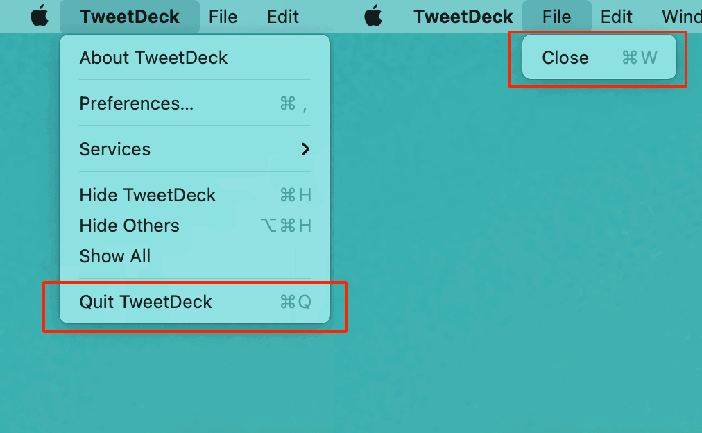
Why even have that neutered File menu with a redundant menu item at all? (I know why.)

While I’m at it, what’s that extra Close menu item doing in the Window menu? Or the native macOS Tab Bar that doesn’t work but can still be shown?

I expect better from companies with so many resources. Even if we are talking about a side-project (and pretending the really nice native Mac app they killed never existed).

So that’s what grinds my gears this evening. Apps that quit when you close their windows. Scanning my /Applications folder, we can add these offenders to the list:

  • Plexamp (Electron sigh Will someone please make a nice Plex music app for macOS?)
  • Apple Books (just bizarre and wonky)
  • FaceTime (admittedly an odd one)
  • Find My (no good excuse)
  • Home (no good excuse)
  • Reminders (really no good excuse)
  • Photos (also no good excuse at all)

Maybe I’m just an ornery old man yelling at the new kids running through my lawn. Maybe I should be content to retrain myself to hit ⌘H instead of ⌘W when I no longer want to see a non-document-based app but want to keep it running.

Maybe Apple has done the research and realized that a decade-plus of relearning computers with iOS had taught the over-60 crowd that fullscreen apps are the be-all-end-all. And Gen-Z, who grew up with touch screens, intuits that as well. Maybe there are diminishing numbers of us in the middle reluctantly dragging overlapping windows around like cave people?

But my (least?) favorite. The most hysterically bad example that I want to point out is Microsoft Teams.

(OK, funny sidebar. You know they’re pushing this app down customers’ throats when what you think would be the Teams website at

https://www.microsoft.com/en-us/microsoft-teams/

redirects to

https://www.microsoft.com/en-us/microsoft-teams/group-chat-software/

(Even $1.3T companies gotta SEO.)

Of course, Teams is Electron-based. So, of course, it comes with all the caveats and compromises that Electron brings. OK, fine.

I want to drag this app because I truly have so much respect for Microsoft software historically. The Office suite is just a mind-blowing multi-decade achievement in my mind. And in recent years, getting all that business logic ported competently to iOS and the web is astounding. The backward compatibility that Windows is forced to maintain while somehow moving forward is inspiring. And while using Visual Studio Code makes me want to gouge my eyes out and write novels in a log cabin far off the grid, I really do respect what they’ve built.

So please, compare what Microsoft can do against Teams.

For so many reasons, it is a nightmare of awfulness that should make my workday better but really only gets in the way. And here is the most glaring fault that convinces me no one who cares or knows better is really using the app as customers do. (Or is empowered to make a difference.)

  1. Use Teams.
  2. Resize and position the one window they limit you to using.
  3. Close that window.
  4. Re-activate Teams by either clicking the Dock icon or using a launcher like Spotlight, Alfred, etc.

OK, first of all. Teams does have the courtesy of not quitting when the window is closed. But rather than reopening the only window where you last placed it or even reopening it to some sane default size and position, it reopens in…full screen.

Not macOS Full Screen that takes over the entire screen – Dock, menu bar, and all. But maximized. What people used to call full screen. Just, boom. Hello. Taking up every pixel of available space.

I would normally share a screen recording of this happening, but everything in Teams is work-related, and I don’t want to start spreading company secrets. (And blurring out an entire window would be silly.)

So, please. Microsoft. Do better. I know you can.

And for all the other big companies out there. Please start caring again. When you take care out of the work, wrapping your web app into a desktop app is no better an idea than ticking a box and thinking your iOS app will make a good Mac app.

Anyway, here’s my fix. And, once again, Keyboard Maestro to the rescue.

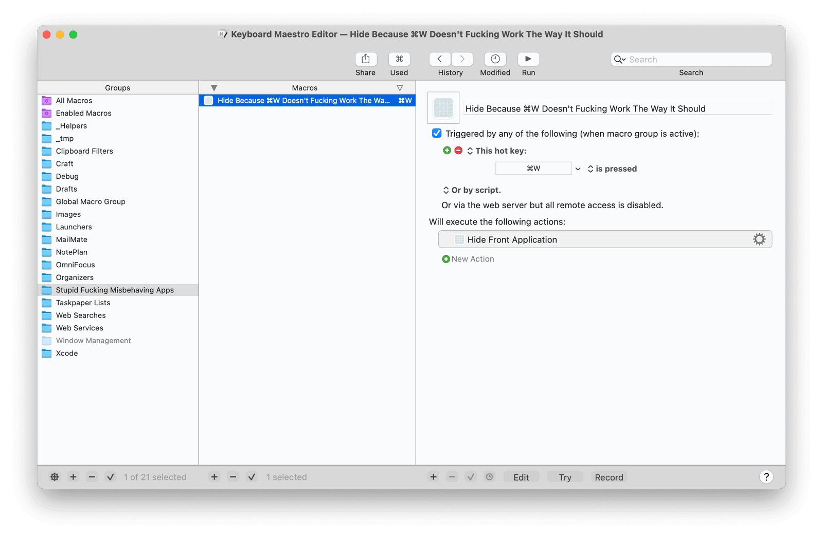
I have a special macro group called Stupid Fucking Misbehaving Apps that only applies to a select group of software.

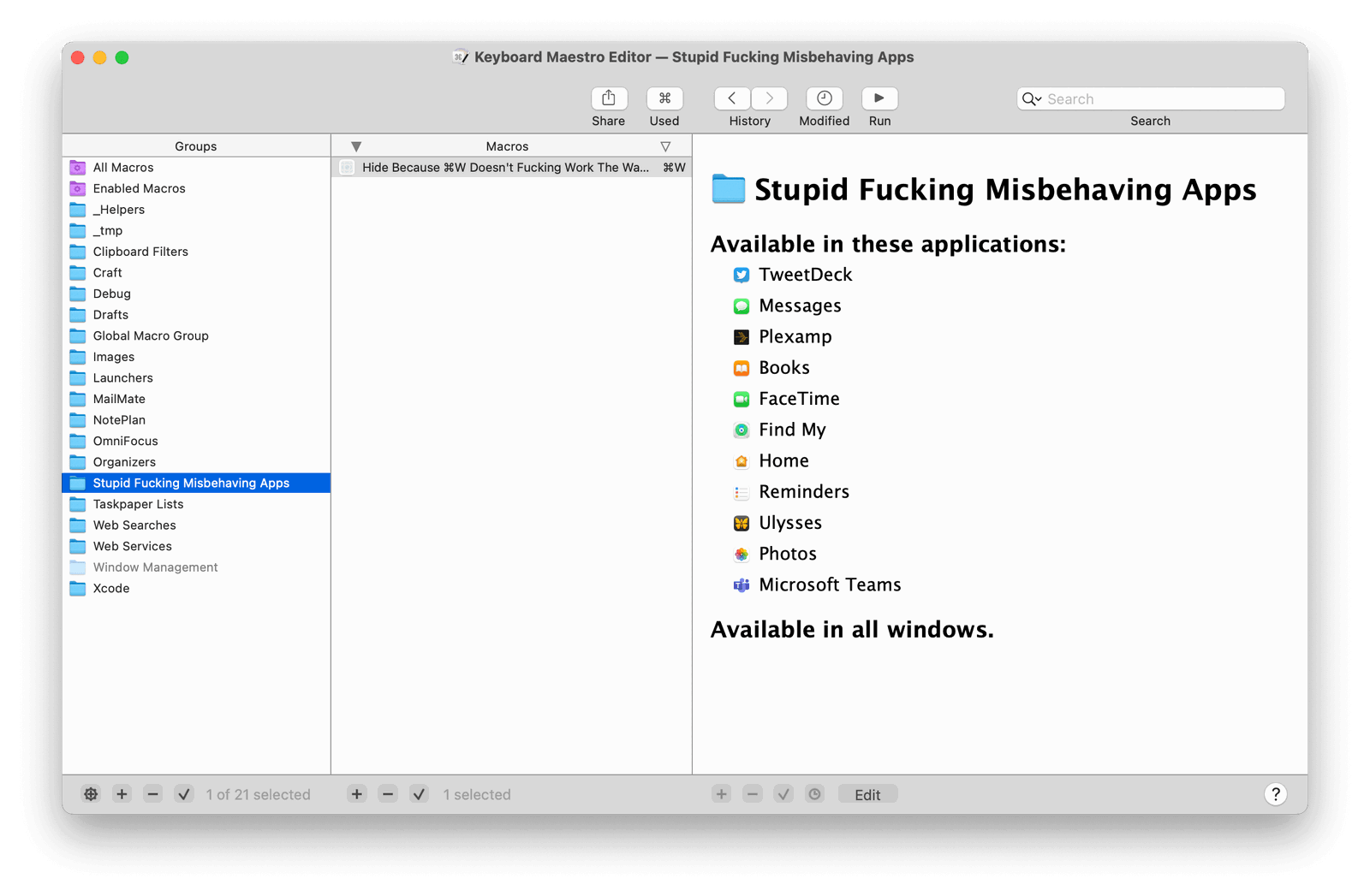
And in that group, a single macro titled Hide Because ⌘W Doesn't Fucking Work The Way It Should.

All it does is override ⌘W to hide the app instead of whatever broken behavior it would normally do.

I should have thought of this years ago.

Calendar Hero

Let’s be honest. I’m an idiot. If it weren’t for technology holding my hand and functioning as a second brain, I wouldn’t be able to make it through this modern world.

That’s why I trust software to remember all the things I would otherwise forget.

And with the number of meetings I’m in now, it really helps if my calendar is front and center.

So, another week, another app. This time it’s a small little open-source calendar for your macOS Desktop I call Calendar Hero. I made it last week after I was late to a meeting because, well, I was vacuuming and not thinking about the day ahead.

I used another Mac app to do this, but it stopped working for me sometime during Catalina in 2019. I missed what it did, so I reimplemented a simple version of it last week.

This is Calendar Hero.

It sits on your Desktop, below all of your other windows, and…shows your weekly calendar. It highlights the current day, the current hour of that day, and shows a countdown until your next event.

That’s it. That’s all I want.

I will live and die and swear that Fantastical 3 is the best Mac app I’ve ever used. But for this one particular use case where I want my calendar front and center, just an F11 glance away, Calendar Hero is what I want.

Here’s how it works.

  • Open the app
  • Move and resize the window where you want it
  • Do something else

That’s it. When Calendar Hero loses focus, the window will become transparent and settle onto your Desktop. You can move other windows on top of it. You can even position your Desktop files and folders on top of it. Your mouse and keyboard clicks will be ignored. And it’ll stay in place as you swipe between spaces and Exposé. It just sits there being helpful.

If you need to reposition Calendar Hero, click its Dock icon or ⌘-tab to it. The window will become normal again, letting you resize it until you switch to another app.

That’s it. That’s the whole thing.

Calendar Hero is free to use, and the source code is available on GitHub. I hope you find it helpful.

You can download a notarized build here. I’ve only tested it on Big Sur, but it should run on Catalina.

Technical Notes

Calendar Hero is a very dumb app. I did not write it to be perfectly correct. If you look closely, you’ll see that the event bubbles are not always to scale. That’s because I just wanted to build something very quickly that solved my problem: seeing what’s next. Seeing a perfectly accurate and proportional view of my day was not the goal.

The app is built using a giant mess of stack views because that was the fastest way to make this app and get on with my real work. I just let them do their thing, and it looks mostly OK.

Also, anything involving dates and calendars scares the crap out of me. If your Mac is set to use a non-Gregorian calendar, or the first day of your week is not Sunday, I cannot promise this app will not eat your hard drive.

TextBuddy for macOS

You either die a programmer, or you live long enough to see yourself build a text editor.
—Harvey Dent (or someone)

Good artists copy. Great artists steal.
—Probably not Harvey Dent

Two weeks ago, I released TextBuddy – a new text editor for macOS. And now I’m finally getting around to sharing why I built it.

It started as an “ugh, I wish I had a small little app that did this” thought going through my head. And followed soon by “Ok, I can make that really quick.”

Sure enough, I had something passable by lunch. But then my dumb brain was like, “Hey, it sure would be great if it also did this…Oh, and this, too…And that!”

As I explained to a friend in an email:

Programmers know all too well where that line of thinking ends. (Hint: madness) In my case, it ends with this blog post announcing TextBuddy.

I typically bounce around between three text editors throughout the day.

Ulysses is where I keep meeting notes and draft long-form writing since it excels in being a very comfortable writing environment, handles Markdown well, and supports file attachments. (I’m writing this post in it right now.)

Drafts is where I jot down quick notes, ideas, and triage ad-hoc to-do lists. While some of my drafts grow larger and graduate to Ulysses, most of the stuff I capture might be considered “throw-away” by other people. Still, to me, Drafts has become this massive, chronological archive of all the ideas I’ve had every day over the last decade or so. Computers are powerful, storage is cheap, and having that corpus of my historical train of thought is a powerful weapon for knowledge workers.

And then, of course, there’s TextMate. Which, for sixteen years, has been my go-to editor for manipulating text.

But now and then, I’ve felt a need for something to drop truly temporary text into — a staging ground to do a few quick edits before taking that text elsewhere. There’s mental overhead to using those other three apps.

Ulysses, while incredibly powerful, is slow and cumbersome to move around. TextMate, being a document editor, requires thinking about files. Making a new one, and then choosing where to save the file or discard my changes. Drafts solves the problem of thinking in files, and I know it’s a fine line, but there’s an obvious (to me) category of “stuff” that I don’t want polluting my Drafts library, which means I need to think about deleting any temporary drafts I create.

I fully realize the above must sound insane to a lot of people. But going back to the old Getting Things Done philosophy of “mind like water,” the fewer decisions I have to make about unrelated tasks while focusing on my work, the better job I can do at the stuff that matters.

So, I found myself in need of a middle ground app between Drafts and TextMate.

TextBuddy is what I came up with.

What started on January 14th as a single text field in a window that automatically saved what you typed kept growing.

The app now offers over 130 nerdy, plain-text commands you can run with a keystroke or two. From Unix-y shell script type stuff to common tasks programmers use daily to crazy workflows like capturing text from screenshots and images and even transcribing spoken words from audio and video files. (All done locally. Nothing sent over the network.)

And it syncs over iCloud, too.

I’m also excited to say that, over the last two weeks, TextBuddy has become the most well-received app I’ve ever built.

VirtualHostX is my main app. It’s the cornerstone of my little software company, and over fourteen years has been a large (and small) source of my income.

And, yet, TextBuddy has already had more downloads in thirteen days than VHX had in all of 2020.

(Should I use 😭 or 🤷)

I don’t say that to announce my retirement to a tropical island (I prefer the mountains anyway), but to say that it feels amazing to find out I’m not crazy. To learn that there are lots of other nerdy people out there like me who find use in an app that I originally built just for myself.

How can you not feel like you’re onto something when the Internet’s Resident Mad Scientist says

I tried it out for 5 minutes and immediately purchased.

I could probably go on for ten-thousand words about all the random ways I find TextBuddy helpful throughout the day. But if you’re interested in hearing that, go check out the website.

Instead, I’ll leave you with this 42-second intro of a typical text editing session with TextBuddy. And then a couple of videos of what I think are some fun features.

TextBuddy requires Big Sur and is free to download and use. Like my other app, Ears, you can optionally support TextBuddy at one of three tiers to remove the nag screen at startup.

Any feedback you have is very much welcome.

42 Second Intro

Rearranging Text

Capturing Text From Screenshots

Transcribing Text from Video and Audio Files