240 Invisible Pixels
When an alert notification arrives in Big Sur (not a banner that slides away after a few seconds), it will remain on screen until you make a decision about it.
On my Mac, helpful examples of this category are
When those apps have something to tell me, I generally don’t want to miss it. So I appreciate that they remain on screen until I dismiss them or open the corresponding app.
An example of unhelpful alerts that you didn’t opt-in to and can’t opt-out of are hot marketing garbage like this.

(That’s not Halide’s fault. Buy Halide. It’s excellent.)
But I digress. Helpful or spam-like, the UX problem is dismissing them.
Here’s a fictitious notification:
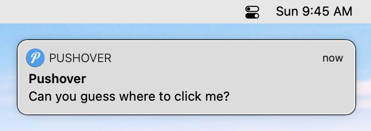
Like the notification says, can you guess where you should click to dismiss it? The keyword being dismiss. Because, in almost all instances of an alert appearing, I want to know about it, but way less frequently do I want to open the entire app behind it.
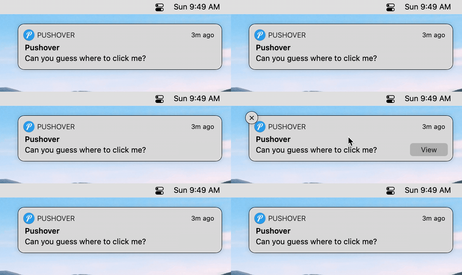
If the clickable areas are not clear from that gif, here’s a better view.
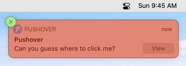
Clicking the green (X) will dismiss the notification. Clicking anywhere else in the red will launch another application on top of whatever you’re currently doing. (Remember the pain of accidentally launching an Adobe app in the late 90s or 2000s? Same vibe.)
For those of you keeping score at home, that’s a 22pt x 22pt target out of the banner’s total 346pt x 78pt. Or 1.8% of the total size.
Fitts’s law doesn’t even help since the (X) is just hanging out there in the ether – unlike the menu.
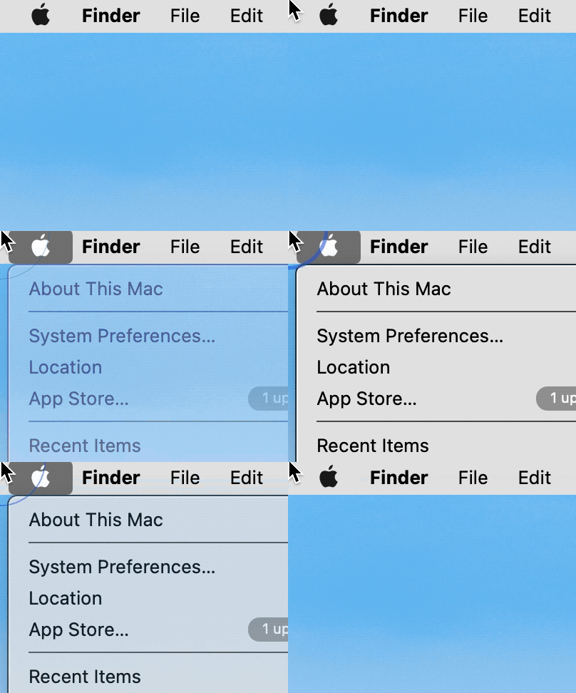
Worse, though, Big Sur hides the (X) until you mouse over the literal bounds of the banner – not even the area where the hidden (X) will appear is initially valid.

If you move your mouse towards the notification intending to dismiss it, the clickable area (without backtracking your mouse) is this even smaller green part.
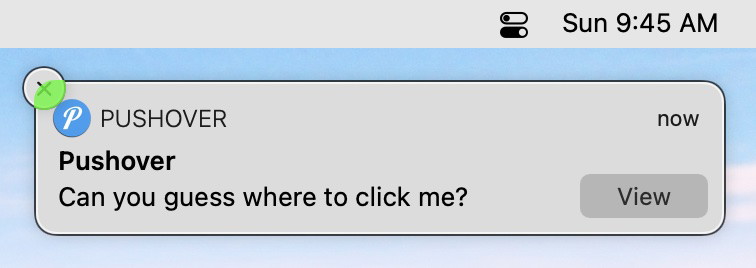
A whopping 16pt x 15pt that aren’t even visible at first to help you aim.
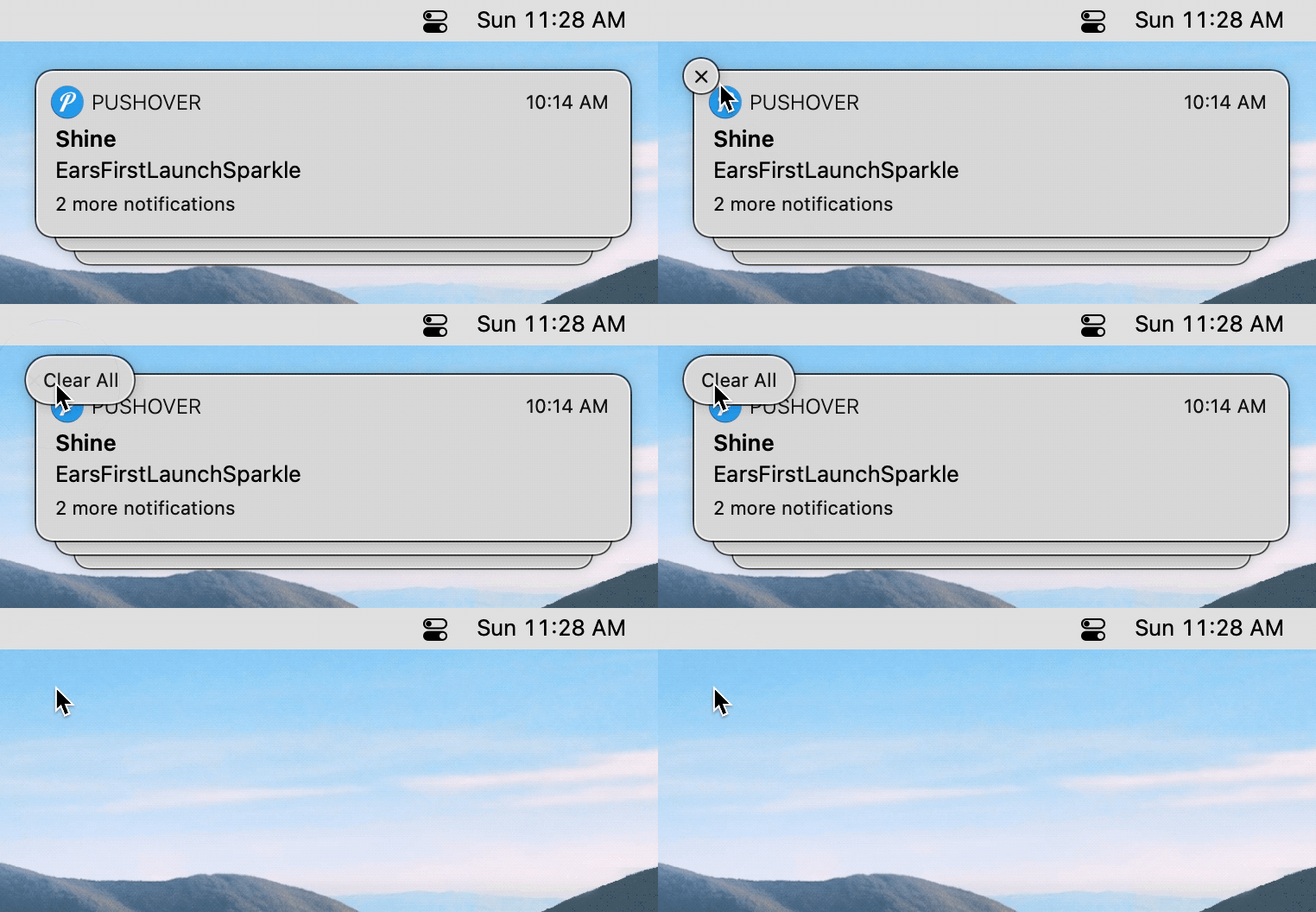
Compounding the problem, when you wake your Mac from sleep, you’ll often have a stack of multiple notifications to dismiss. Some of them requiring multiple clicks to get through the (X) and a second (Clear All).
I’m generally happy with Big Sur, but the focus on design over usability in many places is baffling to me. Luckily, from the menu bar to the muddied translucency, there are ways to improve things.
Here’s my solution for dismissing alerts.
As usual, Keyboard Maestro to the rescue. Clicking those 240 invisible pixels is now a hotkey away.
It also works when they’re stacked or in Notification Center.
It’s the simplest of macros. Move the mouse to a fixed position from the top-right corner of the screen. Pause to give the (X) time to appear, and then simulate a click.
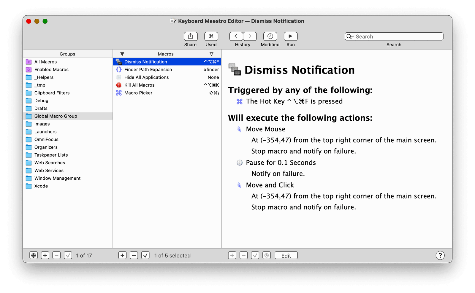
You can download the macro here.
(If Keyboard Maestro is intimidating, give the fantastic new Keysmith a try.)
Just set the macro to an available keyboard shortcut that makes sense to you. Myself? I chose
^⌥⌘Fwhich lets me just mash all the modifier keys at once and press F.
I’ll let you guess what the F stands for.