Digital Heirlooms

This is a blog post in two parts.

The first is about something I built for my son that brought me, well, joy. And the second half is the realization I later came to that made me very sad.

I’m Not a Carpenter

I recently found out that my father-in-law doesn’t (and hasn’t ever) respected me as a “real man” because I don’t work with my hands for a living. I don’t spend my weekends in the garage fixing cars or in the backyard building a deck.

Given the right YouTube video, I’m capable of doing basic repairs and solving problems myself, but that type of work isn’t a skill I grew up learning.

But to think I don’t “build things” is disingenuous and highlights a real generation gap in understanding what “work” used to be (and still is) and what it can be (and is) for more and more people.

I say all of that first to vent and get it off my chest. But second, to illustrate that the iPad app I built last night and this morning is a real thing that (hopefully) solves a real problem just as much as repairing the guest toilet or changing my own oil would.

My son is in first grade and loves stories, but he’s having trouble reading. It’s not that he doesn’t know his sight words or can’t sound out letters. It’s that he’s just like me and inherited one of my worst traits. We both hate doing things we’re not immediately good at.

For him, that means that as soon as he comes to a new word, he gets frustrated and shuts down if he has any trouble figuring it out.

So I’ve been looking for a way to encourage him to keep trying and stay engaged.

Luckily, he’s six. And six-year-old boys are pretty easy to figure out. For him, that means anything involving Super Mario or Black Panther is bound to pique his interest.

I had the idea for this app right after the kids fell asleep last night, and I stayed up late to make it.

My idea was to gamify his reading sessions. I know there are tons of apps out there to help kids read, but building software is what I do for a living. I wanted to use those skills that my father-in-law looks down on and make something special and unique just for my son. Maybe one day I’ll build him a treehouse. But last night, I built him this app.

And, naturally, the source is available on GitHub if you’d like to play along at home.

It’s a simple, one-screen iPad app. The goal is to move Mario across the iPad.

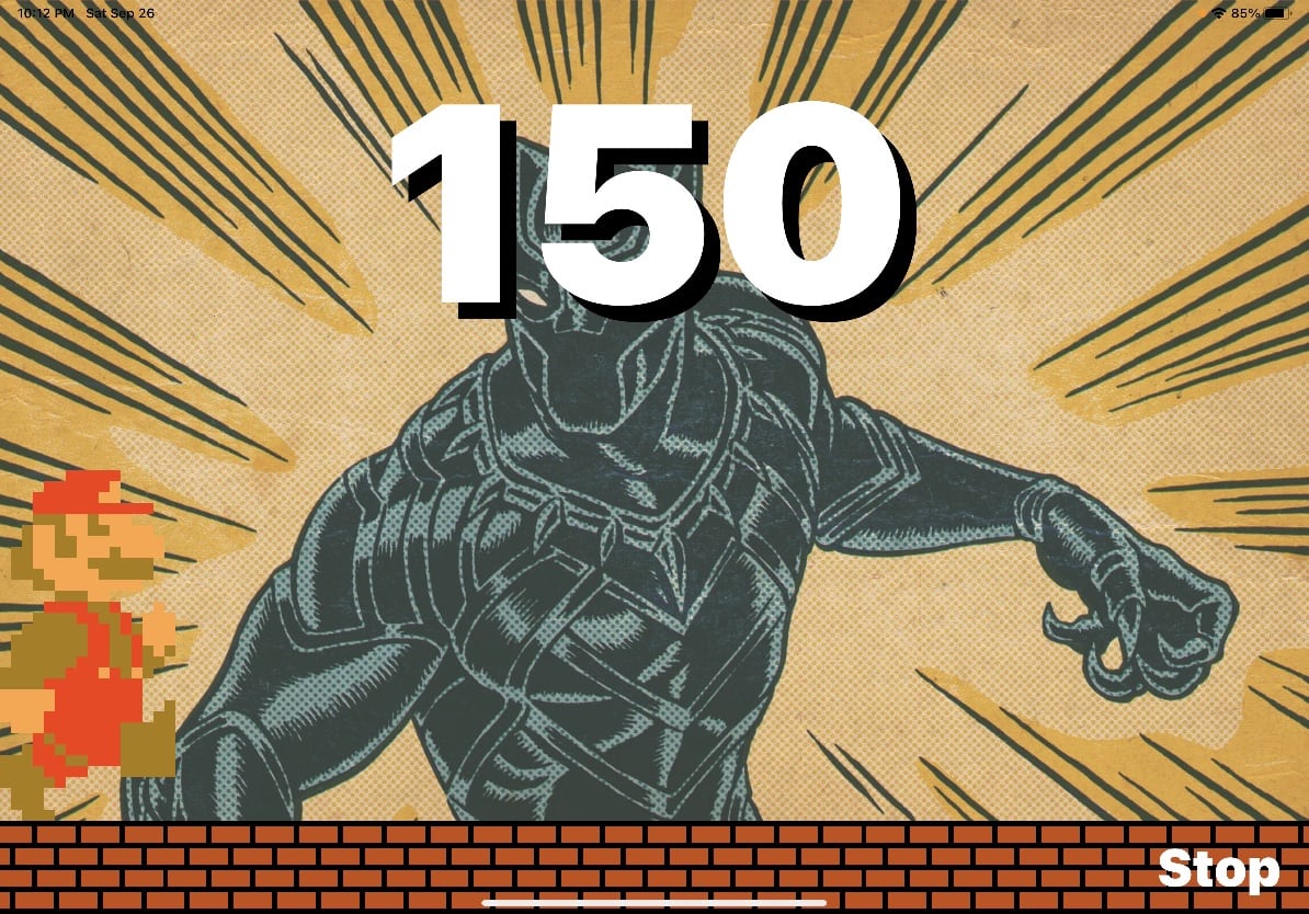
How do you do that? By reading a book.

When a new game starts, the app listens for my son to read a book out loud, and iOS does on-device speech-to-text. With every word he reads, Mario runs further and further across the screen. A live counter ticks down from his word count goal. And when the counter reaches zero and Mario reaches the other side of the iPad, my son gets rewarded with confetti, Mario jumping up and down, and the official Super Mario end-of-world theme music.

What does my son think of his new app? Judge for yourself…

Besides sprinting across the screen, Mario does have another trick up his sleeve. To keep things interesting, at any point when he’s reading, if my son shouts, “Jump!,” Mario will dutifully jump on screen.

Will this app solve my kid’s reading problems? Probably not. Even though my wife is already talking to me about adding additional in-app rewards and bonuses to keep him motivated, I’m sure he’ll be bored with it within a week.

And that’s ok. My larger reason for building the app brings me to the second half of this post.

Modern Software is Designed Not to Last

If you’ve followed this blog for any length of time, you’ll find that I take preserving our (my family’s) digital memories and history seriously. I think it comes from watching my mom put together countless family photo albums and my dad doing decades of genealogy research.

And I’ve applied my digital hoarding habits to our photos, videos, old videotapes from the 80s, scanned physical documents, and even interviewed and recorded grandparents before they passed.

At the start of the pandemic, I began recording myself reading poems by Shel Silverstein every night. He’s my kids’ favorite author / poet. My goal is to read aloud every poem he published and put those audio recordings in some sort of digital archive for my kids. And while I certainly hope I’m not dead anytime soon, I wanted to create a keepsake from me to them that they can look back on when they’re older.

The realization I had last night while building my son’s app, is that as long as I put those poetry recordings somewhere safe and practical, they should last a generation or more. I’m not overly worried about mp3 files (or wav or whatever) bit-rotting and becoming unplayable. Our family photo archives are probably safe as jpg files. (I’m talking file formats, not necessarily the storage medium, which is an entirely different rabbit hole.)

As a society, we spend so much time preserving and protecting artifacts and artistic works from hundreds and even thousands of years ago. It’s just how we’re wired.

I made a joke on Twitter that my legacy and contribution to this world will be the hundreds of abandoned git repos my family finds on my computer when I die. (Or maybe even farther in the future than that.)

And there’s real truth to that.

I’m not a musician or an artist or a novelist. If I recorded music, made paintings, or penned a seven-volume teen vampire young-adult book series, those things would outlast me.

But this app I made for my son? I built it because I thought it might help, sure, and because software is what I do. It’s my life’s output, my legacy, and I wanted him to have his own piece that belongs only to him.

Unfortunately, I write software for Apple’s platforms. And on iOS (and increasingly on macOS), that requires code signing and Apple’s blessing to do anything.

And so if I were to die tomorrow, the app I made just for him and installed on his iPad this morning will stop working in one-hundred and ninety-two days. Not for any technical reason. Not because of future software incompatibilities. If his iPad remained in working order for another hundred years, it wouldn’t even matter. This digital heirloom will self-destruct as soon as my developer certificate expires.

And it’s all due to an arbitrary decision on Apple’s part to lock down their platform(s) to maintain control and protect profits.

And so with all the recent anti-trust rumblings, this is the part that worries me the most.

Sure, it’d be great if Apple’s App Store commission (tax) aligned with the value they provide developers. And I bitch all the time online about the capriciousness and borderline hostility of App Review.

But those are relatively minor concerns in the grand scheme of things. My ask is that Apple’s customers (and this applies to all platforms across the industry) regain the right to run the software of their choosing.

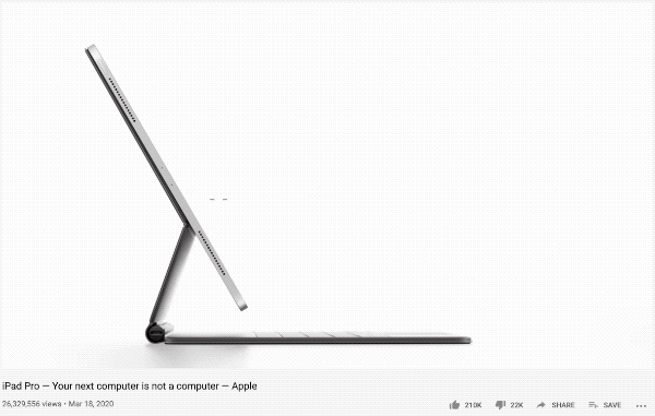
I patently reject the notion that you can enjoy the marketing benefits of claiming your platform is a replacement for a computer when your customers can’t run their own software on it.

Cupertino could allay anti-trust concerns, and I’m serious when I say this, provide an amazing gift to the world and future generations if they’d stop being the worst version of themselves and allow side-loading. And they could do this while continuing to do swan dives into literally infinite Scrooge McDuck sized vaults of cash.

Our world is digital now. And that means our heritage is, too.

I don’t think I’m being hyperbolic when I say that future historians and even archaeologists are going to revisit our time and be furious at the direction our industry turned towards using consolidation, monopoly power, and artificial restrictions to protect profits at all costs.

Imagine if Howard Carter discovered King Tut’s tomb but couldn’t open the door because the Pharaoh’s signing certificate had expired.

Sample Code to Make your Mac App Open at Launch and How to Handle Global Keyboard Shortcuts

(Sorry in advance for the SEO-keyword heavy blog post. I want to make sure Google can do its job.)

After my post last week about the updates I made to my audio app Ears, longtime internet buddy @macrael asked:

@tylerhall Do you use libraries for the hotkey-setting UI or the start-on-launch stuff? I’m putting together my first Mac app and am looking into those parts rn.

I do, actually. In addition to replying to MacRae on the nightmare birdsite, I thought I’d post the two helper projects here for anyone else searching.

(It saddens me that so many of the Mac development resources I used to learn from and rely on have disappeared from Google (and Apple’s developer website) since Mobile swallowed the industry. Ah, well. Here’s my contribution…)

Creating Custom Global Keyboard Shortcuts in your macOS App

I’ve used the excellent MASSShortcut framework for years to handle global hotkeys in my Mac apps. Here’s the original blog post about the project from Vadim Shpakovski. (By the way, this new app from Vadim looks super helpful.)

When I rebuilt my app CommandQ, I needed a way to trap keyUp events in addition to the keyDown events that MASShortcut offered. I modified the framework to allow that, and I’m sorry to say I’m a terrible open-source citizen and never contributed that patch back to the original project. But you can find my fork here.

How to Create a macOS Login Item For Your Mac App

Here’s a small sample Xcode project I extracted from my existing apps. It shows how to create a helper app inside your main application to launch your app at login. (Hopefully, only if the user consents first!)

I’ll be up-front and say I have no idea if this sample code is the “right way” to do this, if it ever was the right way, or if it’s even the modern way any longer. I cribbed it together from a blog post years ago, and it’s worked fine for me thus far.

If anyone would like to point out a better way, I’m all ears. And if anyone knows the original blog post author I should give credit to, I’d love to know that, too.

Listen Up

One of the best things that have come out of the pandemic for me has been my little Mac app, Ears. I had the idea for it and built it about a month into quarantine because I was in so many remote meetings throughout the day. And depending on the time of day, how much notice I had before the call, if my kids were around, all sorts of reasons – I found myself frequently switching my Mac’s audio between speakers, AirPods, headphones, etc. It was a pain, so I built Ears to make that easier.

Since that first release in June, I’ve been refining the app to fit my workflow even better. And tonight, I’m delighted to push out a new release with additional features for all the work-from-home-warriors out there jumping between calls.

First up, if you don’t know the purpose of Ears or why I think it’s helpful, here’s a quick walkthrough FAQ I wrote that explains the why’s and how’s of the app.

Ears Main Window screenshot

InstaMute

InstaMute is a terrible name for a feature, but I needed something to put in my git commit message, and that’s what popped into my head.

The client I work with daily uses RingCentral for all their scheduled and recurring meetings. But then, they use Microsoft Teams for ad-hoc meetings and for employees low enough on the food chain that management doesn’t want to pay for their RingCentral account.

But within the company I work for, the developers bounce around between Google Meet and Discord.

I’m saying all this so I can point out that each service – in the browser or their desktop apps – use a different keyboard shortcut to mute/unmute the microphone. Worse, even if you do remember the correct shortcut per app, you have to switch focus to the app to invoke it because it’s not a global hotkey in every case. (And don’t get me started that they all hide the on-screen mute button until you hover over it, so you don’t initially know where to try and click.)

And it drives me crazy because when working from home – or even at the office – I don’t want coworkers or clients hearing my kids screaming, me eating potato chips, or whatever else. But having to jump back to some random app and quickly unmute to speak and then go back on mute was a thousand paper cuts every workday.

I needed a global hotkey that mutes the system audio input, so it works in every app. I’m sure there’s probably a native way to do this or some other app that will solve it for me, but it seemed like a good fit to add to Ears.

InstaMute has three modes of operation:

InstaMute Screenshot
  1. Toggle On / Off Like it says, press your selected keyboard shortcut, and Ears will toggle your mic’s mute on and off.
  2. Push to Talk Ears will keep your microphone muted. Only when you press and hold the hotkey will it turn on. As soon as you release the keys, your mic will go back on mute.
  3. Push to Mute The opposite of PTT. A cough button. Ears keeps your mic live except when you press and hold your keyboard shortcut. Let go, and folks will hear you again.

And to make sure you always know if you’re on or off mute, the Ears menu bar icon will update based on your mic’s current status to show a cross-line when muted.

Ears InstaMute Menu Bar Icon

Default Volumes

A customer suggested this next feature.

You can assign a default volume on a per-device basis. Speakers, headphones, or even your microphones. Do you want your iMac speakers to be quiet? But don’t mind blasting your AirPods. Give them each a preferred volume, and when you switch devices with Ears, the app will automatically set the correct volume.

(I know macOS will, in theory, do something like this for you, too. But it’s never worked consistently for me. Hence why the user suggested this feature, and I wanted to build it.)

Ears has a straightforward UI. I’m trying not to clutter up the interface beyond its core functionality. So forgive me for hiding this feature behind a context menu. I don’t expect most users will need it frequently – or at all – so it seemed a fine enough compromise.

Right-click on an audio source to choose a value and enable or disable the setting per device.

Ears Default Volume Settings

Notifications

This feature was added shortly after Ears’ first release, but I never mentioned it in my earlier blog post.

Ears Notifications Settings Screenshot

When your system audio changes – whether Ears makes the change or some other app – Ears will display a notification letting you know the new active devices.

Ears Sample Notification Screenshot

I think it’s a great way to confirm what you think happened really did happen and prevent surprises.

Also, you can choose to have your Mac speak your new audio device selections to you. I’ve added a slight delay between when your device changes and when the audio speaks. This delay gives your new device a quick moment to fully come online. So, in the case of switching to a different speaker or headphones, you’ll hear the change announcement with your new choice to confirm it’s active.

Download and Enjoy

So that’s the new version of Ears.

The app is free to download and use. But you can purchase an optional, pay-what-you-want license to remove the nag screen that appears when you open the app.

A Few Nice Things

I made Ears on a lark because I really just wanted it for myself. But it’s turned into one of the most well received apps I’ve ever built. So if you’ll forgive me for bragging, I thought I’d share a few comments I’ve gotten from customers this Summer, and also say thanks to the thousands of folks who have given it a try. I get so much satisfaction everytime someone takes time to email and say it made their workflow during this crazy time just a little better.

I didn’t know I needed this until today, but this is seriously a great app. I’ve spent so much time fiddling with audio devices the past few months 🙁

I do online teaching for a University (in Australia) and have a stream deck set up with some apple scripts to mute/enable the mic. Your software was the missing link in getting it all together.

Ears is great! Thanks for making it! I use it every day to switch among several devices. I wanted to show my support with more than just words, so I purchased a license a few minutes ago.

As an aside: I did notice that Ears posts notifications for audio source changes done in Ears, which is perfect for my use case. It can give that extra piece of confidence when switching.

I just wanted to say – thanks for Ears! I tried it out after reading about it on your website, and it’s exactly what I wanted to help smooth over many audio devices during Work From Home and otherwise. This is especially helpful in an environment where you don’t want to accidentally have your Mac switch to speakers, like in an open office environment. Anyways, thank you again for a great app! Looking forward to see how Ears evolves 🙂

Ears has been a lifesaver – thanks so much for the program!

Don’t Let Experience Get in Your Way

A coworker and I have been working crazy hours since March on a huge new product feature – him on Android and myself on iOS. Quite frankly, it’s maybe the best work we’ve done in our careers. And work I, at least, wasn’t sure we were even skilled enough to pull off. When we first pitched it to the client, we asked for eight weeks of uninterrupted dev time to build an MVP. They gave us five.

But we did it. And since then, it’s been layering on more complex interactions, polishing, and performance improvements.

Yesterday we were wrapping up code review of a bunch of new math in my office. He was surprised when I mentioned that on my todo list was to go back and update some earlier code to use the formulas we had just gone over. He thought I had always been using this more performant method.

I told him:

I cheated back in April when I first wrote this. I was too scared of the math to try and do it the right way.

He replied:

I didn’t know enough about it to be scared.

It was a throwaway comment – more of a joke, I think. But it struck me and stuck with me the rest of the day, and now I’m writing this post.

Is this what the old clichĂ© “ignorance is bliss” means?

I don’t know, but it made me think back to past projects I’ve built. Some that succeeded and others that failed spectacularly.

For many of the successful ones, I think his observation was spot-on. I don’t know if I would even have attempted the work if I had had enough experience to know what lay ahead.

On the other side, I might have avoided some of the lowest points in my life if I had been more attuned to knowing what I didn’t know.

I can hardly believe I’m quoting this man, but Donald Rumsfeld had a not-completely-ridiculous moment of clarity in 2002 when he popularized unknown unknowns:

Reports that say that something hasn’t happened are always interesting to me, because as we know, there are known knowns; there are things we know we know. We also know there are known unknowns; that is to say we know there are some things we do not know. But there are also unknown unknowns—the ones we don’t know we don’t know. And if one looks throughout the history of our country and other free countries, it is the latter category that tend to be the difficult ones.

When we started on this project months ago, there were plenty of known unknowns we knew we’d have to face, and we’ve worked with the design and product teams ever since to resolve.

But there have also been many staggering unknown unknowns that we never considered. Some we’ve gotten past, while others have morphed from tickets, to sprints, to their own epics.

If he and I had predicted these challenges upfront, I’m not sure if we would have pitched the work at all. But we missed them. And now I think that’s a good thing. Because, as I said above, unfinished loose ends or not, we now find ourselves mere weeks from shipping the best work we’ve ever done. (We called our feature work this Summer “pure resumĂ© fodder.”)

So now, I see the two sides as a balancing act.

Early in my career (and even before I had a career), I’d jump into a new project without any hesitation or thought given to how big of a challenge it might be. Or if I was even capable of doing it.

That’s a good thing, right? Challenging yourself is the best way to grow. And how many incredible leaps forward in our industry would never have happened if everyone let self-doubt and worries block them from even starting?

But now that I’m into the middle(?) of my career and leading a team of (mostly) younger developers, I find myself looking at the new features and challenges on our roadmap differently than I did before. Am I more cautious? Timid? Wary of wasting time?

Whatever the reasons, as I wrote about in Fear and Light, I need to remind myself to get out of my head, out of my own way, and look to my coworkers to remind me to hold onto that optimistic approach to difficult problems where anything is possible.

Surtainly Not

I’m behind on testing my apps for Big Sur because I haven’t wanted to update my iMac Pro yet if any third-party apps I depend on stop working. This machine is the hub that controls many devices around the house and serves up music, movies, and TV shows for everyone. My kids would not be happy if that broke.

I don’t want to tempt fate with my MacBook Pro because I have to have at least one stable development environment.

That leaves my precious 2015 MacBook (One). Unfortunately, its logic board died six months ago, so I really am without a Mac I feel comfortable using to test.

At least that’s what I’ve been telling myself since WWDC. But now we’re into September, and I have to start testing. So, I crossed my fingers and upgraded my iMac last night.

Eighteen hours later, I’m here to write about the dumb, little toy of an app I made this morning just for Big Sur. I honestly don’t expect other people to use it. I’m not even sure if I’ll keep using it. It was more of a “I hate this. I wonder if I can fix it?” type of thing.

Surtainly Not.app

Here is my Desktop on Big Sur.

Big Sur Desktop

And with a menu open.

Big Sur Desktop with Menu Open

I’m still on the fence about Big Sur’s new design language overall. But, whatever. It’s iOS 7 come to the Mac. It’ll get dialed back in a few years, and we’ll all get used to it.

But that menu bar.

There’s the old, now-clichĂ© quote from Jobs:

Most people make the mistake of thinking design is what it looks like. People think it’s this veneer — that the designers are handed this box and told, ‘Make it look good!’ That’s not what we think design is. It’s not just what it looks like and feels like. Design is how it works.

I can’t reconcile that approach to building software (you can’t just design it; you have to build it) with the choice to make the menu bar transparent. And I know it’s such a minor little detail, but the macOS menu bar never goes away. It’s in your face every moment you use a Mac. It can’t just be good. It needs to be great.

The updated look harkens back to Leopard in 2007. Siracusa, in his (formerly) annual Mac OS X review, wrote:

The rationale proffered by Apple for the use of translucency in the original Aqua design was that it denoted a transient element—pull-down menus and sheets, for example. Now it’s being applied to the least transient element in the entire interface.

further calling the new menu bar a

gratuitous, inappropriate use of translucency to the detriment of usability.

Here, let’s go back to Jobs on stage at WWDC 2007. (I had third row seats that year.)

He justifies the translucent menu bar by saying that most users choose their own digital photo instead of the default wallpaper. The updated design adapts to that photo and, I assume, makes your desktop feel more immersive.

Regardless of the reasons for the change, Apple did eventually add a system preference to turn off the translucency. And at some point, even that preference went away in favor of an opaque bar again.

Let’s pause here.

As I was preparing the above video for this post, I completely forgot there was a final feature about the new Leopard Desktop that was highlighted in that keynote.

"Prominent active window" WWDC 2007 Keynote Slide

Jobs took time out of a keynote to callout that it was now easier to tell which window is focused. At 1:29 in that clip, you’ll hear an outsized “Wooo!” from some of the audience just for this one improvement.

I’m too lazy to boot up a VM with 10.5 to take a screen recording, so here’s a video of me cycling through windows on Catalina:

Compare that with the latest build of Big Sur:

You can tell the difference, but it’s nowhere near as prominent (to use Jobs’ word). Does it matter? To some users, I think it absolutely will matter very much. Then again, I don’t have access to the same UX research as the world’s largest tech company. Maybe they know something the rest of us don’t?

It’s not just what it looks like and feels like. Design is how it works.

But I worry the industry is moving too far away from that doctrine.

Anyway, back to Big Sur…

I’ve been following along with screenshots and design critiques of the new OS since it was revealed. I really was (still am) excited to explore all of the UI nooks and crannies. But in less than a day of using it, I’ve lost track of how many times my eyes have had trouble settling on menu items because, well, I can’t see them.

Don’t believe me? Here’s the Big Sur Desktop again using an admittedly contrived custom wallpaper image I made.

Contrived Big Sur Desktop Wallpaper

I’m guessing macOS 11 calculates the average brightness of your Desktop image (or something like that) to decide between a dark or light font color for the menu bar.

And try as an algorithm might, it’s going to guess wrong sometimes. (Often? Frequently?) And if you can’t guarantee the legibility of such a critical UI element in every case, why go down that route at all unless your goal is a shinier veneer? I’m not trying to be dismissive or even mean about the new look just because it’s new. I would genuinely love to know the reasons behind it.

Anyway, back to the dumb app I made.

This morning I wanted to fix the contrast of the menu bar’s text against my wallpaper. My first thought was to just put a dark or light border (depending on the wallpaper) on the image itself. But I like to change my wallpaper frequently, so that could get tedious.

Next idea. The menu bar is transparent. I’ll build a quick app that floats a window with a solid background color behind it.

Sadly, after an hour of screwing around with NSWindow.Level, I was never able to find the correct incantation of black magic to position a window behind the menu bar. However, I did figure out that I can place one on top with the right window settings, which gave me a path forward.

Two hours of tinkering later, I came up with a working solution. Here’s the ridiculous Rube Goldberg machine that keeps my menu bar legible.

First, position a borderless NSWindow without a title using the same frame as the menu bar like this:

backgroundColor = .windowBackgroundColor
ignoresMouseEvents = true
styleMask = [.borderless]
styleMask.remove(.titled)
level = NSWindow.Level.init(Int(CGWindowLevelForKey(CGWindowLevelKey.mainMenuWindow)))
let aRect = NSRect(x: 0, y: screen.frame.size.height - 24, width: screen.frame.size.width, height: 24)
setFrame(aRect, display: true)
orderBack(nil)

That puts the correct (for me), solid color over the menu bar, but you can’t see the menu items behind it since it’s not transparent (kinda the point).

How do I get the menu items on top of my custom window?

Easy. You just, uh…

  1. Observe NSWorkspace.didActivateApplicationNotification
  2. When a new app becomes active, use AppleScript to fetch its top-level menu items.
  3. Then, and I’m so sorry for this, draw your own duplicate menu bar items on top.

Believe it or not, it works.

Before…

Big Sur Desktop before Surtainly Not.app

After…

Big Sur Desktop after Surtainly Not.app

And here’s a video as I switch apps…

Is it perfect? Certainly not.

First, because I’m waiting for a notification from the system about a new active application, the menu bar will repaint the new app’s items a split-second slower than the native menu bar.

I’ve done zero testing on multiple monitor setups.

The app has no UI other than the menubar overlay. That means, if you want to quit it, you’ll have to kill it with Activity Monitor.app or the command line.

I’m also not drawing the selection highlights when you click on a top-level item. I wrote some preliminary code that draws the highlight and mostly reacts accordingly, but it wasn’t good enough for my liking, so I turned it off. But maybe that doesn’t matter since Big Sur doesn’t draw much of a highlight between items anyway.

Big Sur menu bar item highlights

Like I said at the top of this post, Surtainly Not.app isn’t something I expect people to use. It was more just a thought experiment on a lazy Saturday afternoon with a cup of coffee in hand.

The source code is available on GitHub, and you can download a pre-built, notarized build of the app here.

Update 2020-09-11

While my fix for the Big Sur menu bar works (albeit with bugs), it’s really just a joke intended to make a point. If you really want to get rid of the transparency, you should use a proper app made for the job. Frank Reiff over at publicspace.net did just that. It’s called Boring Old Menu Bar, and you should go buy it. I just did.