The Mac Won’t Be Sherlocked

With last week’s WWDC news announcing that Catalyst (Marzipan) is now an official thing, there have been a metric crap-ton of Twitter Hot Takes™ declaring UIKit the one true way forward.
I’m not going to debate that.
Instead, I just want to point out that not everything in computing revolves around a 44pt tap target by highlighting a few amazing Mac apps from oft-overlooked developers who do a phenomenal job adhering to the very best parts of macOS while continuing to push the platform forward.
Let’s begin.
Acorn
First up, Acorn by Flying Meat. For $29, an absolute bargain, you get a top-notch, native image editor designed exclusively for the Mac that is sure to make ex-Photoshop users feel immediately at home. It’s a first-class Mac citizen, not some cross-platform Frankenstein, which means it opens lightning-fast, is easy on your battery life, and can take advantage of the latest graphics tech that Apple offers.
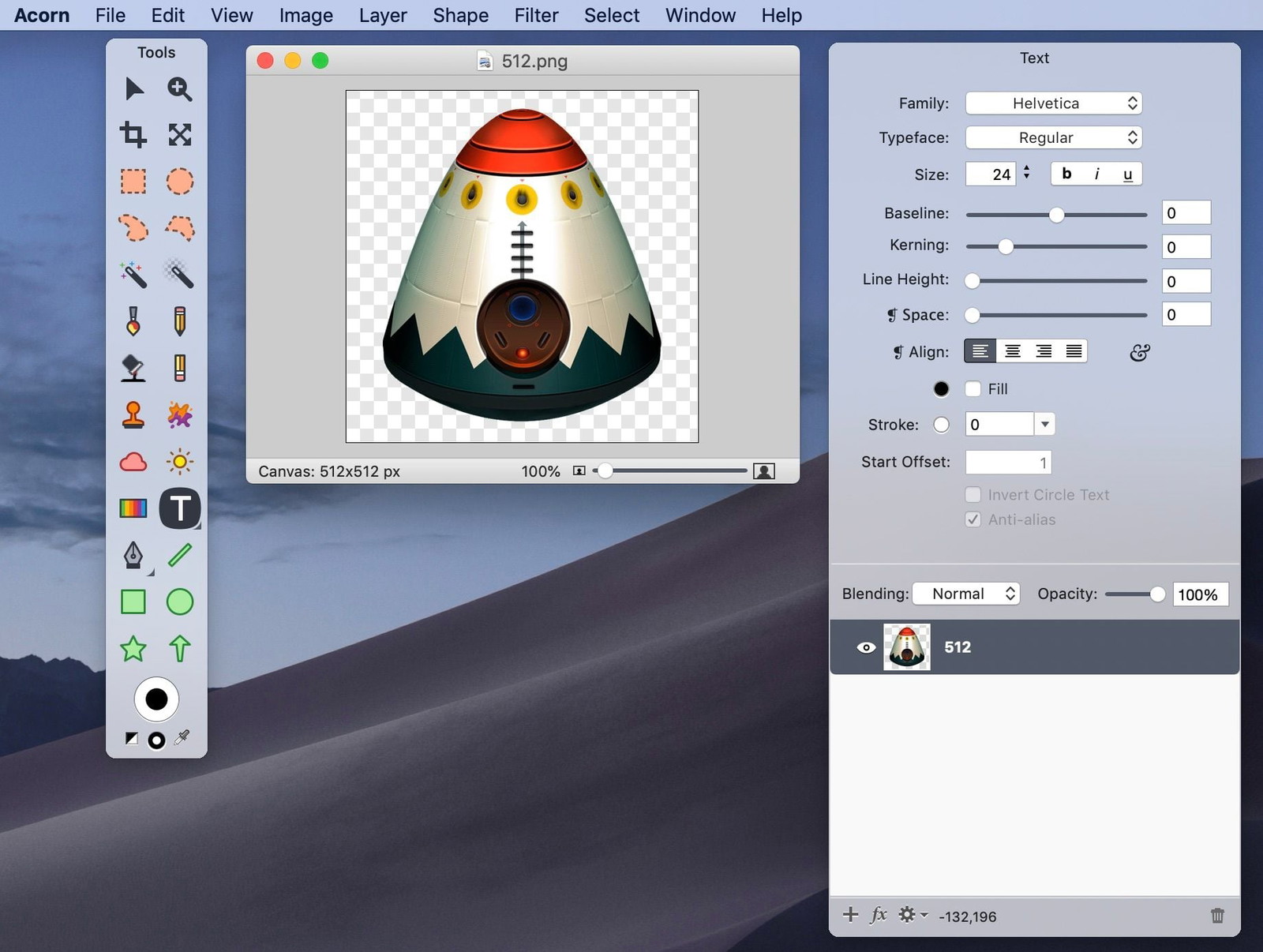
I use Acorn almost every day for editing images before I drop them into my Xcode projects and for optimizing photos I post to this blog. Is it as powerful as Photoshop? No. Of course not. But in the many years I’ve relied on Acorn (as a power user, not as a professional designer) I can’t remember a single time I’ve needed to reach for an Adobe app.
It’s a prime example showcasing how a solo developer can build an outstanding app when they take full advantage of Apple’s powerful frameworks.
Anesidora
Anesidora is a native Mac app for listening to Pandora.
The streaming music giant has long-offered a pretty good iOS app, but only recently launched their Mac version. Unfortunately, it’s an Electron turd. (Man, I wish I had coined that phrase.) Luckily for you and me, Adam Różyński has built this wonderful app directly on top of Pandora’s API.
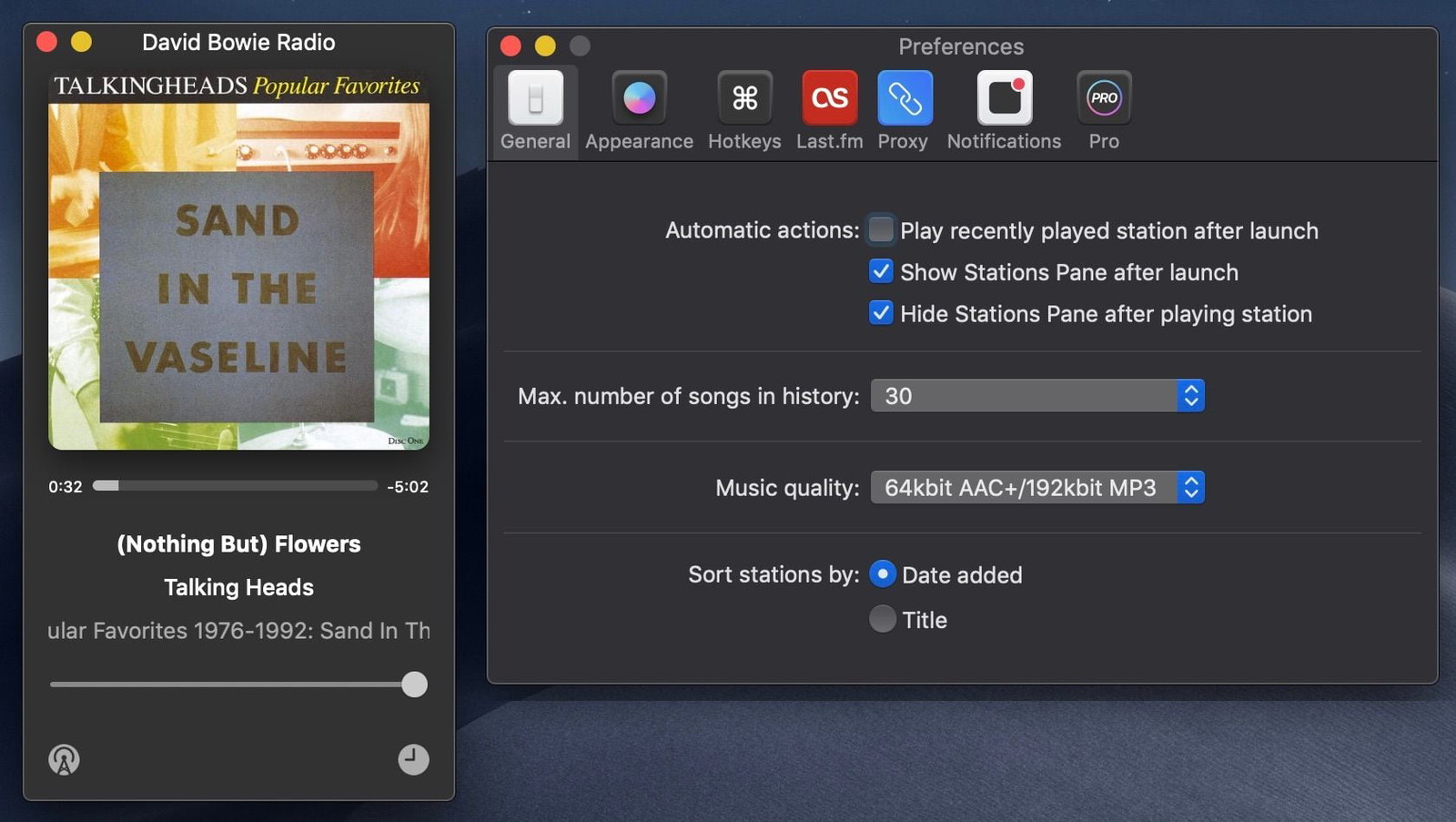
What I love most about Anesidora, besides the beautiful UI, is how well it integrates with all the various macOS nooks and crannies. You can see track changes in Notification Center, assign global hotkeys, Apple’s keyboard media keys do the right thing, and it will even pause the music if you take an AirPod out of your ear.
And because it’s a real Mac app, there’s no need to fire up a full instance of Chrome and Node just to play some music. Right now as I’m typing this and listening to Talking Heads, Anesidora is using 92MB of RAM and virtually no CPU. For comparison, Safari, idling in the background with no windows open, is using 105MB.
DEVONthink
I’ve written twice about DEVONthink recently, but holy damn do I ever love this app. It’s been around for years – I’ve been a customer since at least 2009. It’s where scanned copies of all the documents that would normally be in my fireproof safe are stored, along with any piece of paperwork I might need to refer to in the future, tons and tons of reference material, archived bookmarks, and more. And whether PDF, image, or what-have-you, it’s all indexed, made searchable, and synced across every Mac and iOS device.
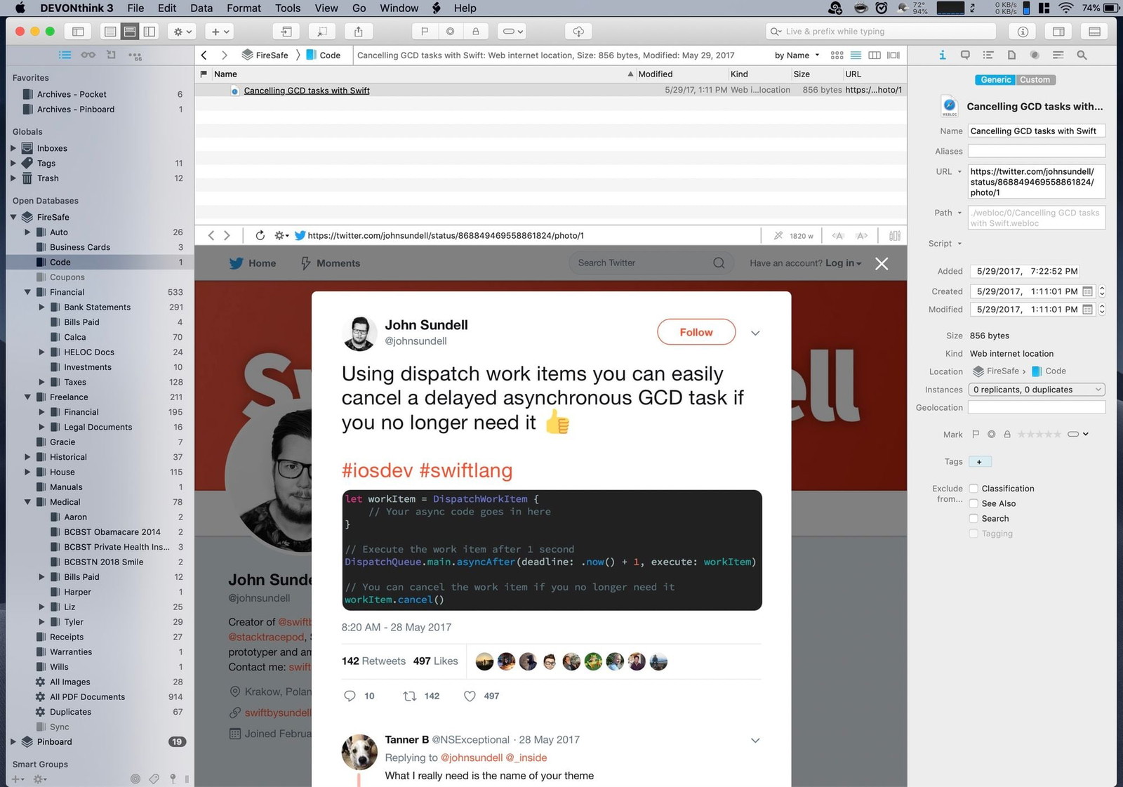
DEVONthink has a truly deep and powerful feature-set. But the reason I want to highlight it in this post is because it’s a perfect example of how you can use AppKit to build a dense, information-rich, highly usable interface. UIKit is wonderful for its simplicity, discoverability, and ease of use, and you can certainly design powerful, professional apps with it, but that’s not its default state. Not even on iPad. AppKit, however, naturally lends itself to concurrent areas of focus and visual hierarchies. You can see more of your work at once and do more with it. Part of that, of course, is that AppKit can run on giant screens compared to what UIKit has traditionally been constrained to. But it’s also a matter of a different philosophy between the two (competing?) frameworks.
Fantastical
Fantastical is the calendar app that Apple should have shipped with macOS. Flexibits goes beyond the basics and shows how powerful a pro version of Apple’s consumer-focused software can be.
Whenever I open a new Mac app, the first two things I do are to look at every menu item and then explore all the settings available in Preferences. Nothing gives me more joy (or sick pleasure) than hitting ⌘+comma and seeing a big, beautiful Preferences window with multiple panes full of fiddly settings I can tweak to my liking. I’m not advocating that developers should provide a switch for every option they were too afraid to make a decision about – sane defaults are a good thing and there’s paralysis in choice, etc – but flexible third-party software is a hallmark of the Mac experience.
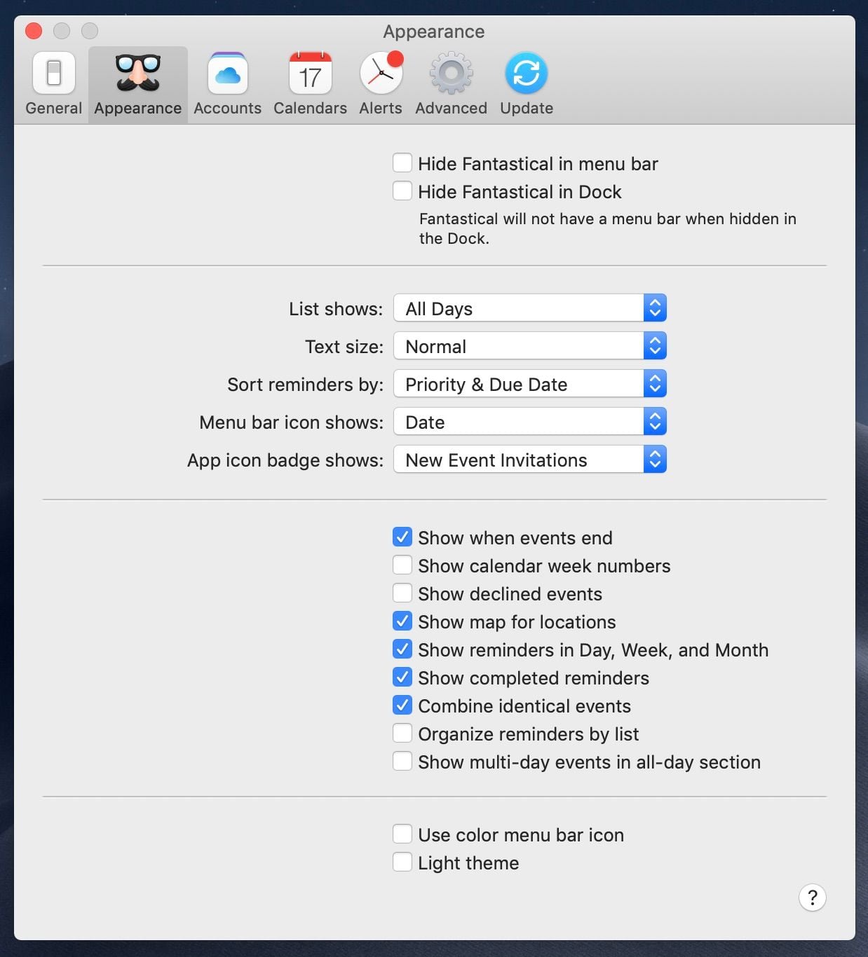
Fantastical takes the solid foundation Apple built into Calendar.app (née iCal) and extends it for power users in the ways indie developers are famous for.
Keyboard Maestro
As a geek first, a developer second, and someone who just wants to get shit done third, I love how scriptable macOS is – how automation is part of its DNA.
At the lowest levels you’ve got full access to a Unix environment with Bash (haha) and all the other standard scripting languages and tools. (For now.)
And at the graphical level you’ve got AppleScript and its friendly cohort Automator as well as the Accessibility frameworks. The former allow novice users to bend the system to their will without having to be a real programmer, while the latter gives developers powerful means to manipulate, control, and extend other apps in ways the original developers would never have thought of. (Love OmniFocus? Wait til you hear how it began.)
Keyboard Maestro is a shining example of a best-in-class automation tool for Mac. No matter how I try and describe the app, I’ll be doing a disservice to how insanely powerful it really is. Any time I come across a repetitive task, or wish another app behaved in a different way, or wondered if I could connect this with that, chances are, there’s a way to do it with Keyboard Maestro. It’s probably best I just let the expert tell you how it’s done.
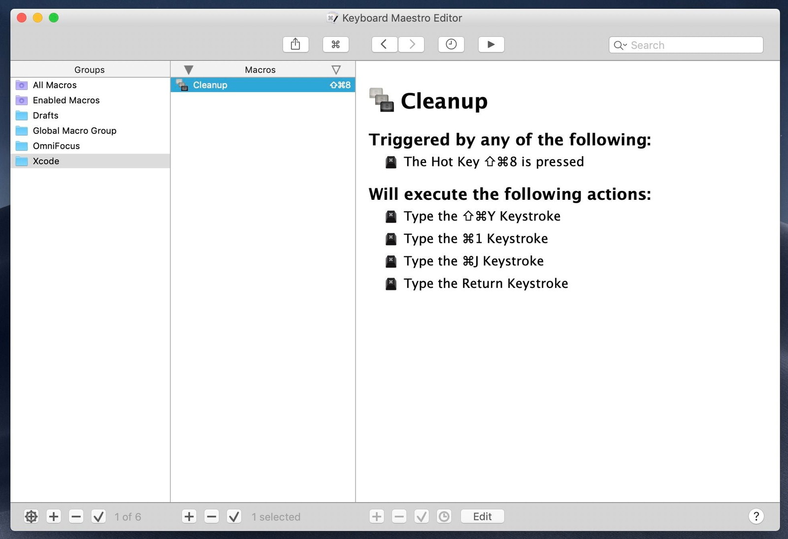
(And it’s not just Keyboard Maestro, there’s FastScripts, Hazel, TextExpander, BetterTouchTool, Script Debugger, and all the various apps that followed in the footsteps of Quicksilver.)
Anyway
I love my phone. I love my iPad. The watch is pretty great and tvOS is tolerable.
But the Mac.
Wow, did they get a lot of things right 35 years ago. It just fits how my brain works.
I’m not afraid of change. I don’t care if I build my UI with drag and drop, purely in code, or with a whizz-bang new DSL. What matters to me is the end result. And after a decade of near stagnation, I want to see macOS pushed forward in bigger and better ways.
Taking an iPad app and adding a menubar, sidebar, mouse support, and even multiple windows may be fine for Twitter, but it’s not going to cut it for end users who expect a level of power, finesse, flexibility, and soul that the Mac exudes. At least not in the Catalina release.
Steve told us there will be trucks. And there will be cars. It’s OK if they’re not the same. I know which one I want to be driving.