Perfectly Cropped
Here’s a fun, personal story about what can go wrong in an otherwise fine UI when things are redesigned.
My wife typically only charges her phone when she’s at her desk during the day. She doesn’t leave it plugged in overnight, which means iOS’s software update never happens automatically for her. So, she just recently upgraded to iOS 13 a few days ago.
Fast forward to today…

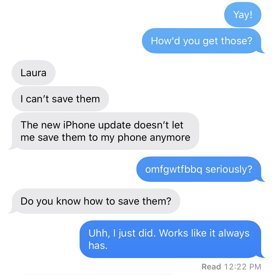
She claimed she couldn’t save photos to her phone that someone else texted her. My first thought was “oh god, it’s something to do with her iCloud account” that I tweeted about a few days ago.

So, I call her and we start debugging this over speaker phone.
“What app are you in?”
“Messages.”
“Are you tapping the Share button?”
“The box with the up arrow? Yes.”
“You don’t have a save option?”
“No, all I can do is send it to other people or make a reminder or a note or stuff like that.”
“Send me a screenshot.”


“Ohhh, no. You have to scroll down. I don’t know how to explain the difference, but “apps” are left and right and “actions” are up and down.”
“I am scrolling down. There’s no save option.”
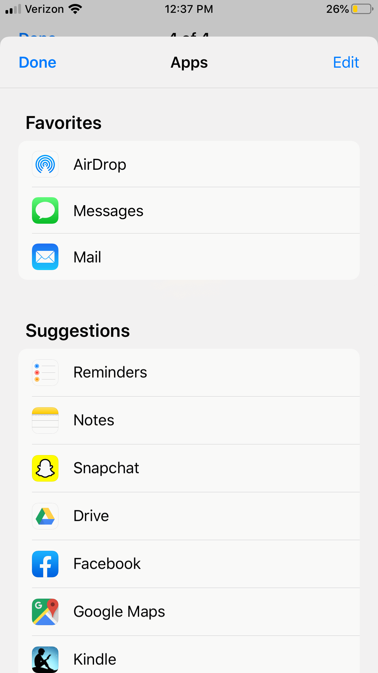
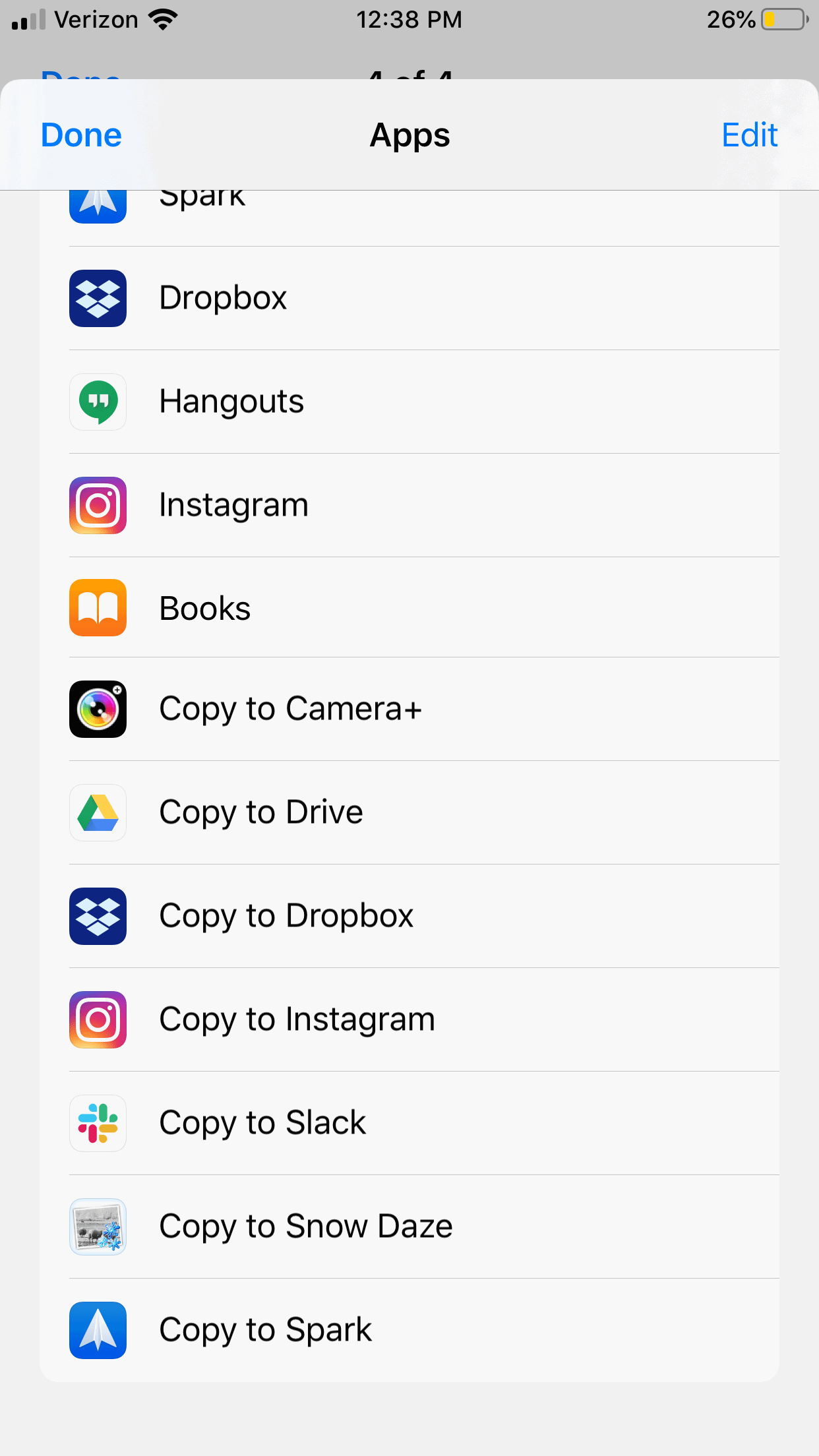
“Send me another screenshot.”


“No, no. You tapped the “More” button where you pick what apps show up. You need to scroll down from the main screen. Look for the black and white icons on the bottom.”
At this point there were a few seconds of silence before she yells “Oh my god! This is just like the dumb new Music app. I didn’t even know I could scroll down!”
Why didn’t she know there were options further down the share sheet? Because she’s using an iPhone 8, which happens to be just the right height to perfectly crop the share sheet. Take a look again at the first screenshot she sent me:

The “Copy” action is perfectly spaced from the bottom of the screen to appear like it’s the only option. And since iOS (and in some places now macOS, too) doesn’t offer visual affordances like scroll indicators, she had no idea there was any content further below.
I’m a developer with an eye for design, but I’m certainly not a designer. So I don’t know what the solution is to these types of accidental UI bugs. But I see them impact my aging parents all the time. This was just the first time one has so obviously confused my wife, and it caught me by surprise, too.