The Title

This is a joke. But not really. But also, yes. But also sorta serious.

Yesterday, Gruber linked to Jeff Kirvin’s essay “Safari 15 Isn’t Bad, Just Misunderstood”.

I’m not going to weigh in on Safari’s new design. Instead, I want to call out something Gruber wrote in his commentary:

You got URLs in address fields, but page titles weren’t exposed other than in the Window menu. That was, in my opinion, a fundamental flaw in the design. Web page titles are useful, and should be more human-readable than URLs.

That’s something I’ve long intuited based on my own web browsing habits but never really put into words. When I stop and think about it, modern web browsers drive me crazy by limiting tabs to a maximum width because that width is almost never enough to show the full page title.

Well, except one web browser: Safari. Look.

Here’s Chrome, Firefox, and Safari showing the same two web pages using the same window widths.

Chrome

Firefox

Safari

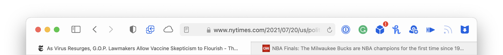
Safari is the only one that lets each tab expand to fill as much room as is available – so you can see more of the web page’s title.

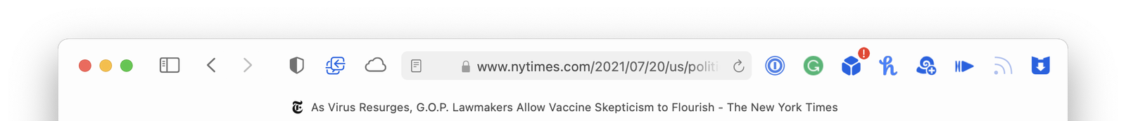
This difference is even more apparent if you only have one tab open. Here they are again:

Chrome

Firefox

Safari

If Safari on macOS Monterey is heading in a similar direction where web page titles are going to be even more truncated, that’s going to make me sad. I guess we should do something about it.

Here’s TheTitle.app

It’s a silly Mac app that is just a window title bar. It floats above all the other windows on your Mac and keeps an eye on your web browsers. As you move from browser to browser and web page to web page, TheTitle shows you the full page title – unobscured. Problem solved.

Here’s a demo video.

And the source is available on GitHub, or you can download a notarized build here.

MeetingBuddy

A few weeks ago I built a niche little app idea dubbed MeetingBuddy. You choose a target app from a pre-defined list (or pick any app on your Mac) and a time interval and MeetingBuddy starts screenshotting that app’s windows.

Each recording session goes into its own folder

where all of the screenshots are organized by date. But! while this is all going on, MeetingBuddy is also OCR-ing any text found in the screenshots and storing that alongside each image in a sidecar file.

You end up with a folder of recordings for each session. Images and their corresponding text contents.

Why is this useful? Honestly, I’m not exactly sure that it is just yet. But here’s what I’ve been using it for.

  1. I’ll start a recording session when I’m doing research. As I browse the web and look through source material, MeetingBuddy is like an assistant taking searchable notes of everything I see. You’ve always been able to search your browser history, but this lets you (to a limited degree) search the contents of your browser history during those periods of focused research as well.

(This all ties back to my Amnesia app idea, which COVID sorta derailed. Maybe I’ll get around to finishing that, too, one day. You can hear me talk about Amnesia on this podcast.)

  1. The reason MeetingBuddy is called MeetingBuddy is because I originally intended for it to help me remember online meetings better. And it does! At work, we’re rarely on camera during our video calls, but we share designs and slide decks constantly. I used to scramble to screenshot the video window when I wanted to remember something. Now it’s automatic. At the end of the day when I’m collating my notes from earlier, I can save any worthwhile screenshots and discard the rest.

And whether you keep the screenshots and text files in folders on your Mac, or if you dump them into a digital brain like DEVONthink, it’s super easy to search and cross-reference the text of what was on screen with the full image.

I don’t yet know if MeetingBuddy will go anywhere, but if nothing else, it’s given me an excuse to learn some new macOS APIs I hadn’t dealt with before.

Here’s a demo:

And if you’d like to try MeetingBuddy, you can download it here. I can’t even begin to describe how completely unpolished it is. I haven’t run it on any Mac other than my own, but it should work. Probably. (And, suffice to say, MeetingBuddy collects zero information about what you record. All text processing and image capture is done locally on your Mac.)

Delight on a Grand Scale

Super clever person, Mario Guzman, released Music Widget the other day. Here’s how he describes it:

A mini player remote for Apple Music. A take on the classic iTunes widget.

The app is exactly what it says on the tin. A pixel-perfect recreation of the old Mac OS X Dashboard widget that debuted with 10.4 Tiger in 2005. But it’s a bit more than that. Mario had to solve two problems.

First, a quick and dirty solution for making this app would be to boot up an old copy of Tiger and rip out the web assets (images, etc.) from the widget itself. But Tiger was 16 years ago. We have @2x retina displays on our Macs now. The original images would be too small or pixelly. Instead, he did things the hard way and took the time to rebuild everything from scratch in code.

Problem number two: Dark Mode wasn’t a thing sixteen years ago. Mario had to create that design himself. (It helped that he had a head start from previously bringing Dark Mode to his impressive rebuild of iTunes.)

Another bit of nostalgia that made the internet squeal last month was Tanner Villarete‘s recreation of the classic iPod interface on the web.

And, holy crap, have you seen The OldOS Project from Zane K? He built a fully functional version of iOS 4 with SwiftUI.

Why are people putting so much time, effort, and obvious love into remaking old user interfaces using modern development tools? Why bother?

I’m sure there’s a whole host of reasons, and each developer is motivated differently. Ultimately, I don’t think it matters. My real question is this:

Fifteen or twenty years from now. In 2036. In 2041. What will those kids rebuild from our devices today?

Mario and I had a short conversation about this last week, and I’ve been thinking about it ever since. I’ve tried paying attention to the devices and apps I use all day. And, I just, don’t know?

Are future developers going to feel nostalgia for the hamburger menu? The Facebook newsfeed? Grayscale colors and identically shaped app icons? Flat UI?

I’m trying very hard not to fall into the trap of being yet another old man yelling at kids to get off my lawn, but I struggle to find delight on a grand scale in modern software. Every incremental step, year over year (from all companies, this isn’t just about Apple), seems to be focused on removing emotion and affection from our devices rather than finding ways to strengthen that bond.

Has the industry decided that our devices have reached a level of maturity that warrants making everything minimal, sterile, and utilitarian to help “do work” and “get stuff done”?

Where’s the fun? Where’s the experimentation? The joy and playfulness?

I see bursts of design like this coming from small companies and individual developers. But the major players have forgotten that how software makes you feel is just as important and necessary as what it lets you do.