Quick question. Take a look at these two screenshots…

and
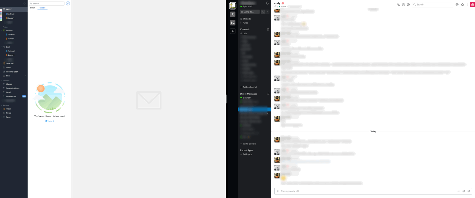
That’s my Mac right now at work with Spark and Slack running fullscreen in Split View.
In the first screenshot, one of the apps has focus. And in the second screenshot the other app has focus.
Can you tell which is which?
I’ve never been a big fan of Spaces or full screen on macOS, but I’ve been giving them a try again recently just to see if I can improve my workflow. And after a day or two of having a dedicated space for Slack + email, I found it maddening.
It turns out that I really enjoy having my noisy, communication windows segregated from the apps and windows I actively use to do work, but every time I’d switch to that space and either try and type into Slack or use the keyboard for navigation, I’d invariably realize the wrong app has focus.
Why? Because there’s no way to tell which is which.
Ok, technically that’s not true. You can tell. I’ve highlighted the difference below…
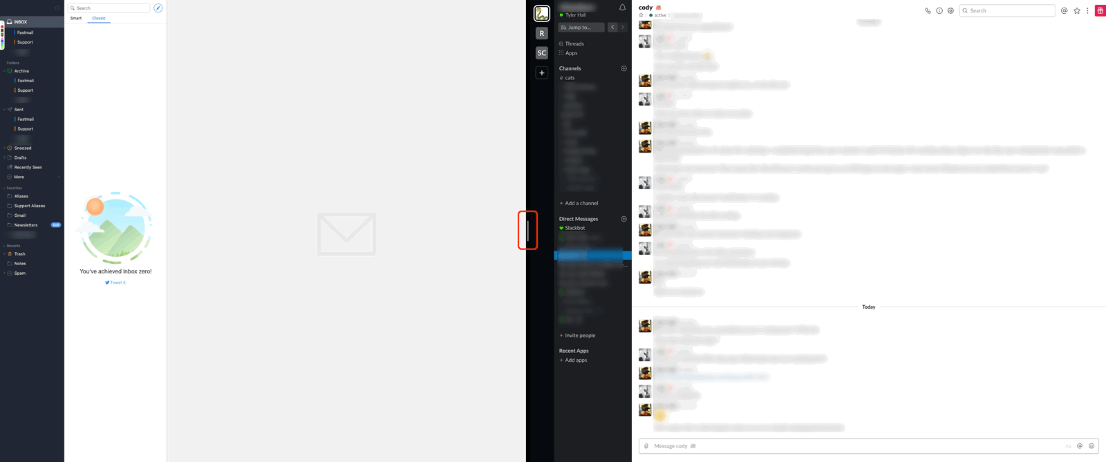
When that little 4px by 64px, gray bar is visible it means Slack is focused. Or something. I don’t know. Probably no one does.
Like I wrote about on iOS a few months ago, there’s been a trend in the industry ever since the iOS 7 redesign to get rid of UI affordances – or as Apple puts it, “subtle and appropriate” “adornments”. I don’t know if these changes are deliberate, due to a lack of empathy for the user, or just inexperience. But as apps deviate further and further away from the HIG with custom UI, whether for design reasons or in the pursuit of a mythical, cross-platform code base that management thinks will cost less, we lose the benefits of a well reasoned platform that was formerly easy to work with and a joy to use. And if we’re gonna go down that road, then let’s just give up and put everything inside a web browser. At least then we can see which tab has focus.