Fossils in the Ground
Iris ships today.
2,023 days since the first line of code. Before I say anything about what it is, I want to show you what the app started as — because the two things barely resemble each other, and the gap between them is basically the whole story.
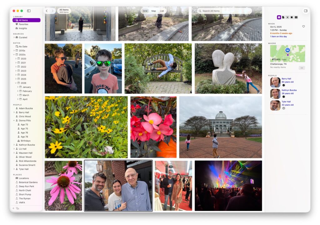
That’s the finished thing. Now let me rewind almost six years.
It started as “AntiPhoto,” and it wasn’t really a photo app
The first version, from November 2020, was called AntiPhoto. The name was a mood. I had tens of thousands of photos and videos scattered across drives and old phone backups, and Apple Photos wanted me to live inside its library, on its terms. I didn’t want a walled garden. I wanted something that could point at a messy folder and just make sense of it.
So the very first build wasn’t about browsing pretty pictures at all. It was a triage tool. It scanned a folder and tried to understand each image — running it through machine learning models to pull out scene categories, objects, and any text it could find.
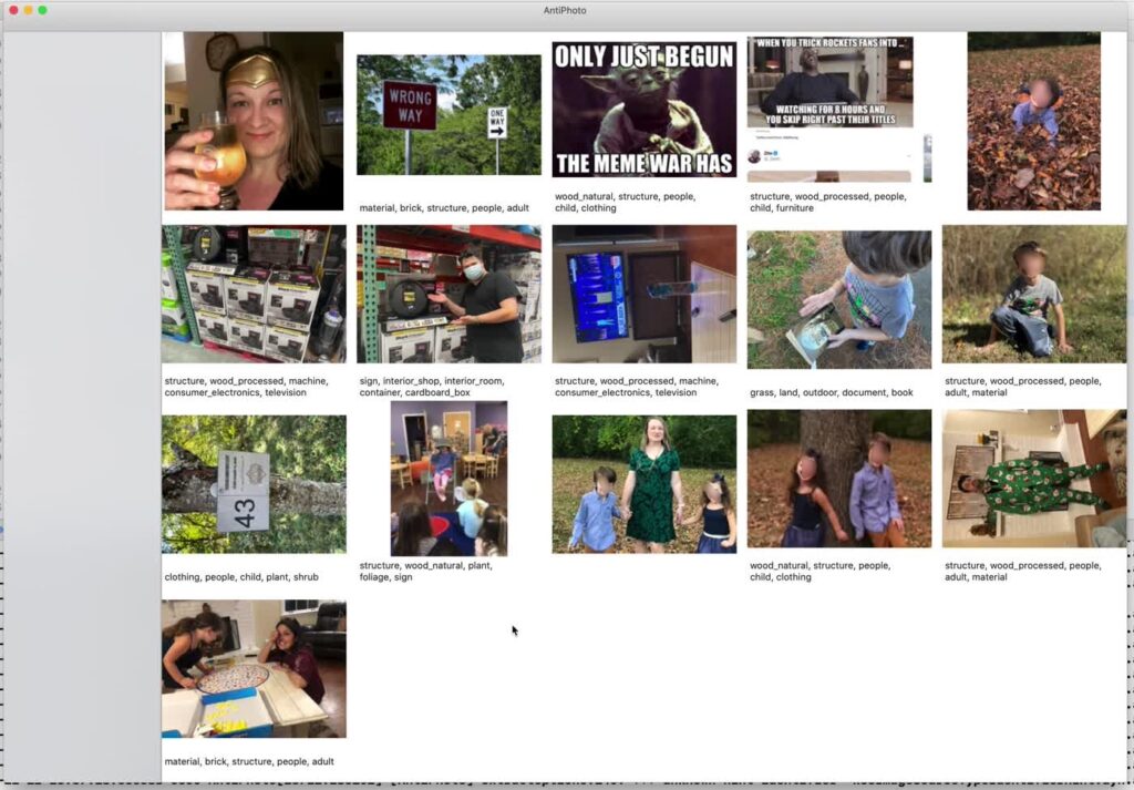
AntiPhoto, week one. Every photo auto-tagged with whatever the models thought was in it. Half of these tags are wrong, which was sort of the point — I was trying to see how far this could go.
Behind the grid was a little command-line program I called TriageDemo. You pointed it at a directory and it printed out everything it could infer per image: categories with confidence scores, detected objects, OCR’d text, the works.
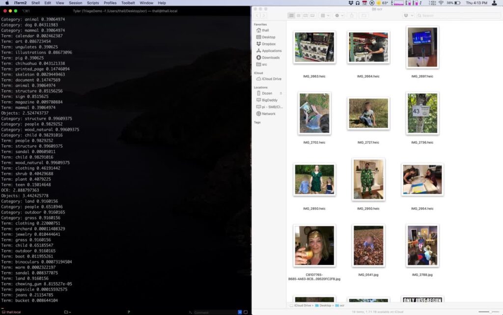
The actual seed of the whole project: TriageDemo chewing through a folder, scoring every guess. “Category: structure 0.996. Term: people 0.98. Term: sign 0.85.”
If you’d asked me then, I’d have told you I was building a search engine for your own hard drive. Faces, things, text-in-images — index all of it, make it findable. The fact that it happened to contain your family photos was almost incidental.
That framing didn’t last.
Renaming to Iris
By the end of December 2020, “AntiPhoto” had become Iris. (The internal library format kept the name AntiPhotoLibrary for an embarrassingly long time afterward — you can still find it lurking in old screenshots.) Within about six weeks the skeleton of the real app was already there: sources, dates, places, people, things, and a status bar quietly counting how much it had scanned.
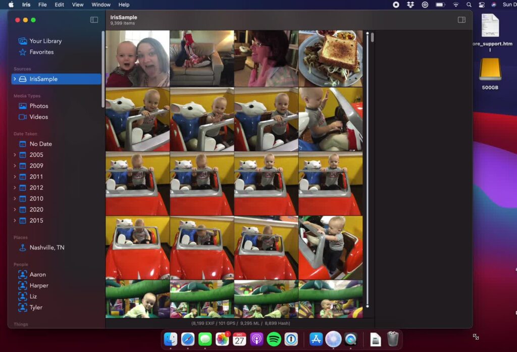
December 2020. Newly renamed, already counting EXIF, GPS, ML, and hash passes in the status bar. Everything after this was variations on a theme.
I liked “Iris” because it refused to mean one thing. It’s the iris of your eye. It’s the aperture of a camera. And it’s the flower. I spent a genuinely unreasonable amount of the next several years unable to decide which of those three the app actually was. You can watch me fail to decide, right in the icon.
The icon saga
This is the part I’m most sheepish about. Here is the design “process,” and I use that word generously. A lot of bad clip-art testing out ideas and even worse Photoshop Acorn choices.
It began on-the-nose: an eyeball, inside a camera lens. Both meanings of “iris,” literally stacked on top of each other.
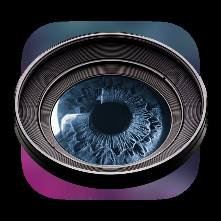
Exhibit A: the “what if we just did both” icon. An eye. In a lens. Subtle.
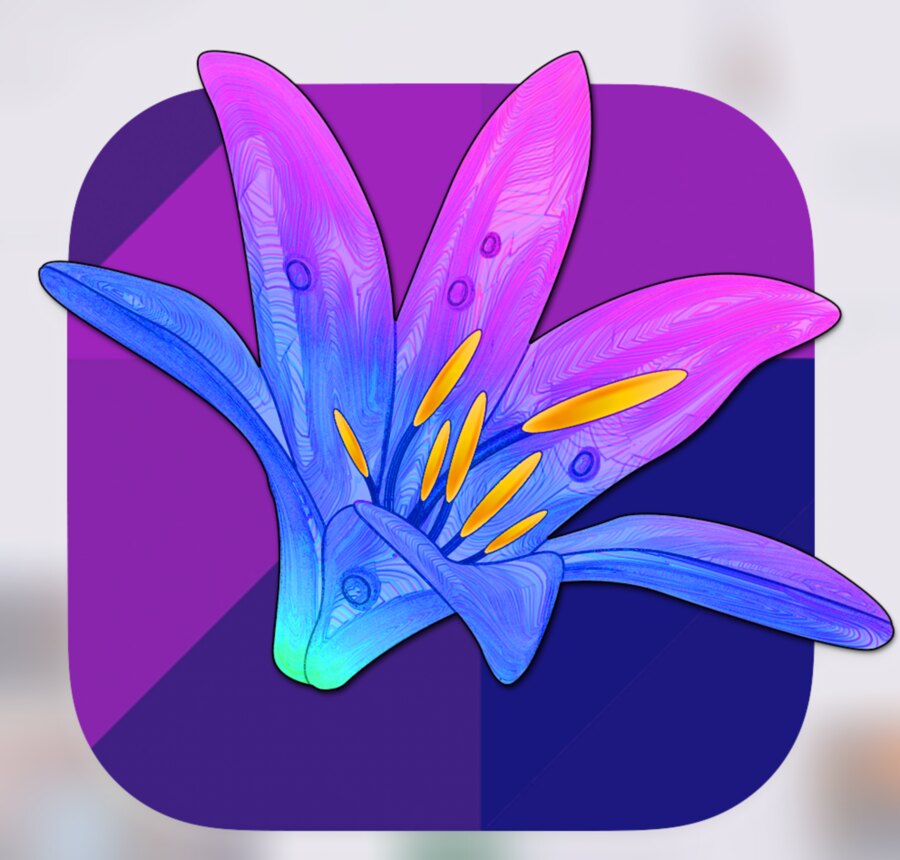
Then I swung hard toward the flower. In January 2022 the icon became a sketched iris bloom — blue fading to magenta, on a purple tile. Meh. It also looked nothing like a utility for searching 100,000 files, which is what the app actually was by then.
Then, in late 2022, image-generation tools showed up and I completely lost the plot. I generated dozens of camera-lens-inside-a-flower icons and saved them all in a folder I named, with no irony, “Icon Apps.” Antique. Black. Blurred Rainbow Waves. Drippy Flower. Funky Shape. Purple Stars. Starfield. White. I could not stop.
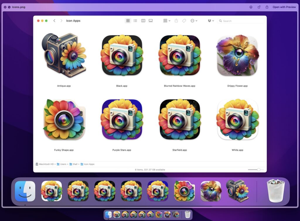
A small sample of the icon binge. There were more. There are always more.
I even went to space.
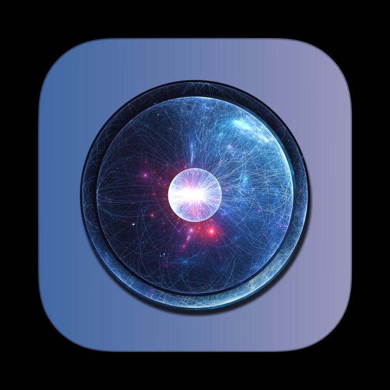
“Space Iris.” This version hung around for a surprisingly long time through early beta versions that friends and family were testing.
For even longer, it came back around to, fittingly, a flower After four years and a few dozen detours, the eye and the lens quietly stepped aside and let the flower win.
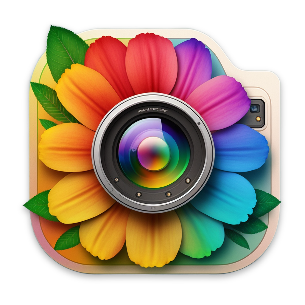
But then Apple came around and decided to put everyone’s Mac apps in squircle jail. I needed to align with Tahoe’s demoralizing icon design guidelines and keep everything within the squircle bounds. Which led to this compromise:
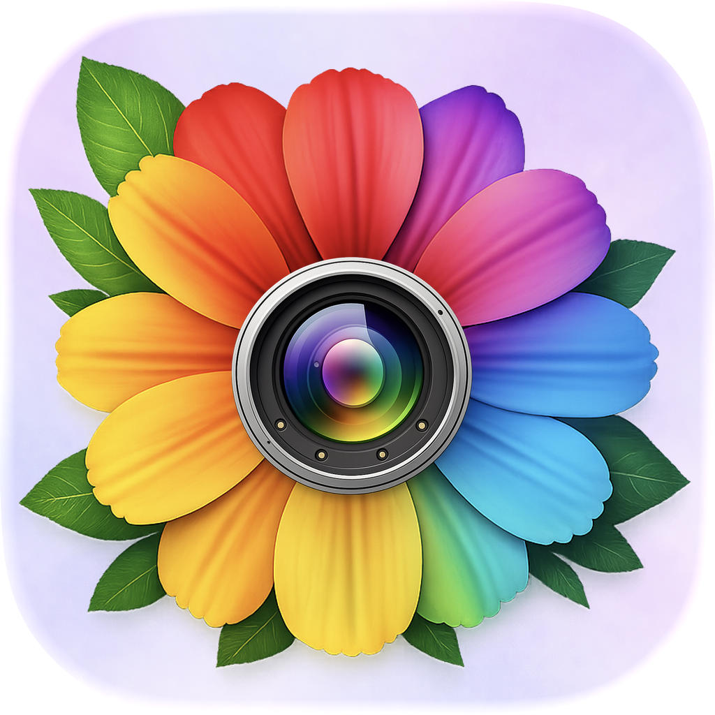
As much as I had learned to love the rainbow flower over the two years it was the app’s icon, it had way too much detail — especially in the modern Apple design era.
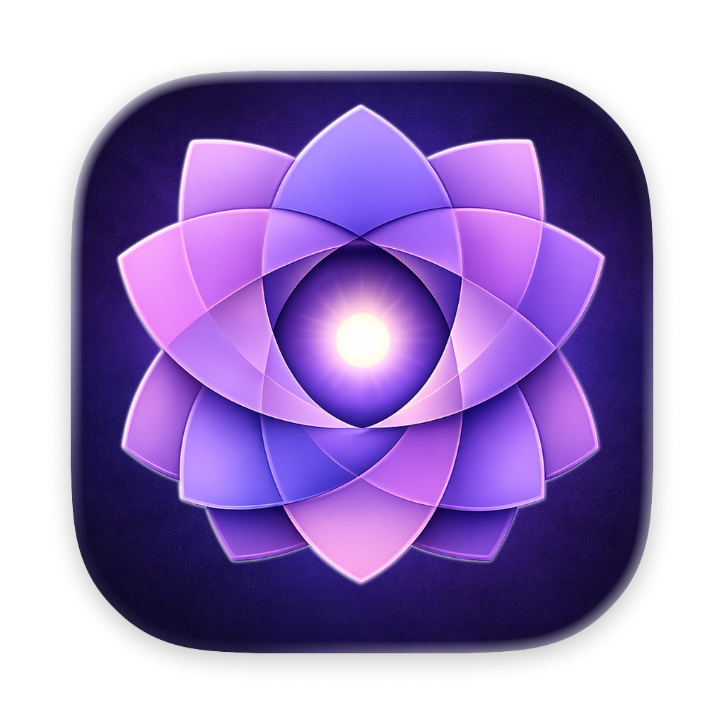
Which brings us to the final icon design that Iris ships with today.
The modes that came and went
Under the hood, Iris was organized around modes — a Browse / Organize / Find toggle at the top of the window. By 2022 you could see it sitting (smugly) right next to Apple Photos, which is exactly where I kept it while I worked.
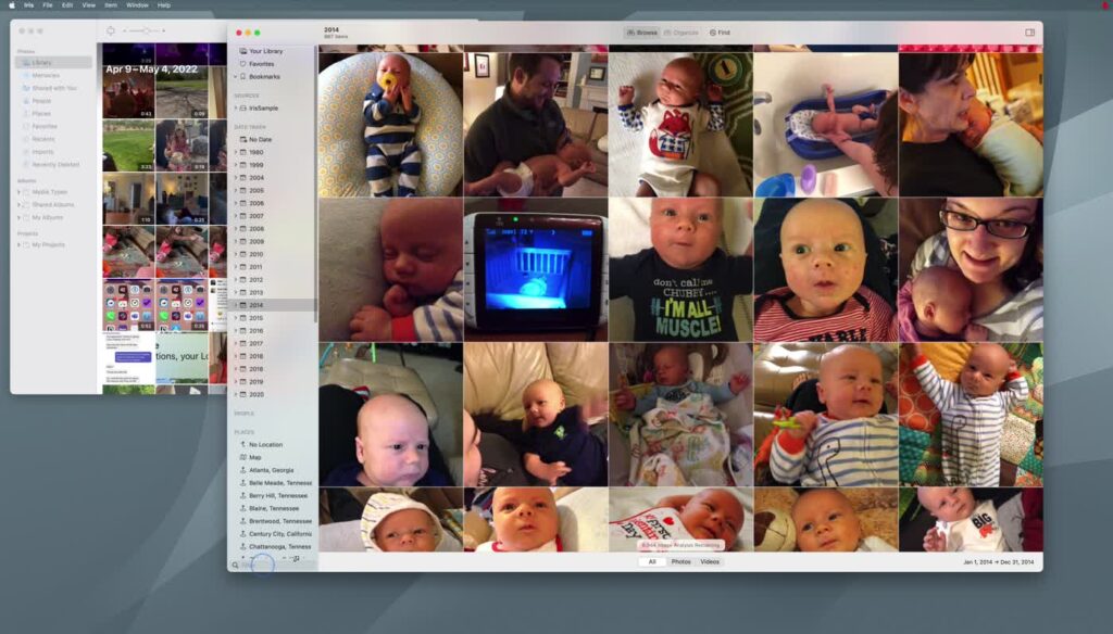
Iris (right) next to the thing it was a reaction to (left), August 2022. Note the “image analysis remaining” counter — there was always more to scan.
Some of those modes were wildly ambitious, and not all of them survived contact with reality. My favorite casualty is Explore Mode — a drag-and-drop visual query builder I described in my own notes as “Advanced Search for Normals.” The idea was that you’d drag People, Places, Things, and Text onto a canvas and wire them together with AND/OR connectors to build a search visually, no query syntax required.
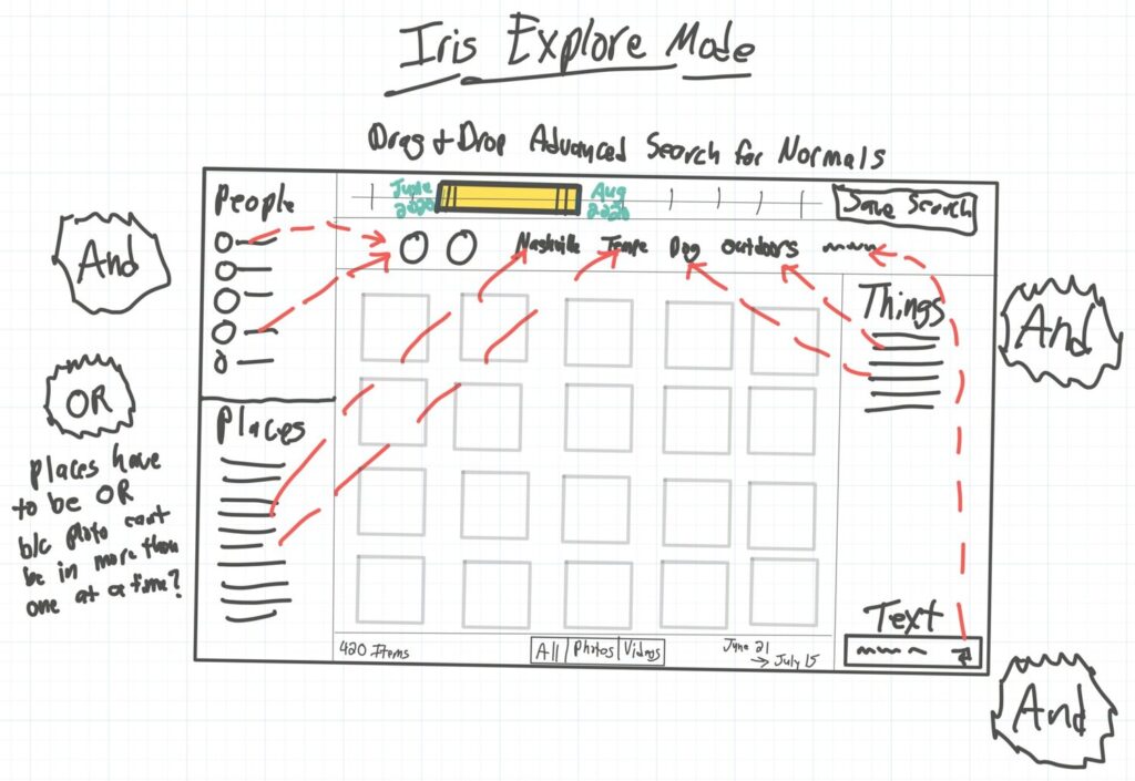
Explore Mode, as sketched on my iPad. I still think this is a good idea. I also fully understand why it didn’t ship in this form — note my own margin note worrying about whether places have to be OR’d “b/c a photo can’t be in more than one at a time.”
This is the only screen recording of the old Explore Mode I could find.
Then there was also Organize Mode, which was its own little universe. You’d collect items onto a “shelf,” then run batch operations on the whole shelf at once: set dates, fix locations, sort into date folders, correct OCR. There was a whole scored duplicate finder in there — same filename worth +2, same size +1, same hash +5, with a hopeful “ML?” scribbled at the bottom — that computed a “dupe %” for every candidate.
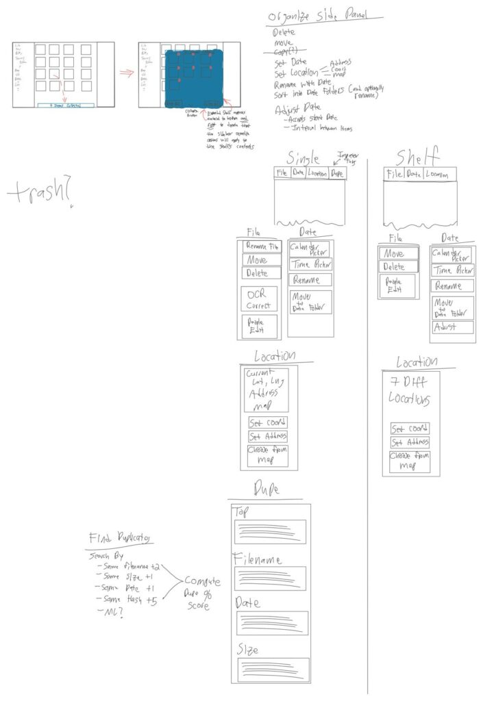
Organize Mode. Half of this shipped, half of it is still a someday-maybe, and the duplicate scorer was way more fun to design than it had any right to be.
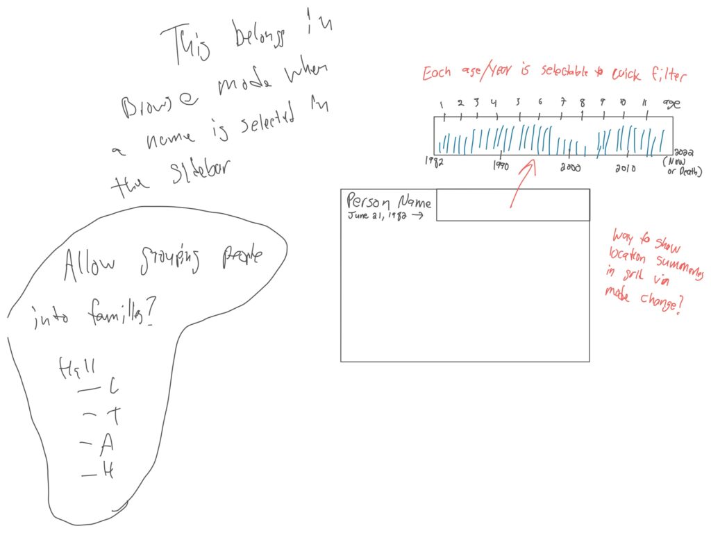
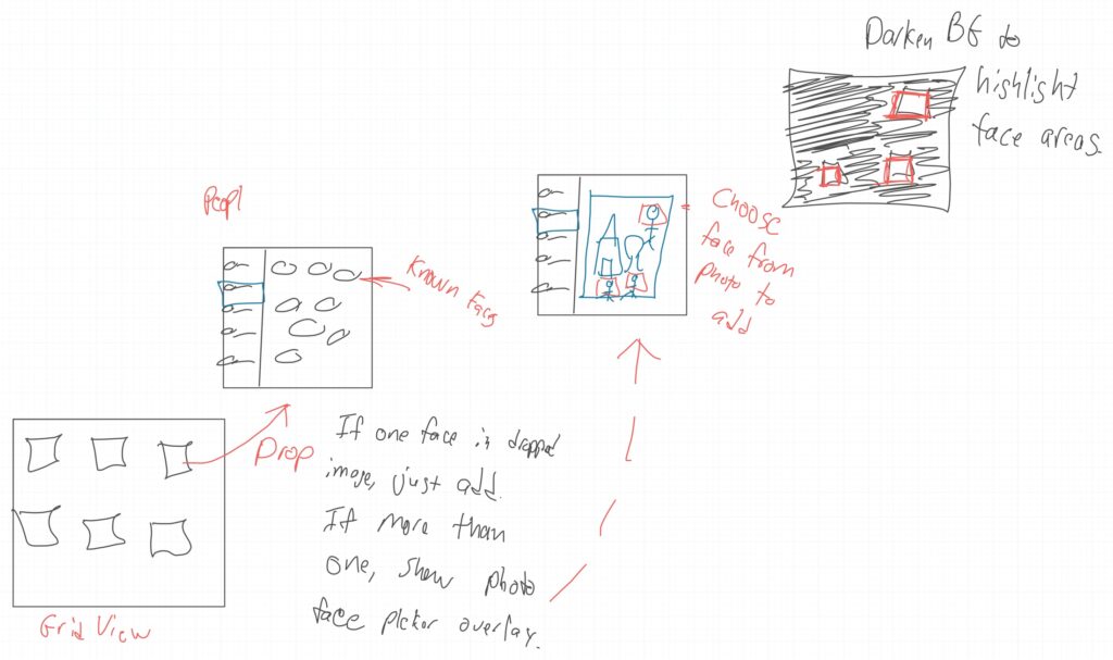
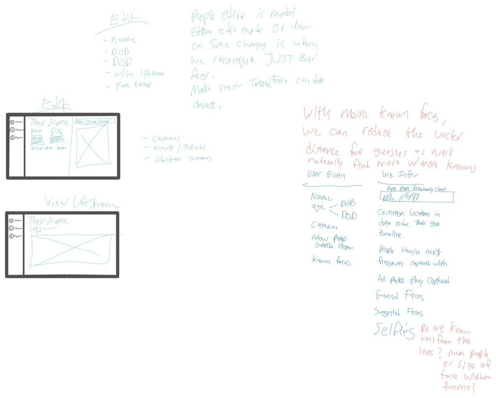
The same notebooks have pages and pages on People: per-person “lifestreams,” matching faces by vector distance (the more faces you confirm, the better the guesses get), a biography view that charts how often someone appears in your photos by age, and a wistful note asking whether I should let you group people into families. Some of that is in the app today. Some of it is still just ink.
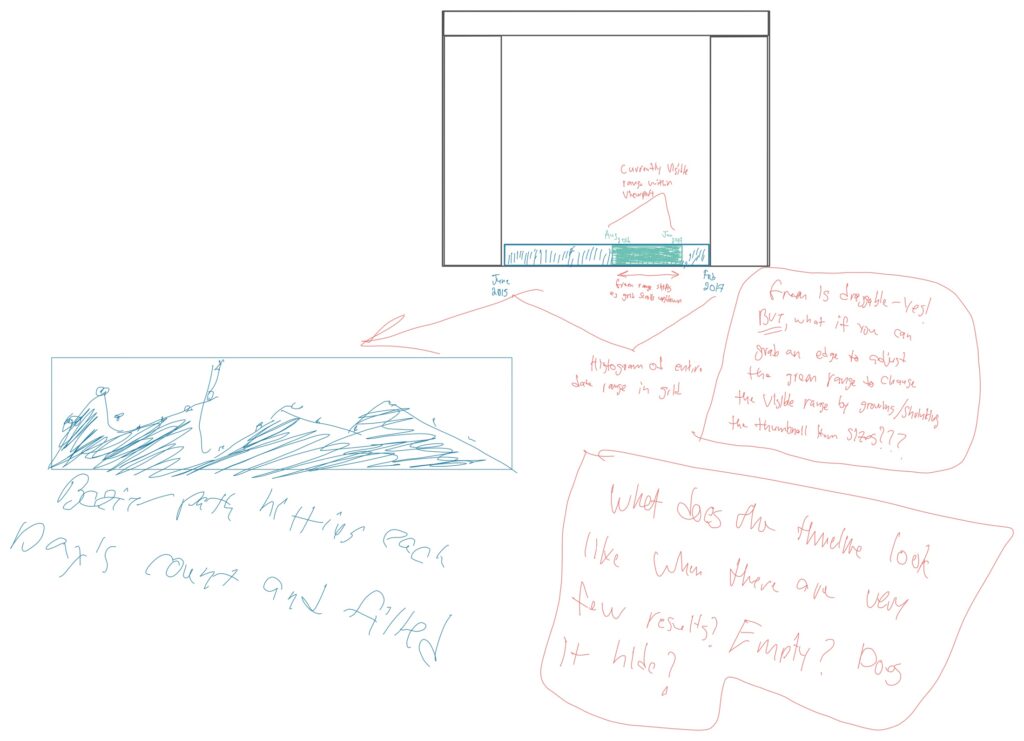
One last, random, video. Iris had a prototype interactive graph view (like Obsidian) that shows a visually weighted representation of how your photos connect with each other by way of people, places, dates, and things.
The boring work nobody sees
For every dreamy sketch there were months of deeply unglamorous hitting my head against the wall, none of which makes a good screenshot. The single hardest problem was often just scrolling. A photo library isn’t 200 items, it’s 200,000+, and they all have different aspect ratios, and you want a buttery justified grid that never stutters. I have a screen recording I named “100k Spinning Scroll” from April 2022 — the day a library of 101,706 items finally scrolled without choking — and I remember it feeling like a bigger win than any feature. But even today, Iris has performance hiccups — especially around complex searches and truly massive libraries. But if I waited to solve every bug, I’d never ship.
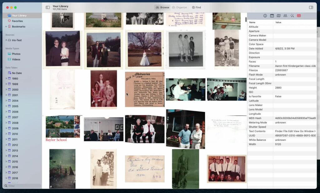
101,706 items, scrolling smoothly at last. That meant a custom collection-view layout, a background scanning daemon, and a lot of staring at memory graphs.
That daemon — IrisScanner — was its own saga. It does all the heavy lifting (EXIF, hashing, location lookups, face and object ML) in the background without making the app feel slow or eating your RAM. I spent a good chunk of 2023 in Instruments getting it to do all of that while holding steady around 266 MB. Nobody will ever notice this work, which is exactly the goal.
What Iris actually became
Here’s the part I didn’t see coming. That original triage idea — the thing that made me call it AntiPhoto — never died. It just grew up.
And somewhere along the way the whole emotional center of the thing shifted. I set out to build an anti-Photos utility — a search engine for a hard drive. What I actually ended up with is a memory keeper. Open a photo today and Iris tells you the date, surfaces “16 items on this day,” drops a pin on the map, and lists the people in the frame with their ages quietly calculated from their birthdays. That is not a utility. That is the opposite of anti-anything.
I think that’s the real lesson from digging through six years of old screenshots. You start with a thesis — mine was basically “Apple Photos is not for me” — and you build toward it. But the app keeps making little counter-arguments. The scroll work pulls you toward big libraries. The face work pulls you toward people. The “on this day” experiment pulls you toward nostalgia. And one day you look up and the spiteful little triage tool has become a thing you’re genuinely fond of, named after a flower you spent three years refusing to commit to.
Stephen King is my favorite author. And if you don’t count The Elements of Style, he wrote the best book ever about writing, On Writing. He says:
“Stories are found things, like fossils in the ground.”
The same can be said about software. Apps go where they want to go. The best you can do is keep showing up and let them.
Iris is out today. Thanks for being here for the wrong turns.